Understanding and Using CSS Logical Properties
Understanding and using CSS logical properties is an essential skill for modern web development. Learn how to leverage CSS logical properties to enhance the flexibility and responsiveness of your web design.
CSS logical properties provide a powerful solution for web developers to create flexible and maintainable layouts that cater to different languages and writing directions. The early days of the internet focused heavily on document uploading and sharing, and so developers used to think only in terms of left and right, top and bottom.
Logical properties offer an alternative approach. By using logical — instead of physical — values, developers can build webpage layouts that adapt to the direction of the content, which is especially important for multi-directional websites. The use of CSS logical properties results in a better user experience, making them an essential tool for modern web development.
This article will delve into the world of CSS logical properties, discuss their unique characteristics compared to physical properties, and explore how they can be seamlessly integrated into existing projects.
Contents:
- What are CSS physical properties?
- What are CSS logical properties?
- Creating a web layout in relation to writing mode
- CSS logical properties and corresponding physical properties
- Mapping CSS physical properties to logical properties
- Why use CSS logical properties?
- Flexibility
- Readability
- Adaptability
- Consistency
- Browser support
What are CSS physical properties?
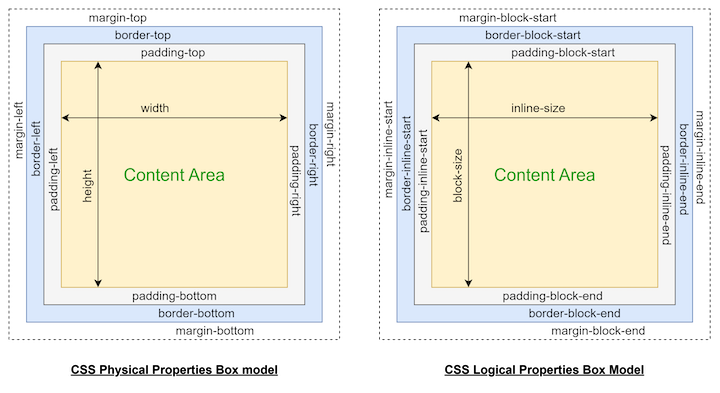
CSS physical properties are the traditional way of defining styles in CSS. These properties are based on the element’s physical properties, such as width, height, and position. Some examples of CSS physical properties are: padding-top, margin-left, and border-right.
Physical properties are often referred to as “directional” properties because they are defined based on the element’s default writing direction. CSS physical properties work well for languages read from left-to-right, such as most Western languages, but they can be challenging for those that read from right-to-left or use another directional model.
This challenge is particularly true for multi-directional languages such as Arabic, Hebrew, and Mongolian, which require different layout rules. For instance, text is read from right-to-left in Arabic, meaning the padding, margin, and border properties must be adjusted accordingly. Similarly, text is written vertically in Mongolian, meaning the physical properties must be modified to accommodate this layout.
In the past, developers relied on cumbersome workarounds and hacks to ensure their web designs were displayed correctly in multi-directional languages. However, with the advent of CSS logical properties, it’s now possible to design more flexible and responsive layouts, regardless of the direction in which the language is read.
What are CSS logical properties?
CSS logical properties specify the layout and styling of webpage elements using their directional, or logical, values instead of physical ones. This enables web developers to create layouts in relation to the writing mode of the document that are more flexible and easier to maintain, especially for websites that support multiple languages and writing directions.
For example, instead of using physical properties like margin-left and margin-right to position elements on a page, developers can use logical properties like margin-inline-start and margin-inline-end to position elements based on the direction of the text.
Understanding CSS physical properties are relatively straightforward since that is what we are used to. CSS logical properties can be a little harder to grasp at first. Allow me to break it down further for you.
Creating a web layout in relation to writing mode
CSS logical properties specify the layout and styling of webpage elements using their directional or logical values instead of physical ones. Directional values refer to the start and endpoints of a block of text’s direction, while logical values refer to the content’s natural progression.
In left-to-right writing modes, like English, the start point is the left side and the endpoint is the right side. In right-to-left writing modes, like Arabic, the start point is the right side and the endpoint is the left side.
Writing modes refer to the orientation of the text on the webpage. This includes horizontal writing modes like left-to-right (used for languages like English, French, and Spanish), right-to-left (used for languages like Arabic, Hebrew, and Persian), and vertical writing modes like top-to-bottom (used for languages like Chinese, Japanese, and Korean) and bottom-to-top (used for languages like Mongolian).
Websites that support multiple languages and writing directions often need to adjust their layouts based on the writing mode of the content. By using logical properties instead of physical ones, web developers can create layouts that accommodate the document’s writing mode but are more flexible and easier to maintain.
Instead of using physical properties like padding-top and padding-bottom to position elements on a page, developers can use logical properties like padding-block-start and padding-block-end to position elements based on the direction of the text. This approach improves user experience, regardless of language or writing direction.
CSS logical properties and corresponding physical properties
Each of the four CSS logical properties has a corresponding physical property, which is used interchangeably depending on the writing mode of the document:
block-start: top or bottomblock-end: bottom or topinline-start: left or rightinline-end: right or left
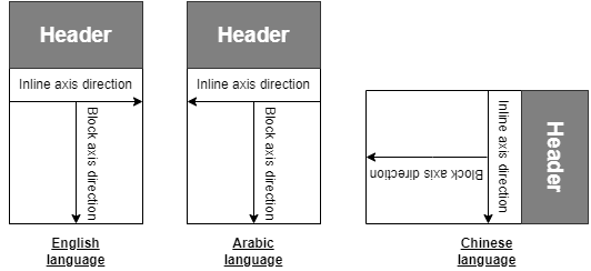
CSS logical properties have two main axes: the block axis (representing the vertical direction) and the inline axis (representing the horizontal direction). The writing mode of the document determines these axes.
The logical properties of languages with a left-to-right writing mode follow the same pattern as the physical properties. The inline axis is horizontal, starting from the left and moving toward the right. The block axis is vertical, starting from the top and moving toward the bottom. In this case, the logical properties work the same way as their physical counterparts, and there is no need for any special consideration.
For languages written from right-to-left, such as Arabic and Hebrew, the inline axis is reversed, meaning that elements are laid out from right-to-left. This affects the positioning of elements such as text, images, and other content. For example, a left-aligned block of text in an English document would be right-aligned in an Arabic document. But, the inline axis remains horizontal, and the block axis remains vertical.
Similarly, for languages written from top-to-bottom, such as Chinese, Japanese, and Korean, the block axis is rotated 90 degrees clockwise, with the top of the elements right-aligned. This means that the layout of elements differs from that of left-to-right languages, with text and other content arranged vertically rather than horizontally.
Here is some further explanation to help further clarify which logical property corresponds to which axis:
block: refers to the direction in which text flows in a block of content (e.g., English flows top-to-bottom) — this can also be associated with the content’s height. Logical properties that affect an element’s top and bottom edges are related to the block axis
inline: refers to the direction in which text flows in a line of content (e.g., English flows left-to-right) — this can also be associated with the content’s width. Logical properties that affect an element’s left and right edges are related to the inline axis
Here are a few examples of the block and inline axes:
For example, block-start specifies the starting edge of an element in the block axis (i.e., vertical for horizontal writing modes, horizontal for vertical writing modes), which is usually the top edge in horizontal writing modes and the leading edge in vertical writing modes.
On the other hand, block-end specifies an element’s ending edge in the block axis, which is usually the bottom edge in horizontal writing modes and the trailing edge in vertical writing modes.
Similarly, inline-start specifies the starting edge of an element in the inline axis (i.e., horizontal for horizontal writing modes and vertical for vertical writing modes), which is usually the left edge in horizontal writing modes and the leading edge in vertical writing modes.
inline-end specifies the ending edge of an element in the inline axis, which is usually the right edge in horizontal writing modes and the trailing edge in vertical writing modes.
To further explain this example, let’s say you have a website that supports both left-to-right and right-to-left languages. In left-to-right languages, like English, the text flows from left-to-right, so the inline axis is horizontal, and the logical property for the left edge is inline-start.
In contrast, the logical property for the right edge is inline-end. In right-to-left languages, like Arabic, the text flows from right-to-left, so the inline axis is still horizontal. However, the CSS logical property for the left edge is inline-end, and the logical property for the right edge is inline-start.
Similarly, the block axis in horizontal writing modes corresponds to the logical properties block-start for the top edge and block-end for the bottom edge. In contrast, in vertical writing modes, the block axis corresponds to block-start for the leading edge and block-end for the trailing edge.
Understanding the relationship between the axes and the logical properties allows you to position and style elements on a web page more efficiently, regardless of the writing mode or language direction.
Mapping CSS physical properties to logical properties
Mapping physical properties to logical properties is essential when developing websites or applications that support different writing modes. The following table shows how to map some common CSS physical properties to their corresponding CSS logical properties:
| CSS physical property | CSS logical property |
margin-top | margin-block-start |
margin-right | margin-inline-end |
margin-bottom | margin-block-end |
margin-left | margin-inline-start |
padding-top | padding-block-start |
padding-right | padding-inline-end |
padding-bottom | padding-block-end |
padding-left | padding-inline-start |
border-top | border-block-start |
border-right | border-inline-end |
border-bottom | border-block-end |
border-left | border-inline-start |
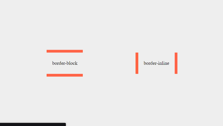
Here is an example of two text blocks using logical properties:
//htmlborder-block
border-inline
//css

p {
  padding-inline: 20px;
  padding-block: 30px;
}

.border-block {
   border-block: 10px solid tomato;
}

.border-inline {
  border-inline: 10px solid tomato;
}
As you can see from the table, the pattern is to replace the directional keyword in the physical property with its logical equivalent. For example, margin-top becomes margin-block-start, and margin-left becomes margin-inline-start. View all CSS logical properties here.
Mapping physical properties to logical properties allows for easier code maintenance and consistency across different writing modes. Developers can use logical properties to create more flexible and adaptable layouts that work well in left-to-right and right-to-left languages.
Why use CSS logical properties?
Developers can leverage logical properties to create layouts that are independent of text direction and can be adapted to different devices and screen sizes. This results in a more responsive and user-friendly website or application.
Logical properties offer several advantages, making them a valuable tool for web developers. Let’s explore some of those benefits in more detail and look at examples demonstrating how logical properties can be used to improve the design and functionality of a website or application.
Flexibility
Logical properties can be used to create flexible layouts that work well in left-to-right and right-to-left languages. For example, to design a website that supports both English (left-to-right) and Arabic (right-to-left), we can use logical properties like margin-inline-start and margin-inline-end, instead of physical properties like margin-left and margin-right, to position elements on the page. This approach improves maintainability and helps ensure a consistent layout across different languages.
Readability
CSS logical properties can be used to make code more readable and easier to understand. For example, instead of using physical properties like width and height to set the size of elements, we can use logical properties like inline-size and block-size based on the direction of the content. This makes it easier for developers to understand the code and make changes when necessary.
Adaptability
Logical properties can be used to create responsive designs that adapt to different screen sizes and devices. For example, we can use logical properties like min-inline-size and max-block-size to adjust the size of elements based on available space. This ensures that the website or application is user-friendly on different devices and screen sizes.
Consistency
Logical properties can be used to ensure consistency across different languages and writing directions. For example, we can use logical properties like border-start and border-end, instead of physical properties like border-left and border-right, to create consistent borders on different sides of an element. This ensures the website or application has a consistent design across different languages and writing directions.
Examples of popular multi-directional websites
Many popular websites use logical properties to make their designs more flexible and adaptable across different languages and writing directions. Here are a few examples:
- Wikipedia: This crowdsourced encyclopedia is available in several languages. The site uses CSS logical properties to ensure that its layout adapts to the writing direction of each language. For example, the Arabic version of Wikipedia is written from right-to-left, while the Chinese version is written from top-to-bottom
- United Nations: This international organization’s website supports multiple languages, including Arabic and Hebrew, which are written from right-to-left. The website uses CSS logical properties to ensure the layout and design are consistent across all languages and writing directions
- BBC: This news website is available in multiple languages and writing directions. The website uses CSS logical properties to ensure consistency in layout for users, regardless of language or writing direction
- Al Jazeera: This news website that supports Arabic and English. It uses CSS logical properties to switch between the two writing modes, depending on the language of the content
- Amazon: This digital marketplace is available in many countries, each with its own language and writing direction. The website uses CSS logical properties to ensure that the layout adapts to the writing direction of each language. For example, the Japanese version of Amazon is written from top-to-bottom, while the English version is written from left-to-right
- Facebook: This social media platform is also available in many languages, each with its writing direction. To ensure that the platform’s layout adapts seamlessly to each language’s writing direction, Facebook employs CSS logical properties
Browser support
Browser support for CSS logical properties is steadily improving. As of this writing, all major modern browsers, including Google Chrome, Mozilla Firefox, Microsoft Edge, Apple Safari, and Opera, support logical properties to varying degrees. View detailed browser support of CSS logical properties here.
It’s important to note that older browsers, particularly Internet Explorer 11 and below, do not support CSS logical properties. Developers may need to use fallbacks for these browsers to ensure that their websites and applications are still functional. Overall, it’s best to check for browser support before using logical properties and to provide fallbacks for unsupported browsers to ensure a consistent user experience.
Wrapping up
CSS logical properties provide a powerful solution for creating flexible and maintainable layouts that cater to different languages and writing directions. By using logical values instead of physical ones, developers can ensure that their layouts adapt to the direction of the content, resulting in a better user experience for all users, regardless of language or writing direction.
Understanding and using CSS logical properties is an essential skill for modern web development, especially for websites that support multiple languages and writing directions. I hope this article provided you with a comprehensive understanding of how to leverage these properties to enhance the flexibility and responsiveness of your web design and create websites that are accessible and easy to use for everyone.
Source: https://blog.logrocket.com
#css