Learn how to create an iOS-inspired toggle switch using React components, building a simple demo React App for using this custom toggle switch component.
In this article, we’re going to create an iOS-inspired toggle switch using React. This will be a small, self-contained component that you’ll be able to reuse in future projects. As we go, we’ll also build a simple demo React app that uses our custom toggle switch component.
We could use third-party libraries for this, but building from scratch allows us to better understand how our code is working and allows us to customize our component completely.
Forms provide a major means for enabling user interactions. The checkbox is traditionally used for collecting binary data — such as yes or no, true or false, enable or disable, on or off, etc. Although some modern interface designs steer away from form fields when creating toggle switches, I’ll stick with them here due to their greater accessibility.
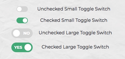
Here’s a screenshot of the component we’ll be building:
Getting Started
Let’s use Create React App to get a React app up and running quickly. If you’re unfamiliar with Create React App
create-react-app toggleswitch
Once everything has installed, change into the newly created directory and start the server with yarn start (or npm start if you prefer). This will start the development server at http://localhost:3000.
Next, create a ToggleSwitch directory in the src directory. This is where we will make our component:
mkdir src/ToggleSwitch
In this directory, make two files: ToggleSwitch.js and ToggleSwitch.scss:
touch ToggleSwitch.js ToggleSwitch.scss
Finally, alter App.js as follows:
import React from 'react';
import ToggleSwitch from './ToggleSwitch/ToggleSwitch'

function App() {
  return (
    <ToggleSwitch />
  );
}

export default App;
#react #javascript #web-development #programming #developer