The flexbox layout module is good news for web developers everywhere. The part where all major browsers now support it is even better news. A lot of fantastic resources, documentation and tutorials have sprung up lately. Solved by Flexbox is one of my favorites.
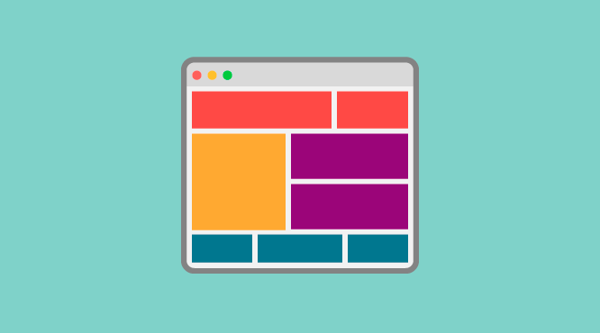
In the past I used very simple CSS float grids for website templating, but Flexbox is even better, and much simpler. In this quick tutorial, I will show you how to create an extremely simple, infinitely scalable responsive grid.
The Demo
See the Pen Easiest Flex Grid Ever.
We have semantic options for naming the tags and classes, but I’ll start off with a simple row and column based naming structure, in the vein of Bootstrap, Foundation, Skeleton, and just about every other CSS framework.
#css #design
