“Whatever your message is, data visualization can increase its reach a thousand-fold” — Randy Olson
Google Data Studio is a data visualization, or a reporting tool aimed at converting data into stories, generate insights and curate reports
Out of the many data visualization or reporting tools, Google Data Studio stands out for its FREE and astute service offerings, and while that might be enough to attract storytelling enthusiasts, it has a multitude of other characteristics to offer –
- Ease of Use — since most users are well versed with google suite’s user interface, deciphering and navigating data studio becomes natural and intuitive
- 200+ data connectors
- Drag and Drop functionality
- Customizable Charts and Visuals
- Effortless sharing and collaboration options
Step 1 — Getting Started
To use Google data studio, you can use your existing Google account or create a new one, there is no installation of any kind required.
Next up, once you open Google Data Studio, your window would look as below.
This window provides you with some predesigned reports and templates as your guide or reference.
The Blank Report tile with a ‘+’ sign or the ‘+ Create’ option on the left pane, would direct us to a blank canvas to create our reports.
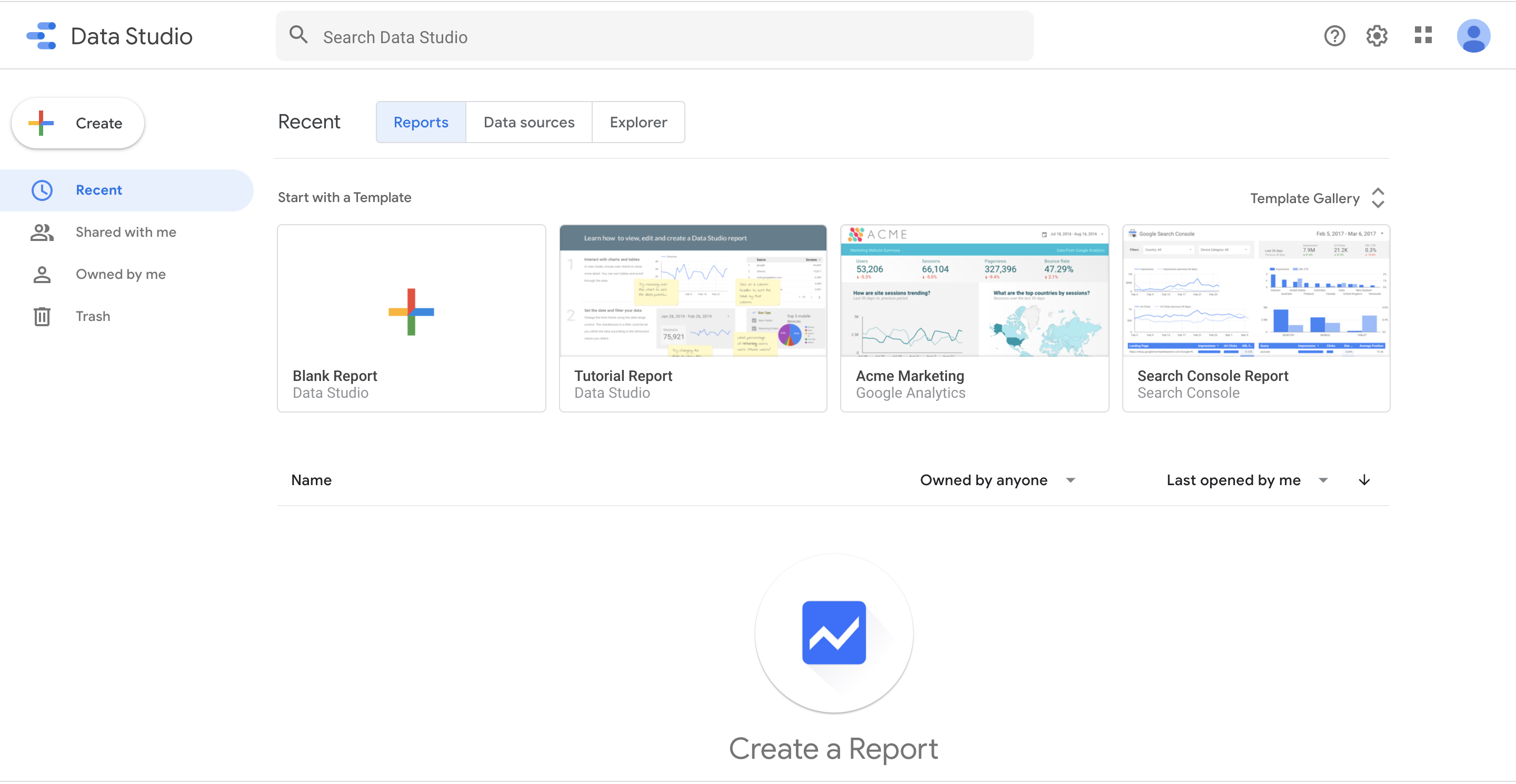
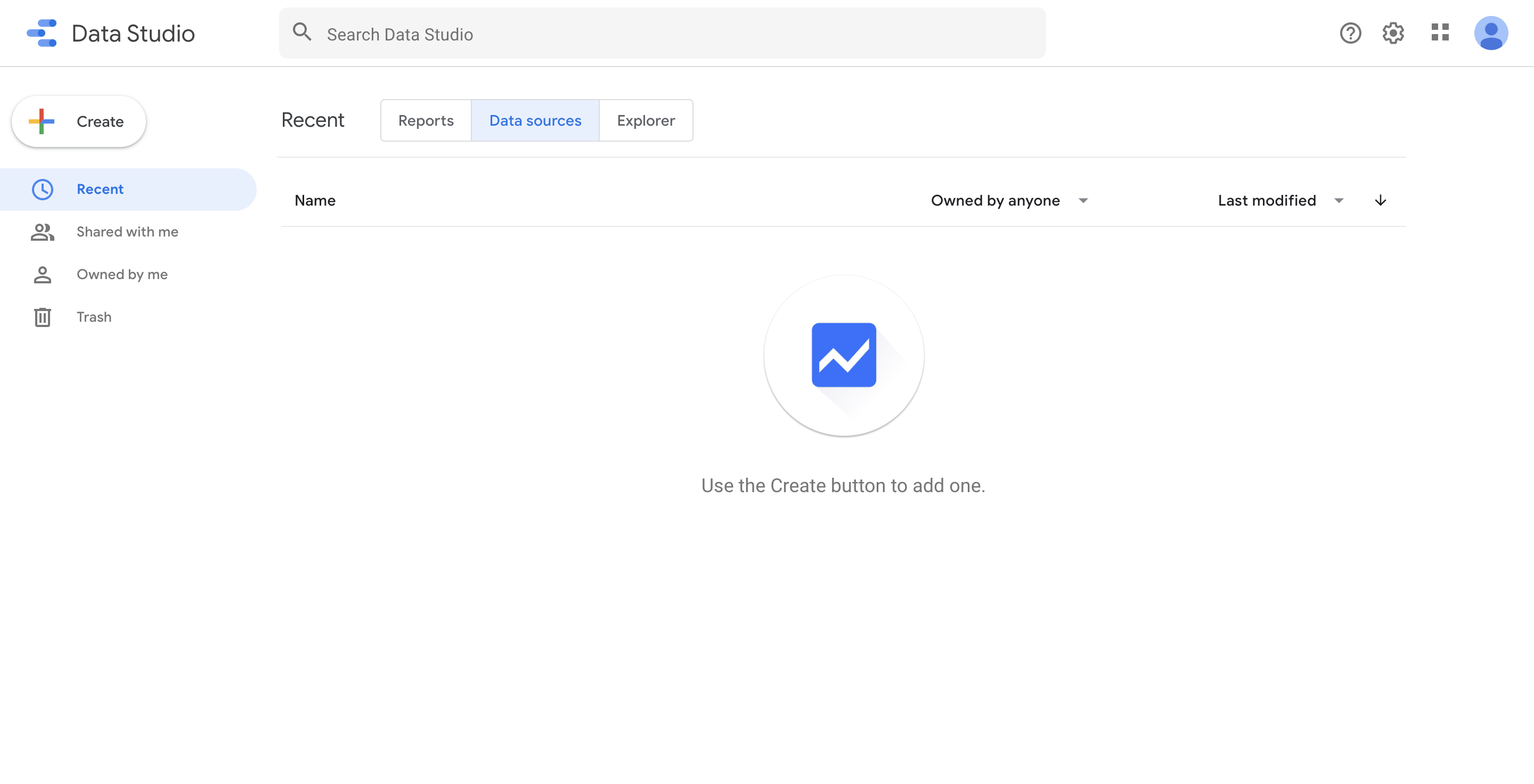
The Data Sources tab provides a view on all the data sources used in creating the reports.
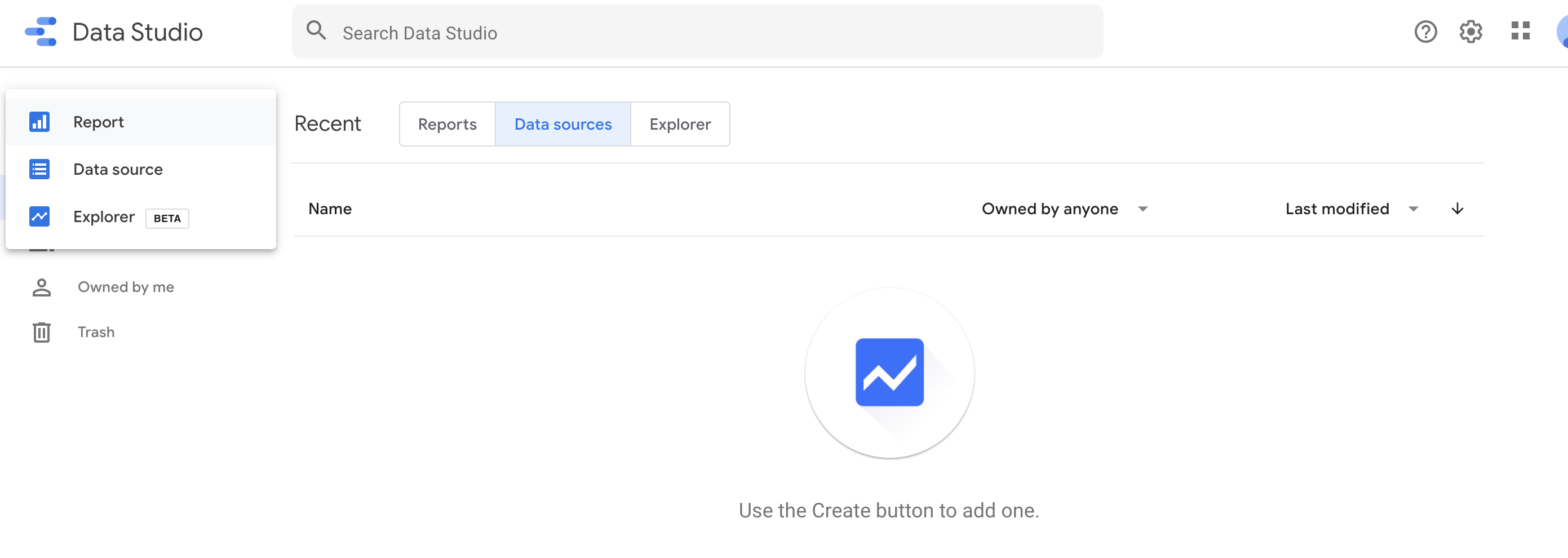
You can click on the ‘+ Create’ option to add a data source
Step 2: Data Preparation
You have an option to pull data from multiple platforms. Scroll down or use the search option in Google Data Studio to find the platform you wish to connect to.
To know more about the data connectors.

Select on the platform or connector of your choice, browse the data set you wish to connect to, and hit the ‘Connect’ button.

Once you connect to the data set, your window would be divided into
- Field Names
- Field Types
- Field Default Aggregation type
- Description (if any)
The Blue colored fields are metric based — fields that can be aggregated (sum, average, count, etc.) or indicate quantitative values.
The Green colored fields are dimensional fields — these fields are categorical in nature (Name, Country, etc.)

#data-science #google-data-studio #data #data-visualization #data analysis