I am often amazed at the flaming hoops of fire people will use to accomplish the simplest of things. Styling the HTML tag when it’s a checkbox or a radio button definitely qualifies for this.
This is particularly true of the people who throw around the word “component” … you know the types; React/Vue fanboys who aren’t qualified to even write HTML in the first place. It’s like the moment they start thinking about things as “components” every last bit of sane and rational development gets erased from the memory.
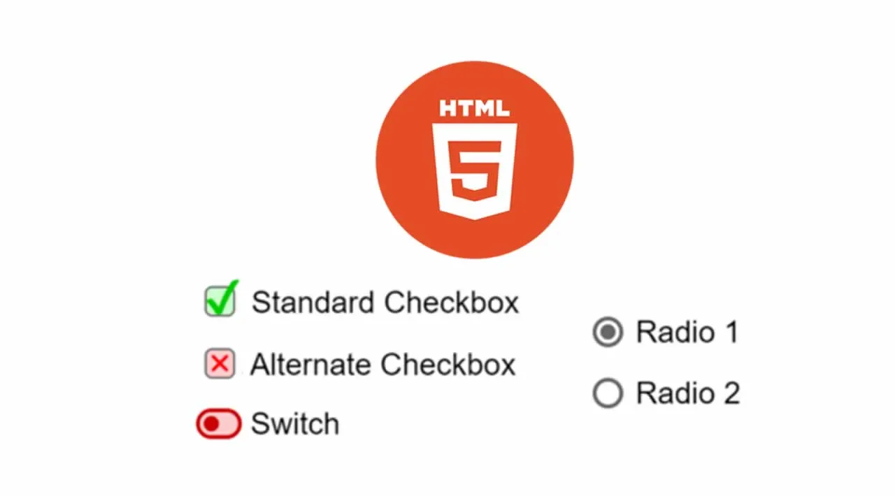
The Problem With Existing Approaches
- They often load down the markup with a slew of extra classes or elements that aren’t needed.
- Many still use JavaScript for this despite this not really being something you’ve needed scripting for in over a decade.
- The use of pixel metrics means they are hard to scale, and don’t auto-enlarge with the user’s font-size choice. Again, EM is the accessible font-size, anything else is rubbish… so use ‘em!
- They often rely on fancy absolute positioning tricks we don’t need either.
- They’re hard to simply blanket apply.
- The method by which the real
<input>tags are hidden either breaks screen readers/braille readers by way ofdisplay:none;orvisibility:hidden; - Or the hiding of said tags is many, MANY times more compex than need be to make it usable on screen readers. Seriously folks, all you have to do is position it off-screen.
#accessibility #html #web-development #css #web-design
3.75 GEEK