Most contact pages are designed with function in mind.
They slap an email address, phone, and location on a plain background and call it a day.
But basic contact pages don’t inspire visitors to reach out and connect.
Other pages make it easy to contact the company – which is awesome.
Except, that can also drive up customer service costs.
So what makes the perfect Contact Us page?
An awesome Contact Us page finds just the right balance between making it easy to reach the company and sharing resources users can use to answer their questions right away.
Keep reading to discover 39 examples of Contact Us pages that go beyond the basics and will, hopefully, inspire you to take your site to the next level.
39 Awesome Contact Us Page Examples You Need to See
1. Broker Notes
At first glance, Broker Notes‘ contact page looks pretty bare.
There’s no graphics, no quirky copy, just a plain old contact form.
Great for UX, but not so great for inspiring users to reach out.
So what stands out on this page?
The drop-down menu under “How can we help you?” lets users share the reason they are contacting the site.
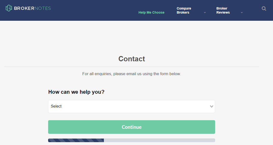
This makes it easier to sort through requests and respond to important contacts as soon as possible.
For example, if you select “I am a broker looking to advertise on Broker Notes,” it takes you to another form to share more information about your firm.
The little bar at the bottom lets you know how much time is left in the form, so users are less likely to get annoyed.
#digital experience #web development