Bubble.io is a great platform for startups and mid-sized companies to develop their website at very low cost, sometime zero.
It enables non-technical people (yes like me) and those teams on tight time constraint to build websites without self-learning Python Flask from the very beginning. Instead, it allows users to drag and drop elements onto a canvas and define workflows to control the logic.[1]
It is said that Bubble’s vision is to make hand-coding largely obsolete.[2]
During my latest internship, I got the chance to develop a company website using bubble.io starting from scratch with only $120 for purchasing 2 plugins. Amazing, right?
Today, I want to walk you through one of the important part of the website: data visualization, and how to do it.
First of all, there’re quite a few data visualization plugins within bubble’s marketplace. But after careful selection, I picked ‘ApexCharts.js’ because its relative wide range of different charts and graphs such as Area chart(Stack chart), Bar chart, Donut chart, Pie chart, Scatter chart, Heatmap and others.You can see more details by clicking this page for demonstration: https://pluginpreview.bubbleapps.io/chart
For integrating this plugin with the pages, there’re a few steps:
- Connect with your database via SQL Database Connector(bubble built-in free plugin, hurray!)
- Add new queries to generate corresponding series categories(columns) and data(rows)
- Select the visualization type, add new visual element on your page and fill the blanks in the ‘Appearance’ section
- Enjoy your beautiful visualization 🎉
Next, I will walk you through step by step and use some simple examples.
Step 1: Connect with your database
Click ‘Plugins’ on the toolbar section and pick ‘SQL Database Connector’
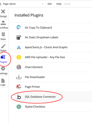
Plugin page
If you don’t see this in your ‘Installed Plugins’ list, you need to download it from the plugins market, no extra charge.
Next, choose the Database type and input the Connection string as instructed:
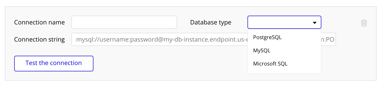
Connect with your database
Recommend using AWS RDS services, free tier can be enough for quite a while based on your storage. (Another way to save some 💲!)
#big-data-analytics #data-visualization #big-data #data-science #programming-languages