Learn how to create and configure the Syncfusion React Dropdown Menu component in a React application using Visual Studio Code. In general, you can use the Dropdown Menu to toggle among different contextual overlays that display a list of action items. You can display both text and images together on these action items. The component has built-in support for icons and their positioning, various sizes, separators, RTL, and UI customization.
In this video, you will learn how to configure the Dropdown Menu component’s built-in features such as adding icons and displaying them in different positions, positioning the pop-up menu, and setting separators. I will also explain how to navigate to other web pages when a specific action item is clicked.
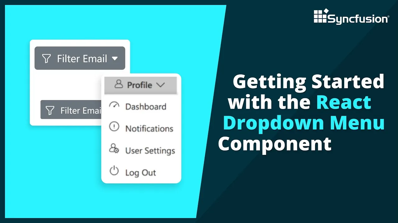
The React Dropdown Menu has built-in options to include an icon to the left or above the text, or provide an icon-only button. The popup menu is a toggleable container that holds a list of action items or custom content that will open or close when the button is clicked. You can customize all the items in a dropdown menu. You can use a horizontal line separator to represent similar action items as a group within the list of available items. You can make use of the icon-only Dropdown Button without button text.
Customize position values to display the React Dropdown Menu above, to the right, or to the left of the dropdown button. You can customize the dropdown button size, appearance, and feel. You can configure a dropdown to open the popup menu without the arrow icon. You can configure context menu component to add submenu items in React Dropdown Menu.
Product overview: https://www.syncfusion.com/react-components/react-dropdown-menu
Tutorial video: https://www.syncfusion.com/tutorial-videos
Download example from GitHub: https://github.com/SyncfusionExamples/getting-started-with-the-react-dropdown-menu-component
https://www.youtube.com/watch?v=IIWgPK-9wWg