How to Truncate Text in CSS
This tutorial will show you the different ways to truncate text in CSS using several CSS and JavaScript techniques. Learn how to achieve multi-line truncations in CSS using JavaScript
CSS is fantastic; we all know that. It has many unique features that enable us to achieve incredible responsiveness on the web. Have you ever wondered how the ellipses (...) you see on some popular websites (as shown in the image below) are created?
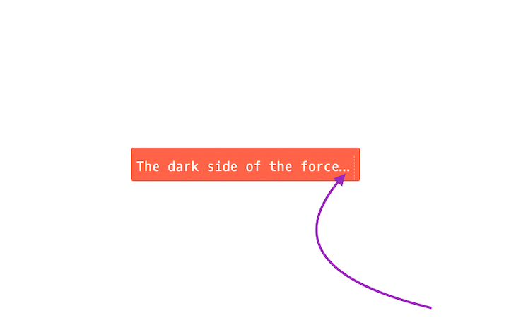
Well, in this article, we will explore how to achieve multi-line truncations in CSS using the language of web JavaScript. Let’s go!
Well, in this article, we will explore different ways to truncate text with CSS. We’ll consider the differences between trimming and truncating text, and we’ll investigate the WCAG implications of truncating text.
Sit and enjoy the ride — Let’s go!
Contents:
- What is the difference between trim and truncate?
- Trimming text
- Truncating text
- Using CSS
text-overflowto truncate textclipfor single-line text truncationellipsesfor single-line text truncation- Adding an element after the ellipses
-webkit-line-clampfor multi-line text truncation- Gotchas when using CSS
text-overflowwith Flexbox
- Using JavaScript to truncate text
- Understanding the accessibility implications of truncating text
What is the difference between trim and truncate?
It’s easy to confuse the words “truncate” and “trim”, but actually they are quite distinct. In CSS, we cannot really compare truncate and trim and they are completely different properties.
Trimming text
As of this writing, the CSS standard doesn’t include the text-trim property. Will this change in the future? Possibly, but it may not be necessary to add this functionality to CSS given that JavaScript already has the String.Prototype.trim() method.
We can use the JavaScript String.Prototype.trim() method to remove whitespace from the beginning and end of a string without modifying the original string or the CSS context of the text. Here’s an example:
let myBio = '        My name is Chinedu, and I work as a Software Engineer. How about you?  '
let trimedText = myBio.trim()
console.log(trimedText)
Truncating text
Truncation often involves cutting off text after a certain line depending on our needs as we build out our application. In most cases, truncating text in CSS refers to adding ellipses at the end of a sentence to indicate that there is more text to be read.
Truncating is quite the opposite of trim in many ways, one being that we have the text-overflow CSS property available to help us truncate text. We can also truncate text with JavaScript.
Using CSS text-overflow to truncate text
CSS offers several ways to truncate text. In this article, we’ll take a close look at the text-overflow and -webkit-line-clamp properties.
According to the MDN Docs , “The text-overflow CSS property sets how hidden overflow content is signaled to users. It can be clipped, displayed as an ellipses, or displayed as a custom string.” In simple terms, the CSS text-overflow property is used to specify that text has overflowed its container and is hidden from users.
In this article, I will be looking at the two major text-overflow CSS properties.
clipellipses
N.B., there are other CSS text-overflow properties like string, initial, and inherit. I am not covering them here because, at the time of writing, they only have support on Firefox and Firefox for Android browsers. You can read more about them here
clip for single-line text truncation
clip is the default value for the CSS text-overflow property. It truncates text in a container at the end of the content area. When clip is applied, the text isn’t accessible:

<!DOCTYPE html>
<html lang="en">
<head>
   <meta charset="UTF-8">
   <meta http-equiv="X-UA-Compatible" content="IE=edge">
   <meta name="viewport" content="width=device-width, initial-scale=1.0">
  <title>Text-overflow</title>
    <style>
       h3 {
           border: 1px solid #2a70a5;
           text-align: center;
            padding: 5px;
            color: #2a70a5;
        }
        .text-overflow-clip {
            border: 2px solid #2a70a5;
           padding: 20px 0;
           white-space: nowrap;
            width: 100%;
            overflow: hidden;
            text-overflow: clip;
            font-size: 50px;
        }
    </style>
</head>
<body>
    <h3>Clip</h3>
    <main class="text-overflow-clip">Lorem Ipsum bụ naanị ederede nke ụlọ ọrụ mbipụta na ụdị mbipụta. Lorem Ipsum abụrụla akwụkwọ ederede ọkọlọtọ ụlọ ọrụ kemgbe afọ 1500, mgbe onye nbipute amaghi ama were ụdị ụgbọ mmiri wee chịkọta ya iji mepụta akwụkwọ nlegharị anya. Ọ dịlarị ọ bụghị naanị narị afọ ise, kamakwa ọbịbịa n'ime ụdị elektrọnik, na-agbanwe agbanwebeghị. Emere ya na 1960 site na mwepụta nke akwụkwọ Letraset nwere akụkụ Lorem Ipsum, yana n'oge na-adịbeghị anya site na ngwa mbipụta desktọpụ dị ka Aldus PageMaker gụnyere ụdị Lorem Ipsum.</main>
</body>
</html>
ellipses for single-line text truncation
ellipses is another value for the CSS text-overflow property; it clips the text and represents it using three horizontal dots:

<!DOCTYPE html>
<html lang="en">
<head>
    <meta charset="UTF-8">
   <meta http-equiv="X-UA-Compatible" content="IE=edge">
   <meta name="viewport" content="width=device-width, initial-scale=1.0">
   <title>Text-overflow</title>
   <style>
       h3 {
            border: 1px solid #2a70a5;
            text-align: center;
          padding: 5px;
           color: #2a70a5;
       }
       .text-overflow-ellipses {
            border: 2px solid #2a70a5;
           padding: 20px 0;
            white-space: nowrap;
            width: 100%;
           overflow: hidden;
          text-overflow: ellipsis;
           font-size: 50px;
       }
   </style>
</head>
<body>
    <h3>Ellipsis</h3>
   <main class="text-overflow-ellipses">Lorem Ipsum bụ naanị ederede nke ụlọ ọrụ mbipụta na ụdị mbipụta. Lorem Ipsum abụrụla akwụkwọ ederede ọkọlọtọ ụlọ ọrụ kemgbe afọ 1500, mgbe onye nbipute amaghi ama were ụdị ụgbọ mmiri wee chịkọta ya iji mepụta akwụkwọ nlegharị anya. Ọ dịlarị ọ bụghị naanị narị afọ ise, kamakwa ọbịbịa n'ime ụdị elektrọnik, na-agbanwe agbanwebeghị. Emere ya na 1960 site na mwepụta nke akwụkwọ Letraset nwere akụkụ Lorem Ipsum, yana n'oge na-adịbeghị anya site na ngwa mbipụta desktọpụ dị ka Aldus PageMaker gụnyere ụdị Lorem Ipsum.</main>
</body>
</html>
It’s important to note that while the text-overflow property can be used to truncate text, it cannot do so on its own. Instead, two additional CSS properties are required:
white-Space: nowrap;: forces text into a straight line and does not wrap to the next lineoverflow: hidden;: causes text to be contained within the parent container
Adding an element after the ellipses
In some situations, I have found myself wanting to add an element such as an icon after the ellipses. But, when the line becomes too long, the element is truncated with the ellipses. The challenge here is getting the element to stay after the ellipses.
So, how do we add the element after the ellipses? Let’s say we have the below HTML:
<div class="parent-box box">
    <div class="child-box">
        You are learning text truncation with javascript which is done with these three steps
    </div>
</div>

<div class="parent-box box">
    <div class="child-box no-max-width">
        You are learning text truncation with javascript which is done with these three steps
    </div>
</div>
In order to achieve this, we set the ::after pseudo-element to the parent element .box. Then, we set the next div with class .child-box and give it a display of inline-block. This allows the pseudo-element of the .parent-box to come after the width of the .child-box.
If the defined max-width is exceeded, then the overflow set to hidden comes into play. This enables us to have the ellipsis and the element of the .parent-box if there is a text-overflow.
N.B., the trick here is to not declare the pseudo-element to an element that we declared overflow width on. This should be done to the parent element, which will, at some point, trim out the content once the max-width is reached:
.parent-box .child-box {
    text-overflow: ellipsis;
    display: inline-block;
    max-width: 70%;
    width: auto;
    white-space: nowrap;
    overflow: hidden;
}

.parent-box .child-box.no-max-width {
max-width: none;
}

.parent-box .child-box::before {
display: none;
}

.parent-box .box::after {
    content: 'X';
    display: inline-block;
}
To learn more about pseudo-elements, check out this guide to CSS pseudo-elements.
Next, let’s look at truncating text with the CSS -webkit-line-clamp property
-webkit-line-clamp for multi-line text truncation
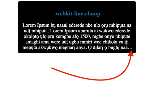
The CSS -webkit-line-clamp property is very useful when we want to truncate multiple lines of text.
According to the MDN Docs, “The CSS -webkit-line-clamp property allows us to limit the content of a block to a specified number of lines.”
Also, for this to work the display must be set to -webkit-box, the -webkit-box-orient must be set to vertical, and the overflow must be set to hidden:
<!DOCTYPE html>
<html lang="en">
<head>
    <meta charset="UTF-8">
    <meta http-equiv="X-UA-Compatible" content="IE=edge">
    <meta name="viewport" content="width=device-width, initial-scale=1.0">
    <title>Line Clamp</title>
    <style>
        .container {
          width: 360px;
           margin: 0 auto;
            padding: 10px;
           border-radius: 4px;
           text-align: center;
          background-color: black;
            color: white;
       }
        .container > h3 {
           color: #2a70a5;
       }
      .text-overflow-clamp {
           width: 100%;
           /* this code clamps based on specified lines */
           overflow: hidden;
          -webkit-box-orient: vertical;
         -webkit-line-clamp: 5;
         display: -webkit-box;
        }
   </style>
</head>
<body>
    <div class="container">
        <h3>-webkit-line-clamp</h3>
        <div class="text-overflow-clamp">Lorem Ipsum bụ naanị ederede nke ụlọ ọrụ mbipụta na ụdị mbipụta. Lorem Ipsum abụrụla akwụkwọ ederede ọkọlọtọ ụlọ ọrụ kemgbe afọ 1500, mgbe onye nbipute amaghi ama were ụdị ụgbọ mmiri wee chịkọta ya iji mepụta akwụkwọ nlegharị anya. Ọ dịlarị ọ bụghị naanị narị afọ ise, kamakwa ọbịbịa n'ime ụdị elektrọnik, na-agbanwe agbanwebeghị. Emere ya na 1960 site na mwepụta nke akwụkwọ Letraset nwere akụkụ Lorem Ipsum, yana n'oge na-adịbeghị anya site na ngwa mbipụta desktọpụ dị ka Aldus PageMaker gụnyere ụdị Lorem Ipsum.</div>
    </div>
</body>
</html>
-webkit-line-clamp also has the full support of all the major browsers, so feel free to use it in your projects. You can read more about the browser support at the MDN Docs.
Gotchas when using text-overflow with Flexbox
I have noticed that truncated text on a flex item’s child messes up the flex item. For instance, in a situation where we have a div with an inner nested element like a p tag, ellipses don’t work on the child element of the flex parent.
Take a look at the code below:
<!DOCTYPE html>
<html lang="en">
<head>
    <meta charset="UTF-8">
    <meta http-equiv="X-UA-Compatible" content="IE=edge">
    <meta name="viewport" content="width=device-width, initial-scale=1.0">
   <title>Line Clamp</title>
  <style>
       .container {
           display: flex;
           flex-wrap: wrap;
        }
        .container h1 {
            align-self: center;
        }
        .container .possible-issues {
            flex: 1;
           border: 1px solid black;
        }
        .container .possible-issues p {
            white-space: nowrap;
            overflow: hidden;
           text-overflow: ellipsis;
            border: 1px solid red
        }
    </style>
</head>
<body>
    <div class="container">
        <h3>Possible issues with flex and overflow</h3>
        <div class="possible-issues">
            <p>Lorem Ipsum bụ naanị ederede nke ụlọ ọrụ mbipụta na ụdị mbipụta. Lorem Ipsum abụrụla akwụkwọ ederede
               ọkọlọtọ ụlọ ọrụ kemgbe afọ 1500, mgbe onye nbipute amaghi ama were ụdị ụgbọ mmiri wee chịkọta ya iji
                mepụta akwụkwọ nlegharị anya. Ọ dịlarị ọ bụghị naanị narị afọ ise, kamakwa ọbịbịa n'ime ụdị elektrọnik,
                na-agbanwe agbanwebeghị. Emere ya na 1960 site na mwepụta nke akwụkwọ Letraset nwere akụkụ Lorem Ipsum,
                yana n'oge na-adịbeghị anya site na ngwa mbipụta desktọpụ dị ka Aldus PageMaker gụnyere ụdị Lorem Ipsum.
           </p>
        </div>
    </div>
</body>
</html>
The possible issues that can occur with Flexbox and test-overview can be visualized in the above code and in the below image:

Here’s a description of the labeled areas:
- A: the
ptag; this is the flex item’s child - B: the outer
divcontainer; the flex item - C: even after adding
white-space: nowrap;,overflow: hidden;, andtext-overflow: ellipsis;the ellipses don’t work thetext overflowparents container
In order to fix this, we have to understand what’s actually the issue here. The possible-issues flex item container has a min-width set to auto by default. To fix this we have to set min-width to 0; this will allow smaller content to shrink and then the ellipses will be applied:
<!DOCTYPE html>
<html lang="en">
<head>
    <meta charset="UTF-8">
   <meta http-equiv="X-UA-Compatible" content="IE=edge">
    <meta name="viewport" content="width=device-width, initial-scale=1.0">
    <title>Line Clamp</title>
    <style>
        .container {
            display: flex;
            flex-direction: column;
           /* flex-wrap: wrap; */
        }
        .container h1 {
            align-self: center;
        }
        .container .possible-issues {
            flex: 1;
            min-width: 0;
            border: 1px solid black;
        }
        .container .possible-issues p {
            white-space: nowrap;
            overflow: hidden;
            text-overflow: ellipsis;
            border: 1px solid red
        }
    </style>
</head>
<body>
    <div class="container">
        <h3>Possible issues with flex and overflow</h3>
        <div class="possible-issues">
            <p>Lorem Ipsum bụ naanị ederede nke ụlọ ọrụ mbipụta na ụdị mbipụta. Lorem Ipsum abụrụla akwụkwọ ederede
                ọkọlọtọ ụlọ ọrụ kemgbe afọ 1500, mgbe onye nbipute amaghi ama were ụdị ụgbọ mmiri wee chịkọta ya iji
                mepụta akwụkwọ nlegharị anya. Ọ dịlarị ọ bụghị naanị narị afọ ise, kamakwa ọbịbịa n'ime ụdị elektrọnik,
                na-agbanwe agbanwebeghị. Emere ya na 1960 site na mwepụta nke akwụkwọ Letraset nwere akụkụ Lorem Ipsum,
                yana n'oge na-adịbeghị anya site na ngwa mbipụta desktọpụ dị ka Aldus PageMaker gụnyere ụdị Lorem Ipsum.
           </p>
        </div>
    </div>
</body>
</html>
N.B., the flex-wrap property was removed because it had some weird unexpected behavior
Here’s an image depicting text with ellipses. This image was created with the above code, setting flex item’s min-width to 0 to stop the overflow and enable the ellipses:

Using JavaScript to truncate text
Now, let’s look at how we can achieve this using JavaScript. First, let’s create a function called truncate and pass in the words to be truncated as parameters. We will also give a max-length Parameter:
Const truncate (words, maxlength)=>{}
Then, we’ll use the slice method to truncate our text, and we will also return our truncated text from within our truncate function.
N.B., we will give the slice method an initial value of zero (0) because we will have to truncate from the beginning of words to the specified area where we wish to stop:
Const truncate (words, maxlength)=>{
return `${words.slice(0, maxlength)} …`
}
Now, for the last and final step, let’s wrap it up by passing the words and the maxlength as arguments:
Const words = "You are learning text truncation with javascript which is done with these three steps"

Const truncate (words, maxlength)=>{
return `${words.slice(0, maxlength)} …`
}


truncate(words, 20)
In this case, the maxLength handles a particular edge case for a situation where the string we want to truncate isn’t long enough to be truncated.
Here, we want to return the original string without truncating it. However, in a situation where this condition is satisfied, we want to truncate and add the ellipses at the end of the string.
Understanding the accessibility implications of truncating text
Text truncation can negatively affect readability for users with visual disabilities as it is nearly impossible for such users to access text that has been hidden from the user interface.
According to WCAG, in order to be accessible to everyone, web content should be:
- Perceivable
- Operable
- Understandable
- Robust
Here are some ways we can try to solve perceivability issues caused by text truncation:
- Always use relative or flexible positioning (e.g., ems, rems. viewports, percentages)
- Always use scalable fonts as they can adapt to user preferences or to available space
- Always try to use consistent margin, padding, and line-height values; this will ensure that text elements always have adequate space within the elements or containers in which they are situated
- When dealing with user-generated content, find intuitive ways to control the properties related to text visibility, like length
Here’s an example of how we can intuitively handle user-generated content in a way that abides by WCAG guidelines and principles:
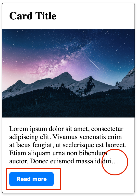
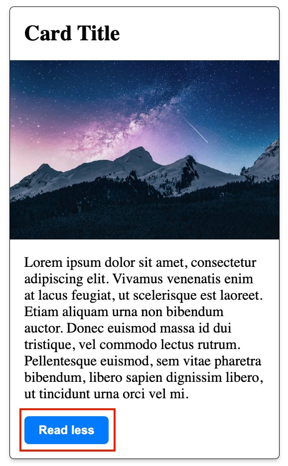
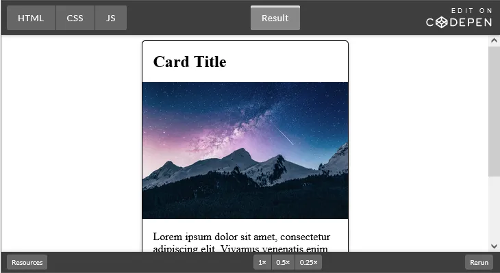
Imagine that this is dynamic content coming from a database and we only want to show five lines of text by default unless the button is clicked. Here, I use the “Read more” button to toggle between the visible and hidden content. The first image shows a truncated text description ending with ellipses and a ”Read more” button.
In the second image, the “Read more” button has already been clicked so more content is visible and the button now says “Read less.” By handling the content in this way, we can abide by the WCAG guidelines and principles.
Conclusion
In this article, we reviewed how to truncate text in CSS using several CSS and JavaScript techniques. We also looked at how to add an element after the ellipses, which is quite tricky to achieve in many cases. We covered the nuances of truncation and WCAG principles and guidelines, explored issues that might arise from working with Flexbox and text-overflow, and discussed the difference between trim and truncate.
Source: https://blog.logrocket.com
#css
