Accessibility may be more than a moral imperative to ensure products are inclusive of more people who already experience barriers in daily life — it has a very practical outcome, benefiting everyone including the person with the disability. Or it may be the law depending on where you live. Regardless, it’s worthwhile to dig deeper and learn about the variety in how others may experience the world.
According to the World Health Organization, disability can be related to:
1. Impairment — in a person’s body structure or function, or mental functioning; examples of impairments include loss of a limb, loss of vision or memory loss.
2. Activity limitation — such as difficulty seeing, hearing, walking, or problem solving.
3. Participation restrictions — in normal daily activities, such as working, engaging in social and recreational activities, and obtaining health care and preventive services.
As designers, we often have full control over creating the visual assets and elements for the user experience. That gives us responsibility for picking what content to highlight and how to help the content get seen, as well as working with developers to implement ways that enable as many people as possible to use the Web or other digital experiences.We have the opportunity to use technology to give people superpowers and it can be an incredible tool to help people thrive and access importance resources.
Here’s some tips and resources to help you consider ways to ensure your design is accessible where possible— even if you feel time-crunched. For a summary of the latest guidance at a glance, check out the Web Content Accessibility site.
1. Convey information with more than color alone
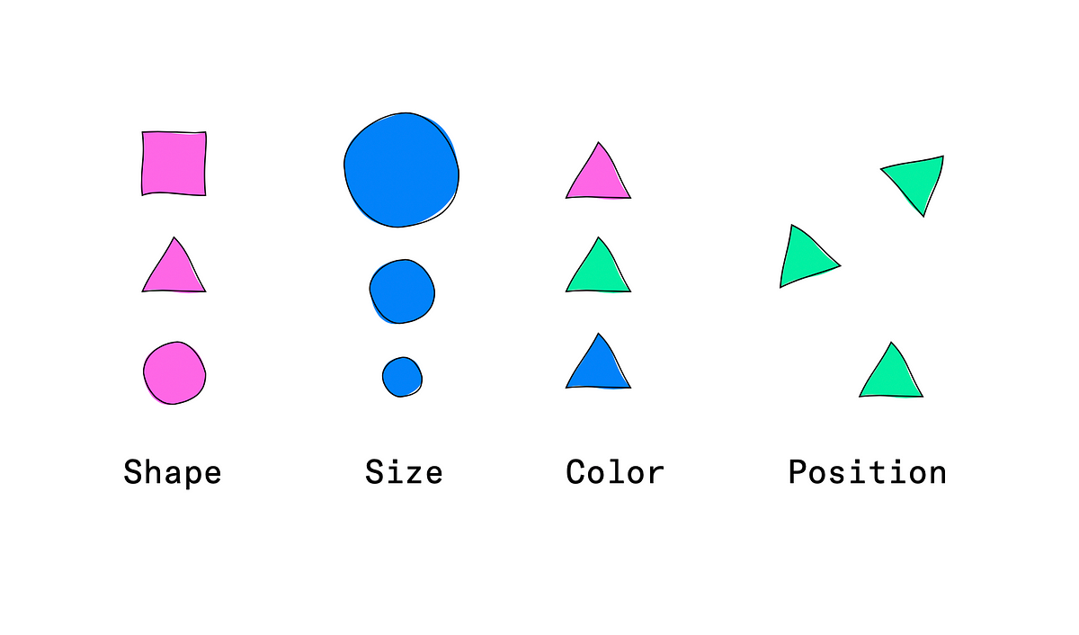
There’s a few ways to add contrast between two visual elements:
- Shape
- Size
- Color
- Position/Orientati

A good rule of thumb is to make sure you are changing more than just one of the elements (shape, color, size, position/orientation) to ensure _enough_contrast for a state change.
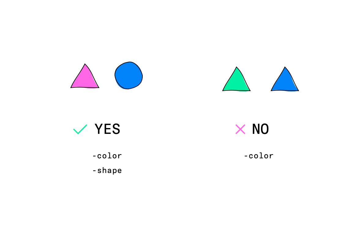
My thought on this guidance is that it is meant to push designers to avoid using thin fonts or subtle colors for conveying information which are hard to see, sometimes subtle changes can be overlooked. At the end of the day, consider this within the context of the workflow for the user.
For example, if not seeing a state change could results in frequent or harmful errors, perhaps a warning label needs to be more prominent not just for meeting a color contrast ratio but to prevent errors as a general design principle.
Tip: Using greyscale mode is a quick way to bypass checking color contrast in a rush. If different states can be perceived in greyscale, it is likely ok for the most common types of color blindness as well.
#design #accessibility #ux #resources