CSS Only Customizable Range Slider – UI-Range
UI-Range 🎚️
CSS-only 🎩 Custom 🛠️ Flexible 🤸♂️ Better
<input type='range'>
👉 Demos: Codepen

Features:
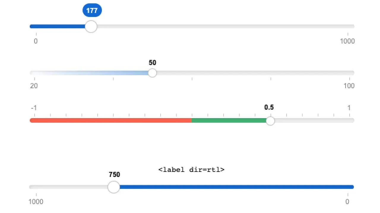
- Extensive CSS variables usage = Much easier customization:
- Track height
- Track color/gradient
- Progress color/gradient
- Progress shadow
- Thumb size & color
- Ticks (per step) height & color
- Ticks count limit (30)
- Ticks skipping (Print on every N tick)
- Value text color when “active” (component hover)
- Value background color
- Cursors for hover & grabbing
- RTL (right-to-left) support via
dir=rtlattribute
- Value is printed by default at all times
- Minimum & maximum values are printed at the edges
- Ticks are printed on each step or every N step
- No ticks if there would be too many of them
A CSS-only component, along-side the corresponding markup, to bring life into the boring, plain, <input type='range'> native component, infusing it with extra basic features, leaving us, developers, alone, to figure things out in the dark, how to bring a spark of life to this lifeless poor thing browsers call “range input”.
I must say that CSS is not yet good enough to make this code much cleaner. I had to rely on repeating the input’s attributes in its parent node, as CSS style variables, because CSS is currently unable to extrapolate attibutes as variables.
Even if the above was possible, still, it would require passing varables from one sibling to another, or to a parent.
The <input> element has all the information needed, but the oninput event is needed to keep things in-sync for the CSS to be “aware”.
--text-value is needed along-side --value due to CSS inability to cast variables types. Technically it is possible with new Houdini, but it’s not yet a norm in modern-browsers.
I intentionallyl did not use the native <progress> element, since it wasn’t flexible enough (especially not cross-browser). Using <div class='range__progress'></div> instead.
Install:
npm i @yaireo/ui-range
Usage:
Import CSS file via JS
import '@yaireo/ui-range'
Or via CSS @import
@import '@yaireo/ui-range'
For the SCSS version, use this path:
@yaireo/ui-range/ui-range.scss
Markup example:
<div class="range" style='--min:0; --max:1000; --value:170; --text-value:"170";'>
  <input type="range" min="0" max="1000" value="170" oninput="this.parentNode.style.setProperty('--value',this.value); this.parentNode.style.setProperty('--text-value', JSON.stringify(this.value))">
  <output></output>
  <div class='range__progress'></div>
</div>
Download Details:
Author: yairEO
Demo: https://codepen.io/vsync/pen/mdEJMLv?editors=1100 target=
Source Code: https://github.com/yairEO/ui-range
#javascript