Build a login UI with Flutter
Introduction
Hey folks, in this tutorial we’ll take a look at the new Google SDK to develop reliable and great mobile apps: Flutter. We’ll build a nice UI using Flutter SDK.
According to its official site,
Flutter allows you to build beautiful native apps on iOS and Android from a single codebase.
Flutter enables developers to quickly develop and in an efficient way native mobile apps that can run both onAndroid and iOS devices. Isn’t that great 😌 ?
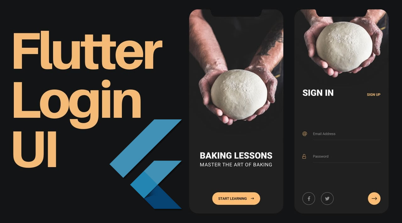
Demo
Here is the final result of our app 😉
As you might have seen, this is a login UI built with the superb Flutter SDK.
Prerequisites
This tutorial assumes a little knowledge of Flutter or Dart. JavaScript knowledge will be helpful as well, especially ES6 features. You should have:
- Visual Studio Code editor installed on your machine if you haven’t yet. We’ll use it in our tutorial.
- Visual Studio Code Flutter plugin
Project setup
Important: We’ll mainly focus on building our beautiful app. For this section, you can take a look here. This link is very helpful and will guide you through the installation of Flutter SDK on your machine(if you haven’t yet) regarding your OS.
Now, open your code editor and hit ctrl+shift+p or cmd+shift+p to create a new project, and give it a name, or simply run flutter create your_project_name. After that, you’ll end up with a fresh Flutter project.
Directory structure
Once the project is created, drag it into VS code. We’re using VS code because it has the most complete Flutter support (Dart syntax, code completion, debugging tools). By default, you should see the following directory structure:
android- where Android-related files are stored. If you’ve done any sort of cross-platform mobile app development before, this, along with theiosfolder should be pretty familiar.ios- where iOS-related files are stored.lib- this is where you’ll be working on most of the time. By default, it contains amain.dartfile, this is the entry point file of the Flutter app.test- this is where you put the unit testing code for the app. We won’t really be working on it in this tutorial.pubspec.yaml- this file defines the version and build number of your app. It’s also where you define your dependencies. If you’re coming from a web development background, this file has the same job description as thepackage.jsonfile so you can define the external packages (from the Dart packages website) you want to use in here.
Note that I’ve skipped on other folders and files because most of the time you won’t really need to touch them.
Defining our assets
Head over to pubspec.yaml file and amend it like the following:
    //../pubspec.yaml
    name: flutter_login_ui
    description: A new Flutter project.
    # The following defines the version and build number for your application.
    # A version number is three numbers separated by dots, like 1.2.43
    # followed by an optional build number separated by a +.
    # Both the version and the builder number may be overridden in flutter
    # build by specifying --build-name and --build-number, respectively.
    # Read more about versioning at semver.org.
    version: 1.0.0+1
    environment:
      sdk: ">=2.0.0-dev.68.0 <3.0.0"
    dependencies:
      flutter:
        sdk: flutter
      # The following adds the Cupertino Icons font to your application.
      # Use with the CupertinoIcons class for iOS style icons.
      cupertino_icons: ^0.1.2
    dev_dependencies:
      flutter_test:
        sdk: flutter
    # For information on the generic Dart part of this file, see the
    # following page: https://www.dartlang.org/tools/pub/pubspec
    # The following section is specific to Flutter.
    flutter:
      # The following line ensures that the Material Icons font is
      # included with your application, so that you can use the icons in
      # the material Icons class.
      uses-material-design: true
      # To add assets to your application, add an assets section, like this:
      assets:
        - logo.png
      fonts:
        - family: Montserrat
          fonts:
            - asset: fonts/Montserrat-Regular.ttf
Create assets and fonts directories into the root of your Flutter project. You should respectively find their content at this link and here. We add a logo.png to our ../assets folder and the Montserrat-Regular.ttf font to our ../fonts folder. Further in the tutorial we’ll make use of these assets in our app.
Build the UI
Let’s take a look at the ..lib/main.dart file and break down things:
First, we import the Material library from Flutter:
import 'package:flutter/material.dart';
Among those are the MaterialApp, Scaffold, and AppBar widgets that we’re using inside our app. The methods that we’re using are either part of a library you’ve imported, or part of the Flutter framework itself.
After that comes the following line:
void main() => runApp(MyApp())
Well, this is the entry point of our whole program so it must always be defined if you want to render something on the screen. But what about the fat-arrow (=>)? If you’re familiar with ES6 features in JavaScript, this is pretty much the same. It’s just a more concise way of defining functions, so we’re actually running the runApp() function inside the main() function. This function makes the MyApp widget the root of the widget tree. This effectively renders the widget, along with its children into the screen.
Note that almost everything in Flutter is a widget, and each one can have its own set of properties and child widgets. We have two main types of widget in Flutter:
- Stateful widget: manages its own internal state and keeps track of it.
- Stateless widget: while this kind of widget doesn’t. For example a button doesn’t need to track of anything.
Then we define our MyApp widget. Amend your MyApp class like the following (only change the title property) :
    class MyApp extends StatelessWidget {
      // This widget is the root of your application.
      @override
      Widget build(BuildContext context) {
        return MaterialApp(
          title: 'Flutter login UI',
          theme: ThemeData(
            // This is the theme of your application.
            //
            // Try running your application with "flutter run". You'll see the
            // application has a blue toolbar. Then, without quitting the app, try
            // changing the primarySwatch below to Colors.green and then invoke
            // "hot reload" (press "r" in the console where you ran "flutter run",
            // or simply save your changes to "hot reload" in a Flutter IDE).
            // Notice that the counter didn't reset back to zero; the application
            // is not restarted.
            primarySwatch: Colors.blue,
          ),
          home: MyHomePage(title: 'Flutter Login'),
        );
      }
    }
The code above returns a new MaterialApp widget defining our app title, our app theme, and our home page. As you can notice, it is a stateless widget. To create a stateless widget, you need to extend the StatelessWidget class like the following:
     class MyApp extends StatelessWidget {
          // ...
        }
Now we’ll define our home widget, this time it is a stateful widget, this means it will contain fields that affect how it looks. No change here!
    class MyHomePage extends StatefulWidget {
      MyHomePage({Key key, this.title}) : super(key: key);
      // This widget is the home page of your application. It is stateful, meaning
      // that it has a State object (defined below) that contains fields that affect
      // how it looks.
      // This class is the configuration for the state. It holds the values (in this
      // case the title) provided by the parent (in this case the App widget) and
      // used by the build method of the State. Fields in a Widget subclass are
      // always marked "final".
      final String title;
      @override
      _MyHomePageState createState() => _MyHomePageState();
    }
The following class will be responsible for defining our MyHomePage widget state. Amend it like the following:
    class _MyHomePageState extends State<MyHomePage> {
      TextStyle style = TextStyle(fontFamily: 'Montserrat', fontSize: 20.0);

      @override
      Widget build(BuildContext context) {

        final emailField = TextField(
          obscureText: false,
          style: style,
          decoration: InputDecoration(
              contentPadding: EdgeInsets.fromLTRB(20.0, 15.0, 20.0, 15.0),
              hintText: "Email",
              border:
                  OutlineInputBorder(borderRadius: BorderRadius.circular(32.0))),
        );
        final passwordField = TextField(
          obscureText: true,
          style: style,
          decoration: InputDecoration(
              contentPadding: EdgeInsets.fromLTRB(20.0, 15.0, 20.0, 15.0),
              hintText: "Password",
              border:
                  OutlineInputBorder(borderRadius: BorderRadius.circular(32.0))),
        );
        final loginButon = Material(
          elevation: 5.0,
          borderRadius: BorderRadius.circular(30.0),
          color: Color(0xff01A0C7),
          child: MaterialButton(
            minWidth: MediaQuery.of(context).size.width,
            padding: EdgeInsets.fromLTRB(20.0, 15.0, 20.0, 15.0),
            onPressed: () {},
            child: Text("Login",
                textAlign: TextAlign.center,
                style: style.copyWith(
                    color: Colors.white, fontWeight: FontWeight.bold)),
          ),
        );

        return Scaffold(
          body: Center(
            child: Container(
              color: Colors.white,
              child: Padding(
                padding: const EdgeInsets.all(36.0),
                child: Column(
                  crossAxisAlignment: CrossAxisAlignment.center,
                  mainAxisAlignment: MainAxisAlignment.center,
                  children: <Widget>[
                    SizedBox(
                      height: 155.0,
                      child: Image.asset(
                        "assets/logo.png",
                        fit: BoxFit.contain,
                      ),
                    ),
                    SizedBox(height: 45.0),
                    emailField,
                    SizedBox(height: 25.0),
                    passwordField,
                    SizedBox(
                      height: 35.0,
                    ),
                    loginButon,
                    SizedBox(
                      height: 15.0,
                    ),
                  ],
                ),
              ),
            ),
          ),
        );
      }
    }
TextStyle style = TextStyle(fontFamily: 'Montserrat', fontSize: 20.0);
First, we define a custom text style to apply to our UI elements. We use the Montserrat font as our fontFamily.
Inside the body of the class, we need to override the build function that returns our main widget. We then define our UI elements, two text fields and a login button:
emailField:
      final emailField = TextField(
          style: style,
          decoration: InputDecoration(
              contentPadding: EdgeInsets.fromLTRB(20.0, 15.0, 20.0, 15.0),
              hintText: "Email",
              border:
                  OutlineInputBorder(borderRadius: BorderRadius.circular(32.0))),
        );
The final keyword simply tells our app that the object value won’t be modified throughout the app. We define an input using the TextField widget, we added a hint,some style and decoration. We use some padding for adding an empty space inside the surrounding area of the field. We add a borderRadius to have a fancy rounded input field 😎 .
passwordField
    final passwordField = TextField(
          obscureText: true,
          style: style,
          decoration: InputDecoration(
              contentPadding: EdgeInsets.fromLTRB(20.0, 15.0, 20.0, 15.0),
              hintText: "Password",
              border:
                  OutlineInputBorder(borderRadius: BorderRadius.circular(32.0))),
        );
The definition of the password field is almost the same as the previous one, except that we add a property obscureText: true to hide input as we are typing, like a password field should behave.
loginButton
    final loginButon = Material(
          elevation: 5.0,
          borderRadius: BorderRadius.circular(30.0),
          color: Color(0xff01A0C7),
          child: MaterialButton(
            minWidth: MediaQuery.of(context).size.width,
            padding: EdgeInsets.fromLTRB(20.0, 15.0, 20.0, 15.0),
            onPressed: () {},
            child: Text("Login",
                textAlign: TextAlign.center,
                style: style.copyWith(
                    color: Colors.white, fontWeight: FontWeight.bold)),
          ),
        );
We use the Material widget to add easily a shadow(elevation ) to our button. We also add a radius to have a rounded button. Last we add a button as a child our material widget which also take a Text widget as a child. Our button has an onPressed property that takes a function called whenever it is clicked.
After that we put all these widgets together inside our Scaffold widget. Our form elements are aligned vertically inside a Column widget. Generally, we use the SizedBox widget just for spacing purposes. We add an our image inside a SizedBox in order define a height for it 🙃 .
     return Scaffold(
          body: Center(
            child: Container(
              color: Colors.white,
              child: Padding(
                padding: const EdgeInsets.all(36.0),
                child: Column(
                  crossAxisAlignment: CrossAxisAlignment.center,
                  mainAxisAlignment: MainAxisAlignment.center,
                  children: <Widget>[
                    SizedBox(
                      height: 155.0,
                      child: Image.asset(
                        "assets/logo.png",
                        fit: BoxFit.contain,
                      ),
                    ),
                    SizedBox(height: 45.0),
                    emailField,
                    SizedBox(height: 25.0),
                    passwordField,
                    SizedBox(
                      height: 35.0,
                    ),
                    loginButon,
                    SizedBox(
                      height: 15.0,
                    ),
                  ],
                ),
              ),
            ),
          ),
        );
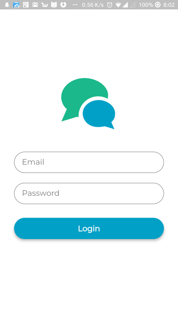
Once everything is done, the app should already be functional. If you don’t already have the app running, launch an Android emulator or iOS simulator instance and execute the following command from the root of the project directory:
flutter run
Conclusion
That’s it! In this tutorial, you learned how to create a beautiful login UI with Flutter. You also learned some basic concepts of the Flutter SDK. I do hope you acquired necessary knowledge in order to continue exploring Flutter.
You can find the code used in this tutorial on its GitHub repo.
Creating Awesome Login Screen in Flutter ❤️
It’s been a month since I started using Flutter and I am loving it. Creating UI is pretty simple once you get used to it.
With the intro out of the way, lets quickly dive into what we are going to create today:

For simplicity, let’s divide the screen into 3 different parts
- Upper Section: Holds the upper curve and header image.
2. Center Section: Holds the TextField and proceed button.
3. Bottom Section: Holds the gradient curve and rounded shapes.
Upper Section:

The upper curve is created by making a Container with a child of ClipPath.
In the context of computer graphics, Clipping is a method to selectively enable or disable rendering operations within a defined region of interest. A clipping area is supplied to a Canvas so the rendering engine will only “paint” the pixels inside of the defined area. Nothing “painted” outside of that area will be rendered.
As developers, we use clipping to create awesome looking, custom user interfaces. You can create some very cool, custom looking interface with very few lines of code.
Let’s dig into some code how its created:
class WavyHeader extends StatelessWidget {
  @override
  Widget build(BuildContext context) {
    return ClipPath(
      clipper: TopWaveClipper(),
      child: Container(
        decoration: BoxDecoration(
          gradient: LinearGradient(
              colors: orangeGradients,
              begin: Alignment.topLeft,
              end: Alignment.center),
        ),
        height: MediaQuery.of(context).size.height / 2.5,
      ),
    );
  }
}

class TopWaveClipper extends CustomClipper<Path> {
  @override
  Path getClip(Size size) {
    // This is where we decide what part of our image is going to be visible.
    var path = Path();
    path.lineTo(0.0, size.height);

    //creating first curver near bottom left corner
    var firstControlPoint = new Offset(size.width / 7, size.height - 30);
    var firstEndPoint = new Offset(size.width / 6, size.height / 1.5);

    path.quadraticBezierTo(firstControlPoint.dx, firstControlPoint.dy,
        firstEndPoint.dx, firstEndPoint.dy);

    //creating second curver near center
    var secondControlPoint = Offset(size.width / 5, size.height / 4);
    var secondEndPoint = Offset(size.width / 1.5, size.height / 5);

    path.quadraticBezierTo(secondControlPoint.dx, secondControlPoint.dy,
        secondEndPoint.dx, secondEndPoint.dy);

    //creating third curver near top right corner
    var thirdControlPoint = Offset(size.width - (size.width / 9), size.height / 6);
    var thirdEndPoint = Offset(size.width, 0.0);

    path.quadraticBezierTo(thirdControlPoint.dx, thirdControlPoint.dy,
        thirdEndPoint.dx, thirdEndPoint.dy);

    ///move to top right corner
    path.lineTo(size.width, 0.0);

    ///finally close the path by reaching start point from top right corner
    path.close();
    return path;
  }

  const List<Color> orangeGradients = [
  Color(0xFFFF9844),
  Color(0xFFFE8853),
  Color(0xFFFD7267),
];
Here we are using a ClipPath to clip the path in Container.
ClipPath uses CustomClipper to clip the path required.
BoxDecoration is used to add a Linear Gradient to the Container.
Firstly, we are creating a path by starting a line at the top left corner of the screen and using path.quadraticBezierTo() method to create curves at three points
1. Bottom Left
2. Middle
3. Top Right
Control Point decides the amount of curve and End Point decides total length the curve path will travel.
For example, you want to create a curve near the bottom left of the screen. So, you will create a QuadraticBezier curve with control point a little away from the bottom left and end point near the center.
control point = Offset(bottomLeft + 30, height - 40);

Center Section:

This one is quite interesting. Lets first start with the TextField
TextField
Material(
          elevation: 10.0,
          color: Colors.white,
          shape: RoundedRectangleBorder(
              borderRadius: BorderRadius.only(
                  topRight: Radius.circular(30.0))),
          child: Padding(
            padding: EdgeInsets.only(left: 40.0, right: 20.0, top: 10.0, bottom: 10.0),
            child: TextField(
              decoration: InputDecoration(
                  border: InputBorder.none,
                  hintText: "JohnDoe@example.com",
                  hintStyle: TextStyle(color: Color(0xFFE1E1E1), fontSize: 14)),
            ),
          ),
        ),
We are using a material widget to add the desired elevation. In addition to this, we can also add color to our shadow.
Material Widget is provided the shape of RoundedRectangularBorder with Rounded edges only at one side i.e topRight to add a curve to our TextField background.
The Material widget is wrapped around the TextField to provide it desired rounded background.
we have used InputDecoration in TextField with border as InputPorder.none to remove the underLine from InputText.
Circular Button
Container(
          padding: EdgeInsets.all(10),
          decoration: ShapeDecoration(
                       shape: CircleBorder(),
                       gradient: LinearGradient(
                       colors: signInGradients,
                       begin: Alignment.topLeft,
                       end: Alignment.bottomRight),),
          child: ImageIcon(
                 AssetImage("assets/ic_forward.png"),
                 size: 40,
                 color: Colors.white,
                 ),
          )
Here a Container is wrapped around an ImageIcon. For the Container’s decoration, ShapeDecoration with CircularBorder is used to create the circle around the container. We also added a gradient using a LinearGradient.
RoundedRectangularButton
Widget roundedRectButton(
    String title, List<Color> gradient, bool isEndIconVisible) {
  return Builder(builder: (BuildContext mContext) {
    return Padding(
      padding: EdgeInsets.only(bottom: 10),
      child: Stack(
        alignment: Alignment(1.0, 0.0),
        children: <Widget>[
          Container(
            alignment: Alignment.center,
            width: MediaQuery.of(mContext).size.width / 1.7,
            decoration: ShapeDecoration(
              shape: RoundedRectangleBorder(
                  borderRadius: BorderRadius.circular(30.0)),
              gradient: LinearGradient(
                  colors: gradient,
                  begin: Alignment.topLeft,
                  end: Alignment.bottomRight),
            ),
            child: Text(title,
                style: TextStyle(
                    color: Colors.white,
                    fontSize: 18,
                    fontWeight: FontWeight.w500)),
            padding: EdgeInsets.only(top: 16, bottom: 16),
          ),
          Visibility(
            visible: isEndIconVisible,
            child: Padding(
                padding: EdgeInsets.only(right: 10),
                child: ImageIcon(
                  AssetImage("assets/ic_forward.png"),
                  size: 30,
                  color: Colors.white,
                )),
          ),
        ],
      ),
    );
  });
}
The Rounded Rectangular Buttons are created using a Container by adding RoundedRectangleBorder as the shape and LinearGradient.
We are using a Stack for placing the icon over the button. Stack works similar to RelativeLayout in Android.
The Visibility Widget is wrapped around the ImageIcon to change the visibility of the ImageIcon as per need.
Moving further we are using a Column to place the HeaderText “Email” vertically above the TextInput. Column acts similar to LinearLayout in Android.
Bottom Section

Its looks pretty cool right.
Let’s see how the circular widget is made.
class CircleYellow extends StatelessWidget {
  @override
  Widget build(BuildContext context) {
    return Transform.translate(
      offset: Offset(0.0, 210.0),
      child: Material(
        color: Colors.yellow,
        child: Padding(padding: EdgeInsets.all(140)),
        shape: CircleBorder(side: BorderSide(color: Colors.white, width: 15.0)),
      ),
    );
  }
}
We created the circular widget using a Material widget adding a shape of CircleBorder, CircleBorder is used to add the white border around the circle.
You can also use Container instead of Material to create the same Circular Widget.
We translated the Circular widget out the screen by wrapping it by a Transform widget.
The bottom curved widget is created using ClipPath that I explained at the Upper Section.
Thanks for reading!
Source code: https://github.com/abuanwar072/Login-Screen---Flutter-UI
Background Image: https://unsplash.com/photos/4yzEtTQLdL4
#flutter #mobile-apps #dart