They say that there’s always a right tool for the job.
But we all know that practicalities are not sayings, and in most cases, _finding _the right tool is no trivial task.
This holds true even for a relative niche field of data visualisation for Python. There exists a ton of amazing tools like Plotly, Altair, Bokeh and the classics such as matplotlib, seaborn and ggplot. That’s not even counting those in other languages, like D3.js, ggplot2 or Highcharts.
Finding them, and then going on to do research on each package to compare their pros and cons can be exhausting.
In addition, if you want to share your outputs as web apps or add interactivity, the search and research criteria become more complex, adding further difficulty to the search and research.
So in this post, I compare a couple of leading data dashboarding packages — namely, Plotly’s Dash, which is arguably the industry leader in this space, and a newer entrant to the scene called Streamlit.
In the spirit of data visualisation, the next chart tells the story so far.
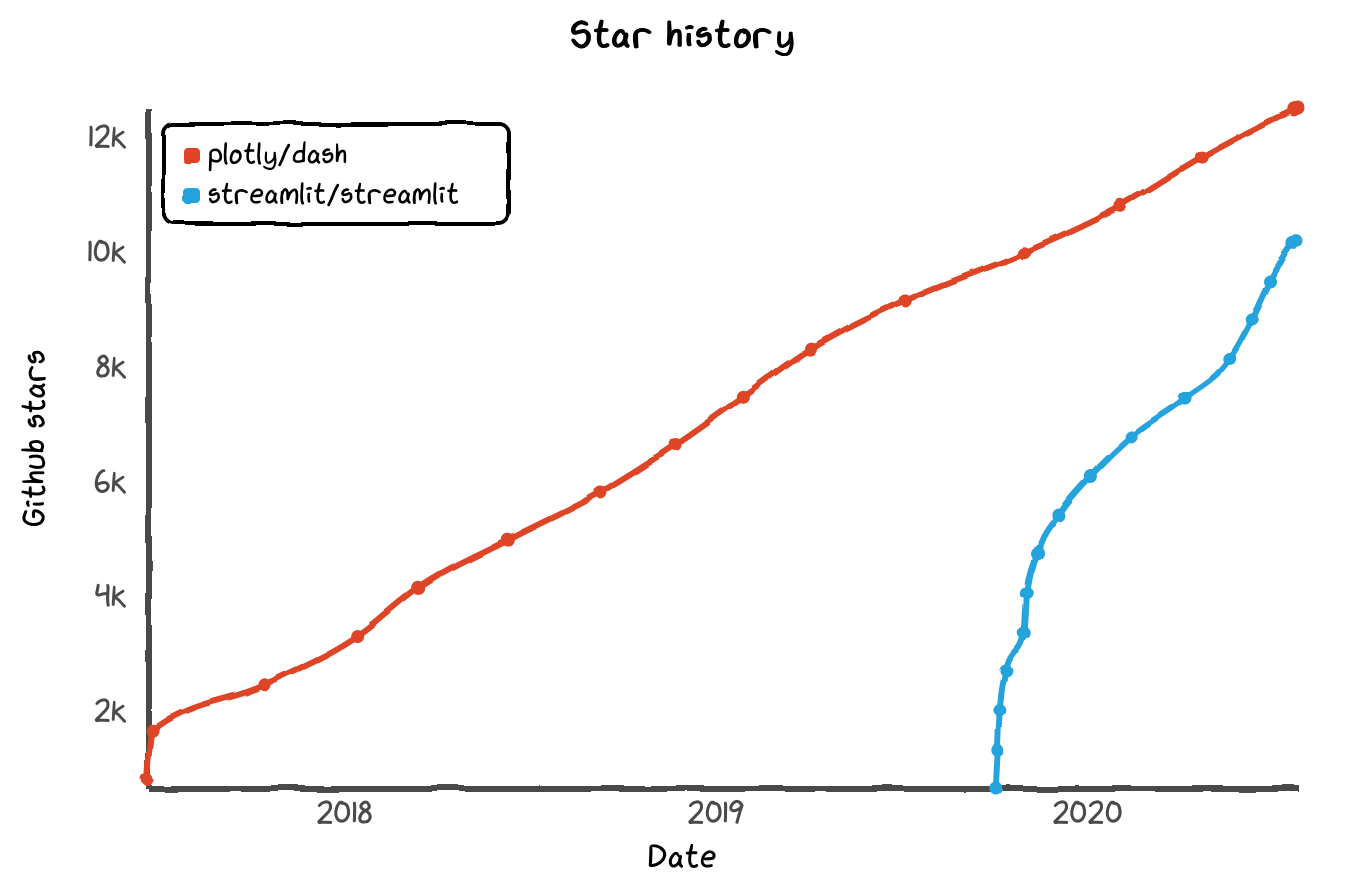
History of GitHub stars for both Plotly Dash and Streamlit (Star History)
Dash hasn’t been around that long in context of normal time. But in the context of data science and open-source software, 3 years is a lifetime. And in that time, it’s racked up over 12k stars on GitHub.
Meanwhile, Streamlit has been around barely a year, during which time its popularity has risen rapidly. It’s not yet quite as popular as Dash by this metric, nor does it quite have Dash’s community, but Streamlit has got pretty impressive momentum behind it.
In other words, they are both tremendously popular libraries, and for good reasons as you will see.
Key differences
Streamlit’s focus is towards rapid prototyping, whereas Dash focusses on production / enterprise settings.
At this point, it is worth pointing out two key differences in philosophy between the two libraries, from which some of the design decisions are derived.
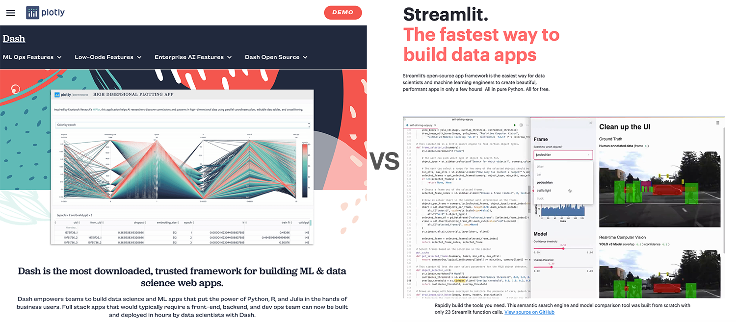
Dash vs Streamlit — the websites tell the story (Image by author, screenshots from plotly.com / streamlit.io)
One, Streamlit appears to be more aimed towards rapidly prototyping an app, whereas Dash appears more directed at a production / enterprise environment. An observation of their websites (screenshots from late July 2020) really confirm this hypothesis. And as you will see below, this leads to some design decisions and functionality differences.
Second, Dash is primarily designed to work with Plotly , whereas Streamlit is more agnostic to the underlying visualisation libraries such as Altair, Bokeh, Plotly, Seaborn, or Matplotlib.
Note: I erroneously indicated in an earlier version of this article that Dash was only compatible with Plotly — this was incorrect. Examples of using third party libraries can be found here.
What all that means is that I think they are both amazing tools, built for slightly different purposes. As such, and the choice of the right tool might be dependent on your use case, as well as your background.
Let’s delve into further details.
Before we get started
To follow along, install a few packages — plotly, dash, dash-bootstrap-components and streamlit. Install each (in your virtual environment) with a simple pip install [PACKAGE_NAME].
To evaluate the dashboarding aspect only, we simply load an existing figure from a JSON file, and build our web app around it. This is the script.
import json
import plotly.graph_objects as go
with open("srcdata/fig.json", "r") as f:
    fig = go.Figure(json.load(f))
If you want to see the code, you can find the accompanying git repo here.
Dash vs Streamlit — Fight!
Let’s begin our comparison in earnest. If you are here, you might be relatively new to both (or at least one). So what’s the learning curve like?
Learning curve — for the absolute minimum
Both of them do a great job by making it super simple to spin up a web app.
#data-visualization #web-development #data-science #python #technology #data analysisa
