Modern cricket game generates a lot of statistical and user-generated data. This information is used by coaches & performance analysts to devise strategies for future games and scout for new talents. In this article, I have visualized data from a recently concluded Indian Premier League (IPL) T20 game using Seaborn and Matplotlib libraries. The motivation of this exercise is to explore and understand the various data points and identify different features for possible machine learning use cases.
Dataset
I used publicly available data from https://www.espncricinfo.com for the IPL 2020 season opener — Mumbai Indians (MI) vs Chennai Super Kings (CSK) @ Abu Dhabi on Sep 19, 2020.
Why?
I’m an ardent fan of Chennai Super Kings and CSK vs MI is the fierce battle in IPL with an enormous fan following for both the teams worldwide. Its the “El Clásico” of IPL, Liverpool vs Man United of the IPL, and MS Dhoni aka “ Thala” & “Captain Cool” is the Steven Gerrard of CSK.
Let’s Play
Bar, Count, and Distribution Plots
First, let’s look at runs scored by both the teams using bar and count plots.
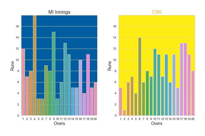
Runs per over — MI vs CSK (Image by Author)
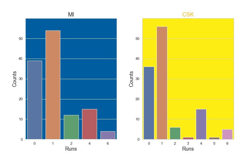
Kinds of runs — MI vs CSK (Image by Author)
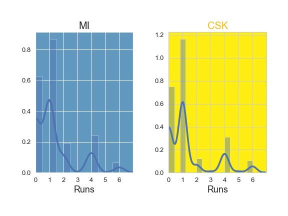
Runs Distribution (Image by Author)
The first two plots show runs per over and the next two plots show the kinds of runs scored by each team. The count plot (kinds of runs) and distribution plot do indicate that both the innings had similar types of scoring with few little variations. However, the Bar plot (Runs per over) depicts an important contrast between the two innings. MI had a blasting initial overs of power play followed by declining innings, Whereas CSK had a troubling power play and picked up steam from the end of power play (after 6 overs) and maintained a steady pace till the end of the game.
#data-visualization #cricket #seaborn #sports-analytics #ipl2020 #data-science