WWDC 2020 commences this week, and the developer community was eagerly looking forward to SwiftUI 2.0. Unsurprisingly, Apple dropped some brand new API updates for SwiftUI at the end of Keynote.
The new improvements in SwiftUI are additive in nature. This means that there are no deprecations or changes that’ll break your old 13 SwiftUI codebases.
In the next few sections, we’ll take a sneak peek at the new SwiftUI controls released with iOS 14. You’ll need an Xcode 12 beta (which requires a minimum macOS version of 10.15.4) to run them. Let’s get started.
A New SwiftUI App Starting Point
Up until now, we had to use AppDelegates and SceneDelegates to set our first SwiftUI view. Swift 5.3 introduced a type-based program entry point that can be set using the @main attribute and the latest SwiftUI iteration smartly leverages that.
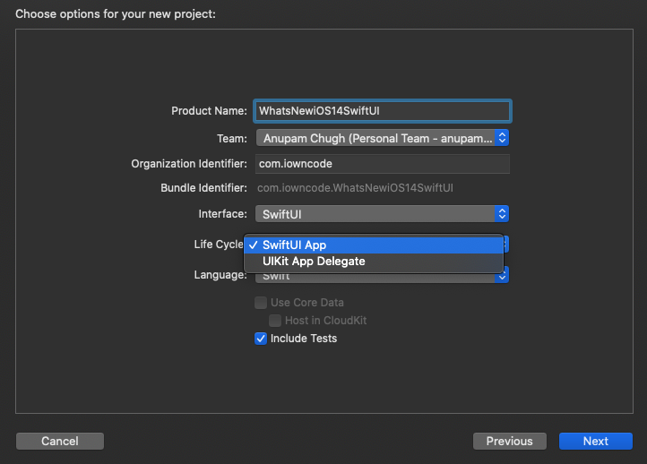
Xcode 12 new project
SwiftUI now provides the following struct that’s called upon app launch:
@main
	struct WhatsNewiOS14SwiftUIApp: App {
	    var body: some Scene {
	        WindowGroup {
	            ContentView()
	        }
	    }
	}
WindowGroup is a scene property inside so that we can define the starting view hierarchy. We can set out TabView, NavigationViews, or App Clips inside the WindowGroup computed property.
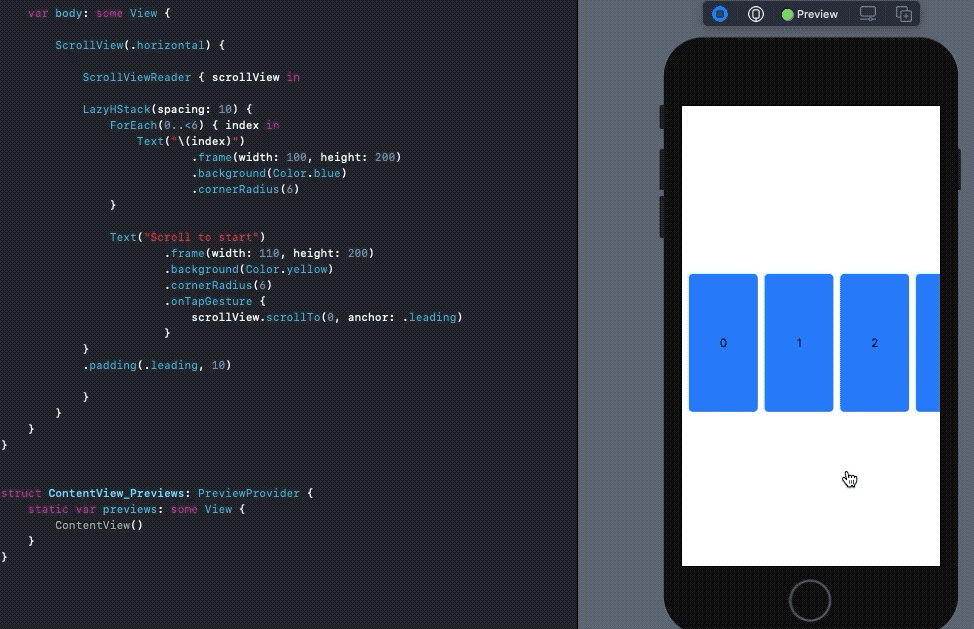
SwiftUI LazyVStack and LazyHStack
Previously, SwiftUI views used to load immediately, which led to performance and memory issues when populating huge amounts of data.
Funnily, the NavigationLink destination view used to load contents upfront too in SwiftUI’s first iteration. This time, Apple has introduced new lazy horizontal and vertical stacks that load content as and when it’s needed, thereby aiding in the performance optimization of SwiftUI. Lazy loading is introduced in SwiftUI Lists as well now.
Here’s an example of a SwiftUI LazyHStack in action:
struct ContentView: View {

	    var body: some View {

	        ScrollView(.horizontal) {

	            LazyHStack(spacing: 10) {
	                ForEach(0..<1000) { index in
	                    Text("\(index)")
	                            .frame(width: 100, height: 200)
	                            .border(Color.gray.opacity(0.5), width: 0.5)
	                            .background(Color.blue)
	                            .cornerRadius(6)
	                }
	            }
	            .padding(.leading, 10)
	        }
	    }
	}

SwiftUI Scroll View Position
The first version of SwiftUI suffered a lot at the ScrollView front due to its limited capabilities. iOS 14’s SwiftUI brings the much-needed ScrollViewReader and ScrollViewProxy to capture scroll view offset positions and move onto them programmatically.
In order to do so, we embed our views inside a ScrollViewReader and use the scrollTo method in either of the following ways:
scrollView.scrollTo(viewId)
//or
scrollView.scrollTo(viewId, anchor: .center)
By default, the scroll view position gets set to the leading or top of the view. We can refine that by using the anchor property. For example, in the following piece of code, when setting the anchor property to the center, the scroll position looks much better than when it was set to leading.
SwiftUI ProgressView
Previously, we had to leverage SwiftUI Shapes to replicate linear ProgressView and UIViewRepresentable for creating ActivityIndicator in SwiftUI. Now, in iOS 14’s SwiftUI, ProgressView has native support.
A default ProgressView() creates an indeterminate UIActivityIndicatorlike progress loader whereas the following creates a linear ProgressView in SwiftUI:
ProgressView("Text", value: 10, total: 100)
We can further customize the ProgressView by using progressViewStyle, which accepts built-in CircularProgressViewStyle , DefaultProgressViewStyle, and lets you create custom modifiers as well.
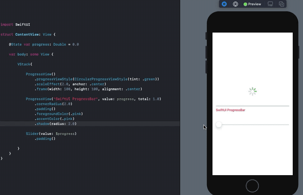
accentColor is used to set the text color in the ProgressView, while foregroundColor acts as the tint.
#programming #swiftui #swift #ios #apple