When thinking about the UX design of your project, there are so many elements to keep in mind that the actual written content is often left on the back burner. We’re told “Users don’t read!” so we Lorem ipsum our way out until we absolutely _have _to write something. However, we must keep in mind — whenever users do read, they pay attention. And that is why establishing your tone of voice is a critical part of the UX design process.
But what is this so-called “tone” exactly? According to this excerpt from the Princeton Encyclopedia of Poetry and Poetics,
Traditionally, tone has denoted an intangible quality, frequently an affective one, which is metaphorically predicate of a literary work or of some part of it such as its style. It is said to pervade and “color” the whole, like a mood in a human being, and in various ways to contribute to the aesthetic excellence of the work…. In Practical Criticism, I. A. Richards compared tone to social manners and defined it as the reflection in a discourse of the author’s attitude towards his audience.
Sounds complicated? Essentially, the tone of voice indicates how the speaker _feels _towards the reader. While the term was originally coined to talk about literature, nowadays it applies heavily to UX design. It’s seen in everything from buttons to calls to action, and even in error pages. How your product speaks to your users is integral to their experience and has a noticeable impact: the right tone could be the difference between a one-time visitor and a convert.
And this is not an exaggeration — in a study by Nielsen Norman Group, users were shown two versions of four product websites (insurance company, bank, hospital, home security system), and asked to give their opinions. Even though the two different versions of each website were identical except for the tone of voice, respondents had very clear preferences. For example, the casual version of the hospital website was unanimously preferred over its formal counterpart. It was perceived to be more friendly and even more trustworthy, despite the fact that we would usually associate confidence and trustworthiness with the formality of the second version. However, that version was seen as “businesslike” and not very reassuring for a prospective hospital patient. The tone of voice was ill-suited to the product in the minds of the users, so that version of the website did not have the desired impact.
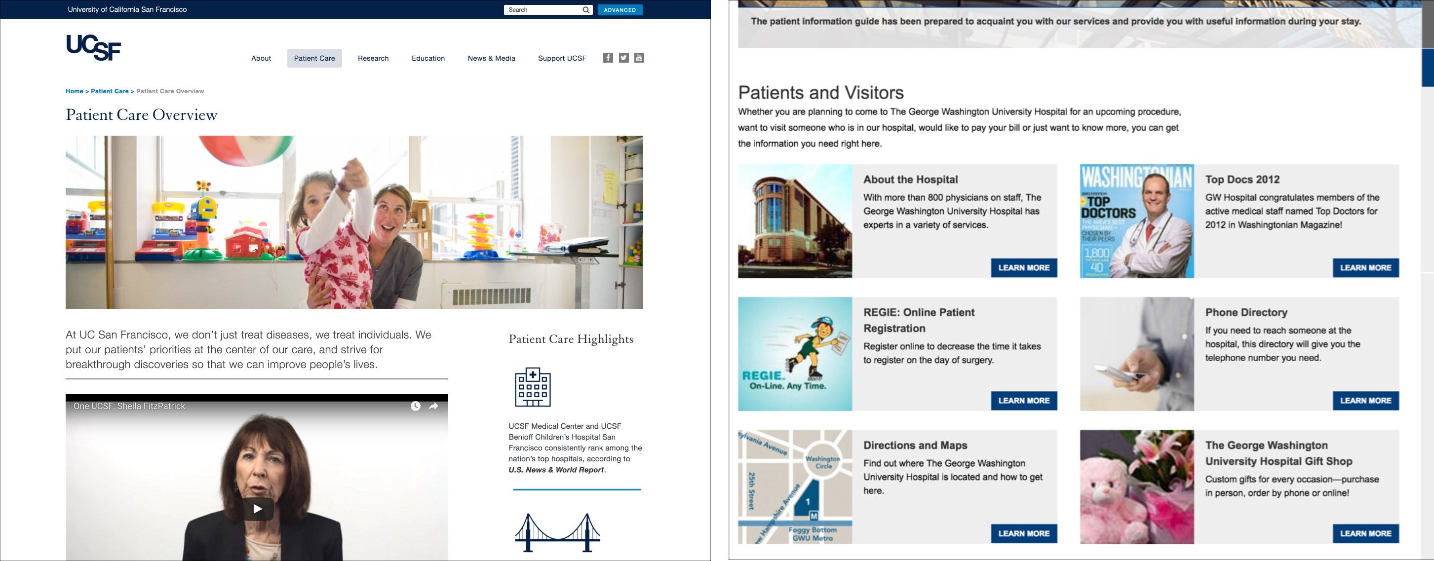
The inspirations behind the casual and formal hospital website versions — notice the introductory paragraphs and their supporting images. Source
#ux-writing #ux-research #design #ux-design #ux