Lately I have been working on different data visualization projects and have been able to note down key different success factors that make certain ones deliver at or above client’s expectations.
Core visualization skills are of course important (i.e. if someone requires you to deliver a Tableau dashboard, being proficient with Tableau will naturally help), but given a certain threshold of technical capability, there are other key considerations that make or break a project which go behind pure technical skills and whose importance I feel is overlooked and not mentioned enough.
In this brief article, I highlight 3 steps I learned to try to get right as I think they are very relevant when delivering a successful data visualization project
1) Understand the data model
Before visualizing your data, it is best to get a clear picture of how the data is structured, organized, collected, processed and managed, even if you are part of a data team in which you are only tasked with the visual portion of the final delivery.
This is perhaps the most critical step. If you do not have a clear view of the data in the back-end, how are you going to develop a neat visualization on the front-end?
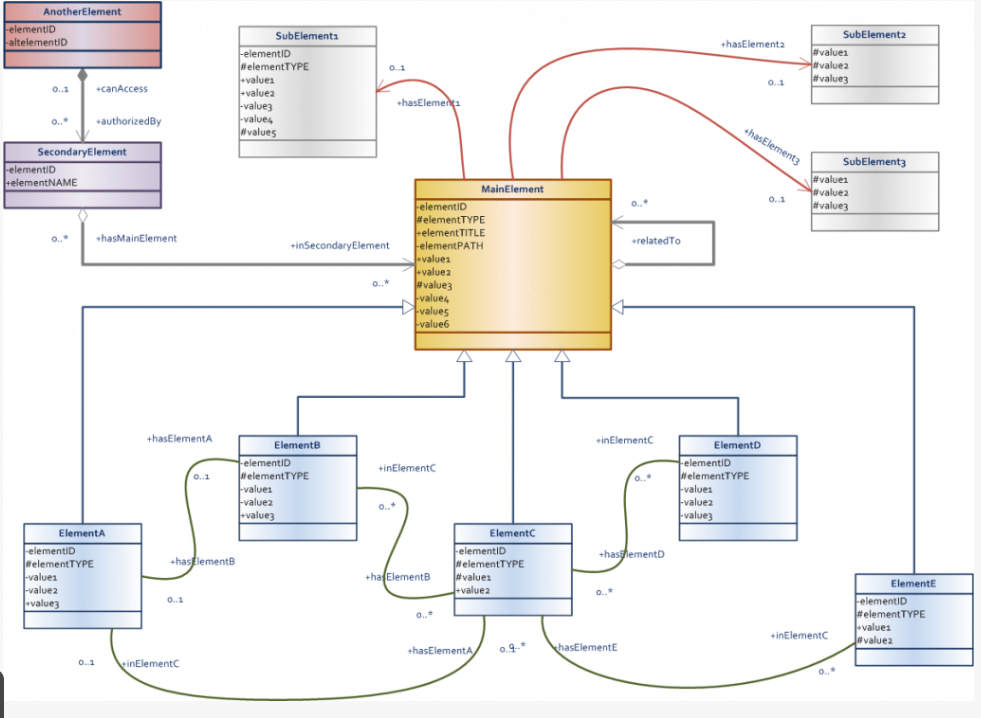
My key advice here would be to spend all the necessary time with your Data Engineers/Cloud Architects/Database Administrators to make sure your grasp on the data modelling concepts for the project in scope is as firm as it can be.
Question like the below can help you narrow down key elements and get you to where you need to be even before you start plotting and visualizing data:
- How is the data organized? What are the key relationships within the model?
- How is the data processed?
- What is the level of data latency? Are you getting real-time feeds? If not, what is the update frequency?
- Where does the data live? Which are the key data sources?
- Who is responsible for the various steps along the data pipeline? Are third-party vendors responsible in the process at any point?
- Are you and the client aligned on terminology in relation to key variables you are going to use?
Leaving no room for mistakes here is vital to steer the project in the right direction and avoid making mistakes when time gets scarce.
#data-visualization #dashboard #charts #data analysis