Design Systems are made to make the designs consistent across products. But they shouldn’t become a bottleneck for creativity. Some room for experimentation should be present. Let’s see how we can tread this fine line between flexibility and consistency using the base + variant pattern.
Suppose there’s a e-commerce platform with multiple products like the main shopping site, inventory management portal, email system. All of these are customer-facing software so they should reflect a common design language.
For that Sarah will be working on the design system and Ana will be using it in the main shopping site where people buy various products. Sarah figures out that the first priority is to have buttons inside the design system.
The buttons should be flexible enough to fit various product needs but not so much that we risk losing design consistency. When new product requirements come these buttons should be extendable too. If any of these elements are missing then the design systems adaption and impact will be negatively affected.
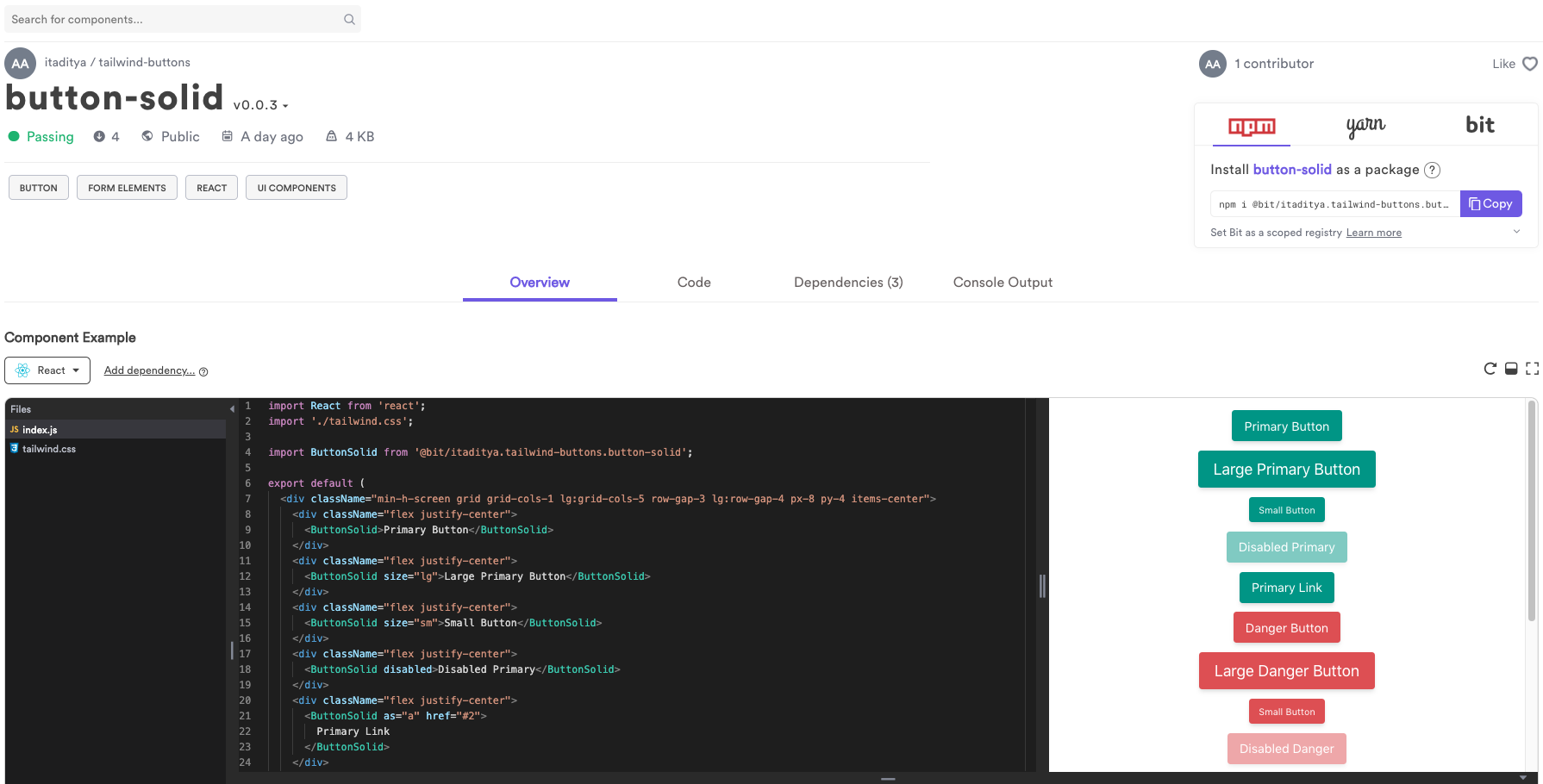
To accommodate all these requirements Sarah uses the Base + Variant pattern to build the buttons.
I’ve used Bit (Github) to publish the base button and its variants, to my shared Bit component collection.
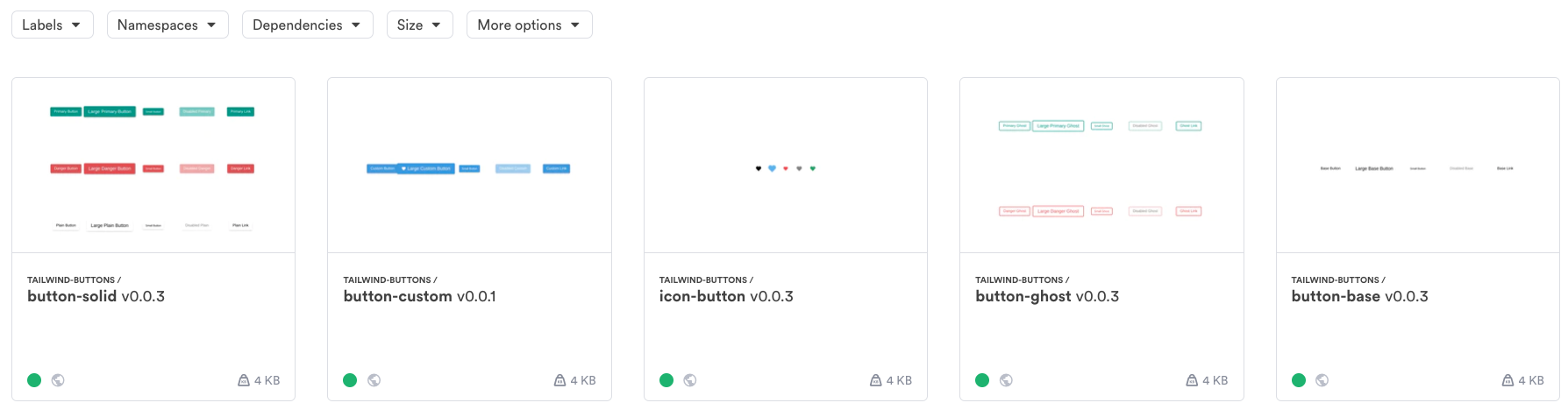
Each component is published as an independent package. That means each component can be installed as an independent package. No need to install an entire library with button variants that are irrelevant to you own project.
That also means each component will only be affected by changes to components it is dependent on. Unlike a library, changes are not global. When you maintain or install a component, you only get updates that are relevant to that specific component.
#design #reactjs #react #javascript #user-experience #programming