React Native cross-plateform Toast Notification Component highly customizable
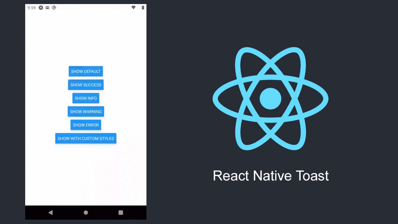
React Native Toast
React Native cross-plateform (iOS/Android) toast notification component highly customizable.
Installation
npm install rn-toast
or with yarn
yarn add rn-toast
Usage
to use toast first wrap your application or screen with toast like shown before
import Toast from "rn-toast";

// app.tsx, index or whatever component is used as initial component

const App = () => <Toast>
    // rest of your application logi
    // <Navigation/>
</Toast>
then you can show toast any where in your app, see Configuration section to see available parameters you can pass into show function
export default function HomeScreen() {
  const showDefault = () => {
    Toast.show({
      title: 'test',
      duration: 2000,
      position: 'top',
      animation: 'slide-bottom',
    });
  };

  return (
    <Toast>
      <View style={styles.container}>
        <Button title={'show'} onPress={showDefault} />
      </View>
    </Toast>
  );
}
the toast will be automatically hidden after given duration, but if you want the hide it before that you can call hide function
 const hideDefault = () => {
    Toast.hide()
  };
Configuration
| option | description | required | default value |
|---|---|---|---|
| duration | Time until the toast gets closed | false | 2000 |
| title | title to show in toast | false | ‘’ |
| message | title to show in toast | false | ‘’ |
| type | type of toast, available values are default, error, success, warning, info |
false | default |
| position | position of toast, available values are bottom, top |
false | bottom |
| animation | animation type of toast, available values are scale, fade, slide-up, slide-bottom, see Animations section custom animations |
false | scale |
| style | see Styling section to make your custom styles, see Styling section to more details | false | {} |
you can pass this configurations in show method, or you can specify default configs as <Toast configs={configs}
const configs = {
    duration: 3000,
    position: 'top',
    animation: 'fade'
}

const App = () => <Toast>
    // rest of your application logi
    // <Navigation/>
</Toast>

// other things

Toast.show({
    // this will override configs.duration
    duration: 2000,
    // this will override configs.position
    position: 'bottom'
})
Styling
you can pass your custom styles in configs as an object with 3 keys, container, message, title, for example below styling will make your toast more like native ToastAndroid
 Toast.show({
      message: 'test',
      position: 'bottom',
      animation: 'fade',
      duration: 3000,

      style: {
        container: {
          backgroundColor: '#eeeeee',
          paddingVertical: 15,
          bottom: 35,
        },
        message: {
          color: '#000',
          fontSize: 13,
          lineHeight: 12,
        },
      },
    });
Animations
Contributing
See the contributing guide to learn how to contribute to the repository and the development workflow.
Download Details:
Author: thevsstech
Source Code: https://github.com/thevsstech/rn-toast
#react #react-native #mobile-apps