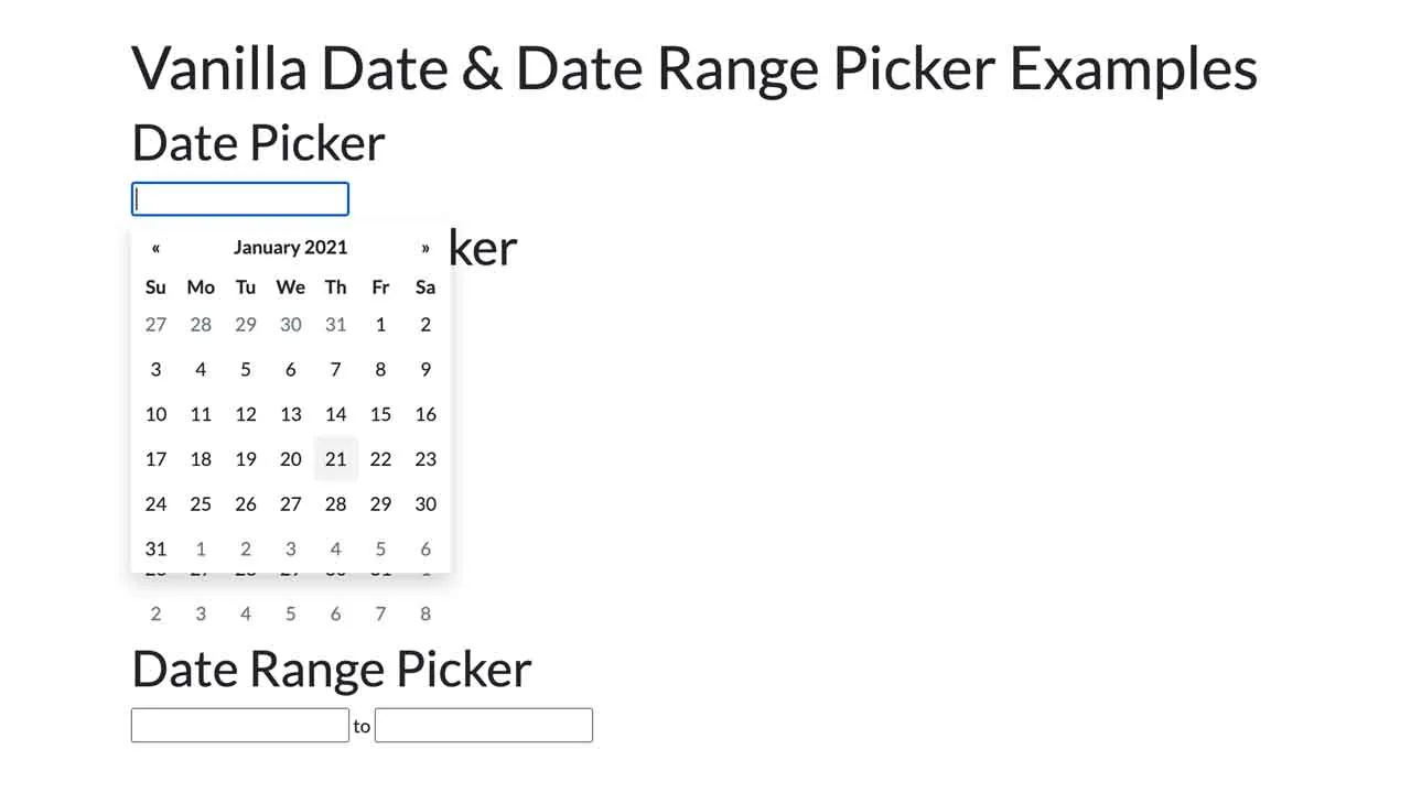
Vanilla JavaScript Date & Date Range Picker For The Web
This is a flexible, powerful, accessible, multi-language, framework-agnostic date & date range picker for modern web design.
Inspired by bootstrap-datepicker, and it works with most popular front-end frameworks such as Bootstrap, Bulma, Foundation, etc.
Main features:
- 3 modes: inline, date picker, date range picker
- i18n.
- Keyboard navigation.
- Days/months/years/decades views.
- Allows to pick multiple dates.
- Allows to disable/highlight specific days.
- Custom date format.
How to use it:
1. Include the stylesheet in the head section of the document.
<!-- Standalone -->
<link href="dist/css/datepicker.min.css" rel="stylesheet" />
<!-- For Bootstrap 4 -->
<link href="dist/css/datepicker-bs4.min.css" rel="stylesheet" />
<!-- For Bulma -->
<link href="dist/css/datepicker-bulma.min.css" rel="stylesheet" />
<!-- For Foundation -->
<link href="dist/css/datepicker-foundation.min.css" rel="stylesheet" />
2. Include the main JavaScript and local files at the end of the document.
<script src="dist/js/datepicker.min.js"></script>
<script src="dist/js/locales/fr.min.js"></script>
3. Or include the all-in-on JS as follows:
<script src="dist/js/datepicker-full.min.js"></script>
4. Create an inline date picker and define the selected date in the data-date attribute.
<div id="inline" data-date="01/05/2020"></div>
5. Attach the date picker to an input field you specify.
<input type="text" name="datepicker">
const elem = document.querySelector('input[name="datepicker"]');
const datepicker = new Datepicker(elem, {
      // options here
});
6. Create a date range picker from two input fields as follows:
<div id="range">
  <input type="text" name="start">
  <span>To</span>
  <input type="text" name="end">
</div>
const elem = document.getElementById('range');
const dateRangePicker = new DateRangePicker(elem, {
      // options here
});
7. Default options & callback functions for the date picker.
const datepicker = new Datepicker(elem, {

      // Whether or not to close the datepicker immediately when a date is selected.
      autohide: false,

      // Whether or not to show week numbers to the left of week rows.
      calendarWeeks: false,

      // If true, displays a "Clear" button at the bottom of the datepicker to clear the input value.
      // If 'autoclose' is also set to true, this button will also close the datepicker.
      clearBtn: false,

      // Delimiter string to separate the dates in a multi-date string.
      dateDelimiter: ',',

      // Array of date strings or a single date string formatted in the given date format.
      datesDisabled: [],

      // Days of the week that should be disabled.
      // Values are 0 (Sunday) to 6 (Saturday).
      // Multiple values should be comma-separated.
      Example: disable weekends: '06' or '0,6' or [0,6].
      daysOfWeekDisabled: [],

      // Days of the week that should be highlighted. Values are 0 (Sunday) to 6 (Saturday).
      daysOfWeekHighlighted: [],

      // Date to view when initially opening the calendar.
      // Date, String or Object with keys year, month, and day.
      // Defaults to today() by the program
      defaultViewDate: undefined,

      // If true, no keyboard will show on mobile devices.
      disableTouchKeyboard: false,

      // Date format string.
      format: 'mm/dd/yyyy',

      // The date format, combination of d, dd, D, DD, m, mm, M, MM, yy, yyyy.
      language: 'en',

      // Maximum limit to selectable date. No limit is applied if null is set.
      maxDate: null,

      // Maximum number of dates users can select. No limit is applied if 0 is set.
      maxNumberOfDates: 1,

      // Muximum limit to the view that the date picker displayes. 0:days – 3:decades.
      maxView: 3,

      // Minimum limit to selectable date. No limit is applied if null is set.
      minDate: null,

      // HTML (or plain text) for the button label of the "Next" and "Prev" button.
      nextArrow: '»',
      prevArrow: '«',

      // left|right|auto for horizontal and top|bottom|auto for virtical.
      orientation: 'auto',

      // Whether or not to show the day names of the week.
      showDaysOfWeek: true,

      // If false, the datepicker will be prevented from showing when the input field associated with it receives focus.
      showOnFocus: true,

      // Show the date picker when the associated input filed is clicked
      showOnClick: true,

      // The view that the datepicker should show when it is opened.
      // Accepts: 0 or "days" or "month", 1 or "months" or "year", 2 or "years" or "decade", 3 or "decades" or "century", and 4 or "centuries" or "millenium".
      // Useful for date-of-birth datepickers.
      startView: 0,

      // The string that will appear on top of the datepicker. If empty the title will be hidden.
      title: '',

      // If true or "linked", displays a "Today" button at the bottom of the datepicker to select the current date.
      // If true, the "Today" button will only move the current date into view;
      // if "linked", the current date will also be selected.
      todayBtn: false,

      // 0  focus Move the focused date to the current date without changing the selection
      // 1 select  Select (or toggle the selection of) the current date
      todayBtnMode: 0,

      // If true, highlights the current date.
      todayHighlight: false,

      // Update the selected date(s) with the input field's value when the input field is losing focus
      updateOnBlur: true,

      // The level that the date picker allows to pick. 0:date,1: month  or 2:year
      pickLevel: 0,

      // Day of the week start. 0 (Sunday) to 6 (Saturday)
      weekStart: 0,

      // A function that takes a date as a parameter and returns one of the following values:
      beforeShowDay: function(date){
        /* Return:
           {Object} - Things to customize. Available properties are:
             enabled: {Boolean} - whether the cell is selctable
             classes: {String} - space-sparated additional CSS classes for the cell element
             content: {String} - HTML for the cell element's child nodes
           {String} - additional classes — same as returning { classes: additionalClasses }
           {Boolean} - whether the cell is selctable — same as returning { enabled: isSelectable }
        /*
      }
      beforeShowDecade: function(date){
        /* Return:
           {Object} - Things to customize. Available properties are:
             enabled: {Boolean} - whether the cell is selctable
             classes: {String} - space-sparated additional CSS classes for the cell element
             content: {String} - HTML for the cell element's child nodes
           {String} - additional classes — same as returning { classes: additionalClasses }
           {Boolean} - whether the cell is selctable — same as returning { enabled: isSelectable }
        /*
      }
      beforeShowMonth: function(date){
        /* Return:
           {Object} - Things to customize. Available properties are:
             enabled: {Boolean} - whether the cell is selctable
             classes: {String} - space-sparated additional CSS classes for the cell element
             content: {String} - HTML for the cell element's child nodes
           {String} - additional classes — same as returning { classes: additionalClasses }
           {Boolean} - whether the cell is selctable — same as returning { enabled: isSelectable }
        /*
      }
      beforeShowYear: function(date){
        /* Return:
           {Object} - Things to customize. Available properties are:
             enabled: {Boolean} - whether the cell is selctable
             classes: {String} - space-sparated additional CSS classes for the cell element
             content: {String} - HTML for the cell element's child nodes
           {String} - additional classes — same as returning { classes: additionalClasses }
           {Boolean} - whether the cell is selctable — same as returning { enabled: isSelectable }
        /*
      }
});
8. Additional settings for the date range picker.
const dateRangePicker = new DateRangePicker(elem, {

      // Whether to allow one side of the date-range to be blank.
      allowOneSidedRange: false,

      // Input fields to attach start- and end-date pickers. Must contain 2 items.
      input: input

});
9. Available props & methods.
// Determines if the date picker is shown
Datepicker.active

// Adds new locals
Datepicker.locales.en = {
  days: ["Sunday", "Monday", "Tuesday", "Wednesday", "Thursday", "Friday", "Saturday"],
  daysShort: ["Sun", "Mon", "Tue", "Wed", "Thu", "Fri", "Sat"],
  daysMin: ["Su", "Mo", "Tu", "We", "Th", "Fr", "Sa"],
  months: ["January", "February", "March", "April", "May", "June", "July", "August", "September", "October", "November", "December"],
  monthsShort: ["Jan", "Feb", "Mar", "Apr", "May", "Jun", "Jul", "Aug", "Sep", "Oct", "Nov", "Dec"],
  today: "Today",
  clear: "Clear",
  titleFormat: "MM y",
  format: "mm/dd/yyyy",
  weekstart: 0
}

// Formats a date
Datepicker.formatDate(date, format, lang);

// Parses date strings
Datepicker.parseDate(dateStr, format, lang);

// Shows the date picker
instance.show();

// Refreshes a date picker
instance.refresh(target, forceRender);

// Destroys the date picker
instance.destroy();

// Updates the date picker
instance.update(options);

// Updates options
instance.setOptions(options);

// Sets selected date(s)
instance.setDate( date1 [, date2 [, ... dateN ]][, options ] );
instance.setDate( dates [, options ] );
instance.setDate( [ options ] );

// Returns a Date object of selected date
instance.getDate(format);

// Updates options of the date range picker
rangepicker.setOptions(options);

// Get the start and end dates of the date range picker
rangepicker.getDate(format);

// Destroys the date range picker
rangepicker.destory();
10. Event handlers.
instance.addEventListener('changeDate', function (e, details) {
  /* details:
  date: {Date} - Selected date(s) (see getDate())
  viewDate: {Date} - Focused date
  viewMode: {Number} - ID of the current view
  datepicker: {Datepicker} - Datepicker instance
  */
});

instance.addEventListener('changeMonth', function (e, details) {
  /* details:
  date: {Date} - Selected date(s) (see getDate())
  viewDate: {Date} - Focused date
  viewMode: {Number} - ID of the current view
  datepicker: {Datepicker} - Datepicker instance
  */
});

instance.addEventListener('changeView', function (e, details) {
  /* details:
  date: {Date} - Selected date(s) (see getDate())
  viewDate: {Date} - Focused date
  viewMode: {Number} - ID of the current view
  datepicker: {Datepicker} - Datepicker instance
  */
});

instance.addEventListener('changeYear', function (e, details) {
  /* details:
  date: {Date} - Selected date(s) (see getDate())
  viewDate: {Date} - Focused date
  viewMode: {Number} - ID of the current view
  datepicker: {Datepicker} - Datepicker instance
  */
});

instance.addEventListener('hide', function (e, details) {
  /* details:
  date: {Date} - Selected date(s) (see getDate())
  viewDate: {Date} - Focused date
  viewMode: {Number} - ID of the current view
  datepicker: {Datepicker} - Datepicker instance
  */
});

instance.addEventListener('show', function (e, details) {
  /* details:
  date: {Date} - Selected date(s) (see getDate())
  viewDate: {Date} - Focused date
  viewMode: {Number} - ID of the current view
  datepicker: {Datepicker} - Datepicker instance
  */
});
Download Details:
Author: mymth
Demo: https://raw.githack.com/mymth/vanillajs-datepicker/v1.1.2/demo/
Source Code: https://github.com/mymth/vanillajs-datepicker
#javascript