Easy to Use UI Components for React Native
React Native Basic UI
- ✅ highly performant
- ✅ lightweight
- ✅ customizable
- ✅ easy to use
- ✅ typed
- ✅ documented
- ✅ accessible
- ✅ compatible with Expo
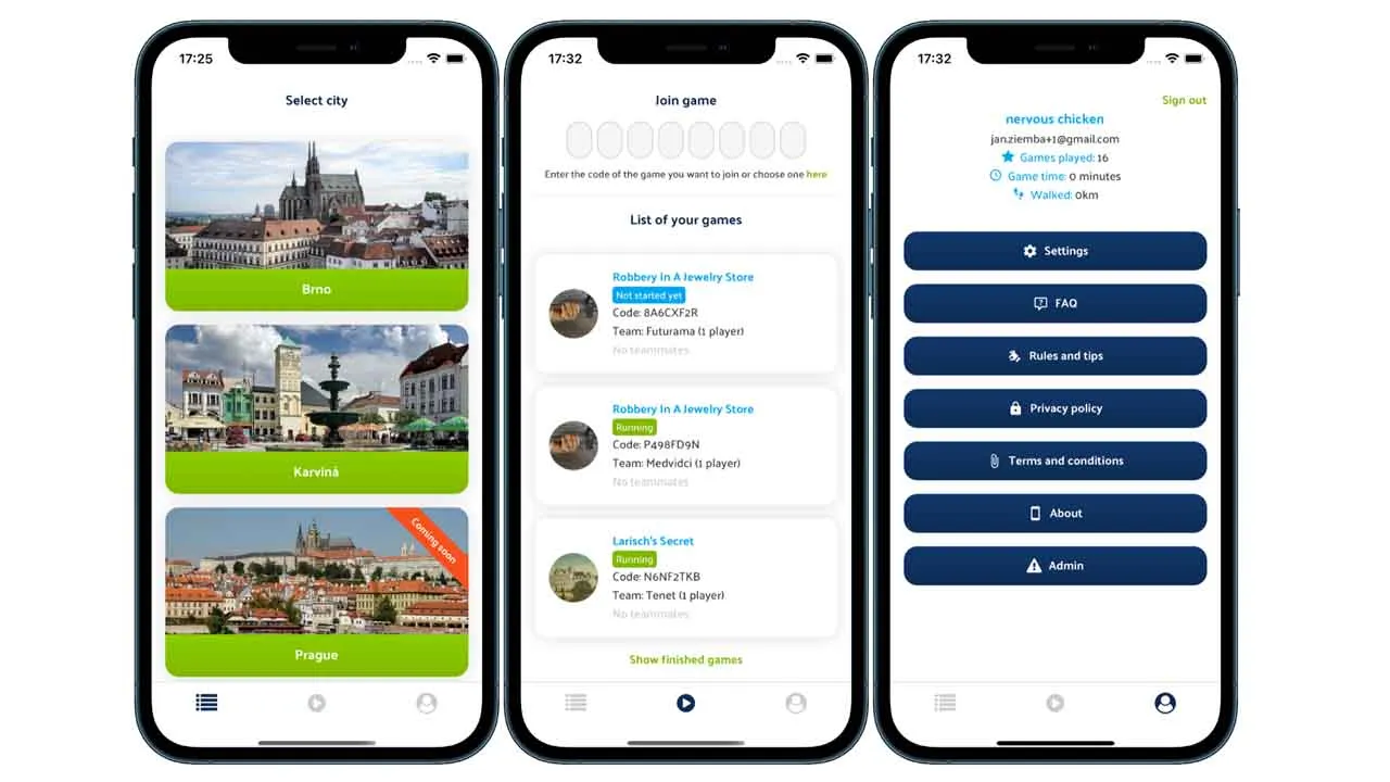
Screenshots
 |
 |
 |
 |
 |
 |
Getting started
yarn add react-native-basic-ui
or
npm install react-native-basic-ui
Also, complete installation of react-native-vector-icons and react-native-linear-gradient, otherwise you won’t be able to use the Icon component and linear gradients.
Usage
Theme provider
You have to add a theme context to your app’s root component. A default theme will be used.
import { ThemeProvider } from 'react-native-basic-ui';

const App = () => {
    return (
        <ThemeProvider>
            ...
        </ThemeProvider>
    );
}
Theme config
But you can set your own primitives and overwrite the default theme. For example:
import { defaultTheme, ThemeProvider } from 'react-native-basic-ui';

const customTheme = {
    ...defaultTheme,
    colors: {
        ..defaultTheme.colors,
        primary: 'green',
    },
};

const App = () => {
    return (
        <ThemeProvider value={customTheme}>
            ...
        </ThemeProvider>
    );
}
Components
Once you have included ThemeProvider in your app, you can use the components:
import { Button, CenterContainer } from 'react-native-basic-ui';

const ExampleComponent = () => {
    return (
        <CenterContainer>
            <Button text="Hello world" />
        </CenterContainer>
    );
};
Custom components with the theme
To use the theme in your own components, you can use useStyles hook. You can define styles while using theme primitives:
import { useStyles } from 'react-native-basic-ui';

const injectTheme = ({ colors, radiuses, spacing }) =>
    StyleSheet.create({
        container: {
            backgroundColor: colors.primary,
            borderRadius: radiuses.medium,
            borderTopColor: colors.white,
            marginBottom: spacing.small,
        },
    });

const ExampleComponent = () => {
    const styles = useStyles(injectTheme);

    return (
        <View style={styles.container}>
            ...
        </View>
    );
};
Accessing the theme
And you can also access the theme object anywhere in the app:
import { useTheme } from 'react-native-basic-ui';

const ExampleComponent = (props) => {
    const { isError } = props;
    const { colors } = useTheme();

    const color = isError ? colors.danger : colors.primary;

    return (
        <Text style={{ color }}>
            Hello world
        </Text>
    );
};
Documentation
Coming soon
Example
Check this Expo.
FAQ
Is it compatible with Expo?
Yes, it is, thanks to @expo/vector-icons and expo-linear-gradient.
Can I change the default props?
No. If you want to overwrite the default props you have to create your own component which extends this UI’s component. For example if you want your Scalable to always have a scale of 0.5, you would need to create a new component which extends UI’s Scalable and passes this prop to it.
Can I change the theme dynamically?
Yes, you can, however the whole app would be re-rendered.
Author
Download Details:
Author: janziemba
Source Code: https://github.com/janziemba/react-native-basic-ui
#react-native #react #mobile-apps
