Bootstrap: Advantages, Disadvantages, and Usage Explained
Overview
- Bootstrap is popular among web designers and developers because it is adaptable and easy to use. Its key advantages are that it is responsive by design, maintains broad browser compatibility, gives consistent design by employing reusable components, and is very easy to use and understand.
- Bootstrap has a large support group, so you can typically receive assistance when you run into problems. Furthermore, Bootstrap is constantly being updated, and the designers have been very good about releasing updates on schedule. In this tutorial, we will discuss what Bootstrap is and its advantages and disadvantages.
Furthermore, We will also discuss how to install it in your system.
What is Bootstrap, and What is Its Syntax?
- Bootstrap is a robust front-end framework for building modern web pages and web apps. It's open-source and free to use, but it includes a plethora of HTML and CSS templates for UI interface elements like buttons and forms. JavaScript extensions are also supported by Bootstrap.
- Bootstrap eases the development process since it gives you access to everything you need to design your project in a simple setting. You may use prepackaged classes (a variety of shorthand responsive margin and padding utility classes for changing the appearance of an element), kits, and themes right out of the box and accelerate your development without sacrificing performance.
- Bootstrap contains basic style definitions for all HTML elements. As a result, text, tables, and form components show consistently across online browsers. Furthermore, developers can use the CSS classes defined in Bootstrap to further personalize the appearance of their content.
- Bootstrap 5 is the most recent version of the framework. Except for Internet Explorer 11, Bootstrap 5 is compatible with all major browsers. If you need IE9 or IE8 support, you must use Bootstrap 3.
Basic Bootstrap HTML Template:
<!DOCTYPE html>
<html lang="en">
  <head>
    <!-- Required meta tags -->
    <meta charset="utf-8">
    <meta http-equiv="X-UA-Compatible" content="IE=edge">
    <meta name="viewport" content="width=device-width, initial-scale=1">

    <title>Bootstrap Template</title>

    <!-- Bootstrap CSS -->
    <link href="css/bootstrap.min.css" rel="stylesheet">
  </head>
  <body>
    <h1>Hello, world!</h1>

    <!-- Optional JavaScript -->
    <!-- jQuery first, then Popper.js, then Bootstrap JS -->
    <script src="https://code.jquery.com/jquery-3.3.1.slim.min.js" integrity="sha384-q8i/X+965DzO0rT7abK41JStQIAqVgRVzpbzo5smXKp4YfRvH+8abtTE1Pi6jizo" crossorigin="anonymous"></script>
    <script src="https://cdn.jsdelivr.net/npm/popper.js@1.14.7/dist/umd/popper.min.js" integrity="sha384-UO2eT0CpHqdSJQ6hJty5KVphtPhzWj9WO1clHTMGa3JDZwrnQq4sF86dIHNDz0W1" crossorigin="anonymous"></script>
    <script src="https://cdn.jsdelivr.net/npm/bootstrap@4.3.1/dist/js/bootstrap.min.js" integrity="sha384-JjSmVgyd0p3pXB1rRibZUAYoIIy6OrQ6VrjIEaFf/nJGzIxFDsf4x0xIM+B07jRM" crossorigin="anonymous"></script>

  </body>
</html>
How to Use Bootstrap?
You can use one of three approaches to add Bootstrap in HTML:
1. Making use of Bootstrap CDN (Content Delivery Network) Bootstrap CDN is a useful and efficient tool for your website designs. Moreover, it is simple to use and comprehend. You can utilize a CDN to incorporate Bootstrap if you don't want to download and host it yourself.
- CSS
Using of this file will allow you to add responsive CSS to your website.
Simply paste this stylesheet link into your HTML file's section.
<link rel="stylesheet" href="https://stackpath.bootstrapcdn.com/bootstrap/4.3.1/css/bootstrap.min.css" integrity="sha384-ggOyR0iXCbMQv3Xipma34MD+dH/1fQ784/j6cY/iJTQUOhcWr7x9JvoRxT2MZw1T" crossorigin="anonymous">
- js
Some components' of JavaScript functionality, such as dropdowns and tabs, rely on jQuery and popper.js. For proper operation, include jQuery and popper.js in the following order before loading the bootstrap JavaScript file.
<script src="https://code.jquery.com/jquery-3.3.1.slim.min.js" integrity="sha384-q8i/X+965DzO0rT7abK41JStQIAqVgRVzpbzo5smXKp4YfRvH+8abtTE1Pi6jizo" crossorigin="anonymous"></script>

<script src="https://cdnjs.cloudflare.com/ajax/libs/popper.js/1.14.7/umd/popper.min.js" integrity="sha384-UO2eT0CpHqdSJQ6hJty5KVphtPhzWj9WO1clHTMGa3JDZwrnQq4sF86dIHNDz0W1" crossorigin="anonymous"></script>

<script src="https://stackpath.bootstrapcdn.com/bootstrap/4.3.1/js/bootstrap.min.js" integrity="sha384-JjSmVgyd0p3pXB1rRibZUAYoIIy6OrQ6VrjIEaFf/nJGzIxFDsf4x0xIM+B07jRM" crossorigin="anonymous"></script>
2. Downloading the Bootstrap Instead of using CDN, you can download the files from here to your project folder.
After downloading the file, include bootstrap.min.css in the <head> and bootstrap.min.js in the <body>. Even if you use the downloaded bootstrap code, you must include jquery.min.js and popper.min.js before loading bootstrap.min.js.
3. Using Package Managers Bootstrap is simple to install. Package managers can be used to import source files into your project. It must be used with a Sass compiler and an Autoprefixer. It's a collection of downloadable files because it's only CSS and JavaScript. It's essentially a library if you're familiar with other languages. Your website will connect to these CSS/JavaScript files to display correctly.
- Navigate to GetBootstrap.com.
- Get the most recent version (Bootstrap current version: 5.1).
- Unpack the files into a directory and upload them to your server.
- In your project folder, run the following command. This command will download a local copy of the bootstrap files in your project's 'node modules' folder. Then, in the <head>, include bootstrap.min.css and in the <body>, include bootstrap.min.js.
Before loading bootstrap.min.js, you must include jquery.min.js and popper.min.js, as specified in procedure no.2.
npm install bootstrap
You can manually update the HTML5 and CSS files or use one of the numerous available Bootstrap templates. It's generally more accessible for a beginner to use a template. However, if you're going to customise it for your site, you'll need to know at least basic HTML.
Why is Bootstrap the Go-to for Web Developers?
The Bootstrap framework saves developers hundreds of hours of coding time. CSS (to handle the visual aspects of your page), JavaScript (JS, which enables functionality from within the browser), and HTML are commonly used when creating websites (forms the base construction of a web page).
It's supported by a vast community, which means you can typically get the answer to any Bootstrap question with a simple online search.
You can utilize jQuery plugins to expand the functionality of custom components such as grids, carousels, and progress bars. You can completely omit JavaScript and jQuery from your project if you like. You have complete control over the features of Bootstrap you implement into your web project.
Instead of coding all of your HTML, CSS, and JavaScript from scratch, you can add the Bootstrap snippet to basic HTML markup. You can also browse for Bootstrap themes and web page templates that allow you to customize them to your liking.
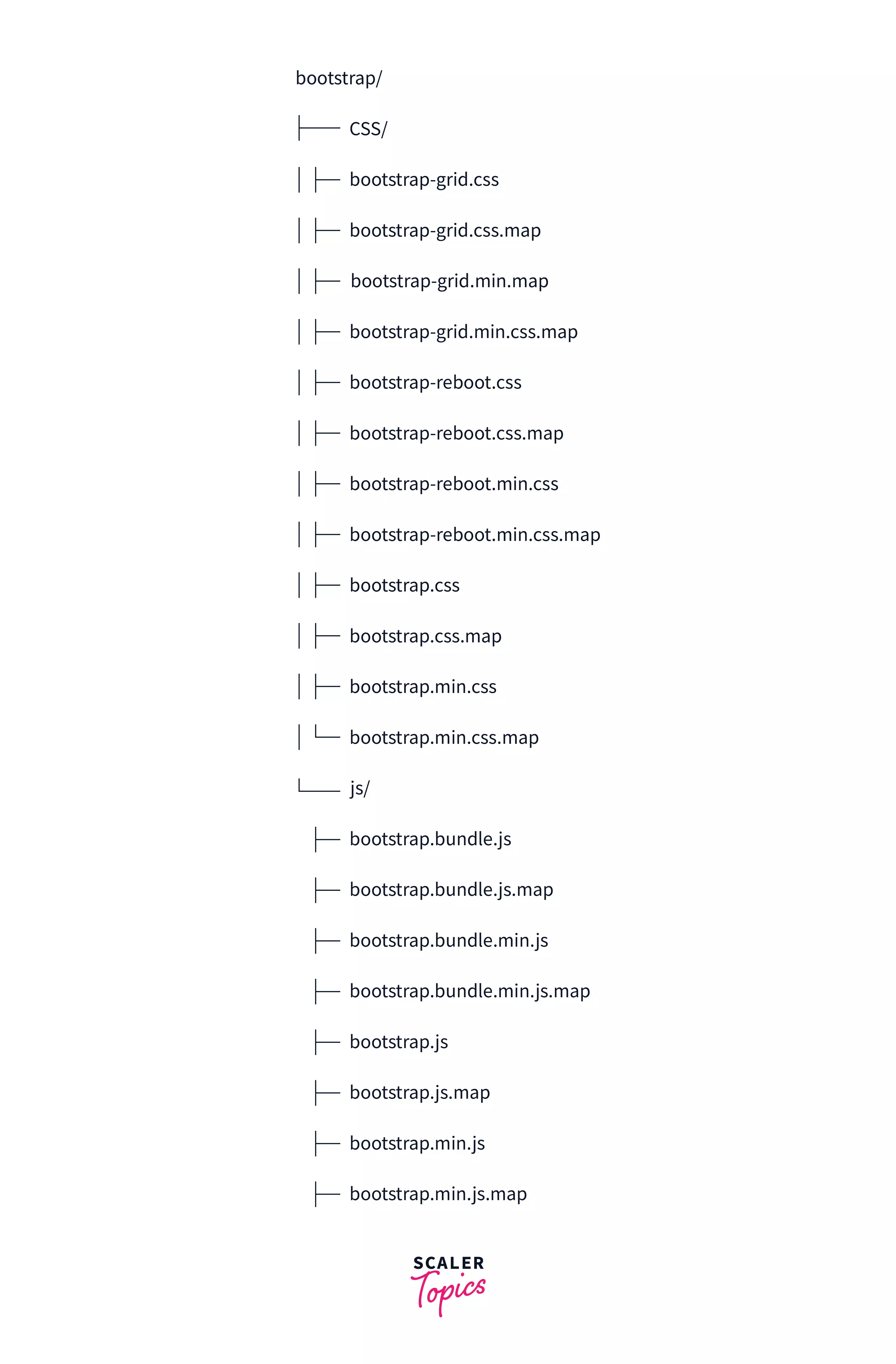
Primary Bootstrap Files
Primary files enable quick usage in any web project. It includes fonts from Glyphicons, as well as an optional beginning Bootstrap theme, in addition to compiled and minified CSS and JS scripts. Bootstrap features three core files as a front-end framework:
- bootstrap.js is a jQuery and JavaScript framework.
- bootstrap.css is a CSS framework, and
- glyphicons is a collection of icon fonts.
Bootstrap 5 is supposed to be used without jQuery. Still, many components can be used with jQuery. If Bootstrap recognizes jQuery in the window object, it will register all of our components in the jQuery plugin system.
Bootstrap Components
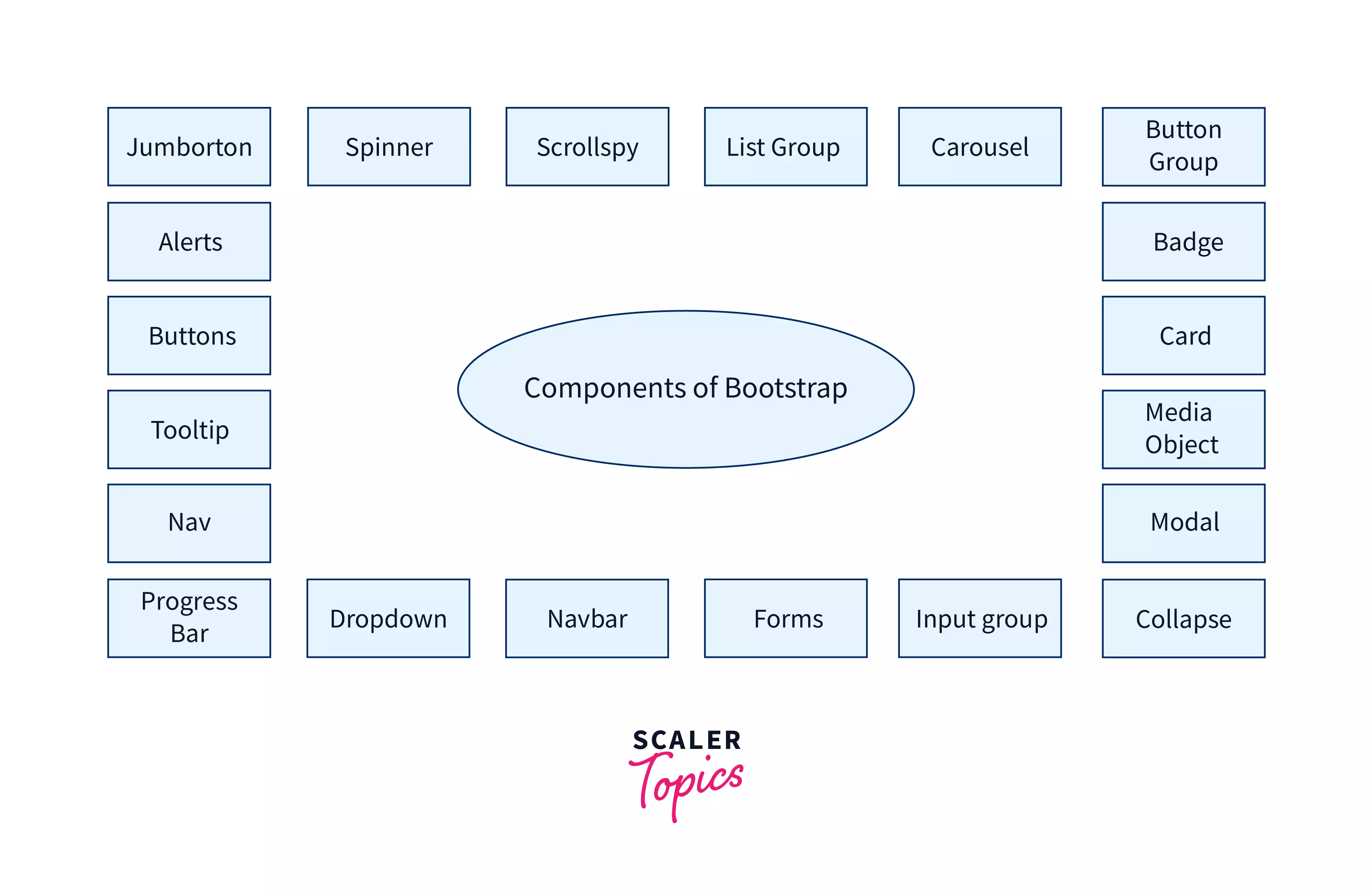
Bootstrap comes with dozens of components that may be reused to create a friendly user experience and user interactions on a web page, such as navigation bars, popups, dropdowns, icons, buttons, pre-designed forms, and scaling choices for various DOM elements.
- Jumborton: It simply draws attention to a specific piece of text or information by making it more extensive and more eye-catching.
- Spinner: The Spinner displays the status of websites or projects as they load. They are created using HTML and CSS and do not require any JavaScript.
- Scrollspy: It constantly updates the navigation bar to the currently active link based on the viewport's scroll position.
- List Group: It is used to properly present an unordered series of items.
- Carousel: It is an image or text-based slide show created with CSS 3D and JavaScript.
- Button Group: It is a set of buttons that are aligned in a single line and can be positioned vertically or horizontally.
- Badge: It is a labeling component used to add more information.
- Card: It provides a content container that is customizable, expandable, and adaptable.
- Media Object: It is used for components that are repetitive and complex, such as tweets or blogs. Images or videos are positioned to the left or right of the content.
- Modal: A little popup window sits on top of the main window.
- Collapse: It's a JavaScript plugin that allows you to show or conceal stuff.
- Input Group: They have enhanced form controls by placing a button, button group, or text on either side of inputs.
- Forms: Forms are used to collect various inputs from the user simultaneously. Bootstrap provides two layouts: stacked and inline.
- Navbar: The headers at the top of a website or web page are the navigation bar.
- Dropdown: It displays the menu as a list of links; they are contextual and toggleable overlays.
- Progress Bar: It is used to display the progress of a particular process using a custom progress bar. Text labels, layered bars, and dynamic backgrounds are among the features.
- Nav: .nav base class is used to create a basic and simple navigation menu.
- Tooltip: When the mouse hovers over an element/link, it displays a small amount of information about it.
- Buttons: It is a set of customizable buttons used to conduct an action in a form, dialogue box, etc. They come in a variety of states, sizes, and styles.
- Alerts: A popup with a predefined message shows after doing a specific activity.
Bootstrap Documentation and Customizability?
- The main parts of code used in the development process are defined and explained on the Bootstrap website. Among the explanations, there are also code samples, and these code fragments are used to construct essential aspects and demonstrate further how programming works within the Bootstrap framework.
- What makes Bootstrap unique, and why it's perfect for new developers, is that you can select a component, copy the code to the page you're developing, and make changes from there.
- When it comes to customizability, there are two sides to it. On the one hand, the framework is quite huge, which leads the application to slow down significantly when it is loaded for the first time. The most recent version of the Bootstrap CSS file is 119 KB. Compared to photos and other multimedia files, this may appear minor; but this is a CSS file, and it is massive from that perspective.
- On the other hand, Bootstrap allows you to avoid this problem by customizing the functionality included in the download. This is performed by heading to the customization and download page and unchecking the features that will not be required for the application, resulting in a smaller file and a shorter download time.
Bootstrap Templates and Syntax:
<!doctype html>
<html lang="en">
<head>
<!-- Required meta tags -->
<meta charset="utf-8">
<meta name="viewport" content="width=device-width, initial-scale=1">
<!-- Bootstrap CSS -->
<link href="https://cdn.jsdelivr.net/npm/bootstrap@5.1.0/dist/css/bootstrap.min.css" rel="stylesheet" integrity="sha384-KyZXEAg3QhqLMpG8r+8fhAXLRk2vvoC2f3B09zVXn8CA5QIVfZOJ3BCsw2P0p/We" crossorigin="anonymous">
<link rel="stylesheet" href="https://cdnjs.cloudflare.com/ajax/libs/font-awesome/5.15.4/css/all.min.css">
<link rel="stylesheet" href="style.css">
<title>Bootstrap Templates and syntax</title>
<style>
.my_nav{
box-shadow: 0px 2px 8px rgba(0,0,0,0.2);
backdrop-filter: blur(10px);
background-color: rgb(255 255 255 / 87%) !important;
}
.my_card{
font-size: 1.2em;
}
.default-body-content .list-group a{
color: black;
padding-top: 30px;
}
.default-body-content .list-group .list-group-item h3{
font-size: 1.3em;
}
.my_card:hover{
box-shadow: 2px 2px 12px rgba(0,0,0,0.2);
transition-duration: 0.4s;
}
footer.main-footer{
padding-top: 25px;
padding-bottom: 25px;
color: white;
background-color: black;
}
footer.main-footer p{
margin: 0px;
}
</style>
</head>
<body>
<!--Nav Bar-->
<nav class="navbar navbar-expand-lg navbar-light bg-light my_nav fixed-top">
<div class="container">
<a class="navbar-brand" href="#">My Blog</a>
<button class="navbar-toggler" type="button" data-bs-toggle="collapse" data-bs-target="#navbarSupportedContent" aria-controls="navbarSupportedContent" aria-expanded="false" aria-label="Toggle navigation">
<span class="navbar-toggler-icon"></span>
</button>
<div class="collapse navbar-collapse" id="navbarSupportedContent">
<ul class="navbar-nav me-auto mb-2 mb-lg-0">
<li class="nav-item">
<a class="nav-link active" aria-current="page" href="#">Home</a>
</li>
<li class="nav-item">
<a class="nav-link" href="#">Link</a>
</li>
</ul>
</div>
</div>
</nav>
<!--Nav Bar-->
<!--Body Content-->
<section class="home-body-content">
<div class="container">
<div class="row">
<div class="col-lg-6 col-md-6">
<div class="card my_card">
<img src="https://source.unsplash.com/random/800x600" class="img-fluid" alt="Banner">
<div class="card-body">
<h3 class="card-title">Blog Post Title</h3>
<p class="card-text">Lorem ipsum dolor sit amet consectetur adipisicing elit.
Veritatis perferendis non fuga voluptatem repudiandae tempora perspiciatis modi veniam </p>
<a href="#" class="btn btn-sm btn-primary">Read More</a>
</div>
</div>
</div>
</div>
</div>
</section>
<!--Body Content-->
<!--Footer-->
<footer class="main-footer">
<div class="container">
<div class="row">
<div class="col-lg-12">
<div class="copy text-center">
<p><small>Copyright © 2020. All Rights Reserved</small></p>
</div>
</div>
</div>
</div>
</footer>
<!--Footer-->
</body>
</html>
Output: 
Advantages of Using Bootstrap
1. It has a Responsive Grid. You don't have to style your own grid when Bootstrap comes with a standard grid system. Instead of using extra small, small, medium, large, and extra-large breaks, you can easily define custom breakpoints for each column. You can also continue with the default because it may already match the demands of your site.
2. It has Responsive Images. Bootstrap includes its code for automatically resizing pictures based on screen size. Simply apply the img-responsive class to your photos, and the provided CSS rules will handle the rest. It can also adjust the shape of your photos by adding classes like img-circle and img-rounded, all without having to switch between the code and your design tools.
3. Easy Documentation. Every line of code is described and discussed in detail on their website. Explanations often offer code samples for basic implementation, making the process easier for even the most inexperienced newcomers.
4. Its Large Community Support. Bootstrap has many open-source projects supported by a vast community of designers and engineers. Bootstrap is hosted on GitHub, making it simple for developers to alter and contribute to the codebase. It also makes it simple for people to cooperate, offer advice, and communicate with peers and other users.
5. Assists You in Avoiding the jQuery Plugin Soup. A website may be required to provide a variety of interactive features. Adding jQuery plugins to the mix is one option. On the other hand, adding too many of these to your site may cause major problems. Version mismatches and browser difficulties are only a few examples of potential complications. Bootstrap includes a selection of jQuery components that are stable on modern browsers and compatible with your jQuery version. Moreover, the styling is consistent with the rest of the elements in your project.
6. It is Entirely Free. That means that independent web developers don't have to spend a lot of money to produce a web app that gives users a consistent web experience.
Disadvantages of Using Bootstrap
1. Every Bootstrap Website Looks the Same. You would have to put more effort when establishing a design because if you don't make a lot of customization, all websites would seem the same.
2. Quite Heavy to Run. While creating a responsive website with Bootstrap is simple, the end product can be highly burdensome to consumers due to slower loading times and battery drain issues. If you do not compile the source SASS files, you will frequently find yourself using Chrome's DevTools inspect tool to locate the default style attributes. These styles will then need to be overridden in a new stylesheet. As a result of the code redundancy, your site will load slower.
Furthermore, the files generated by Bootstrap can be rather large, which can significantly slow things down for you. You could continue and delete things manually, but it negates the purpose of utilizing the framework in the first place.
3. Unusual Plugins Styles are verbose and can result in a large amount of unnecessary HTML output. Because JavaScript is linked to jQuery and is one of the most used libraries, most of the plugins go unused.
4. Less Streamlined for Front-End Web Development. It might not be as streamlined as you would like. Bootstrap is known for being large because it contains everything you could need, and it will not be appropriate for creating a small, simple site.
Bootstrap's Appealing Features and Benefits
Bootstrap comes with a plethora of functionality. These qualities not only make it stand out, but they also make it more popular, even among site designers who prefer to take things slowly.
- Simple to Begin With
- Lesser CSS files
- Easily Modifiable
- Code re-use
- Utility Classes that are Responsive
- Drop-Down Component Menu
- Templates are readily available.
- Responsive Community and Well explained documentation
Conclusion
- Bootstrap is quickly becoming the most popular front-end component library on the planet. You can simply create responsive, mobile-first web projects with Bootstrap, and you can swiftly prototype your one-of-a-kind ideas. To create a complete application, you can use their Sass variables, sophisticated plugins, incredibly responsive grid system, and other features.
- The Bootstrap framework is useful in some commercial applications. Besides other apps, Bootstrap can also be utilized to create WordPress themes. It's simple to connect to the CMS, and its preset classes allow developers to quickly design bespoke, responsive WordPress themes: a time and money saver.
- With Bootstrap, a few simple CSS classes are required to quickly and easily create a fully responsive and stunning front end. It's a terrific place to start with your next major project or startup.
- Every minute you save when your time is billable will significantly increase your bottom line. It also makes development more enjoyable because you are not specifying unnecessary CSS attributes. I hope I've demonstrated how Bootstrap can save you time while making you a better developer.
This blog post was originally published at: Source