Before SF Symbols, making icons for iOS apps used to present a major hassle for both the designer and the developer. A workflow would often look along the lines of this:
- Plan the icon.
- Design it and make sure it aligns with your app’s message.
- Or go online and find an icon instead…
- … which would probably mean purchasing a license.
- After all the work, you can finally embed it into your app — only to find the font weight is off and you need to tweak it.
Google’s Material Design icons have been around since 2014, and websites like Font Awesome were launched even earlier. So when would Apple jump into the icon battle?
In 2019, Apple debuted their own set of icons, called SF Symbols. It was a huge gift for developers and designers alike, as in a truly Apple way, they were easier to use than any other icon pack.
Now, in 2020, Apple has decided it was time for a refresh. At WWDC20, they released the second generation of SF Symbols: SF Symbols 2. Here’s what’s new.
The Numbers
SF Symbols 1 boasted 1,500+ icons, and SF Symbols 2 raises that to 2,400+, including 150+ that are multicolor.
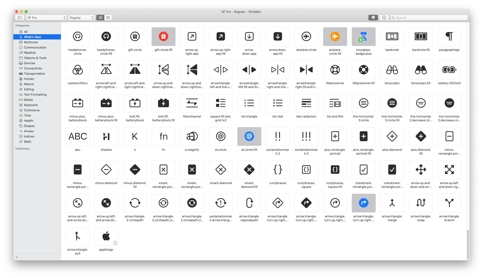
A lot of the new icons depict physical devices, like the buttons on a gaming controller and an external drive. The Apple logo is also finally available as an icon, but it can only be used to reference “Sign in with Apple.”
#swift #xcode #sf-symbols