There are a lot of different UI components you can find on an app. The ones you’ll find the most will probably be buttons, inputs, forms, or images. They are so common that HTML even provides default elements for them! However, it’s not rare to encounter lesser-known components that you have to build by yourself.
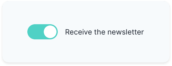
We started building our design system within my company and I found myself working on the switch component, something like this:
At first, it seems like a simple UI component. But building it can be tricky when you need to consider all the different states, its accessibility, and its reusability.
Well, lucky you! Today I’m going to share with you how you can do the same.
Note: though I’m building it with Vue, the concepts can easily be applied to React. Also, I’m using Vue 3, but don’t be scared, there are not many differences with Vue 2 here! 😉
A Bit of Conception
Before jumping straight to your keyboard and start coding, you have few things to consider, especially the switch’s purpose. Indeed, a switch can be used in two ways:
- To turn on or off something (as you would do with a light switch)
- To select between two choices (a theme switcher for example)
It’s essential to know which use case is the right one for you because it impacts the underlying implementation. In our case, we’re going to go for the first use case.
Additionally, we want to label our toggle switch, so the user knows what is going to happen if he toggles the switch.
Let’s look at a real-world example where a user would choose to receive a newsletter. You can think of a first implementation where you would use a checked prop and a label prop and a toggle event:
<Switch
  :checked="shouldReceiveNewsletter"
  @toggle="toggle"
  label="Receive newsletter"
/>
That’s good. But we can achieve the same result by using v-model like so:
<Switch v-model:checked="shouldReceiveNewsletter" label="Receive newsletter" />
If you’re familiar with Vue, you might be surprised with the use of v-model in the example above. That’s one of the changes introduced by Vue 3: You can now use an argument name directly on the template. The code above passes a checked prop to <Switch> that you can update by emitting an update:checked event.
Build the Template
The switch UI we’re building
Whenever you have to choose HTML elements, you need to select the ones that make sense semantically. In our case, we’ll have to use an input as we’re building a control. Remember, there are two use cases for a switch:
- Switch a setting on/off: we need a checkbox.
- Switching between one option and another (like a light/dark theme): we need two radio buttons.
We also need to make sure our input is labeled correctly. One way of doing so is to wrap an <input> in a <label> and add some text.
Finally, we can also add an empty <span> that we’re going to use later to build our toggle switch. Go ahead and create a Switch.vue in which you can paste the following:
<template>
  <label>
    <input type="checkbox" />
    <span></span>
    <span>{{ label }}</span>
  </label>
</template>
#vuejs #software-development #javascript #programming #vue