The world is facing a unique crisis these days and we all are stuck in a never seen before lockdown. As all of us are utilizing this time in many productive ways, I thought of creating some blogs of data concepts I know, not only to share it with the community but also to develop a more deep understanding of the concept as I write it down.
The first one is here about the most loved evaluation metric — The ROC curve.
ROC (Receiver Operating Characteristic) Curve is a way to visualize the performance of a binary classifier.
Understanding the confusion matrix
In order to understand AUC/ROC curve, it is important to understand the confusion matrix first.
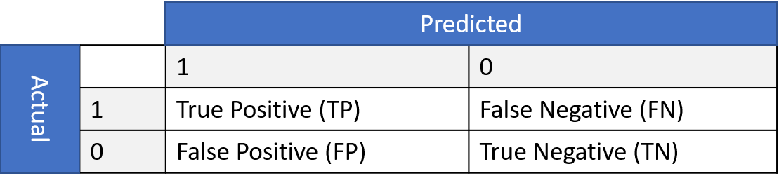
Image by author
TPR = TP/(TP+FN)
FPR = FP/(TN+FP)
TPR or True Positive Rate answers the question — When the actual classification is positive, how often does the classifier predict positive?
FPR or False Positive Rate answers the qestion — When the actual classification is negative, how often does the classifier incorrectly predict positive?
To understand it more clearly, let us take an example of the current COVID situation. Assume that we have data for COVID patients and using some classifier we were able to classify the patients as positive and negative.
Let us now, without going into further details have a look at the distribution of the predicted classes. Here, again for simplicity let us assume that the data is balanced i.e. negative and positive classes are almost equal, additionaly they follow a normal distribution.
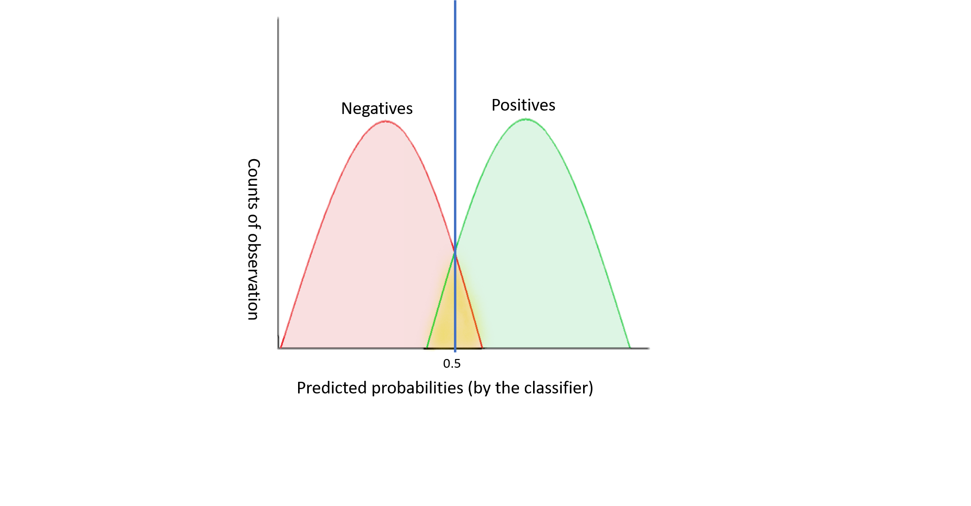
Image by author
In the above graph, my classifier is doing a great job in classifying the patients — positive and negative. If I calculate the accuracy for such model, it will be quite high. Now, for different values of threshold, I can go ahead and calculate my TPR and FPR. According to the graph let us assume, that my threshold =0.5. At this threshold, the number of patients for which my classifier predicted a probability of 0.5, half were negative and half were positive.Similarly, I can check for other thresholds as well. For every threshold, TPR would be all patients in green area in the right of the threshold line divided by total patients in the green area.
FPR would be all patients in pink area in the right of the threshold line divided by total patients in the pink area.
ROC Curve
Now, if I plot this data on a graph, I will get a ROC curve.
The ROC curve is the graph plotted with TPR on y-axis and FPR on x-axis for all possible threshold. Both TPR and FPR vary from 0 to 1.
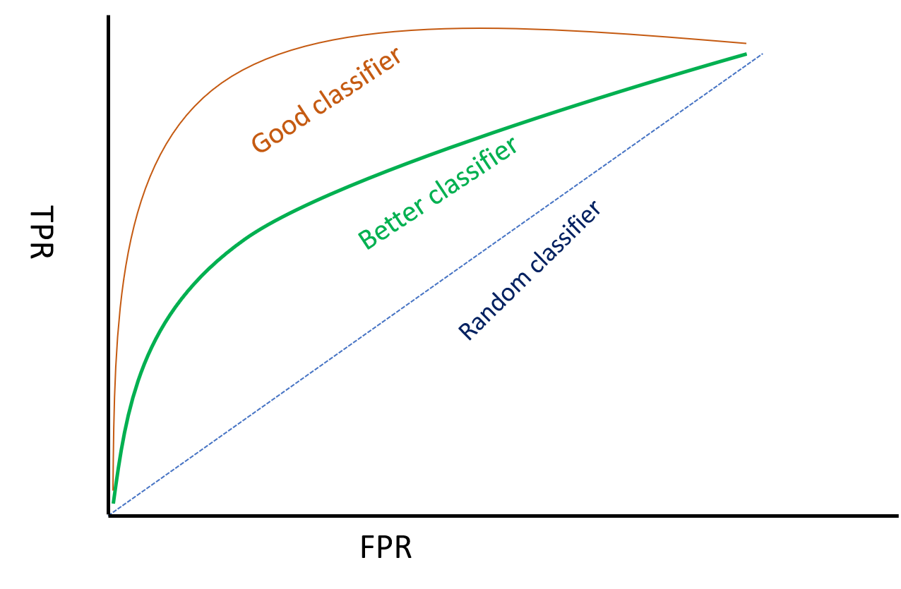
Therefore, a good classifier will have an arc/ curve and will be further away from the random classifier line.
To qantify a good classifier from a bad one using a ROC curve, is done by AUC (Area under Curve). From the graph it is quite clear that a good classifier will have AUC higher than a bad classifier as the area under curve will be higher for the former.
From the above discussion, it is evident that ROC is a robust evaluation metrics than say Accuracy or Missclassification error because ROC takes into account all possible threshold levels whereas a metric like missclassification error takes only one threshold level into account.
The choice of your threshold depends on the business problem or domain knowledge. In our COVID patients example above, I would be okay with high FPR thus keeping my threshold levels low to ensure maximum COVID patients tracked.
#r #auc-roc #r-package #data-science #roc #data analysis