Sneak Peek at Syncfusion WinUI 3 Preview Controls
We are glad to announce our first-ever Syncfusion Essential Studio for WinUI 3 preview in the 2020 Volume 3 release. Although the first release of production-ready WinUI for application development isn’t expected until 2021, we’re already starting to offer a range of controls. Our toolkit will grow to help you develop line-of-business applications by 2021, along with WinUI 3’s first production-ready release.
What is WinUI?
WinUI is a progressive platform for developing user interfaces (UI) in Windows applications. It was developed by Microsoft. The following are the available versions of WinUI in active development:
- WinUI 2
- WinUI 3
WinUI 2 is used for developing UWP XAML apps. It is a library containing Fluent-based UI controls and styles. It was first released in Oct 2018 and its latest release, v2.4, was rolled out on May 8, 2020.
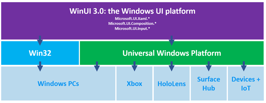
WinUI 3 is a standalone UI framework currently in development. We can use it for both desktop and UWP application development. It provides state-of-the-art graphical capabilities and Fluent Design styling for all trending devices, hardware, and inputs. The major use of WinUI 3 is for decoupling the XAML, composition, and input layers of Windows 10, and deploying them independently through NuGet for Windows 10 1803 (and above) applications. It also supports C++ and .NET-based applications. Learn more about the benefits of WinUI 3 from this roadmap. The latest available release is WinUI 3 Preview 2, which was rolled out on July 15, 2020.
Syncfusion controls for WinUI 3 Preview
The Syncfusion Essential Studio for WinUI 3 preview will include a set of controls for developing line-of-business applications. This will include DataGrid, TreeGrid, beautiful charts and gauges, TreeView, Barcode, Badge, and ColorPicker controls. These controls are completely customizable and already feature rich. Let’s sneak a peek at these controls.
Chart
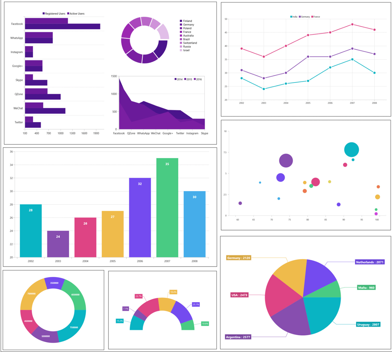
The Syncfusion WinUI Chart control will be a data visualization control optimized to visualize large quantities of data in an elegant way. Its rich feature set will include functionalities like data binding, multiple axes, animations, data labels, trackballs, tooltips, selection, and zooming. What’s more, as we already announced, the Syncfusion charts work on Web/WebAssembly through our support of Uno Platform.
The WinUI charts will have the following feature highlights in the upcoming release:
- Chart types: 10+ chart types such as column, bar, line, area, pie, and doughnut.
- Axis: 4 types of axes: numerical, categorical, date-time, and logarithmic.
- Appearance: 10+ built-in palettes, using which you can create your own desired custom palettes, too.
- Legends: Provide additional information to identify the individual series in a chart. These legends can be docked to the left, right, top, or at the bottom of the chart area.
- User interaction: The end-user experience is greatly enhanced by a set of user interaction features like cross hair, zooming, panning, trackball, selection, and tooltip.
DataGrid
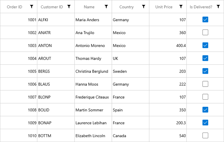
The Syncfusion WinUI DataGrid can be used to display and manipulate data in a tabular format. Its rich feature set will include functionalities like data binding, editing, sorting, filtering, and grouping. It will also be optimized to work with millions of records, as well as handle high-frequency, real-time updates.
The WinUI DataGrid will have the following features:
- Editing: Edit various built-in and template column types to handle different types of data.
- Sorting: Sort one or more columns by tapping the header.
- Grouping: Group one or more columns to achieve user-interactive grouping.
- Filtering: Filter data using an intuitive, built-in, Excel-inspired filtering UI.
- Selection: Select rows or cells in ways similar to an Excel worksheet with all keyboard navigations.
- Row height: Allow users to adjust (auto fit) the row height depending on the content of any column or certain columns to enhance the readability of content. It’s also possible to set the row height conditionally.
- And other features, like unbound rows, columns, stacked header rows, column auto-sizing, and localization.
TreeGrid
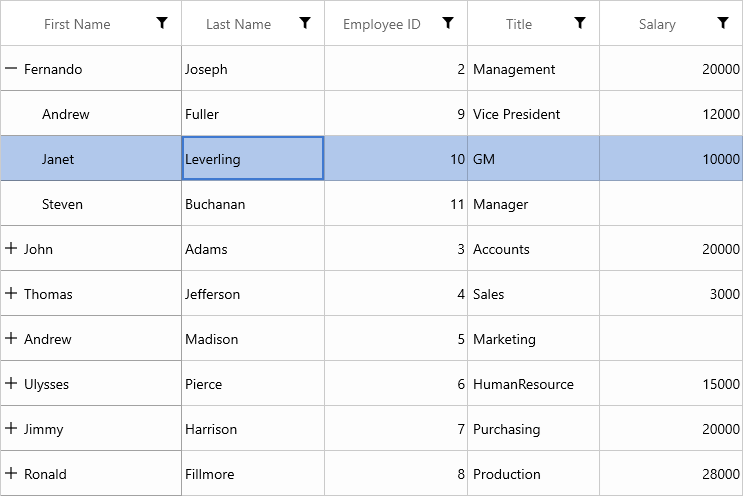
The Syncfusion WinUI TreeGrid will be a data-oriented control for displaying self-relational data in a tree structure UI like a multicolumn tree view. The data can be loaded on-demand. Its rich feature set will include editing with different column types, selection, and node selection with check boxes, sorting, and filtering.
Radial Gauge
The Syncfusion WinUI Radial Gauge will be used for visualizing numeric values on a circular scale. It will have a rich set of features and will be completely customizable and extendable to simulate a speedometer, meter gauge, analog clock, and so on.
The WinUI Radial Gauge will have the following features:
- Axis: A circular scale that holds elements like ticks, labels, and axis lines.
- Pointers: Point out a definite value on an axis. The control will support needle pointers, range bar pointers, and marker pointers.
- Pointer interaction: Drag a pointer from one value to another at run time.
- Ranges: Categorize certain intervals in the Radial Gauge.
- Annotation: Place any desired view inside the plot area.
- Animation: Display fluid animation for the pointers.

TreeView
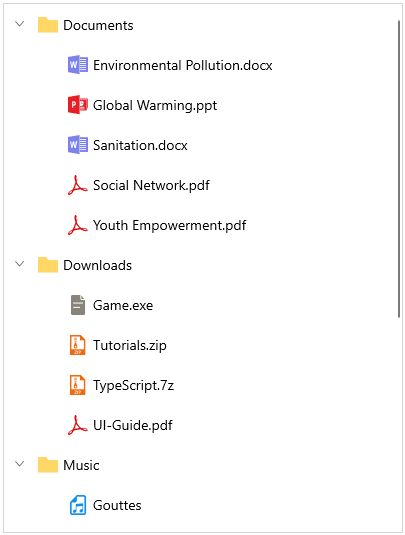
The Syncfusion WinUI TreeView will be a data-oriented control for displaying data in a hierarchical structure with built-in virtualization and expanding and collapsing nodes.
The WinUI TreeView will have the following features:
- UI virtualization: Optimized view-reusing strategy for enhanced performance.
- Bound and unbound modes: Bind hierarchical data or add unbound tree nodes.
- On-demand loading: Load nodes on demand when the end user expands the node.
- Selection: Select nodes with different selection modes and keyboard navigation.
- Drag and drop: Reorder the nodes by dragging and dropping them.
- Templating: Provide complete UI customization using a template and template selectors.
- Root lines: Show lines between tree nodes.
Barcode
The Syncfusion WinUI Barcode will be a data visualization control used to generate and display data in a machine-readable format. It will provide a perfect approach to encode text using supported symbol types.
The WinUI Barcode will have the following features:
- One-dimensional barcodes
- Two-dimensional barcodes
- Barcode rendering customization
- Text customization

Badge
The WinUI Badge can be used to show a notification to users via a simple, elegant badge view. The Badge control can also be loaded with predefined shapes and contextual color variants. It can be easily integrated with other controls, like Button or Listview.

ColorPicker and DropDownColorPicker
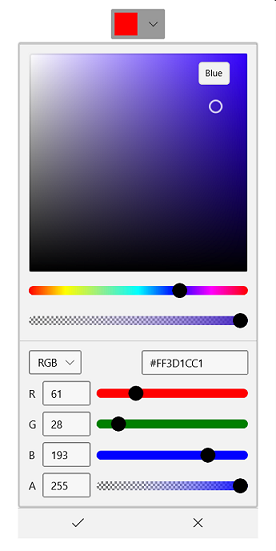
The Syncfusion WinUI ColorPicker and DropDownColorPicker controls will allow a user to select a brush (solid color, linear gradient, and radial gradient brushes) visually in a WYSIWYG interface. They will provide RGB, HSV, HSL, CMYK, and hex color modes for color selection. Also, they offer solid and complete customizations with the color edit options.
ColorPalette and DropDownColorPalette
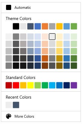
The Syncfusion WinUI ColorPalette and DropDownColorPalette controls will allow a user to select colors from a predefined color palette. The controls will also provide various built-in color palettes, as well as automatic and more-color options for the user to choose desired colors.
Source: https://www.syncfusion.com/blogs/post/sneak-peek-at-syncfusion-winui-3-preview-controls.aspx
#winui #desktop #syncfusion
