Animations in Flutter: Simple understanding in 10 minutes
This article will show you how to create animations in Flutter step by step
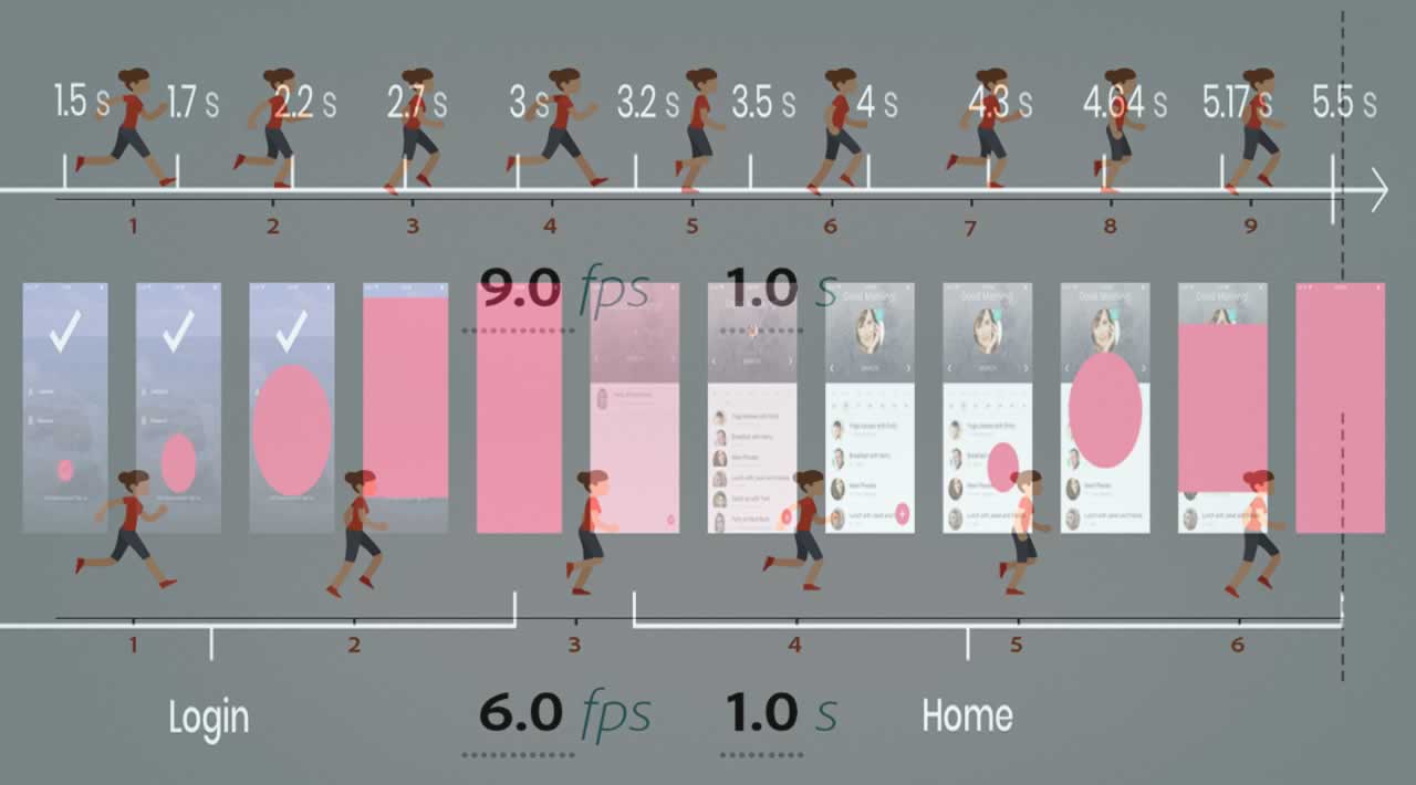
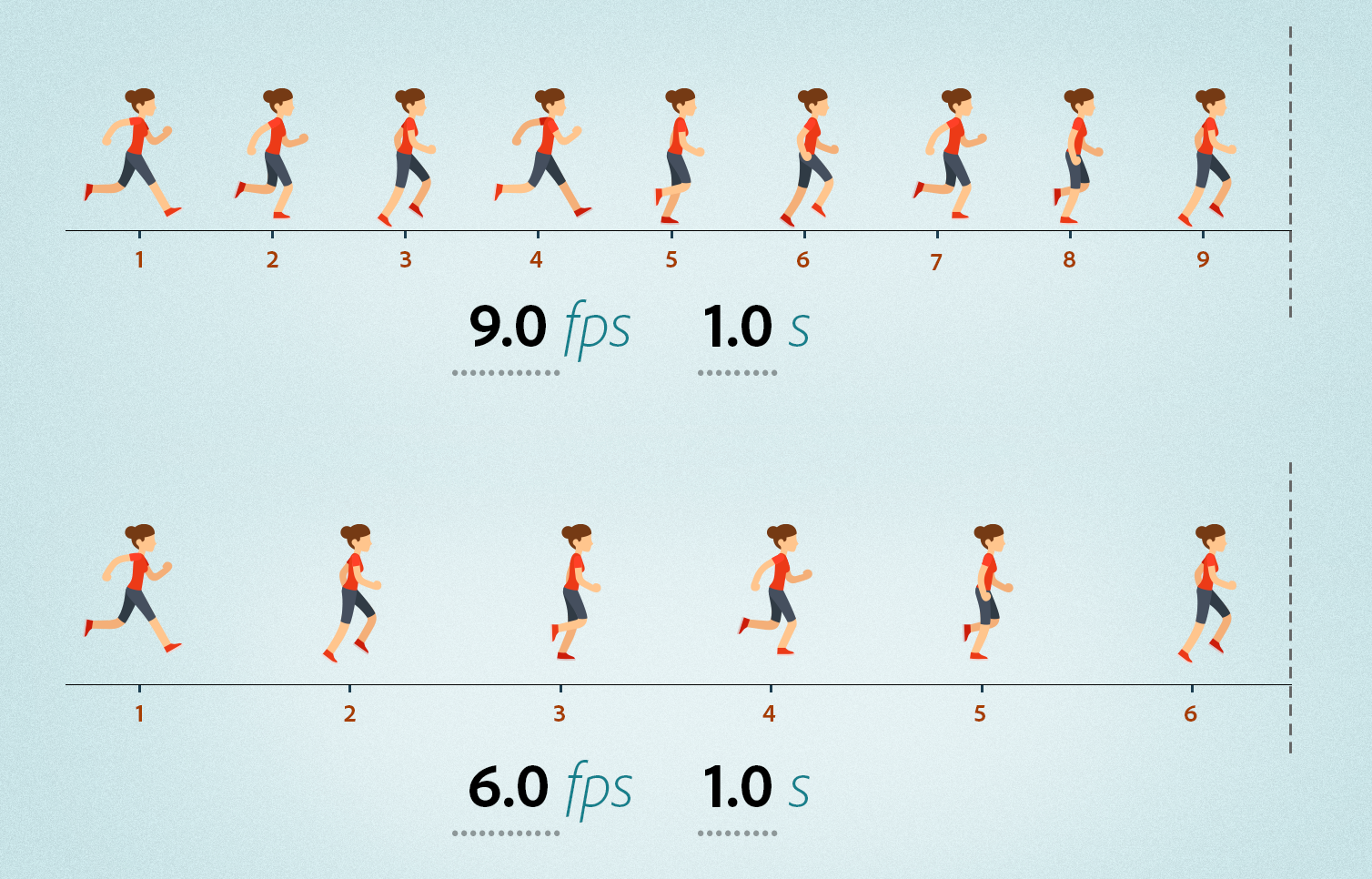
If we want to animate something, we have to either change the size or change the position of our object in consecutive frames. e.g. in frame 1 our object is in position x, in frame 2 it will be in position x+1, in frame 3 it’d be in position x+2 and so on.
Another concept when creating an animation is “frames per second” or FPS. How many times do we want to change the position or size of our object per second? Movies usually use 24 frames per second. That’s the minimum number of FPS where animations seem smooth and natural to human eyes.
FPS (image credit)
In order to animate a widget in Flutter, we need the following widgets:
- Animation<T>: An animation object consists of a value (of type
T) together with a status. The value is like the current frame number. It tells you whether you are in frame 1, 2, 3, etc. Depending on this value, you decide the next position or size of your widget. The status indicates whether the animation is conceptually running from beginning to end or from the end back to the beginning. - AnimationController: To create an animation, first create an AnimationController. This widget linearly produces values that range from 0.0 (lower bound) to 1.0 (upper bound), during a given duration. The animation controller generates a new value whenever the device running your app is ready to display a new frame (typically, this rate is around 60 values per second). An AnimationController should be disposed when it is no longer needed. This reduces the likelihood of leaks. When used with a StatefulWidget, it is common for an AnimationController to be created in the State.initState method and then disposed in the State.dispose method. Note that the AnimationController inherits the Animation class and therefore is of type Animation.
- Tween: This class can be used to translate (or map) the lower bound and upper bound of
AnimationController(which is by default from 0.0 to 1.0) to values frombegintoend. Tween is by default of type double unless otherwise stated. The sole job of aTweenis to define a mapping from an input range to an output range. The input range is commonly 0.0 to 1.0, but that’s not a requirement. - TickerProvider: This is a factory that generates Ticker objects. A Ticker object fires an event for every new frame. The AnimationController class uses a Ticker to step through the animation that it controls. We can add the Ticker functionality to our stateful class by using the
SingleTickerProviderStateMixinmixin to implement the TickerProvider functionality. If you are not sure what mixins are, read this article. This mixin is useful when you only need one Ticker object (e.g. if the class creates only a single AnimationController during its entire lifetime). - AnimatedBuilder: That’s obvious that every time we change the size or position of our widget, we’d want to re-build it. But how’d we do that? This is where the AnimatedBuilder widget comes in handy. We give this widget our animation and tell it what to draw as the animation goes forward.
Ok, Let’s do something practical.
First, we’ll create a circle in the middle of the screen, and make it go large and small periodically.
Our main function runs the application and displays the AnimatedCirclePage:
import 'package:animation/pages/animated_circle_page.dart'; import 'package:flutter/material.dart';void main() => runApp(MyApp()); class MyApp extends StatelessWidget { // This widget is the root of your application. @override Widget build(BuildContext context) { return MaterialApp( title: 'Flutter Demo', home: AnimatedCirclePage(), ); } }
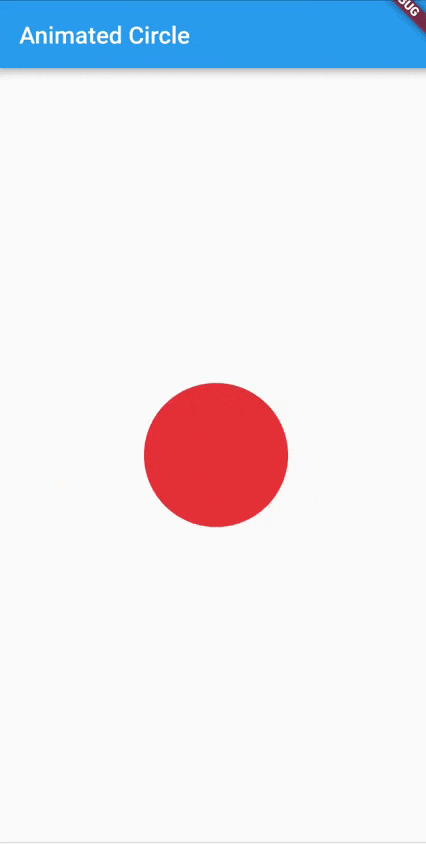
The AnimatedCirclePage initially shows a circle in the middle of the page:
import ‘package:flutter/material.dart’;class AnimatedCirclePage extends StatefulWidget { @override _AnimatedCirclePageState createState() => _AnimatedCirclePageState(); } class _AnimatedCirclePageState extends State<AnimatedCirclePage> { @override Widget build(BuildContext context) { return Scaffold( appBar: AppBar( title: Text("Animated Circle"), ), body: Center( child: Container( width: 50, height: 50, decoration: BoxDecoration( borderRadius: BorderRadius.all( Radius.circular(25), ), color: Colors.red, ), ), ), ); } }

Now let’s enlarge this circle with animation.
In the following code, we have added a member of type AnimationControllerand have instantiated it in the initState method. AnimationControllerrequires two parameters: Duration and TickerProvider.
The duration parameter specifies how long the animation will last, in our example, it will take 1 second to complete.
The second argument is named vsync which is of type TickerProvider. Since we have added the functionality of TickerProvider to our class using the following mixin:
with SingleTickerProviderStateMixin
The current instance of the class can be passed to vsync parameter as a TickerProvider:
vsync: this
Therefore we will have:
class _AnimatedCirclePageState extends State<AnimatedCirclePage>
with SingleTickerProviderStateMixin {AnimationController animationController; @override void initState() { super.initState(); animationController = AnimationController( duration: Duration(seconds: 1), vsync: this, ); animationController.forward(); }
Calling the forward method starts the animation and generates values from 0.0 (lower bound) to 1.0 (upper bound). But how can we consume the generated values?
Using the AnimatedBuilder widget!
  @override

Widget build(BuildContext context) {

return Scaffold(

appBar: AppBar(

title: Text(“Animated Circle”),

),

body: AnimatedBuilder(

animation: animationController,

builder: (BuildContext context, Widget child) {

final size = 100 * (animationController.value+1);

return Center(

child: Container(

width: size,

height: size,

decoration: BoxDecoration(

borderRadius: BorderRadius.all(

Radius.circular(size/2),

),

color: Colors.red,

),

),

);

},

),

);

}
The AnimationBuilder’s constructor takes three parameters:
animation: We provide our animation object here. Remember that the AnimationController inherits from the Animation class. Therefore our AnimationController is of type Animation and can be passed to this parameter.child: This optional parameter is a widget that does not change during the animation and is created only once (to improve performance). It’s always available to re-use in the builder function (next parameter).builder: This is the function which is called for every tick of animation. Here we can decide what to draw in the next frame of our animation. We can access the current frame number throughanimation.valueproperty.
As soon as we call the animationController.forward() method, our animation starts and the builder method of AnimatedBuilder will be called for each frame of the animation. In each frame, the value of animationController.value will gradually increase from 0.0 to 1.0. We can take advantage of this value and change the width and height of our circle based on it:
final size = 100 * (animationController.value+1);
As you can see, when the animation value is 0.0, the circle size will be 100 and as the value increases to 1.0, the size will change to 200. So we have to see the following animation where the size of the circle changes from 100 to 200:
The Enlarging Circle
In the above example, we have added 1 to all animation values. In fact, we needed to change the animation’s range from [0.0…1.0] to [1.0…2.0]. Do you remember what the Tween class was useful for? It was used to modify the animation values. So we could use the Tween class here to map the animation values from [0.0…1.0] to [1.0…2.0]. Let’s do it:
void initState() {

super.initState();

animationController = AnimationController(

duration: Duration(

seconds: 1,

),

vsync: this,

);

animation = Tween(begin: 1.0, end: 2.0).animate(animationController);

animationController.forward();

}
Mapping the animation values actually happens in this line:
animation = Tween(begin:1.0, end:2.0).animate(animationController);
We create an instance of Tween and specify the begin and end values. Then we call the animate method and pass an animation object to it. The animate function will return a new animation object whose values will be frombeginto end. Then in the AnimatedBuilder object, we’d simply set the animation property to our new animation object:
body: AnimatedBuilder(

animation: animation,
and set the size of the circle to this:
final size = 100 * (animation.value);
Reversing the Animation
Now let’s do something fun. As soon as our animation is completed, we will reverse the animation (so that its values change from 1 to 0 this time). This will make the circle go small again.
How can we know that our animation is complete?
By listening to AnimationStatus!
We can add a listener to the animation, so that every time its status changes, we will get notified.
@override
void initState() {
super.initState();
animationController = AnimationController(
duration: Duration(
seconds: 1,
),
vsync: this,
);
animation = Tween(begin: 1.0, end: 2.0).animate(animationController);animationController.addStatusListener(animationStatusListener); animationController.forward(); } void animationStatusListener(AnimationStatus status) { if (status == AnimationStatus.completed) { animationController.reverse(); } else if (status == AnimationStatus.dismissed) { animationController.forward(); } }
Our listener function will be called only when the status changes. There are four statuses possible for an animation:
- dismissed: The animation is stopped at the beginning
- forward: The animation is running from beginning to end
- reverse: The animation is running backwards, from end to beginning
- completed: The animation is stopped at the end
In the code above, we have checked the status. If it’s completed, that means that we have just reached the end of our animation, so we call the reversefunction, which plays the animation backwards. When the status becomes dismissed, that means that the animation has reached the beginning, so we call forward again! This loop will continue forever!
The resulting animation is a circle that goes large and small continuously:
Now let’s do something more fun. We are going to rotate this circle around the center of the screen!
Create a new page called rotatingcirclepage.dart with the following code in it:
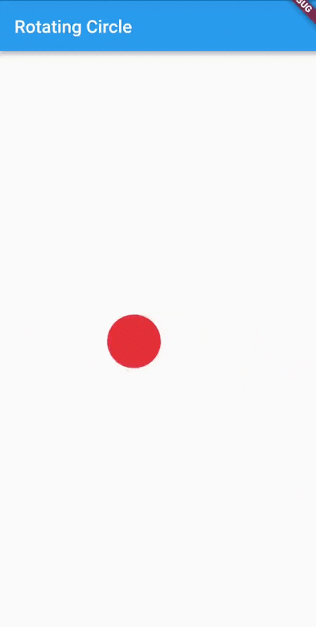
import ‘package:flutter/material.dart’;class RotatingCirclePage extends StatefulWidget { @override _RotatingCirclePageState createState() => _RotatingCirclePageState(); } class _RotatingCirclePageState extends State<RotatingCirclePage> with SingleTickerProviderStateMixin { Widget _buildCircle(radius) { return Container( width: radius * 2, height: radius * 2, decoration: BoxDecoration( borderRadius: BorderRadius.all( Radius.circular(radius), ), color: Colors.red, ), ); } @override Widget build(BuildContext context) { return Scaffold( appBar: AppBar( title: Text("Rotating Circle"), ), body: Align( alignment: Alignment(0, -0.1), child: _buildCircle(30.0), ), ); } }
To make the code more readable, I just created a helper function called _buildCircle which draws a red circle with the given radius. And instead of centering the circle, I aligned it a little above the center of the page. (watch this short video by Google to get familiar with the Align widget if you are not). The result is:

Now let’s animate this circle like a pendulum:
import ‘package:flutter/material.dart’;
import ‘dart:math’ as math;class RotatingCirclePage extends StatefulWidget { @override _RotatingCirclePageState createState() => _RotatingCirclePageState(); } class _RotatingCirclePageState extends State<RotatingCirclePage> with SingleTickerProviderStateMixin { AnimationController animationController; Animation animation; @override void initState() { super.initState(); animationController = AnimationController( duration: Duration( seconds: 2, ), vsync: this, ); animation = CurvedAnimation( parent: animationController, curve: Curves.fastOutSlowIn, ); animationController.addStatusListener(animationStatusListener); animationController.forward(); } void animationStatusListener(AnimationStatus status) { if (status == AnimationStatus.completed) { animationController.reverse(); } else if (status == AnimationStatus.dismissed) { animationController.forward(); } } Widget _buildCircle(radius) { return Container( width: radius * 2, height: radius * 2, decoration: BoxDecoration( borderRadius: BorderRadius.all( Radius.circular(radius), ), color: Colors.red, ), ); } @override Widget build(BuildContext context) { return Scaffold( appBar: AppBar( title: Text("Rotating Circle"), ), body: Align( alignment: Alignment(0, -0.1), child: AnimatedBuilder( child: _buildCircle(30.0), animation: animationController, builder: (BuildContext context, Widget child) { return Transform.rotate( child: child, angle: math.pi * 2 * animation.value, origin: Offset(0, 30), ); }, ), ), ); } }
Let me explain the important parts of the above code.
animation = CurvedAnimation(

parent: animationController,

curve: Curves.fastOutSlowIn,

);
By default, an AnimationController linearly produces the numbers from 0.0 to 1.0 during a given duration and therefore the animation is played without any velocity. If we want to change the speed and style of our animation, we can wrap it in a CurvedAnimation widget:
CurvedAnimation is useful when you want to apply a non-linear Curve to an animation object, especially if you want different curves when the animation is going forward vs when it is going backward.
Note that it’s possible to first wrap the animation in the CurvedAnimation widget and then translate its lower and upper bounds using the Tween widget, like the following:
animation = Tween(begin: 5.0, end: 10.0).animate(

CurvedAnimation(

parent: animationController,

curve: Curves.fastOutSlowIn,

),

);
Here I’ve used the Curves.fastOutSlowIn curve, but you can play with other values and see how they affect the speed and velocity of the animation.
Now let me explain a little bit about the build method:
@override

Widget build(BuildContext context) {

return Scaffold(

appBar: AppBar(

title: Text(“Rotating Circle”),

),

body: Align(

alignment: Alignment(0, -0.1),

child: AnimatedBuilder(

child: _buildCircle(30.0),

animation: animationController,

builder: (BuildContext context, Widget child) {

return Transform.rotate(

child: child,

angle: math.pi * 2 * animation.value,

origin: Offset(0, 30),

);

},

),

),

);

}
We have set the child property of AnimatedBuilder to the circle. Why? Because we want it to be created only once, not for every frame! (to improve the performance, we do not need to rebuild parts of the animation that do not change over time. Here the size of our circle remains the same during the animation, so we build it only once and assign it to the child of AnimatedBuilder. This child will be available to be re-used in the buildermethod every time a new frame is to be drawn).
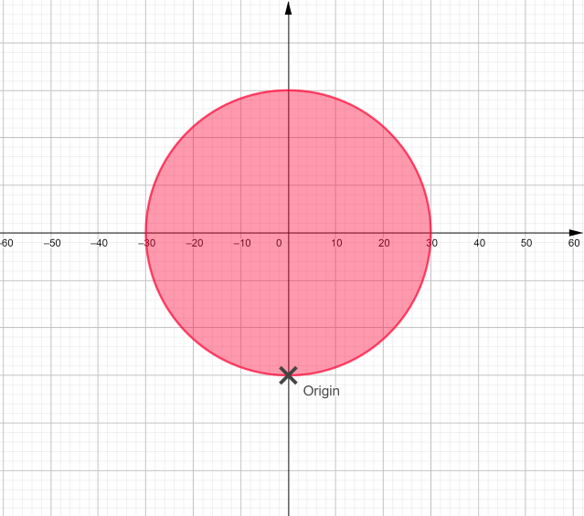
In the builder method, which will be called for every frame of our animation, we have used Transform.rotate to rotate our circle. If we do not specify the origin parameter, the circle will rotate around the center of itself (in this case, since a circle rotates around the center of itself, we won’t see any rotation!). For this reason, we’ve set the center of rotation to a point denoted by Offset(0, 30), which is a point whose x distance from the center of the widget is 0, and y distance is 30. Look at the following picture. The circle will now rotate around the origin point marked with X:
The angle of rotation has been set to:
angle: math.pi * 2 * animation.value,
Since the animation value changes from 0 to 1, the rotation angle will change from 0 to 2π, which is equal to a complete 360° rotation.
Important Note: I have not wrapped _buildCircle(30.0) in the Align widget. Instead, I have wrapped the whole animation, which is our AnimatedWidget object, in the Align widget. That’s because we want to rotate only the circle, not the space around it! If we wrapped the child of AnimatedBuilder in the Align widget, there would be an extra space around our circle which would cause our calculations to go wrong. My whole point is that the following code is wrong:
@override

Widget build(BuildContext context) {

return Scaffold(

appBar: AppBar(

title: Text(“Rotating Circle”),

),

body: AnimatedBuilder(

child: Align(

alignment: Alignment(0, -0.1),

child: _buildCircle(30.0),

),

animation: animationController,

builder: (BuildContext context, Widget child) {

return Transform.rotate(

child: child,

angle: math.pi * 2 * animation.value,

origin: Offset(0, 30),

);

},

),

);

}
Like the previous animation, when the animation is completed, we reverse it so that it rotates back from 2π to 0 degrees. The result is the following animation:
Circle Rotating Around Origin
In the previous article, we learned how to draw a curved dashed line. And I told you about creating the following animation:

I will include the source code of the above animation in the code of this article on github. But I’d suggest you try to create it yourself as homework! Note that I am not moving the dish on a curved path. I am jusing animating it over two separate straight lines using the Transform.translate widget. Transform.translate can be used to offset an object by dx and dy before painting it.
Summary, Recap, and Final Notes
That’s it. You can stop reading right here! I’d just want to emphasize on the following notes that I grabbed from three articles provided by Flutter about animation (it’s good to read these articles):
- Animations Overview
- Animations Tutorial
- Introduction to Animations
To create an animation, first create an AnimationController. As well as being an animation itself, an AnimationController lets you control the animation. For example, you can tell the controller to play the animation forward or stop the animation.
AnimationController is a special Animation object that generates a new value whenever the hardware is ready for a new frame. By default, an AnimationController linearly produces the numbers from 0.0 to 1.0 during a given duration.
AnimationController derives from Animation<double>, so it can be used wherever an Animation object is needed. However, the AnimationControllerhas additional methods to control the animation. For example, you start an animation with the .forward() method. The generation of numbers is tied to the screen refresh, so typically 60 numbers are generated per second.
The Tween abstract class maps a double value nominally in the range 0.0-1.0 to a typed value (e.g. a Color, or another double). It is an Animatable. To animate beyond the 0.0 to 1.0 interval, you can use a Tween<T>, which interpolates between its begin and end values. Many types have specific Tween subclasses that provide type-specific interpolation. For example, ColorTween interpolates between colors and RectTween interpolates between rectangles. A Tween inherits from Animatable<T>, not from Animation<T>. An Animatable, like Animation, doesn’t have to output double. For example, ColorTween specifies a progression between two colors:
colorTween = ColorTween(begin: Colors.transparent, end: Colors.black54);
The source code of this article can be found on Github.
Thanks for reading! Originally published on https://codequs.com
#flutter