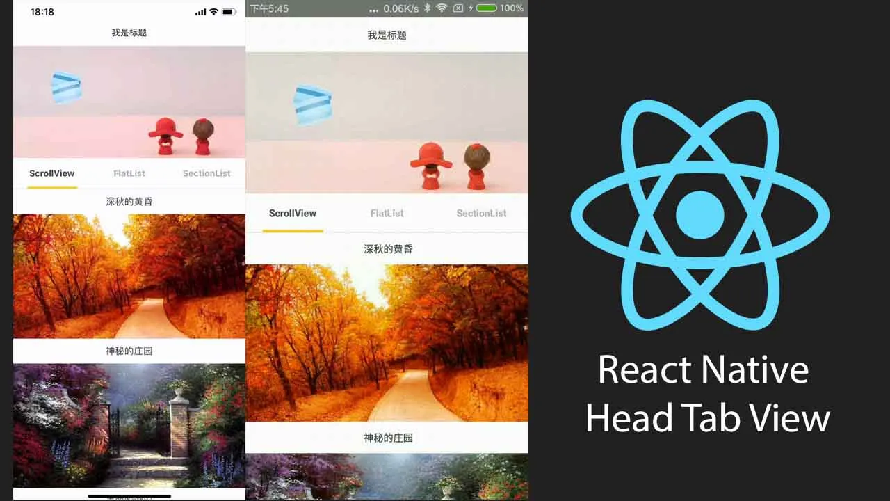
React Native Head Tab View
React Native Head Tab View
Features
- Scrollable tabs
- All Tab pages share Collapsible headers
- Collapsible Headers controls the slide of the Tabview in the vertical direction
- Collapsible Headers can respond to an event
- Add a drop-down refresh for the Tab page(v2.0~)
- Add a drop-down refresh for the Tabview(v2.0.6~)
Demo
iOS demo
Android demo:
Example
import { ScrollView } from 'react-native';
import { HPageViewHoc, TabView } from 'react-native-head-tab-view'
const HScrollView = HPageViewHoc(ScrollView)

_renderScene = (sceneProps: { item: string, index: number }) => {
        return <HScrollView {...sceneProps}>
            <View style={{ height: 800, backgroundColor: 'red' }} />
            <View style={{ height: 800, backgroundColor: 'green' }} />
            <View style={{ height: 800, backgroundColor: 'blue' }} />
        </HScrollView>
}

render() {
        return (
            <View style={{ flex: 1, backgroundColor: '#FFF' }}>
                <TabView
                        tabs={['tab1','tab2','tab3']}
                        renderScene={this._renderScene}
                        makeHeaderHeight={() => { return 180 }}
                        renderScrollHeader={()=><View style={{height:180,backgroundColor:'red'}}/>}
                        onChangeTab={this.onChangeTab}
                    />
            </View>
        )
    }
More examples:Example
Run the example
cd Example
yarn or npm install

//run Android
react-native run-android

//run iOS
cd ios
pod install
cd ../
react-native run-ios
Add to your project
yarn add react-native-head-tab-view react-native-gesture-handler @react-native-community/viewpager
or
npm install react-native-head-tab-view react-native-gesture-handler @react-native-community/viewpager --save
Linking
- dependencies: @react-native-community/viewpager Autolinking and Manually link
https://github.com/react-native-community/react-native-viewpager#Linking
- dependencies: react-native-gesture-handler Autolinking and Manually link
Versions (@react-native-community/viewpager) 【It is recommended that you fix the version for V3.3,reference issues28】
Some versions of @react-native-community/viewpager
1.x2.x3.xiOS supportiOS supportAndroid supportAndroid supportAndroidX support
Documentation
Common Props
HPageViewHoc Props (HOC props)
isRefreshing (boolean)
Whether the scene is refreshing
onStartRefresh (() => void)
If provided, a standard RefreshControl will be added for “Pull to Refresh” functionality.
Make sure to also set the isRefreshing prop correctly.
renderRefreshControl (() => React.ReactElement)
A custom RefreshControl for scene
refreshHeight (number)
If this height is reached, a refresh event will be triggered (onStartRefresh)
it defaults to 100
overflowPull (number)
It’s the distance beyond the refreshHeight, the distance to continue the displacement, when the pull is long enough,
it defaults to 50.
TabView Props - (extends Common Props)
renderScene (required) (renderScene :(info: TabViewItemInfo) => React.ReactElement | null | undefined)
Takes an item from tabs and render the scene of the TAB item When renderScrollHeader is assigned, pass info to the component wrapped by HPageViewHoc
- item (string) : An element in the Tabs array
- index (number) : index
Example:
<TabView
    renderScene={(sceneProps)=>{
        const {item} = sceneProps
        if (item == 'ScrollView') {
            return <Page1 {...sceneProps} />
        } else if (item == 'FlatList') {
            return <Page2 {...sceneProps} />
        } else if (item == 'SectionList') {
            return <Page3 {...sceneProps} />
        }
        return null;
    }}

/>
renderScrollHeader (React.ComponentType | React.ReactElement | null)
render the collapsible header
<TabView
    makeHeaderHeight={() => { return 180 }}
/>
frozeTop (number)
The height at which the top area of the Tabview is frozen
<TabView
    frozeTop={50}
/>
headerRespond (boolean) 【This property has been deprecated,By default, the header responds to events.】
Collapsible headers can respond to an event it defaults to false
<TabView
    headerRespond={true}
/>
makeHeaderHeight
The height of collapsible header
renderScrollHeader={()=><View style={{height:180,backgroundColor:'red'}}/>}
renderHeader (React.ComponentType | React.ReactElement | null)
render the header of the Tabview
renderFooter (React.ComponentType | React.ReactElement | null)
render the footer of the Tabview
initialPage (number)
The sequence number of the initial scene. it defaults to 0
preInitSceneNum (number)
Number of pre-loaded pages
it defaults to 0
renderTabBar (React.ComponentType | React.ReactElement | null)
Render the custom tabbar
onChangeTab ((value: ChangeTabProperties): void)
This method is called when the scene is switched
<TabView
    onChangeTab={({from,curIndex}) => { console.log('from:'+from+'-to:'+curIndex) }}
/>
onScroll ((value: number): void)
Horizontal scrolling invokes this method
value: Progress relative to total length
locked (boolean)
Whether horizontal sliding is allowed.
it defaults to false
scrollEnabled (boolean)
Whether to allow the scene to slide vertically
tabbarStyle (StyleProp)
The style of the Tabbar
extraData (any)
A marker property for telling the tabview to re-render (since it implements PureComponent).
stick it here and treat it immutably.
isRefreshing (boolean)
Whether the TabView is refreshing
onStartRefresh (() => void)
If provided, a standard RefreshControl will be added for “Pull to Refresh” functionality.
Make sure to also set the isRefreshing prop correctly.
renderRefreshControl (() => React.ReactElement)
A custom RefreshControl
refreshHeight (number)
If this height is reached, a refresh event will be triggered (onStartRefresh)
bounces (boolean)
When true, the scroll view bounces when it reaches the end of the content if it slides the tabs horizontally
Tabbar Props - (extends Common Props)
style (StyleProp)
The style of the tabbar
underLineHidden (boolean)
Whether the underline is displayed
it defaults to false
underlineStyle (StyleProp)
The style of the underlined container
lineStyle (StyleProp)
The style of the underline
tabItemStyle (StyleProp)
The style of the tab item
renderTabItem (React.ComponentType | React.ReactElement | null)
Takes an item from data and renders it
renderTabItemButton (React.ComponentType | React.ReactElement | null)
Takes an item from data and renders it to the TAB Item button
scrollValue (Animated.Value)
Progress relative to total length
renderLeftView (React.ComponentType | React.ReactElement | null)
Render the view to the left of the Tabbar
renderRightView (React.ComponentType | React.ReactElement | null)
Render the view to the right of the Tabbar
Download Details:
Author: zyslife
Source Code: https://github.com/zyslife/react-native-head-tab-view
#react #react-native #mobile-apps


