R Programming
R programming has become one of the best data analytics tools especially when it comes for visual analytics. A great community contribution makes it easier to learn, use and share for the effective visualization. It is imperative to say that proper visualization is a very important factor for data scientists & AI specialists. Even if you are only interested to work with business communication with impactful visualizations, R can provide you a comprehensive way of work where you have full freedom to play with your data and create useful graphs for your audiences. It is an open-sourced tool by the way. RStudio is the most favorable IDE(Integrated Development Environment) for R.
ggplot2
ggplot2 is the most popular data visualization package in the R community. It was created by Hadley Wickham in 2005. It was implemented based on Leland Wilkinson’s Grammar of Graphics — a general scheme for data visualization which breaks up graphs into semantic components such as scales and layers. While using ggplot2, you provide the data, call specific function, map your desired variables to aesthetics, define graphical arguments, rest it will take care! For details, you can go through its documentation.
Image source : tidyverse , ggplot2
tidyverse
tidyverse is a collecttion of packages for data science introduced by the same Hadley Wickham. ‘tidyverse’ encapsulates the ‘ggplot2’ along with other packages for data wrangling and data discoveries. More details can be found in its documentation.
Install Packages
Let’s install the required packages first. You do not need to install any package more than once in our system unless willing to upgrade it. Note : If you install tidyverse, then you do not need to install ggplot2 separately!
## install.packages('ggplot2')
install.packages('tidyverse')
install.packages("ggalt")
install.packages('GGally')
install.packages('ggridges')
- **_tidyverse _**for All plots
- ggalt for Dumbbell plot
- GGally for Scatter Matrix plot
- ggridges for Ridge Plot
Load Packages
Now we need to load our packages. Unlike installing, loading packages is required every time you start your system.
library(tidyverse)
library(ggalt)
library(GGally)
library(ggridges)
Explore the Datasets
In this exercise we will use four datasets. Two of them are standard datasets and used worldwide for practicing data visualizations. these are**_ iris_** and diamonds datasets. Other two are specially curated datasets for this work purpose. names.csv has the data of three female names’ uses along the years from 1880 to 2017 and life_expectency.csv contains contains fifteen countries’ life expectancy in years for 1967 and for 2007. Please download these two datasets either from my github repository or from google drive whichever is convenient. Note : all these datasets are open-sourced.
Now, Let’s import the datasets
data_iris <- iris
data_diamonds <- diamonds

setwd("E:/---/your_working-directory")
data_names <- read.csv("names.csv", header = TRUE)
data_life_exp <- read.csv("life_expectency.csv", header = TRUE)
Here are three options to check on your imported data,
View(data_iris)
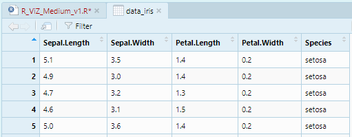
Image by Author
head(data_iris)
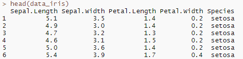
Image by Author
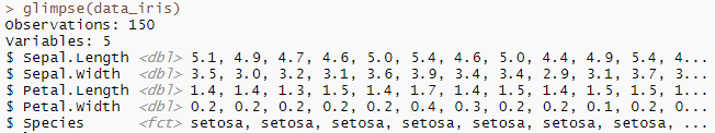
glimpse(data_iris)
#r #analytics #data-science #data-visualization #ggplot2