Learn about the blink tag in HTML. We’ll go over the basics like if you can even use it and how you can recreate it with CSS animations.
In the earlier days of the web, HTML elements like the blink tag were native ways to add some animation effects to liven up a webpage. How can we use those animations today to add flare to our websites and apps?
- What is the HTML tag blink?
- How do you use the blink tag?
- Can you still use the blink tag?
- Recreating the blink tag with CSS animations
What is the HTML tag blink?
The blink tag (<blink>) is an obsolete HTML tag that makes the content of that tag slowly flash.
 Google search of “blink tag”
This, along with some other obsolete tags like the marquee tag (<marquee>), were an easy way to add simple animation effects to your site.
How do you use the blink tag?
Being that the blink tag was a simple HTML element, you would use it right in line with your content.
For example, if you wanted the word “blink” in blink-182 to blink, you would write the following HTML:
<p>
  <blink>blink</blink>-182
</p>
Can you still use the blink tag?
As you might have noticed in the gif above, this tag is obsolete.
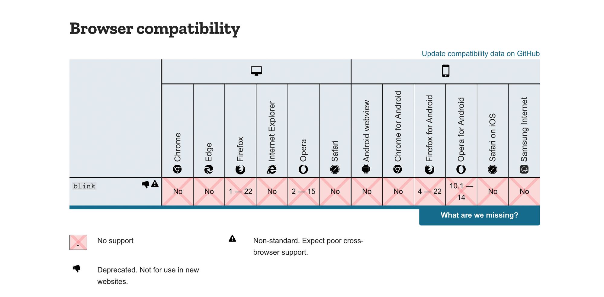 Blink tag browser compatibility
This means you can’t use the blink HTML tag itself. However, that shouldn’t stop us from remaking it in all of its blinking glory.
Recreating the blink tag with CSS animations
In today’s web development world, animations are generally handled with CSS or JavaScript. Using CSS animations, we can recreate our blink tag with a few lines and be back in business.
With the following CSS:
.blink {
  animation: blink 1s steps(1, end) infinite;
}

@keyframes blink {
  0% {
    opacity: 1;
  }
  50% {
    opacity: 0;
  }
  100% {
    opacity: 1;
  }
}
You can add the .blink class to any HTML element to make it blink.
<p>
  <span class="blink">blink</span>-182
</p>
 HTML CSS blink effect
Modernizing the blink tag
This is 2020, what if we wanted something a little smoother?
Well to start, we can make the animation fade by removing the steps from the animation definitions.
.blink {
  animation: blink 1s infinite;
}
 Blink fade effect
Or what if we wanted to make it fade out like a sci-fi effect?
.blink {
  animation: blink 3s infinite;
}

@keyframes blink {
  0% {
    opacity: 1;
  }
  100% {
    opacity: 0;
    color: blue;
  }
}
 CSS blink fade sci-fi effect
Or even a nice grow and fade effect.
.blink {
  animation: blink 3s infinite;
}

@keyframes blink {
  0% {
    opacity: 1;
  }
  50% {
    opacity: 0;
    transform: scale(2);
  }
  51% {
    opacity: 0;
    transform: scale(0);
  }
  100% {
    transform: scale(1);
    opacity: 1;
  }
}
 CSS blink grow and fade effect
#html #css #developer #web-development
