Seaborn Heatmap Tutorial | Python Data Visualization
You will learn what is a heatmap, how to create it, how to change its colors, adjust its font size, and much more, so let’s get started.
What is a heatmap?
The heatmap is a way of representing the data in a 2-dimensional form. The data values are represented as colors in the graph. The goal of the heatmap is to provide a colored visual summary of information.
Create a heatmap
To create a heatmap in Python, we can use the seaborn library. The seaborn library is built on top of Matplotlib. Seaborn library provides a high-level data visualization interface where we can draw our matrix.
For this tutorial, we will use the following Python components:
To install seaborn, run the pip command as follows:
pip install seaborn
Seaborn supports the following plots:
Okay, let’s create a heatmap now:
Import the following required modules:
import numpy as np

import seaborn as sb

import matplotlib.pyplot as plt
We imported the numpy module to generate an array of random numbers between a given range which will be plotted as a heatmap.
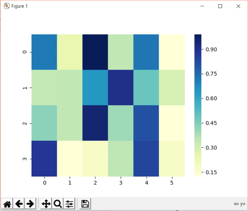
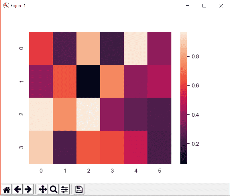
data = np.random.rand(4, 6)
A 2-dimensional array is created with 4 rows and 6 columns. Now let’s store these array values in the heatmap. We can create a heatmap by using the heatmap function of the seaborn module. Then we will pass the data as follows:
heat_map = sb.heatmap(data)
Using matplotlib, we will display the heatmap in the output:
plt.show()
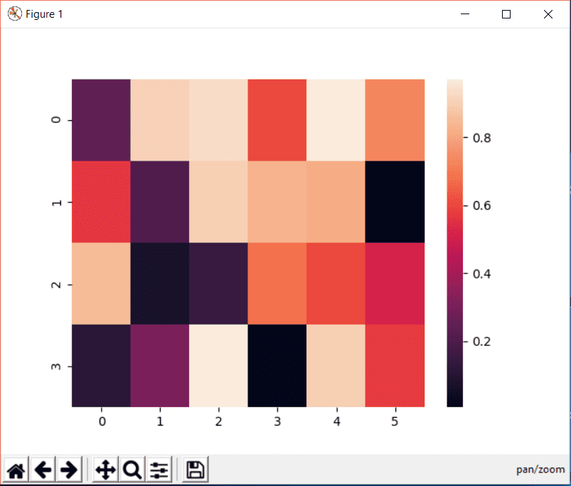
Congratulations! Your first heatmap is just created!
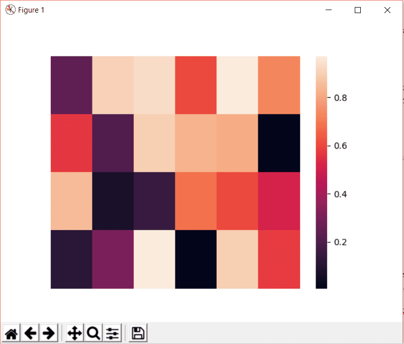
Remove heatmap x tick labels
The values in the x axis and y axis for each block in the heatmap are called tick labels. The tick labels are added by default. If we want to remove the tick labels, we can set the xticklabel or ytickelabel attribute of seaborn heatmap to False as below:
heat_map = sb.heatmap(data, xticklabels=False, yticklabels=False)
Set heatmap x axis label
We can add a label in x axis by using the xlabel attribute of Matplotlib as shown in the following code:
>>> plt.xlabel("Values on X axis")
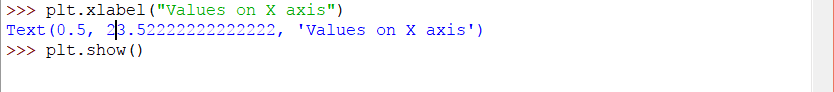
The result will be as follows:
Remove heatmap y tick labels
The labels for y axis are added by default. To remove them, we can set the yticklabels to false.
heat_map = sb.heatmap(data, yticklabels=False)
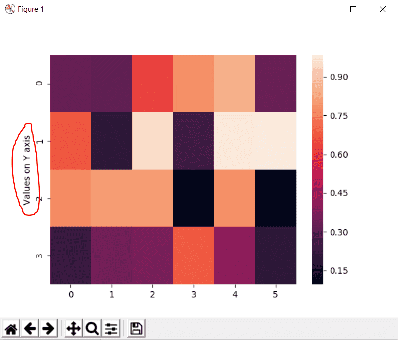
Set heatmap y axis label
You can add the label in y axis by using the ylabel attribute of Matplotlib as shown:
>>> data = np.random.rand(4, 6)

>>> heat_map = sb.heatmap(data)

>>> plt.ylabel('Values on Y axis')
Changing heatmap color
You can change the color of seaborn heatmap by using the color map using the cmap attribute of the heatmap.
Consider the code below:
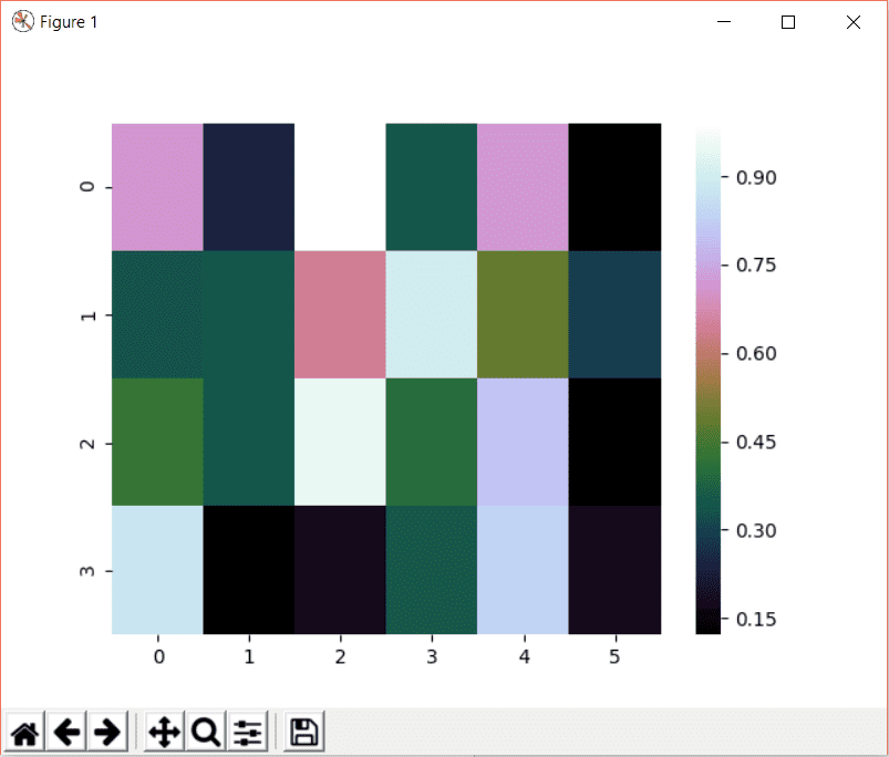
>>> heat_map = sb.heatmap(data, cmap="YlGnBu")

>>> plt.show()
Here cmap equals YlGnBu which represents the following color:

In Seaborn heatmap, we have three different types of colormaps.
- Sequential colormaps
- Diverging color palette
- Discrete Data
Sequential colormap
The sequential color map is used when the data range from a low value to a high value. The sequential colormap color codes can be used with the heatmap() function or the kdeplot() function.
The sequential color map contains the following colors:
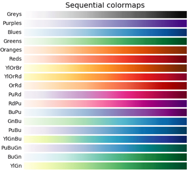
This image is taken from Matplotlib.org.
Sequential cubehelix palette
The cubehelix is a form of the sequential color map. The cubehelix is used when there the brightness is increased linearly and when there is a slight difference in hue.
The cubehelix palette looks like the following:

You can implement this palette in the code using the cmap attribute:
>>> heat_map = sb.heatmap(data, cmap="cubehelix")
The result will be:
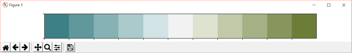
Diverging color palette
You can use the diverging color palette when the high and low values are important in the heatmap.
The divergent palette creates a palette between two HUSL colors. It means that the divergent palette contains two different shades in a graph.
You can create the divergent palette in seaborn as follows:
import seaborn as sb

import matplotlib.pyplot as plt

>>> sb.palplot(sb.diverging_palette(200, 100, n=11))

>>> plt.show()
Here 200 is the value for palette on the left side and 100 is the code for palette on the right side. The variable n defines the number of blocks. In our case, it is 11. The palette will be as follows:
Discrete Data
In Seaborn, there is a built-in function called mpl_palette which returns discrete color patterns. The mpl_palette method will plot values in a color palette. This palette is a horizontal array.
The diverging palette looks like the following:
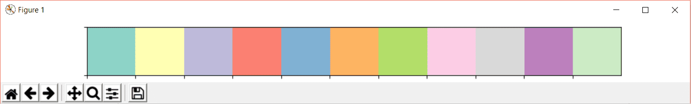
This output is achieved using the following line of code:
>>> sb.palplot(sb.mpl_palette("Set3", 11))

>>> plt.show()
The argument Set3 is the name of the palette and 11 is the number of discrete colors in the palette. The palplot method of seaborn plots the values in a horizontal array of the given color palette.
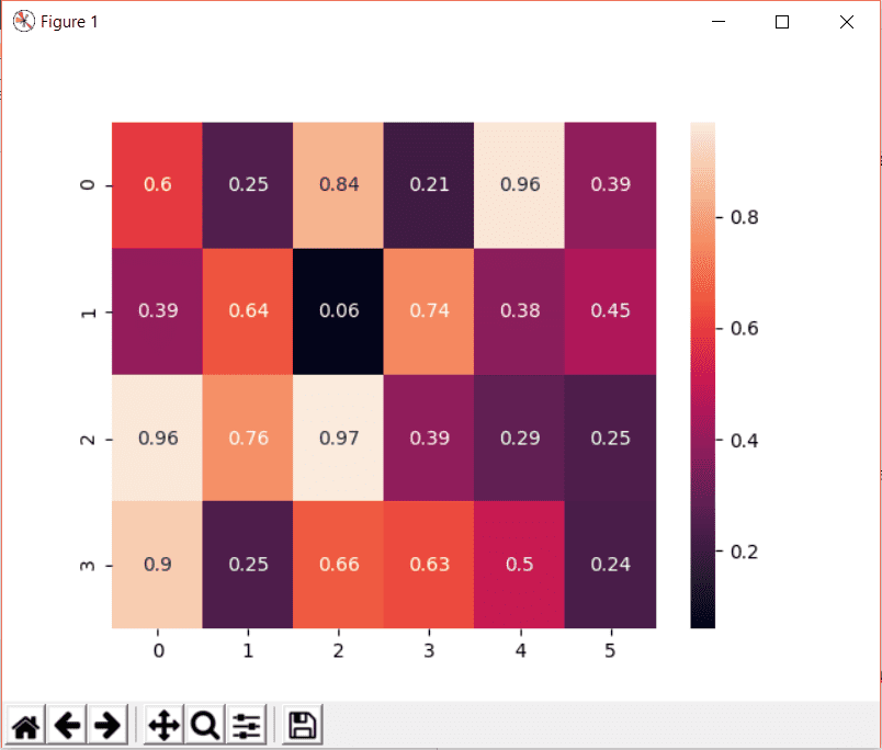
Add text over heatmap
To add text over the heatmap, we can use the annot attribute. If annot is set to True, the text will be written on each cell. If the labels for each cell is defined, you can assign the labels to the annot attribute.
Consider the following code:
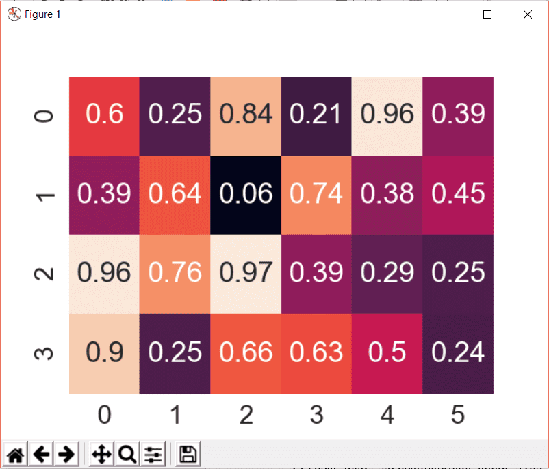
>>> data = np.random.rand(4, 6)

>>> heat_map = sb.heatmap(data, annot=True)

>>> plt.show()
The result will be as follows:
We can customize the annot value as we will see later.
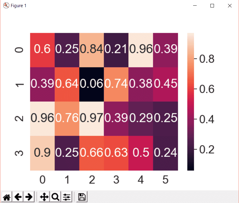
Adjust heatmap font size
We can adjust the font size of the heatmap text by using the font_scale attribute of the seaborn like this:
>>> sb.set(font_scale=2)
Now define and show the heatmap:
>>> heat_map = sb.heatmap(data, annot=True)

>>> plt.show()
The heatmap will look like the following after increasing the size:
Seaborn heatmap colorbar
The colorbar in heatmap looks like the one as below:
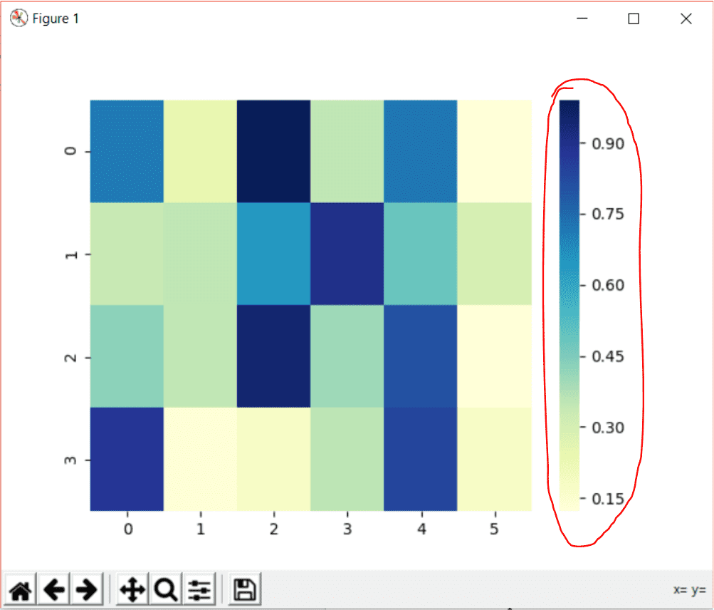
The attribute cbar of heatmap is a Boolean attribute which if set to true tells if it should appear in the plot or not. If the cbar attribute is not defined, the color bar will be displayed in the plot by default. To remove the color bar, set cbar to False:
>>> heat_map = sb.heatmap(data, annot=True, cbar=False)

>>> plt.show()
To add a color bar title, we can use the cbar_kws attribute.
The code will look like the following:
>>> heat_map = sb.heatmap(data, annot=True, cbar_kws={'label': 'My Colorbar'})

>>> plt.show()
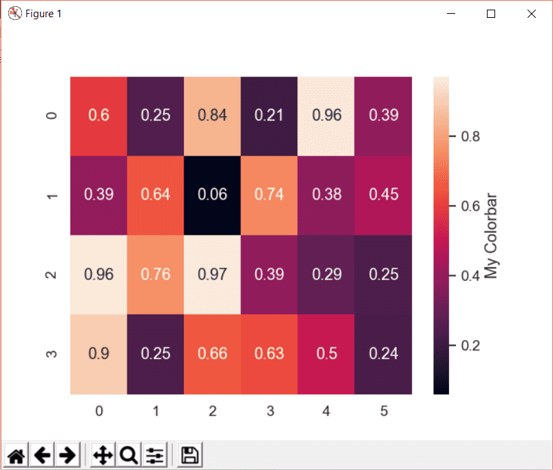
In the cbar_kws, we have to specify what attribute of the color bar we are referring to. In our example, we are referring to the label (title) of the color bar.
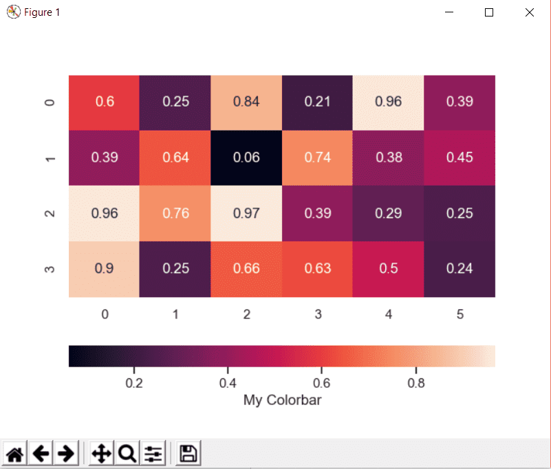
Similarly, we can change the orientation of the color. The default orientation is vertical as in the above example.
To create a horizontal color bar define the orientation attribute of the cbar_kws as follows:
>>> heat_map = sb.heatmap(data, annot=True, cbar_kws={'label': 'My Colorbar', 'orientation': 'horizontal'})

>>> plt.show()
The resultant color bar will be like the following:

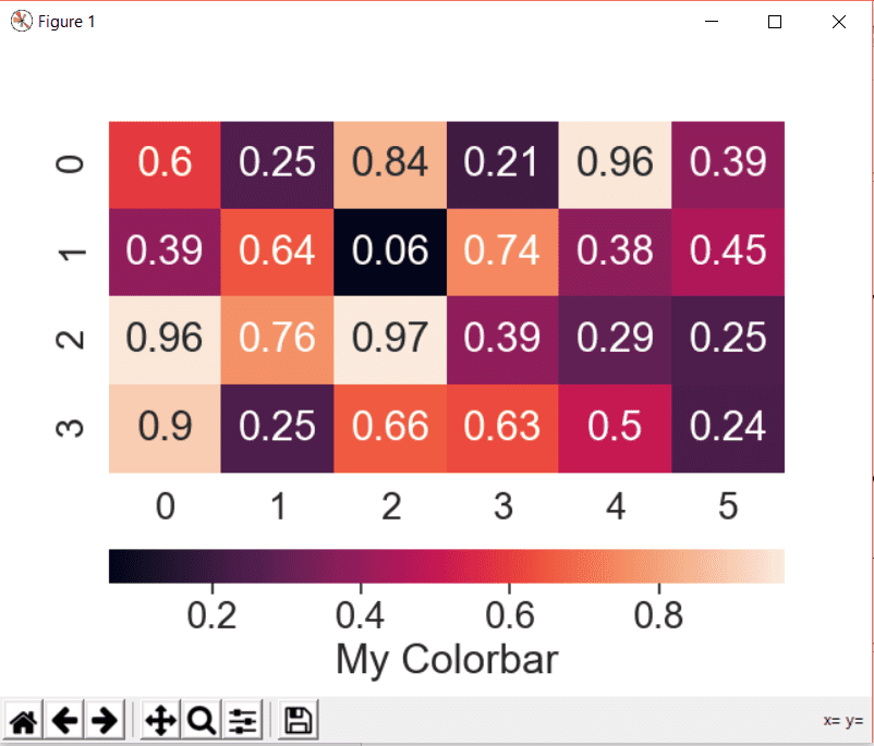
Change heatmap colorbar font size
If we need to change the font size of all the components of seaborn, you can use the font_scale attribute of Seaborn.
Let’s set the scale to 1.8 and compare a scale 1 with 1.8:
>>> sb.set(font_scale=1.8)

>>> heat_map = sb.heatmap(data, annot=True, cbar_kws={'label': 'My Colorbar', 'orientation': 'horizontal'})

>>> plt.show()
This result for scale 1:
And the scale of 1.8 will look like this:
Change the rotation of tick axis
We can change the tick labels rotation by using the rotation attribute of the required ytick or xtick labels.
First, we define the heatmap like this:
>>> heat_map = sb.heatmap(data)

>>> plt.show()
This is a regular plot with random data as defined in the earlier section.
Notice the original yticklabels in the following image:
To rotate them, we will first get the yticklabels of the heatmap and then set the rotation to 0:
>>> heat_map.set_yticklabels(heat_map.get_yticklabels(), rotation=0)
In the set_yticklabels, we passed two arguments. The first one gets the yticklabels of the heatmap and the second one sets the rotation. The result of the above line of code will be as follows:
The rotation attribute can be any angle:
>>> heat_map.set_yticklabels(heat_map.get_yticklabels(), rotation=35)

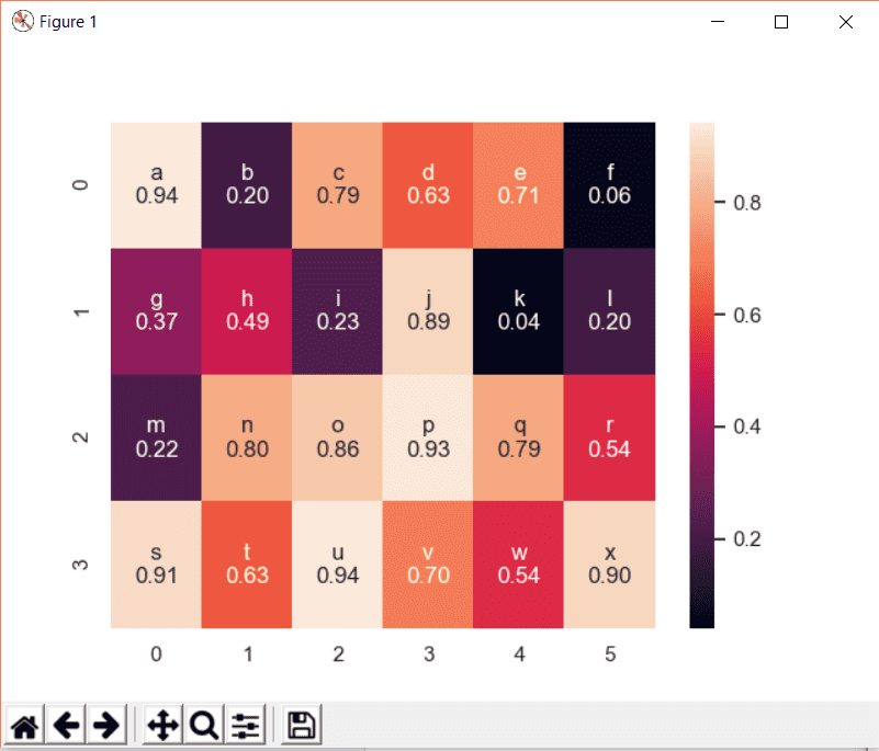
Add text and values on the heatmap
In the earlier section, we only added values on the heatmap. In this section, we will add values along with the text on the heatmap.
Consider the following example:
Create random test data:
>>> data = np.random.rand(4, 6)
Now create an array for the text that we will write on the heatmap:
>>> text = np.asarray([['a', 'b', 'c', 'd', 'e', 'f'], ['g', 'h', 'i', 'j', 'k', 'l'], ['m', 'n', 'o', 'p', 'q', 'r'], ['s', 't', 'u', 'v', 'w', 'x']])
Now we have to combine the text with the values and add the result onto heatmap as a label:
>>> labels = (np.asarray(["{0}\n{1:.2f}".format(text,data) for text, data in zip(text.flatten(), data.flatten())])).reshape(4,6)
Okay, so here we passed the data in the text array and in the data array and then flatten both arrays into simpler text and zip them together. The resultant is then reshaped to create another array of the same size which now contains both text and data.
variable will be added to heatmap using annot:
>>> heat_map = sb.heatmap(data, annot=labels, fmt='')
The attribute fmt is a string which should be added when adding annotation other than True and False.
On plotting this heatmap, the result will be as follows:
Working with seaborn heatmaps is very easy. I hope you find the tutorial useful.
Recommended Reading
☞ Is your Django app slow? Think like a data scientist, not an engineer
☞ Python project: 3D chess in augmented reality
☞ 5 Common Python Mistakes and How to Fix Them
☞ Build & Deploy A Python Web App | Flask, Postgres & Heroku
☞ Snake Game with python curses (new features)
☞ Django 2 Ajax CRUD with Python 3.7 and jQuery
☞ How to Program a GUI Application (with Python Tkinter)
Thank you.
#python