How To Code A Dynamic Header In Flutter
Originally published by Gaspard Merten at https://medium.com
Something very stylish those days is to have a responsive header in your ListView! And here is how to code it.
What does our goal looks like:
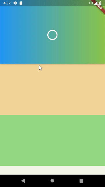
Our goal!
So here is what we will do today. As you can see the header is first extended but then as the user scrolls, it is reduced until it gets to its minimal size.
But that’s not all, there is also the CircularProgressIndicator that displays the current extent of the header.
And finally, you have the gradient that changes whenever the user scrolls.
What we are going to use:
A little disclaimer: we are not going to use a ListView but a CustomScrollView!
The ListView widget is very useful whenever you want to display a simple list of widgets! The thing is that whenever you want to do something more complex, you will be limited by the possibility of the ListView!
That is why we have the CustomScrollView widget! It allows you to create custom scrolling effects, such as lists, grids, and expanding headers!
If you just want to have a dynamicAppBar you should use the SliverAppBar widget! Here is a video about it:
The CustomScrollView is only a container for slivers. The slivers that we are going to use are the SliverPersistentHeader and the SliverList !
The SliverPersistenetHeader is the sliver that allows us to create a dynamic header while the SliverList is just used to display a list of containers!
What…Just show us the code:
Now let’s see what the code looks like!
class MyWidget extends StatelessWidget {
  @override
  Widget build(BuildContext context) {
    return Scaffold(
        body: Container(
            child: CustomScrollView(
              slivers: <Widget>[
                SliverPersistentHeader(
                  pinned: true,
                  delegate: MyDynamicHeader(),
                ),
                SliverList(
                    delegate: SliverChildBuilderDelegate((BuildContext context, int index) {
                      return Container(
                        height: 200,
                        color: Color(Random().nextInt(0xffffffff)),
                      );
                    },
                    )
                )
              ],
            )
        )
    );
  }
}

class MyDynamicHeader extends SliverPersistentHeaderDelegate {
  int index = 0;

  @override
  Widget build(BuildContext context, double shrinkOffset, bool overlapsContent) {
    return LayoutBuilder(
        builder: (context, constraints) {
          final Color color = Colors.primaries[index];
          final double percentage = (constraints.maxHeight - minExtent)/(maxExtent - minExtent);

          if (++index > Colors.primaries.length-1)
            index = 0;

          return Container(
            decoration: BoxDecoration(
                boxShadow: [BoxShadow(blurRadius: 4.0, color: Colors.black45)],
                gradient: LinearGradient(
                    colors: [Colors.blue, color]
                )
            ),
            height: constraints.maxHeight,
            child: SafeArea(
                child: Center(
                  child: CircularProgressIndicator(
                    value: percentage,
                    valueColor: AlwaysStoppedAnimation<Color>(Colors.white),
                  ),
                )
            ),
          );
        }
    );
  }

  @override
  bool shouldRebuild(SliverPersistentHeaderDelegate _) => true;

  @override
  double get maxExtent => 250.0;

  @override
  double get minExtent => 80.0;
}
So as you can see and as I said it before, the two slivers are contained by the CustomScrollView widget! As you can see we *must *configure those two silvers with delegates! The one for the SliverList is pretty simple and looks like the .builder constructor of the ListView! But the other one is already way more complex! There is no default delegate that you could simply use, instead of that you must create your own SliverPersistentHeaderDelegate!
There are four important things in our MyDynamicHeader class:
- The maxExtent getter is the maximal size for your header.
- The minExtent getter is the minimal size for your header.
- The shouldRebuild method should always be true in this example but for some reason, you could sometimes return false.
- The build method returns the widget that you want to display, you have access to the double shrinkOffset which tells you the current amount by which the sliver has been shrunk and the boolean overlapsContent just tells you if some other sliver is going to be rendered beneath this one.
Now as you can see I am using a LayoutBuilder to get the current height that is available but you could just use the shrinkOffset to do so.
Thanks for reading ❤
#flutter #mobile-apps #dart #ios