How to Create Pixel Art with CSS
Designing pixel art using CSS is a fun and challenging way to create unique and interesting images. Let's design intricate and visually appealing pixel art directly in your web browser with CSS.
Pixel art has captured the hearts of many with its nostalgic appeal and retro aesthetics. Pixelated graphics have become increasingly popular in web design, gaming, and digital art.
While creating pixel art typically involves using specialized software, you can also use CSS to create stunning pixel art! In this article, we’ll take a look at how to create pixel art using CSS.
We will cover:
- How pixel art works in CSS
- Using the
divmethod to create CSS pixel art - Understanding the
box-shadowproperty - Creating a pixel in CSS
- Exploring a simple example of CSS pixel art
- Adding a little animation
- Adding colors and complexity to our CSS pixel art
- Scaling our pixel art
You can view the code for all our examples in this CodePen collection. Let’s get started.
How pixel art works in CSS
The logic behind CSS pixel art is quite simple. What we need is a canvas to paint in our pixels. Our canvas will be in the form of a grid. The size of the grid will depend on the design and resolution of the pixel art you want to create.
For example, we could create a nine-by-eight grid totaling 72 pixels or a perfect eight-by-eight square grid totaling 64 pixels. Once we create the grid, all we need to do is paint the pixels with our desired color to form an image.
Using the div method to create CSS pixel art
One way to create pixel art in CSS is by creating two div elements. One div will act as a container for our canvas. The other will act as a container for our pixels and can be duplicated as much as we want to represent each pixel.
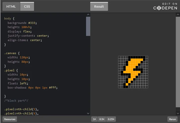
Let’s take a look at an example by creating a lightning bolt shape. We’ll create a 12×13 grid and then paint it to form our lightning bolt pixel art. We’ll start by creating our div:
<div class="canvas">
      <div class="pixel one"></div>
      <div class="pixel"></div>
      <div class="pixel"></div>
      <div class="pixel"></div>
      <div class="pixel"></div>
      <div class="pixel"></div>
      <div class="pixel"></div>
      <div class="pixel"></div>
      <div class="pixel"></div>
      <div class="pixel"></div>
      <div class="pixel"></div>
      <div class="pixel"></div>
      <div class="pixel"></div>
      <div class="pixel"></div>
      <div class="pixel"></div>
      <div class="pixel"></div>
      <div class="pixel"></div>
      <div class="pixel"></div>
      <div class="pixel"></div>
      <div class="pixel"></div>
      <div class="pixel"></div>
      <div class="pixel"></div>
      <div class="pixel"></div>
      <div class="pixel"></div>
      <div class="pixel"></div>
      <div class="pixel"></div>
      <div class="pixel"></div>
      <div class="pixel"></div>
      <div class="pixel"></div>
      <div class="pixel"></div>
      <div class="pixel"></div>
      <div class="pixel"></div>
      <div class="pixel"></div>
      <div class="pixel"></div>
      <div class="pixel"></div>
      <div class="pixel"></div>
      <div class="pixel"></div>
      <div class="pixel"></div>
      <div class="pixel"></div>
      <div class="pixel"></div>
      <div class="pixel"></div>
      <div class="pixel"></div>
      <div class="pixel"></div>
      <div class="pixel"></div>
      <div class="pixel"></div>
      <div class="pixel"></div>
      <div class="pixel"></div>
      <div class="pixel"></div>
      <div class="pixel"></div>
      <div class="pixel"></div>
      <div class="pixel"></div>
      <div class="pixel"></div>
      <div class="pixel"></div>
      <div class="pixel"></div>
      <div class="pixel"></div>
      <div class="pixel"></div>
      <div class="pixel"></div>
      <div class="pixel"></div>
      <div class="pixel"></div>
      <div class="pixel"></div>
      <div class="pixel"></div>
      <div class="pixel"></div>
      <div class="pixel"></div>
      <div class="pixel"></div>
      <div class="pixel"></div>
      <div class="pixel"></div>
      <div class="pixel"></div>
      <div class="pixel"></div>
      <div class="pixel"></div>
      <div class="pixel"></div>
      <div class="pixel"></div>
      <div class="pixel"></div>
      <div class="pixel"></div>
      <div class="pixel"></div>
      <div class="pixel"></div>
      <div class="pixel"></div>
      <div class="pixel"></div>
      <div class="pixel"></div>
      <div class="pixel"></div>
      <div class="pixel"></div>
      <div class="pixel"></div>
      <div class="pixel"></div>
      <div class="pixel"></div>
      <div class="pixel"></div>
      <div class="pixel"></div>
      <div class="pixel"></div>
      <div class="pixel"></div>
      <div class="pixel"></div>
      <div class="pixel"></div>
      <div class="pixel"></div>
      <div class="pixel"></div>
      <div class="pixel"></div>
      <div class="pixel"></div>
      <div class="pixel"></div>
      <div class="pixel"></div>
      <div class="pixel"></div>
      <div class="pixel"></div>
      <div class="pixel"></div>
      <div class="pixel"></div>
      <div class="pixel"></div>
      <div class="pixel"></div>
      <div class="pixel"></div>
      <div class="pixel"></div>
      <div class="pixel"></div>
      <div class="pixel"></div>
      <div class="pixel"></div>
      <div class="pixel"></div>
      <div class="pixel"></div>
      <div class="pixel"></div>
      <div class="pixel"></div>
      <div class="pixel"></div>
      <div class="pixel"></div>
      <div class="pixel"></div>
      <div class="pixel"></div>
      <div class="pixel"></div>
      <div class="pixel"></div>
      <div class="pixel"></div>
      <div class="pixel"></div>
      <div class="pixel"></div>
      <div class="pixel"></div>
      <div class="pixel"></div>
      <div class="pixel"></div>
      <div class="pixel"></div>
      <div class="pixel"></div>
      <div class="pixel"></div>
      <div class="pixel"></div>
      <div class="pixel"></div>
      <div class="pixel"></div>
      <div class="pixel"></div>
      <div class="pixel"></div>
      <div class="pixel"></div>
      <div class="pixel"></div>
      <div class="pixel"></div>
      <div class="pixel"></div>
      <div class="pixel"></div>
      <div class="pixel"></div>
      <div class="pixel"></div>
      <div class="pixel"></div>
      <div class="pixel"></div>
      <div class="pixel"></div>
      <div class="pixel"></div>
      <div class="pixel"></div>
      <div class="pixel"></div>
      <div class="pixel"></div>
      <div class="pixel"></div>
      <div class="pixel"></div>
      <div class="pixel"></div>
      <div class="pixel"></div>
      <div class="pixel"></div>
      <div class="pixel"></div>
      <div class="pixel"></div>
      <div class="pixel"></div>
      <div class="pixel"></div>
      <div class="pixel"></div>
      <div class="pixel"></div>
      <div class="pixel"></div>
    </div>
As described earlier, when using this method, we need to create two div elements. One acts as our container and the other is duplicated 72 times to represent each pixel. Add the styling to set up our pixel art canvas:
body {
  background: #333;
  height: 100vh;
  display: flex;
  justify-content: center;
  align-items: center;
}

.canvas {
  width: 90px;
  height: 80px;

}

.pixel {

  width: 10px;
  height: 10px;
  float: left;
  box-shadow: 0px 0px 1px #fff;

}
Moving on to painting our pixels:
body {
  background: #333;
  height: 100vh;
  display: flex;
  justify-content: center;
  align-items: center;
}

.canvas {
  width: 120px;
  height: 80px;
}
.pixel {
  width: 10px;
  height: 10px;
  float: left;
  box-shadow: 0px 0px 1px #fff;

}
/*black part*/

.pixel:nth-child(5),
.pixel:nth-child(6),
.pixel:nth-child(7),
.pixel:nth-child(8),
.pixel:nth-child(9),
.pixel:nth-child(10),
.pixel:nth-child(11),
.pixel:nth-child(17),
.pixel:nth-child(23),
.pixel:nth-child(28),
.pixel:nth-child(34),
.pixel:nth-child(40),
.pixel:nth-child(45),
.pixel:nth-child(51),
.pixel:nth-child(56),
.pixel:nth-child(63),
.pixel:nth-child(67),
.pixel:nth-child(68),
.pixel:nth-child(69),
.pixel:nth-child(70),
.pixel:nth-child(74),
.pixel:nth-child(82),
.pixel:nth-child(86),
.pixel:nth-child(87),
.pixel:nth-child(88),
.pixel:nth-child(89),
.pixel:nth-child(93),
.pixel:nth-child(101),
.pixel:nth-child(104),
.pixel:nth-child(112),
.pixel:nth-child(115),
.pixel:nth-child(124),
.pixel:nth-child(126),
.pixel:nth-child(135),
.pixel:nth-child(137),
.pixel:nth-child(147),
.pixel:nth-child(148)
{
  background: black;
}

/*yellowpart*/

.pixel:nth-child(18),
.pixel:nth-child(19),
.pixel:nth-child(20),
.pixel:nth-child(21),
.pixel:nth-child(22),
.pixel:nth-child(29),
.pixel:nth-child(30),
.pixel:nth-child(31),
.pixel:nth-child(32),
.pixel:nth-child(33),
.pixel:nth-child(41),
.pixel:nth-child(42),
.pixel:nth-child(43),
.pixel:nth-child(44),
.pixel:nth-child(52),
.pixel:nth-child(53),
.pixel:nth-child(54),
.pixel:nth-child(55),
.pixel:nth-child(64),
.pixel:nth-child(65),
.pixel:nth-child(66),
.pixel:nth-child(75),
.pixel:nth-child(76),
.pixel:nth-child(77),
.pixel:nth-child(78),
.pixel:nth-child(79),
.pixel:nth-child(80),
.pixel:nth-child(81),
.pixel:nth-child(90),
.pixel:nth-child(91),
.pixel:nth-child(92),
.pixel:nth-child(102),
.pixel:nth-child(103),
.pixel:nth-child(113),
.pixel:nth-child(114),
.pixel:nth-child(125),
.pixel:nth-child(136)

{
  background: orange;
}
In the code above, we’re using the :nth-child CSS selector to target our pixels. The :nth-child selector selects a pixel at a specific position within the canvas and gives it a background color of either yellow or black.
Here’s our result:
Another method we’ll take a look at is the box-shadow property. Let’s go over this CSS property and learn to create pixel art with it.
Understanding the box-shadow property
The box-shadow CSS property can be used to add a shadow to an element, as you can see in this screenshot of a box-shadow property demo from the MDN docs:
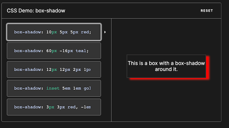
The shadow is defined by four values:
- Horizontal offset — Specifies the horizontal position of the shadow
- Increasing the value will shift the element toward the right
- Decreasing the value will shift the element toward the left
- Vertical offset — Specifies the vertical position of the shadow
- A positive value will move the element downwards
- A negative value will move the element upwards
- Blur radius — Specifies the amount of blur applied to the shadow
- Spread radius — Specifies how much the shadow is spread beyond the element’s border
The box-shadow property is quite helpful in making pixel art using CSS. It allows designers to precisely position and style individual pixels, forming a grid-like pattern with each pixel having a shadow effect.
By adjusting properties like offset values, blur radius, and color, designers can create intricate pixel art designs, imitating the appearance of handcrafted pixel art. This technique is widely used in creating icons, game visuals, and retro-themed websites.
The grid-based nature of pixel art aligns perfectly with the box-shadow property, as it enables designers to create pixel-perfect designs without compromising visual integrity.
Each pixel can be represented as a box or a specific element. Then, by applying a box shadow to each element, we can create the illusion of depth and texture.
Let’s try it out!
Creating a pixel in CSS
To create a pixel in CSS, follow these steps:
- Create a
divelement - Set the width and height of the
div - Set the background color of the
divto the desired color - Add a box shadow to the
div
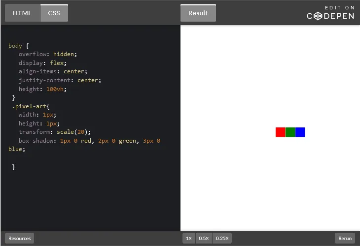
One cool thing about the box-shadow property is that it allows you to add multiple box-shadows separated by a comma. This ability is what allows us to create pixel art with CSS. See the example below:
body {
   overflow: hidden;
   display: flex;
   align-items: center;
   justify-content: center;
   height: 100vh;
 }
 .pixel-art{
   width: 1px;
   height: 1px;
   transform: scale(20);
   box-shadow: 1px 0 red, 2px 0 green, 3px 0 blue;

 }
The code above would result in the following three simple pixels of different colors in a row:
Let’s use what we’ve learned so far to actually build some pixel art.
Exploring a simple example of CSS pixel art
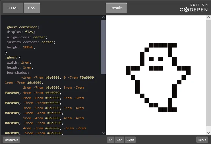
Let’s create a simple ghost pixel art design. We’ll start by creating our HTML markup like so:
<div class="ghost-container">
    <div class="ghost"></div>
</div>
The .ghost-container acts as our container for our pixel art, and we are wrapping our .ghost element inside it. However, you can choose not to do that and only write the .ghost instead. Whichever one you prefer is fine.
Now, let’s move on to the CSS part, where we’ll be focusing on our main work. First, we need to style our .ghost-container:
.ghost-container{
 display: flex;
 align-items: center;
 justify-content: center;
 height: 100vh;
}
If you’re just using the .ghost, then all you have to do is change the .ghost-container to body like so:
body {
 display: flex;
 align-items: center;
 justify-content: center;
 height: 100vh;
}
Both code blocks above essentially achieve the same result — centering the container both vertically and horizontally. We set the display property to flex, enabling a Flexbox layout for this class’s elements.
The align-items property centers the items vertically within the container, while the justify-content property centers the items horizontally. The height property — 100vh — sets the height of the container to occupy 100 percent of the viewport’s height.
The next step is to draw our pixel art. We’ll start by creating the original block and then move on to adding multiple box-shadow values:
.ghost {
 width: 1rem;
 height: 1rem;
}
Note that we are using the rem relative length unit in our example.
We create a square-shaped pixel by making the element’s width and height 1rem each. When each element is the same size — in this case, 1rem — we ensure that each shadow corresponds exactly to one unit or block on the grid.
This gives us precise control over the position and appearance of each pixel in our art. We can confidently arrange and align the pixels, even when creating intricate designs or patterns.
Finally, let’s add in all of our box-shadow values:
.ghost {
width: 1rem;
height: 1rem;
box-shadow:
box-shadow:
-1rem -7rem #0e0909, 0 -7rem #0e0909, 1rem -7rem #0e0909,
2rem -7rem #0e0909, 3rem -7rem #0e0909, 4rem -7rem #0e0909,
-2rem -6rem #0e0909, 3rem -6rem #0e0909, -3rem -5rem#0e0909,
3rem -5rem #0e0909,-3rem -4rem #0e0909, -1rem -4rem #0e0909,
1rem -4rem #0e0909, 4rem -4rem #0e0909, -3rem -3rem #0e0909,
4rem -3rem #0e0909, -6rem -2rem #0e0909, -5rem -2rem #0e0909,
-4rem -2rem #0e0909, -1rem -2rem #0e0909, 0 -2rem #0e0909,
1rem -2rem #0e0909, 5rem -2rem #0e0909, 6rem -2rem #0e0909,
7rem -2rem #0e0909, -6rem -1rem #0e0909, 7rem -1rem #0e0909,
-5rem 0 #0e0909, 6rem 0 #0e0909, -4rem 1rem #0e0909,
5rem 1rem #0e0909, -4rem 2rem #0e0909, 4rem 2rem #0e0909,
-4rem 3rem #0e0909,4rem 3rem #0e0909, -3rem 4rem #0e0909,
4rem 4rem #0e0909, -2rem 5rem #0e0909,3rem 5rem #0e0909,
-1rem 6rem #0e0909, 0 6rem #0e0909, 3rem 6rem #0e0909,
1rem 7rem #0e0909, 2rem 7rem #0e0909, 3rem 7rem #0e0909,
4rem 7rem #0e0909;
}
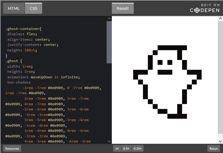
}Here’s our result:
As you noticed, our ghost is just static and isn’t scaring anyone. Let’s add a little animation to it just to make our pixel art move upwards and downwards.
Adding a little animation
To animate our ghost pixel art, we’ll use the animation CSS property, which needs @keyframes. So, we need to first create a keyframe for the ghost’s movement:
@keyframes moveUpDown {
   0% {
       transform: translateY(0);
   }

   50% {
       transform: translateY(-10px);
   }

   100% {
       transform: translateY(0);
   }
}
In the code above, we have three keyframes defined: 0%, 50%, and 100%. Each keyframe represents a specific point in time during the animation.
At the beginning of the animation — the 0% keyframe — the element is set to its initial state with no transformation applied. The transform: translateY(0); property ensures that the element remains in its original vertical position.
At the halfway point of the animation — the 50% keyframe — the element is translated vertically upward by 10 pixels. This is achieved using the transform: translateY(-10px); property. As a result, the element moves up from its initial position.
Finally, at the end of the animation — the 100% keyframe — the element returns to its original vertical position, back to where it started. The transform: translateY(0); property resets the vertical translation.
Let’s apply this animation inside of our .ghost element:
animation: moveUpDown 2s infinite;Our result:
Let’s create another pixel art example to demonstrate something a little more complicated with different colors.
Adding colors and complexity to our CSS pixel art
In this next example, we’ll create a Superman crest — and yes, I’m a DC fan 😉 This example will allow us to explore adding more detail and color when creating pixel art with CSS.
The steps involved in creating our CSS pixel art remain the same. We first have to create our HTML markup:
<div class="crest-container">
<div class="crest"></div>
</div>
Just like our first example, the .crest-container acts as our container for our pixel art, and we are wrapping our .crest element inside it. Let’s move on to the CSS.
The first piece of code we need to write is the .crest-container:
.crest-container{
  position: absolute;
        top: 10%;
        left:30%;
        transform: translate(-50%, -50%);
        width: 6em;
        height: 5em;
}
The code above helps to center our .crest-container on the screen.
Next, we’ll work on our .crest element. We’ll draw our pixels by creating the original block and then move on to adding multiple box-shadow property values:
.crest-container {
   wwidth: 20px;
 height:20px;
   }
Let’s now add our box-shadow property alongside its values to create a pattern that spans our 20×20 grid layout:
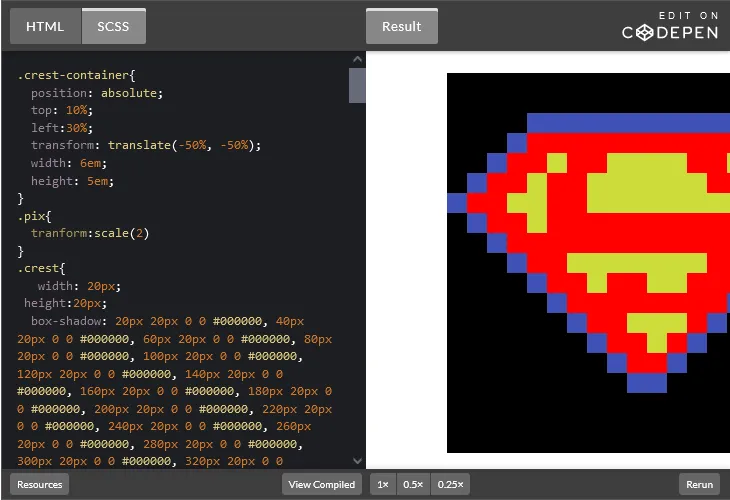
Looks great! But what if we want our pixel art to be bigger or smaller? Let’s see how to scale our pixel art next.
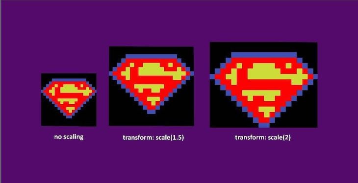
Scaling our pixel art
To scale the pixels in our design, we can use the transform: scale() property in CSS. This property is used to scale an element, making it larger or smaller.
By applying the scale() transformation to our pixel art, you can make the pixels — and as a result, the whole image — appear bigger:
You can also use a value less than 1.0 to make the pixels appear smaller.
Conclusion
Designing pixel art using CSS is a fun and challenging way to create unique and interesting images. Using the box-shadow property and other CSS techniques, you can design intricate and visually appealing pixel art directly in your web browser.
From static images to animated sprites, the techniques covered in this article provide a solid foundation to explore and expand your skills in pixel art. So grab your favorite text editor, unleash your creativity, and start building stunning pixel art with CSS today!
Source: https://blog.logrocket.com
#css