The idea is straightforward, replace numbers with colors.
Now, this visualization style came a long way from simple color-coded tables, it became widely used with geospatial data, and its commonly applied for describing density or intensity of variables, visualize patterns, variance, and even anomalies.
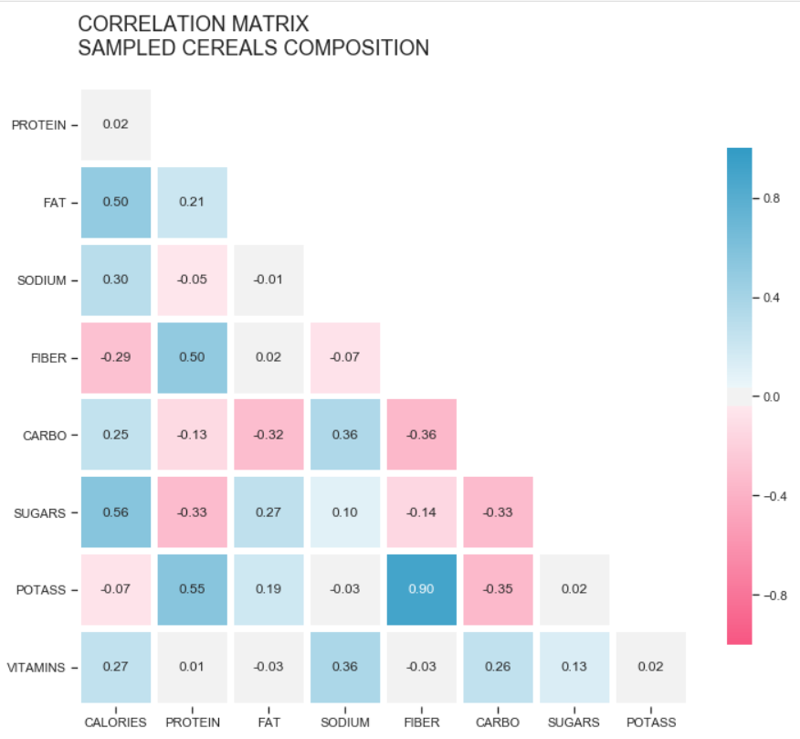
Correlation Matrix — Composition of a sample of Cereals
With so many applications, this elementary method deserves some attention. In this article, we’ll go through the basics of heatmaps, and see how to create them using Matplotlib, and Seaborn.
Hands-on
We’ll use Pandas and Numpy to help us with data wrangling.
import pandas as pd
import matplotlib.pyplot as plt
import seaborn as sb
import numpy as np
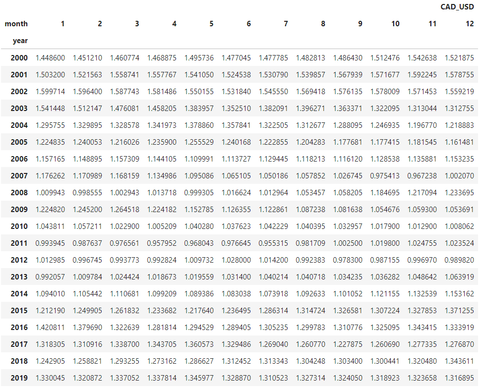
The dataset for this example is a time-series of foreign exchange rates per U.S. dollar.
Instead of the usual line chart to represent the values over time, I want to try visualizing this data with a color-coded table, having the months as columns and the years as rows.
I’ll try sketching both the line chart and the heatmap, to get an understanding of this will look.
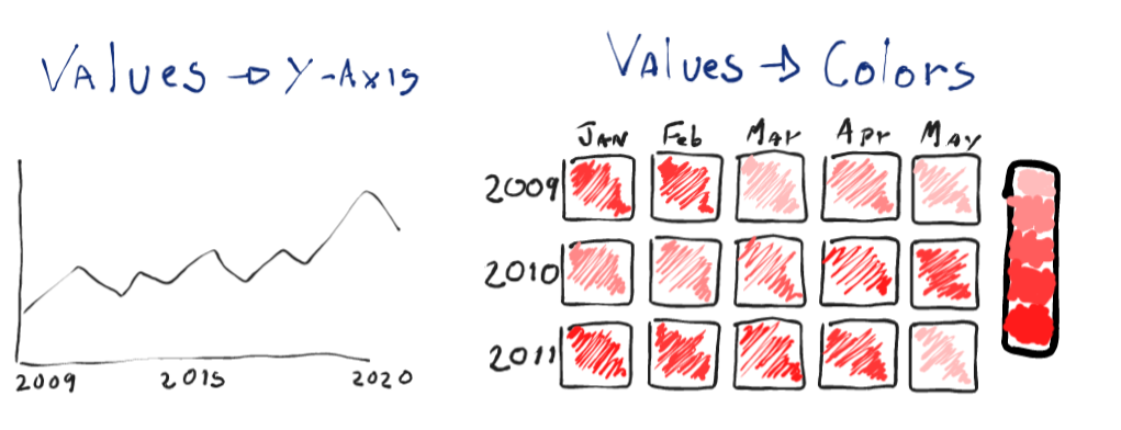
Line charts would be more effective in displaying the data; it’s easier to compare how higher a point is in the line than it is to distinguish colors.
Heatmaps will have a higher impact as they are not the conventional way of displaying this sort of data, they’ll lose some accuracy, especially in this case, since we’ll need to aggregate the values in months. But overall, they would still be able to display patterns and summarize the periods in our data.
Let’s read the dataset and rearrange the data according to the sketch.
# read file
df = pd.read_csv('data/Foreign_Exchange_Rates.csv',
                 usecols=[1,7], names=['DATE', 'CAD_USD'],
                 skiprows=1, index_col=0, parse_dates=[0])
For this example, we’ll use the columns 1 and 7, which are the ‘Time Serie’ and ‘CANADA — CANADIAN DOLLAR/US$’.
Let’s rename those columns to ‘DATE’ and ‘CAD_USD’, and since we’re passing our headers, we also need to skip the first row.
We also need to parse the first column, so the values are in a DateTime format, and we’ll define the date as our index.
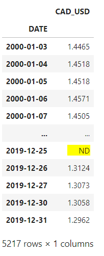
Let’s make sure all our values are numbers, and remove the empty rows as well.
df['CAD_USD'] = pd.to_numeric(df.CAD_USD, errors='coerce')
df.dropna(inplace=True)
We need to aggregate those values by month. Let’s create separate columns for month and year, then we group the new columns and get the mean.
# create a copy of the dataframe, and add columns for month and year
df_m = df.copy()
df_m['month'] = [i.month for i in df_m.index]
df_m['year'] = [i.year for i in df_m.index]
# group by month and year, get the average
df_m = df_m.groupby(['month', 'year']).mean()
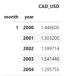
All that’s left to do is unstack the indexes, and we’ll have our table.
df_m = df_m.unstack(level=0)
#heatmap #seaborn #data-science #data-visualization #python