Flutter Responsive UI for Learning Platform App
Flutter Responsive UI | Learning Platform App - Part 1
This video mainly focuses on making the simplest layout working on multiple devices, portrait, and landscape orientation. And, you will learn tips and tricks to create consistent and responsive Flutter UI.
Flutter Responsive UI | Learning Platform App - Part 2
In this video, you will more about responsive layouts using multiple layout structures for various screen resolutions and configurations.
A lot many people don’t have time to watch the full video, it is better to write an article explaining the core concepts and thought process behind code.
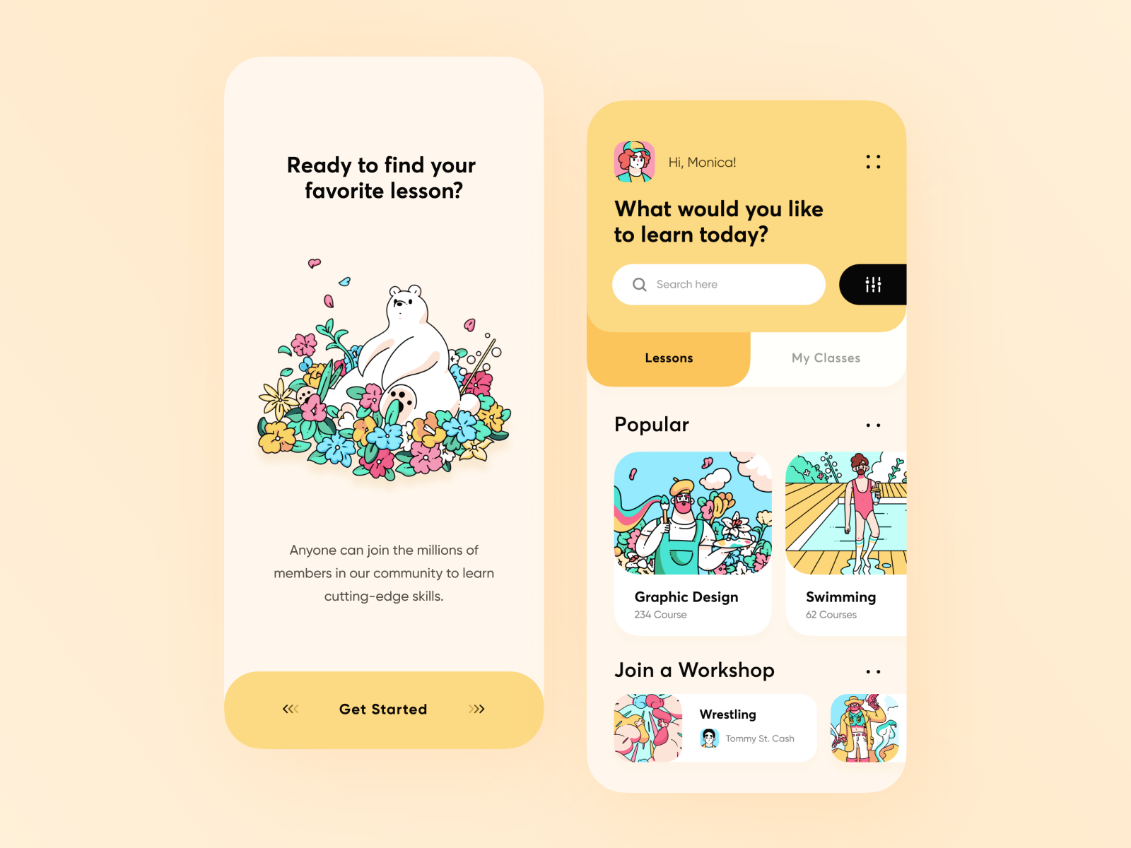
The Design
When I came across this design and found appropriate to explain how to create responsive layouts using Flutter SDK.
What’s the Problem?
When we talk about Flutter, we consider the amazing fact that with Flutter we write code once and run on any platform(Android, iOS, Web, Desktop, Embedded, any many more to come…). This impresses and makes you move to Flutter, no matter which mobile platform you come from.
But, how many times has it happened that you have created a screen for iPhone XS and when you run it on Android Phones, you see the most famous exception — RenderFlowException, because the sizes like 24.0, 16.0, etc. that worked for iPhone doesn’t render exactly for Android. This is because both the hardware have different screen configurations like devicePixelRatio and many others.
What is the End Result?
Well, the end product is — we need a codebase that handles portrait, the landscape for mobile and tablets and multiple mobile phone resolutions. Now, when you are targeting these many devices you already covered Desktop and Web.
How to Achieve this?
Here, in this article, I am trying to cover possible solutions but do not forget to check out the official documentation of Flutter, which covers the responsive widgets that can help in creating the ultimate layout. But, there are some more hacks that you need to use to solve our problem.
- Strategy -1 Use a mechanism where text and image sizes can be changed based on the width, height, and orientation of the screen. I am obliged to mention the post from Daniele Cambi for his article on using the width and height of the screen to decide the text multipliers, which will make text sizes to not grow or shrink when there is a small screen size phone.
- Strategy -2 Provide two or more layouts for portrait, landscape and also considering the width of the screen.
Let’s Begin !!! (Strategy — 1 )
I have created a very simple welcome screen mostly dealing with Column, Row and Expanded widgets. We need to have size_config.dart which will give us some multipliers like imageSizeMultiplier, textMultiplier, heightMultiplier, widthMultiplier . These all have meaningful names, that you can easily understand.
class SizeConfig {
  static double _screenWidth;
  static double _screenHeight;
  static double _blockSizeHorizontal = 0;
  static double _blockSizeVertical = 0;

  static double textMultiplier;
  static double imageSizeMultiplier;
  static double heightMultiplier;
  static double widthMultiplier;
  static bool isPortrait = true;
  static bool isMobilePortrait = false;

  void init(BoxConstraints constraints, Orientation orientation) {
    if (orientation == Orientation.portrait) {
      _screenWidth = constraints.maxWidth;
      _screenHeight = constraints.maxHeight;
      isPortrait = true;
      if (_screenWidth < 450) {
        isMobilePortrait = true;
      }
    } else {
      _screenWidth = constraints.maxHeight;
      _screenHeight = constraints.maxWidth;
      isPortrait = false;
      isMobilePortrait = false;
    }

    _blockSizeHorizontal = _screenWidth / 100;
    _blockSizeVertical = _screenHeight / 100;

    textMultiplier = _blockSizeVertical;
    imageSizeMultiplier = _blockSizeHorizontal;
    heightMultiplier = _blockSizeVertical;
    widthMultiplier = _blockSizeHorizontal;
  }
}
You need an entry point for SizeConfig to be initialized. For me, it will be when you load your first widget.
void main() => runApp(MyApp());

class MyApp extends StatelessWidget {
  @override
  Widget build(BuildContext context) {
    return LayoutBuilder(
      builder: (context, constraints) {
        return OrientationBuilder(
          builder: (context, orientation) {
            SizeConfig().init(constraints, orientation);
            return MaterialApp(
              title: 'Learning Platform Application',
              theme: AppTheme.lightTheme,
              home: WelcomeScreen(),
            );
          },
        );
      },
    );
  }
}
Whenever there is layout change or orientation change, we can get new values for
textMultiplier,imageMultiplier,heightMultiplierandwidthMultiplier.
In the above code, if we are in landscape mode, maxHeight it becomes screen width and maxWidth becomes the screen height. _blockSizeWidth and _blocSizeHeight are the width and height of the block which is 1/100th of the screen.
It’s all up to you to decide when you consider the width of the screen to be mobile’s screen or any other screen. Here, in my case, I have considered the tablet’s portrait and landscape to be landscape category and mobile as portrait only when the screen width is less than 450.
Text Multiplier
Let us assume the textMultiplier is 8.01234… something. So, you have to first use the Text widget for one mobile size you usually work on and see what font size looks good (apart from the fact many companies have designers tell you that). Suppose the fontSize is 24, then divide fontSize by textMultiplier, let’s call this X. X is the number that multiplied with textMultiplier will give the required fontSize for every possible screen out there.
Not to forgot, FittedBox is not wrong to use while using
textMultiplier. I have used a combination of both. It depends on how much space Text has to Fit.
I recommend using ThemeData, TextTheme, and TextStyles in styling.dart as I did for this project.
class AppTheme {
  AppTheme._();

  static const Color appBackgroundColor = Color(0xFFFFF7EC);
  static const Color subTitleTextColor = Color(0xFF9F988F);

  static final ThemeData lightTheme = ThemeData(
    scaffoldBackgroundColor: AppTheme.appBackgroundColor,
    brightness: Brightness.light,
    textTheme: lightTextTheme,
  );

  static final ThemeData darkTheme = ThemeData(
    scaffoldBackgroundColor: Colors.black,
    brightness: Brightness.dark,
    textTheme: darkTextTheme,
  );

  static final TextTheme lightTextTheme = TextTheme(
    title: _titleLight,
    subtitle: _subTitleLight,
    button: _buttonLight,
    display1: _greetingLight,
    display2: _searchLight,
  );

  static final TextTheme darkTextTheme = TextTheme(
    title: _titleDark,
    subtitle: _subTitleDark,
    button: _buttonDark,
    display1: _greetingDark,
    display2: _searchDark,
  );

  static final TextStyle _subTitleLight = TextStyle(
    color: subTitleTextColor,
    fontSize: 2 * SizeConfig.textMultiplier,
    height: 1.5,
  );

  static final TextStyle _subTitleDark = _subTitleLight.copyWith(color: Colors.white70);
}
Image Size Multiplier
Like textMultiplier, imageSizeMultiplier will be used which will scale images according to the screen size.
I
magecan also be made responsive to a certain limit by usingAspectRatio,BoxFitbut again it depends on the space it has to grow and shrink
Certainly, in the project, I required imageMultiplier for Icons and not the Image as I wanted the image to take maximum size possible because it is in Expanded widget. Have a look at the two code snippets below.
Expanded(
  flex: 3,
  child: Padding(
    padding: EdgeInsets.symmetric(vertical: 1 * SizeConfig.heightMultiplier),
    child: Image.asset(
      Images.homeImage,
      fit: BoxFit.fill,
    ),
  ),
)
Expanded(
  flex: 1,
  child: Icon(
    Icons.chevron_right,
    size: 6 * SizeConfig.imageSizeMultiplier,
  ),
)
Expanded used as Icon parent is in Row to give equal horizontal space.

Height Multiplier & Width Multiplier
As the name suggests, heightMultiplier and widthMultiplier can be used for making paddings, margins, Box Constraints, SizedBox, and alike widgets responsive.
Container(
  constraints: BoxConstraints(minHeight: 6.5 * SizeConfig.heightMultiplier, maxHeight: 7.9 * SizeConfig.heightMultiplier),
  decoration: BoxDecoration(
    borderRadius: BorderRadius.vertical(
      top: Radius.circular(4 * SizeConfig.heightMultiplier),
    ),
    color: AppTheme.topBarBackgroundColor,
  ),
);

FittedBox(
  child: Padding(
    padding: EdgeInsets.only(bottom: 2 * SizeConfig.heightMultiplier),
    child: Text(
      Strings.welcomeScreenSubTitle,
      style: Theme.of(context).textTheme.subtitle,
      textAlign: TextAlign.center,
    ),
  ),
);
Some screenshots after Strategy 1


Strategy — 2
If you come from a web background, there are Media Queries that execute specific CSS based on the dimensions of the screen.
If you come from Android background you know how to create Master-Detail Layout for landscape and List Screen with navigation drawer for Portrait introduced way back in 2011–12.
Both of these use cases come to a conclusion — load different layouts for certain screen sizes and orientations.
Have a look at the responsive widget that can handle multiple layouts.
class ResponsiveWidget extends StatelessWidget {
  final Widget portraitLayout;
  final Widget landscapeLayout;

  const ResponsiveWidget({
    Key key,
    @required this.portraitLayout,
    this.landscapeLayout,
  }) : super(key: key);

  @override
  Widget build(BuildContext context) {
    if (SizeConfig.isPortrait && SizeConfig.isMobilePortrait) {
      return portraitLayout;
    } else {
      return landscapeLayout;
    }
  }
}
This widget has two fields — portraitLayout that is used when the device width is < 450 and orientation is portrait and landscapeLayout that is used when the device’s orientation is landscape.
However, you can have your own criteria based on your app’s case.
Use ResponsiveWidget like below —
Stack(
  children: <Widget>[
    ResponsiveWidget(
      portraitLayout: TopContainerPortrait(),
      landscapeLayout: TopContainerLandscape(),
    ),
  ],
);


If you loved some or the other thing in the article, don’t forget to clap 👏.
#flutter #mobile-apps