Vue Final Modal is a customizable, stackable, detachable and lightweight modal component
Vue Final Modal
Documentation
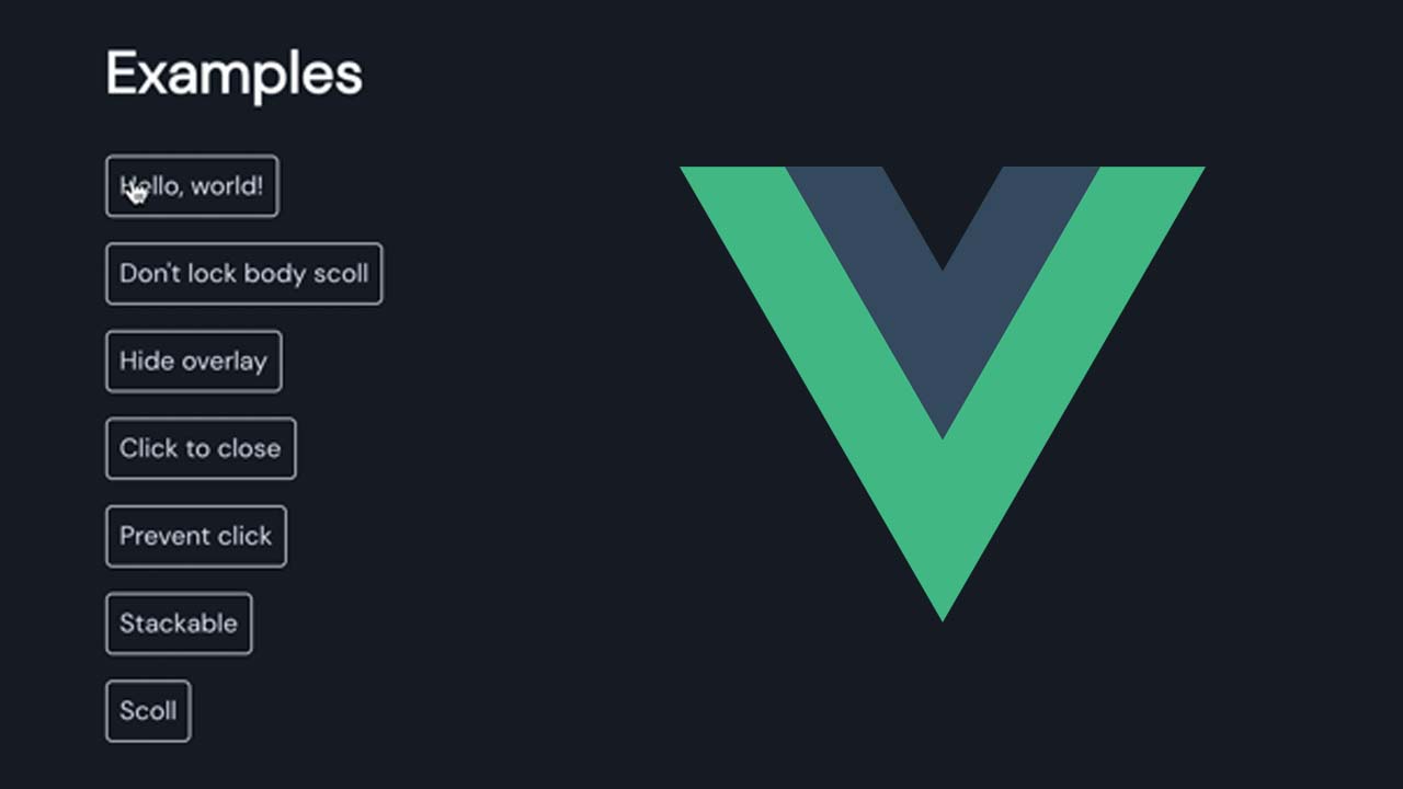
Examples
CDN example
Introduction
features:
- Tailwind CSS friendly
- Renderless component
- SSR support
- Stackable
- Detachable
- Scrollable
- Transition support
- Mobile friendly
- 3.2kb gzipped
vue-final-modal has no predefined styles. There are only three classes inside vue-final-modal, including .vfm__containter, .vfm__content, .vfm__overlay. These classes have only the necessary styles and you can still easily override these styles through these props: classes, content-class, overlay-class
Here is the simplified template of entire vue-final-modal
<div class="vfm">
  <div class="vfm__overlay">
  <div class="vfm__container">
    <div class="vfm__content">
      <slot />
    </div>
  </div>
</div>
Install
NPM:
npm install vue-final-modal --save
Yarn:
yarn add vue-final-modal
How to use
<button @click="showModal = true">Show modal</button>

<vue-final-modal v-model="showModal">
  <button @click="showModal = false">close modal</button>
</vue-final-modal>
import { VueFinalModal } from 'vue-final-modal'

export default {
  components: {
    VueFinalModal,
  },
  data: () => ({
    showModal: false
  })
}
Properties
| Name | Type | Required | Default | Description |
|---|---|---|---|---|
| ssr | Boolean | — | true | use v-show(true) or v-if(false) |
| classes | [String, Object, Array] | — | ‘’ | custom class names for Modal container element |
| contentClass | [String, Object, Array] | — | ‘’ | custom class names for Modal content element |
| lockScroll | Boolean | — | true | whether scroll of body is disabled while Dialog is displayed |
| hideOverlay | Boolean | — | false | Hides the display of the overlay. |
| clickToClose | Boolean | — | true | Clicking outside of the element will not close Modal. |
| preventClick | Boolean | — | false | The click event will not be blocked by overlay |
| overlayClass | String | — | ‘’ | Add classes to the overlay element. |
| transition | String | — | ‘vfm’ | CSS transition applied to the modal window. |
| overlayTransition | String | — | ‘vfm’ | CSS transition applied to the overlay (background). |
| attach | any | — | ‘body’ | Specifies which DOM element that this component should detach to. Set false will disabled this feature. String can be any valid querySelector and Object can be any valid Node. Component will attach to the element by default. |
Slots
| Name | Description |
|---|---|
| content-before | inject an element before content slot |
| content | inject an element has class vfm__content by default |
| - | content of Modal inside slot content |
| content-after | inject an element after content slot |
Events
| Name | Description |
|---|---|
| @before-open | Emits while modal is still invisible, but before transition starting. |
| @opened | Emits after modal became visible and transition ended. |
| @before-close | Emits before modal is going to be closed. |
| @closed | Emits right before modal is destroyed |
Here is template structure:
<div class="vfm__container">
  <slot name="content-before" />
  <slot name="content">
    <div class="vfm__content">
      <slot />
    </div>
  </slot>
  <slot name="content-after" />
</div>
CDN
jsDelivr
<script src="https://cdn.jsdelivr.net/npm/vue-final-modal"></script>
Unpkg
<script src="https://unpkg.com/vue-final-modal"></script>
Roadmap
If you have any ideas for optimization of vue-final-modal, feel free to open issues or pull request.
These are the features that will be added in the comming weeks:
- draggable modal
- resizable modal
- duplicate overlay property
- dynamic emit modal component with vue directive like:
this.$modal.show('hello-world')this.$modal.hide('hello-world')
- support Vue 3.0
Download Details:
Author: hunterliu1003
Demo: https://hunterliu1003.github.io/vue-final-modal/examples
Source Code: https://github.com/hunterliu1003/vue-final-modal
#vuejs #vue #javascript
24.40 GEEK