Everything You Need to Know to Use CSS Grid Like a Pro
This tutorial discusses everything you need to know to use CSS Grid like a pro. All the CSS Grid tools you need to create basic and advanced website layouts in responsive ways that look great on all devices.
CSS Grid Handbook – Complete Guide to Grid Containers and Grid Items
CSS Grid gives you the tools to create basic and advanced website layouts in responsive ways that look great on mobile, tablet, and desktop devices.
Table of Contents
- What Is CSS Grid?
- Grid Container vs. Grid Item: What's the Difference?
- What Is a
gridValue in CSS? - What Is an
inline-gridValue in CSS? - Properties for Specifying a Grid's Layout
- What Are the Grid Container's Properties?
- What Is CSS Grid's
grid-template-columnsProperty? - What Is CSS Grid's
grid-template-rowsProperty? - What Is CSS Grid's
justify-contentProperty? - What Is CSS Grid's
justify-itemsProperty? - What Is CSS Grid's
align-contentProperty? - What Is CSS Grid's
align-itemsProperty? - What Are the Grid Item's Properties?
- What Is CSS Grid's
justify-selfProperty? - What Is CSS Grid's
align-selfProperty? - What Is CSS Grid's
grid-column-startProperty? - What Is CSS Grid's
grid-column-endProperty? - What Is CSS Grid's
grid-columnProperty? - What Is CSS Grid's
grid-row-startProperty? - What Is CSS Grid's
grid-row-endProperty? - What Is CSS Grid's
grid-rowProperty? - What Is CSS Grid's
grid-areaProperty? - What Is CSS Grid's
grid-template-areasProperty? - How to Use the CSS
minmax()function to Define Minimum and Maximum Grid Sizes - How to Use the CSS
repeat()Function to Define Grid Tracks with Repeated Patterns - Overview
So, without any further ado, let's understand what CSS Grid is.
What is CSS Grid?
The CSS Grid Layout Module makes browsers display the selected HTML elements as grid box models.
Grid allows you to easily resize and reposition a grid container and its items two-dimensionally.
Note:
- "Two-dimensionally" means grid modules allow simultaneous laying out of box models in rows and columns.
- Use Flexbox if you only need to resize and reposition elements one-dimensionally.
Grid Container vs. Grid Item: What's the Difference?
A grid container is an HTML element whose display property's value is grid or inline-grid.
A grid item is any of the direct children of a grid container.
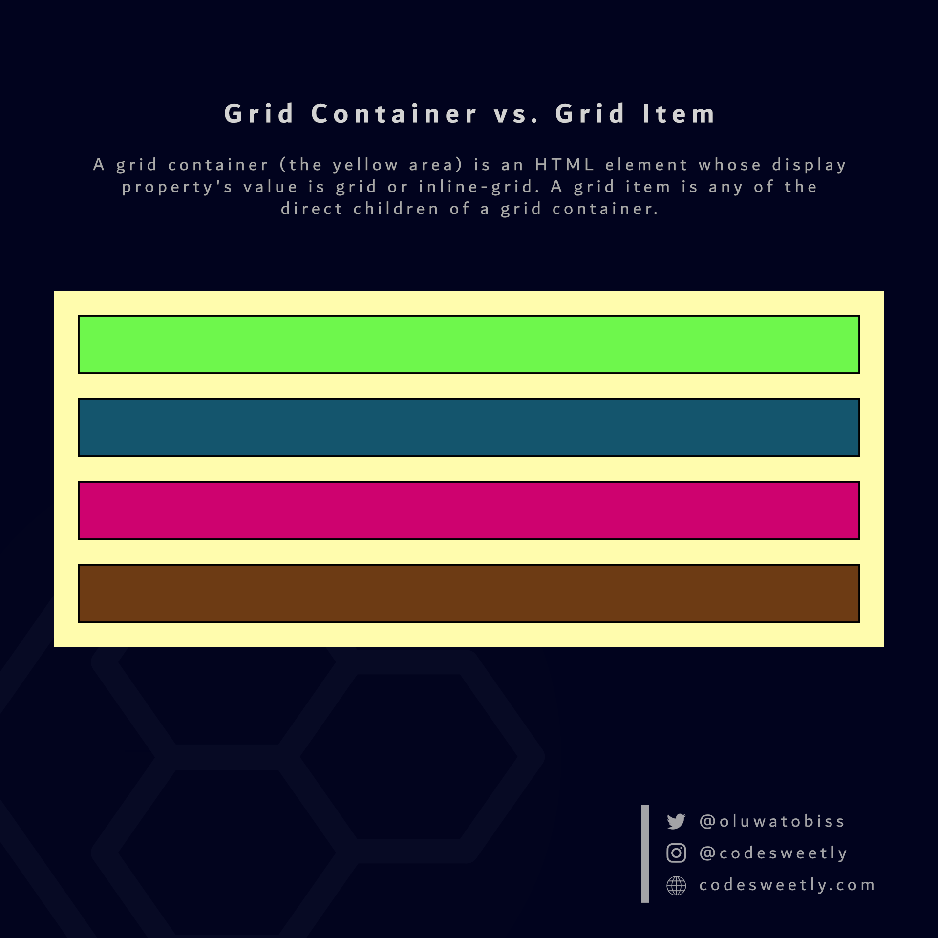
A grid container (the large yellow area in the image) is an HTML element whose display property's value is grid or inline-grid. Grid items (the smaller boxes within the yellow container) are the direct children of a grid container.
What Is a grid Value in CSS?
grid tells browsers to display the selected HTML element as a block-level grid box model.
In other words, setting an element's display property's value to grid turns the box model into a block-level grid layout module.
Here's an example:
section {
  display: grid;
  background-color: orange;
  margin: 10px;
  padding: 7px;
}The snippet above used the grid value to convert the HTML document's <section> elements from regular <section> nodes to block-level grid box models.
Note:
- The
display: griddirective creates only a single-column grid container. Therefore, the grid items will display in the normal layout flow (one item below another). - Converting a node to a grid box model makes the element's direct children become grid items.
- The
display: griddirective only affects a box model and its direct children. It does not affect grandchildren nodes.
Let's now discuss the inline-grid value.
What Is an inline-grid Value in CSS?
inline-grid tells browsers to display the selected HTML element as an inline-level grid box model.
In other words, setting an element's display property's value to inline-grid turns the box model into an inline-level grid layout module.
Here's an example:
section {
  display: inline-grid;
  background-color: orange;
  margin: 10px;
  padding: 7px;
}The snippet above used the inline-grid value to convert the HTML document's <section> elements from regular <section> nodes to inline-level grid box models.
Note:
- Converting a node to a grid box model makes the element's direct children become grid items.
- The
display: inline-griddirective only affects a box model and its direct children. It does not affect grandchildren nodes.
Properties for Specifying a Grid's Layout
On converting a regular HTML element to a grid (or inline-grid) box model, the grid layout module provides two categories of properties for positioning the grid box and its direct children:
- Grid container's properties
- Grid item's properties
What Are the Grid Container's Properties?
A grid container's properties specify how browsers should layout items within the grid box model.
Note: We define a grid container's property on the container, not its items.
The eight (8) types of grid container properties are:
grid-template-columnsgrid-template-rowsgrid-auto-columnsgrid-auto-rowsjustify-contentjustify-itemsalign-contentalign-items
Let's discuss the eight types now.
What Is CSS Grid's grid-template-columns Property?
grid-template-columns specifies the number and widths of columns browsers should display in the selected grid container.
Example 1: How to create a two-column grid container
section {
  display: grid;
  grid-template-columns: 95px 1fr;
  background-color: orange;
  margin: 10px;
  padding: 7px;
}The snippet above used the grid-template-columns property to display two columns of different widths in the selected <section> grid container.
Note: We used the fr (fraction) unit to scale the second column relative to the fraction of available space in the grid container.
Example 2: How to create a three-column grid container
section {
  display: grid;
  grid-template-columns: 15% 60% 25%;
  background-color: orange;
  margin: 10px;
  padding: 7px;
}The snippet above used the grid-template-columns property to display three columns of different widths in the selected <section> grid container.
Note:
- You can use the
grid-auto-columnsproperty to specify default column widths for all the grid container's columns. For instance,grid-auto-columns: 150pxwill set default widths of150pxfor all columns. But agrid-template-columnsdeclaration will override it. - Explicit grid columns are the columns you explicitly define with the
grid-template-columnsproperty. - Implicit grid columns are the columns browsers create automatically. We use the
grid-auto-columnsproperties to specify track sizes for implicit columns.
Tip:
- Use the CSS
repeat()function to specifygrid-template-columnsvalues with repeated patterns. We will discuss therepeat()function later in this tutorial. - Use the CSS
column-gapproperty to create gaps between grid columns.
What Is CSS Grid's grid-template-rows Property?
grid-template-rows specifies the number and heights of rows browsers should display in the selected grid container.
Example 1: How to create a three-row grid container
section {
  display: grid;
  grid-template-rows: 95px 1fr 70px;
  background-color: orange;
  margin: 10px;
  padding: 7px;
}The snippet above used the grid-template-rows property to display three rows of different heights in the selected <section> grid container.
Note: We used the fr (fraction) unit to scale the second row relative to the fraction of available space in the grid container.
Example 2: How to create a three-row and four-column grid container
section {
  display: grid;
  grid-template-rows: 90px 300px 1fr;
  grid-template-columns: auto auto auto auto;
  background-color: orange;
  margin: 10px;
  padding: 7px;
}The snippet above used the grid-template-rows property to display three columns of different heights in the selected <section> grid container.
Note:
- You can use the
grid-auto-rowsproperty to specify default row heights for all the grid container's rows. For instance,grid-auto-rows: 100pxwill set default heights of100pxfor all rows. But agrid-template-rowsdeclaration will override it. - Explicit grid rows are the rows you explicitly define with the
grid-template-rowsproperty. - Implicit grid rows are the rows browsers create automatically. We use the
grid-auto-rowsproperties to specify track sizes for implicit rows.
Tip:
- Use the CSS
repeat()function to specifygrid-template-rowsvalues with repeated patterns. We will discuss therepeat()function later in this tutorial. - Use the CSS
row-gapproperty to create gaps between grid rows.
What Is CSS Grid's justify-content Property?
justify-content specifies how browsers should position a grid container's columns along its row axis.
Note:
- A row axis is sometimes called an inline axis.
- The
justify-contentproperty works if the total column widths are less than the grid container's width. In other words, you need free space along the container's row axis to justify its columns left or right.
The justify-content property accepts the following values:
startcenterendstretchspace-betweenspace-aroundspace-evenly
Let's discuss these values.
What is justify-content: start in CSS Grid?
start positions the grid container's columns with its row-start edge.
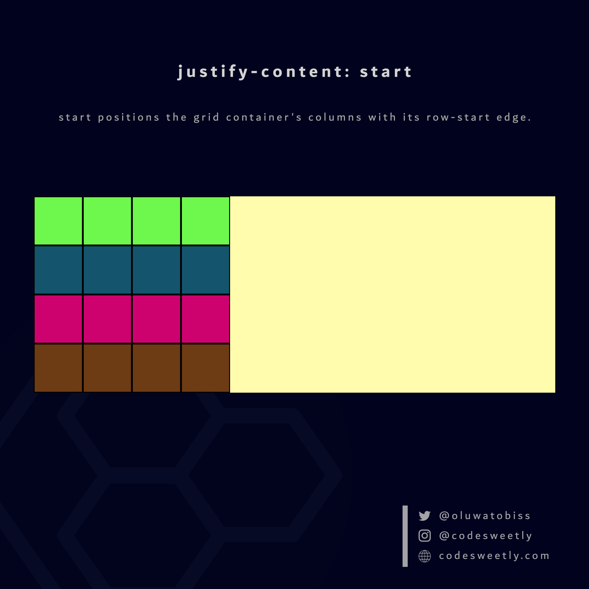
justify-content's start value positions columns to the grid container's row-start edge
Here's an example:
section {
  display: grid;
  justify-content: start;
  grid-template-columns: repeat(4, 40px);
  background-color: orange;
  margin: 10px;
}The snippet above used the start value to position the <section>'s columns to the grid container's row-start edge.
What is justify-content: center in CSS Grid?
center positions the grid container's columns to the center of the grid's row axis.
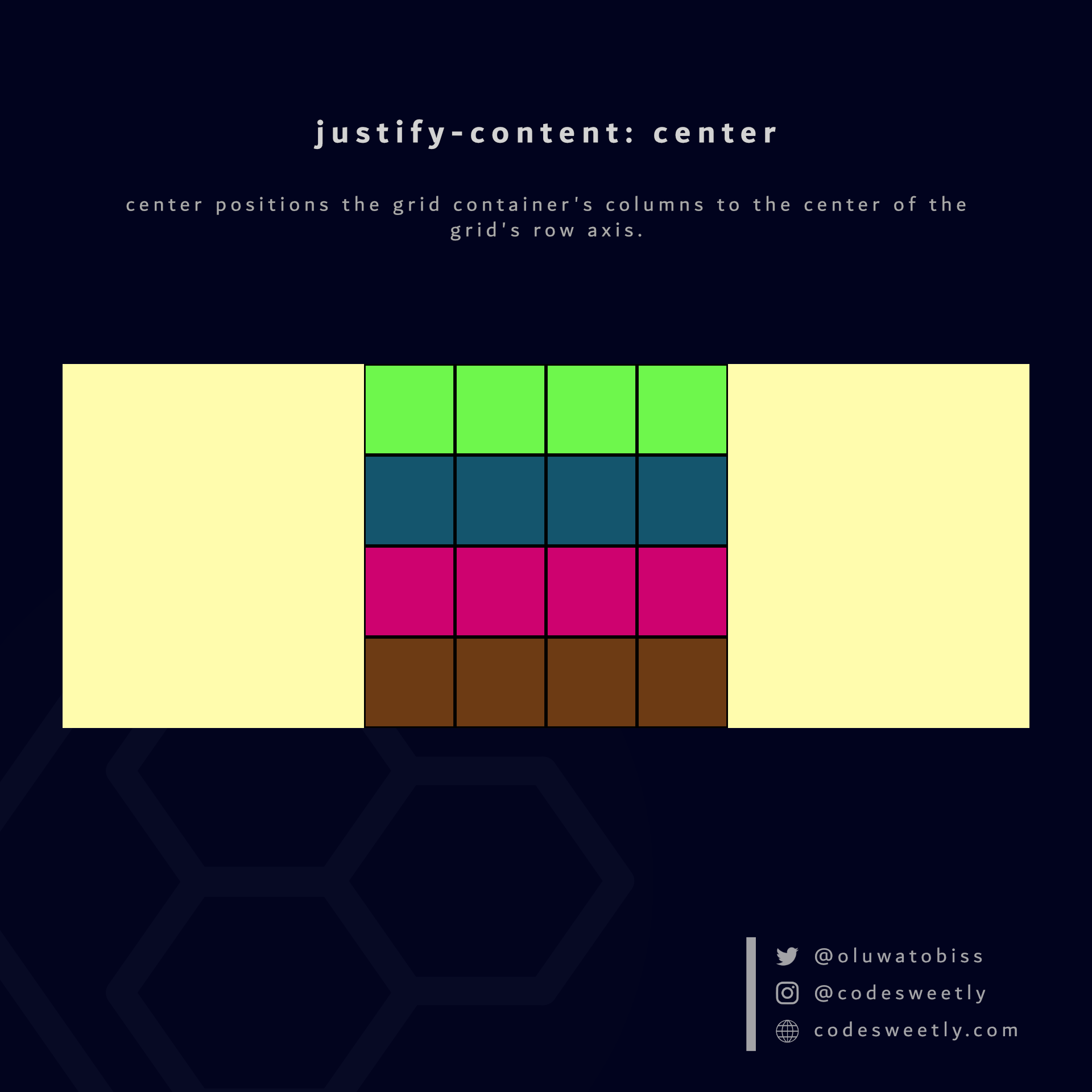
justify-content's center value positions columns to the center of the grid container
Here's an example:
section {
  display: grid;
  justify-content: center;
  grid-template-columns: repeat(4, 40px);
  background-color: orange;
  margin: 10px;
}The snippet above used the center value to position the <section>'s columns to the center of the grid container.
What is justify-content: end in CSS Grid?
end positions a grid container's columns with its row-end edge.
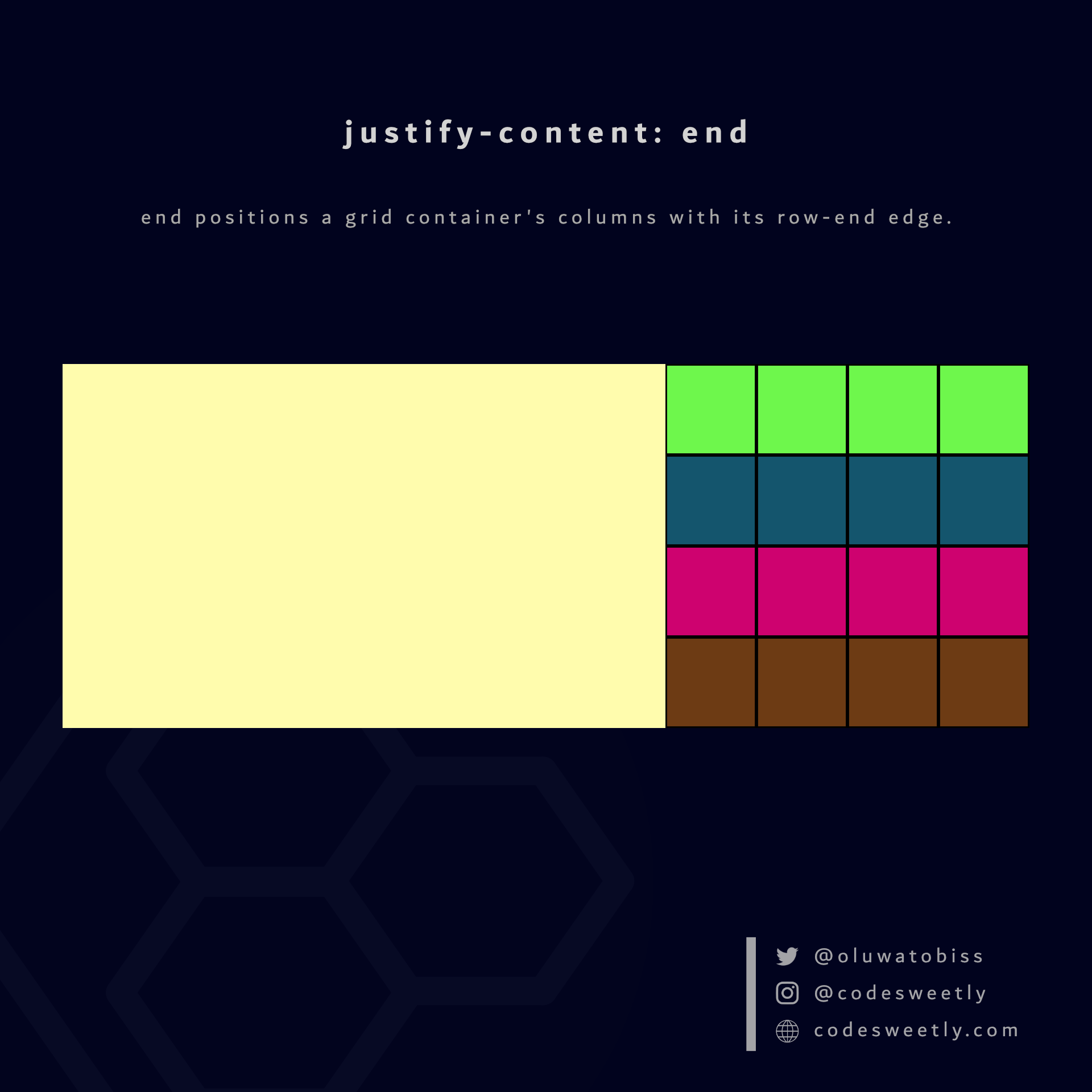
justify-content's end value positions columns to the grid container's row-end edge
Here's an example:
section {
  display: grid;
  justify-content: end;
  grid-template-columns: repeat(4, 40px);
  background-color: orange;
  margin: 10px;
}The snippet above used the end value to position the <section>'s columns to the grid container's row-end edge.
What is justify-content: space-between in CSS Grid?
space-between does the following:
- It positions a grid container's first column with its row-start edge.
- It positions the container's last column with the row-end edge.
- It creates even spacing between each pair of columns between the first and last columns.
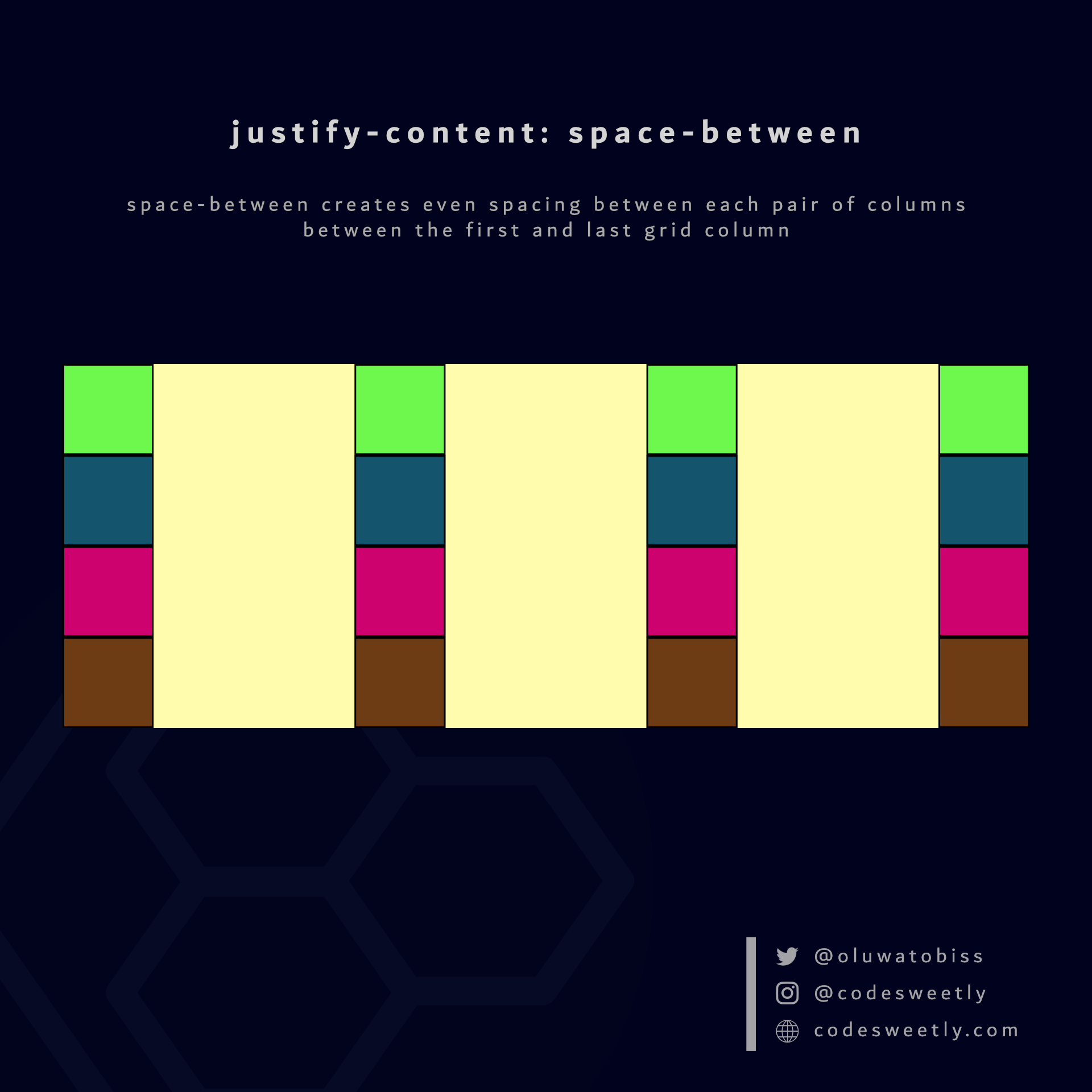
justify-content's space-between value creates even spacing between each pair of columns between the first and last grid column
Here's an example:
section {
  display: grid;
  justify-content: space-between;
  grid-template-columns: repeat(4, 40px);
  background-color: orange;
  margin: 10px;
}The snippet above used the space-between value to create even spacing between each pair of columns between the first and last grid column.
What is justify-content: space-around in CSS Grid?
space-around assigns equal spacing to each side of a grid container's columns.
Therefore, the space before the first column and after the last one is half the width of the space between each pair of columns.
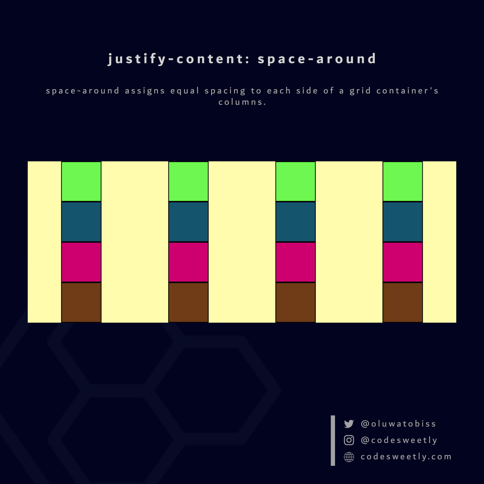
justify-content's space-around value assigns equal spacing to each side of the grid container's columns
Here's an example:
section {
  display: grid;
  justify-content: space-around;
  grid-template-columns: repeat(4, 40px);
  background-color: orange;
  margin: 10px;
}The snippet above used the space-around value to assign equal spacing to each side of the grid container's columns.
What is justify-content: space-evenly in CSS Grid?
space-evenly assigns even spacing to both ends of a grid container and between its columns.
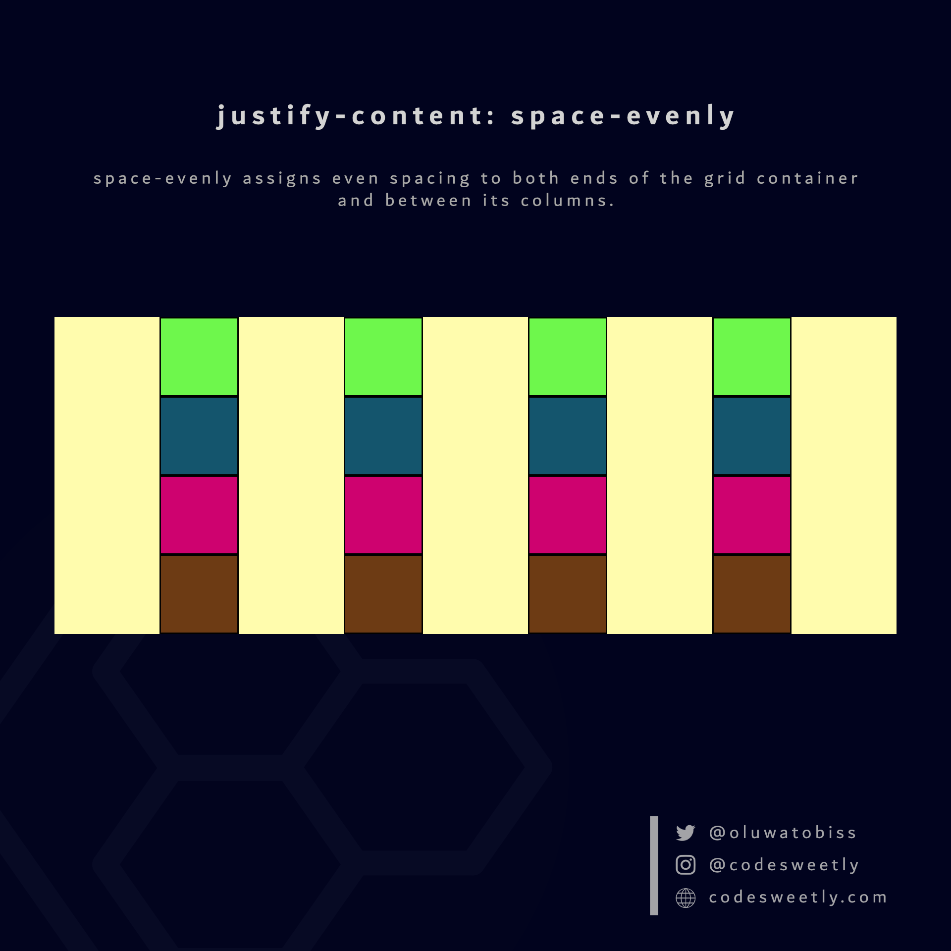
justify-content's space-evenly value assigns even spacing to both ends of the grid container and between its columns
Here's an example:
section {
  display: grid;
  justify-content: space-evenly;
  grid-template-columns: repeat(4, 40px);
  background-color: orange;
  margin: 10px;
}We used the space-evenly value to assign even spacing to both ends of the grid container and between its columns.
What Is CSS Grid's justify-items Property?
justify-items specifies the default justify-self value for all the grid items.
The justify-items property accepts the following values:
stretchstartcenterend
Let's discuss the four values.
What is justify-items: stretch in CSS Grid?
stretch is justify-items' default value. It stretches the grid container's items to fill their individual cells' row (inline) axis.
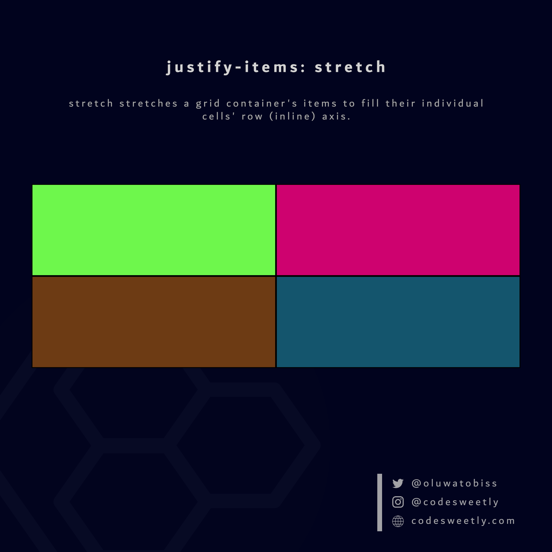
justify-items' stretch value stretches grid items to fill their individual cells' row axis
Here's an example:
section {
  display: grid;
  justify-items: stretch;
  grid-template-columns: 1fr 1fr;
  background-color: orange;
  margin: 10px;
}The snippet above used the stretch value to stretch the grid items to fill their individual cells' row axis.
What is justify-items: start in CSS Grid?
start positions a grid container's items with the row-start edge of their individual cells' row axis.
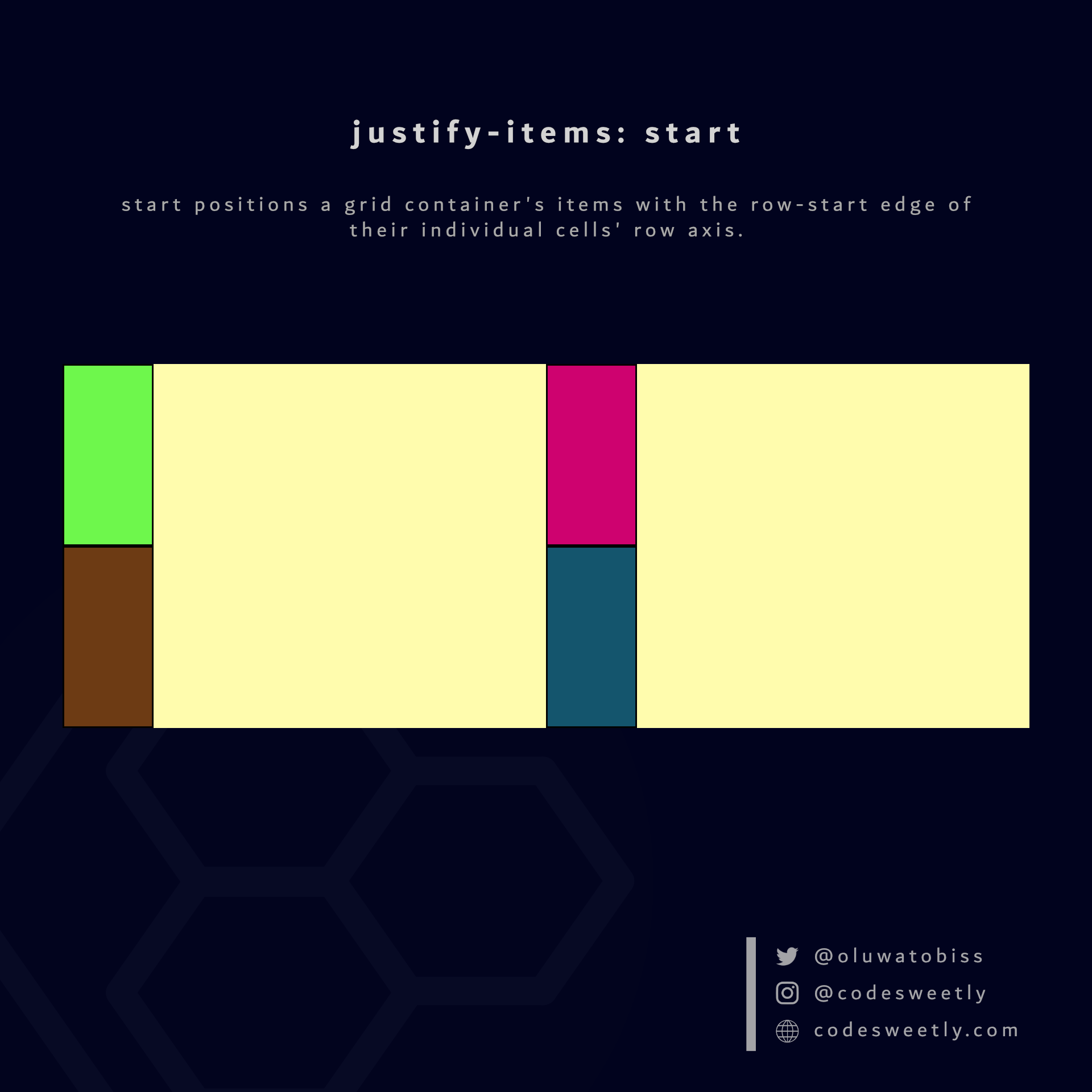
justify-items' start value positions grid items to their individual cells' row-start edge
Here's an example:
section {
  display: grid;
  justify-items: start;
  grid-template-columns: 1fr 1fr;
  background-color: orange;
  margin: 10px;
}The snippet above used the start value to position the grid items to their individual cells' row-start edge.
What is justify-items: center in CSS Grid?
center positions a grid container's items to the center of their individual cells' row axis.
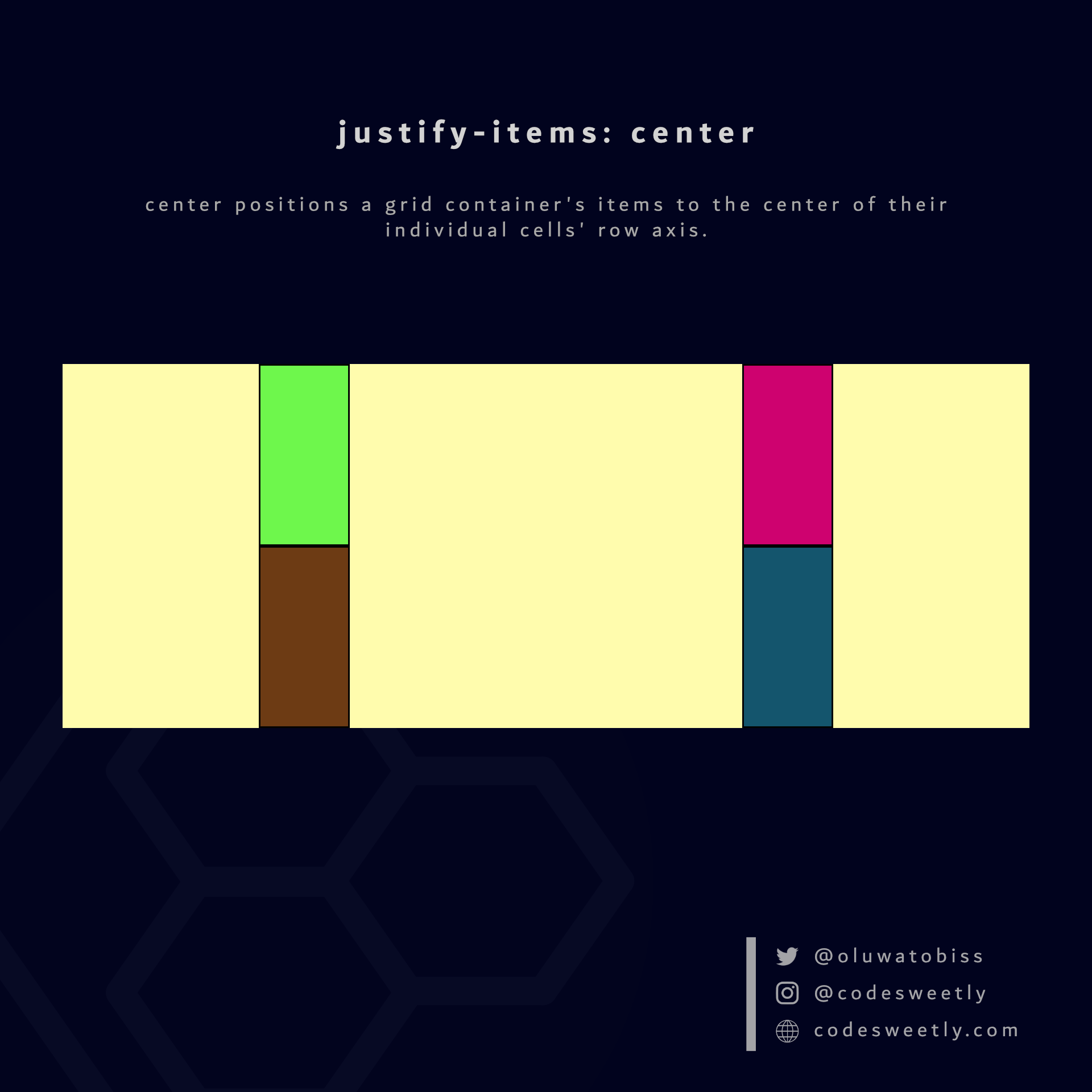
justify-items' center value positions grid items to their individual cells' center
Here's an example:
section {
  display: grid;
  justify-items: center;
  grid-template-columns: 1fr 1fr;
  background-color: orange;
  margin: 10px;
}The snippet above used the center value to position the grid items to the center of their individual cells' row axis.
What is justify-items: end in CSS Grid?
end positions a grid container's items with the row-end edge of their individual cells' row axis.
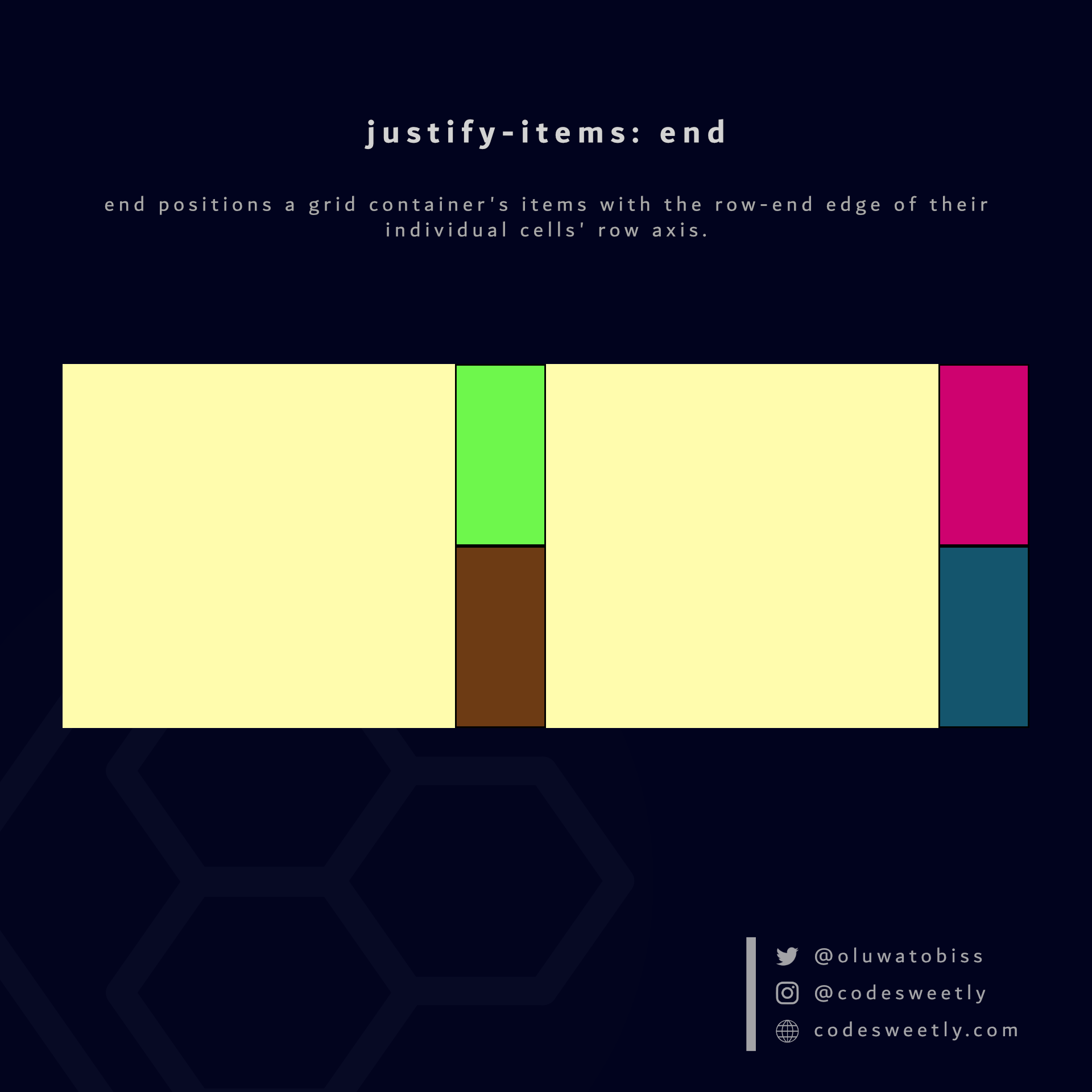
justify-items' end value positions grid items to their individual cells' row-end edge
Here's an example:
section {
  display: grid;
  justify-items: end;
  grid-template-columns: 1fr 1fr;
  background-color: orange;
  margin: 10px;
}The snippet above used the end value to position the grid items to their individual cells' row-end edge.
What Is CSS Grid's align-content Property?
align-content specifies how browsers should align a grid container's rows along the container's column axis.
Note:
- A column axis is sometimes called a block axis.
- The
align-contentproperty works if the total row heights are less than the grid container's height. In other words, you need free space along the container's column axis to align its rows up or down.
The align-content property accepts the following values:
startcenterendstretchspace-betweenspace-aroundspace-evenly
Let's discuss these values.
What is align-content: start in CSS Grid?
start aligns a grid container's rows with the column-start edge of the grid's column axis.
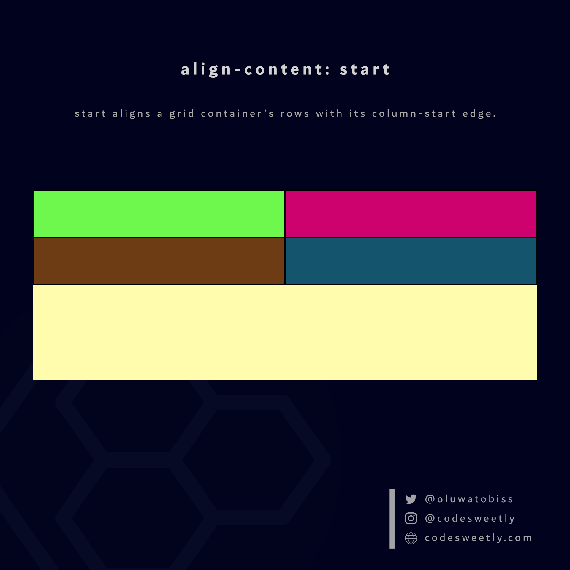
align-content's start value aligns rows to the grid container's column-start edge
Here's an example:
section {
  display: grid;
  align-content: start;
  grid-template-columns: 1fr 1fr;
  background-color: orange;
  margin: 10px;
  height: 300px;
}The snippet above used the start value to align the <section>'s rows to the grid container's column-start edge.
What is align-content: center in CSS Grid?
center aligns a grid container's rows to the center of the grid's column axis.
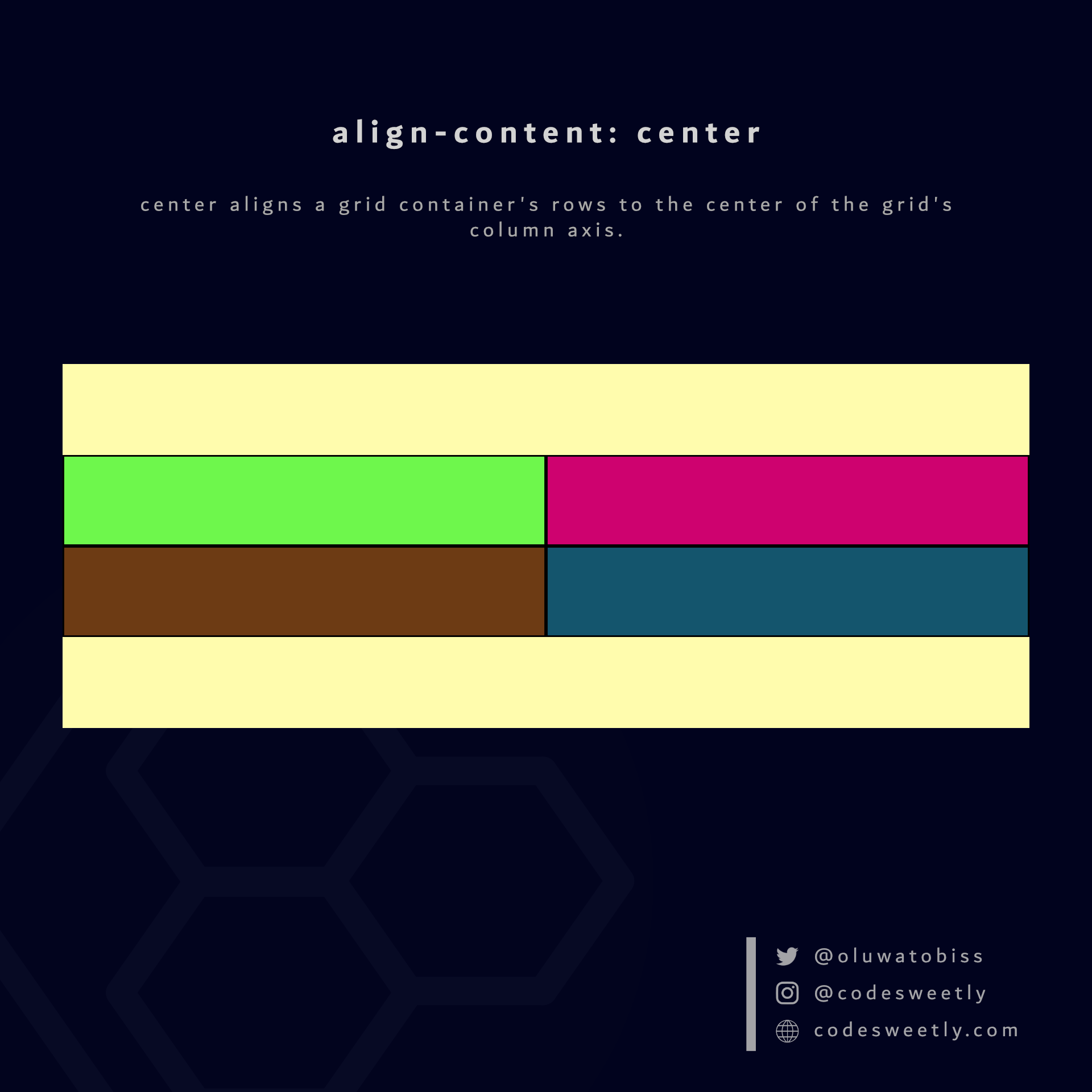
align-content's center value aligns rows to the center of the grid container
section {
  display: grid;
  align-content: center;
  grid-template-columns: 1fr 1fr;
  background-color: orange;
  margin: 10px;
  height: 300px;
}The snippet above used the center value to align the <section>'s rows to the center of the grid container.
What is align-content: end in CSS Grid?
end aligns a grid container's rows with the column-end edge of the grid's column axis.
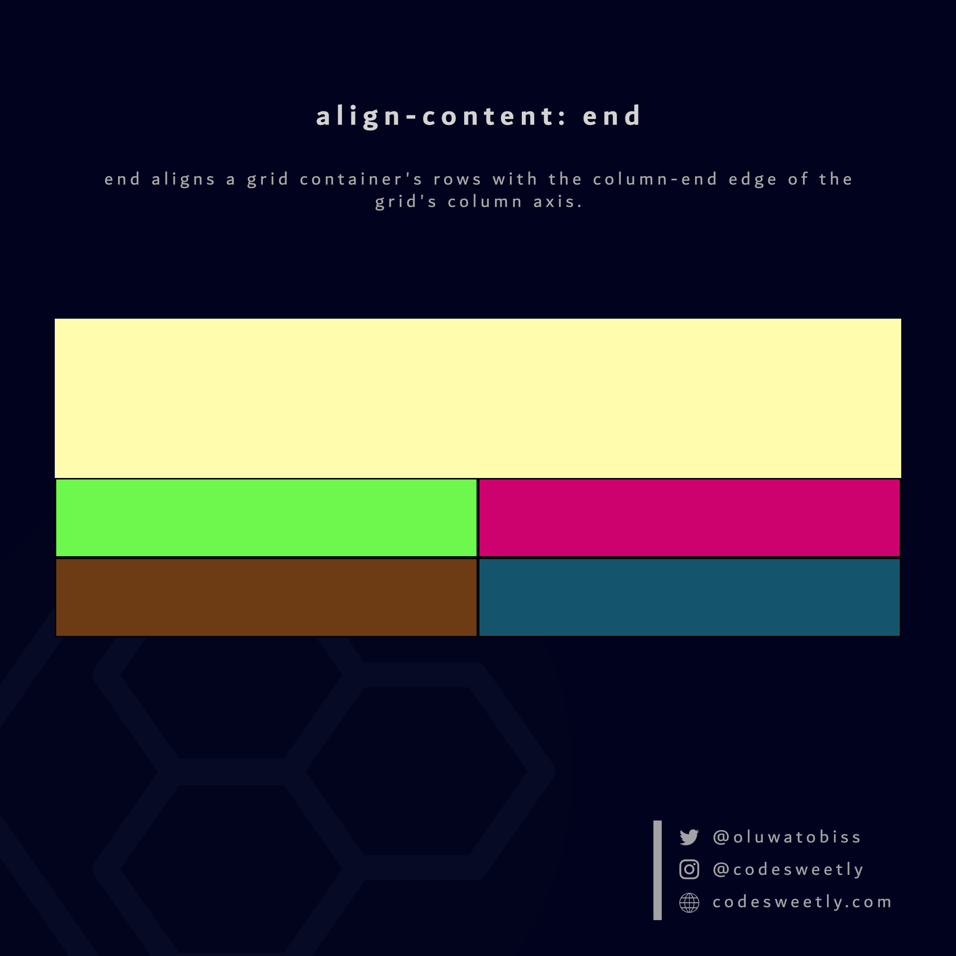
align-content's end value aligns rows to the grid container's column-end edge
Here's an example:
section {
  display: grid;
  align-content: end;
  grid-template-columns: 1fr 1fr;
  background-color: orange;
  margin: 10px;
  height: 300px;
}The snippet above used the end value to align the <section>'s rows to the grid container's column-end edge.
What is align-content: space-between in CSS Grid?
space-between does the following:
- It aligns a grid container's first row with its column-start edge.
- It aligns the container's last row with the column-end edge.
- It creates even spacing between each pair of rows between the first and last row.
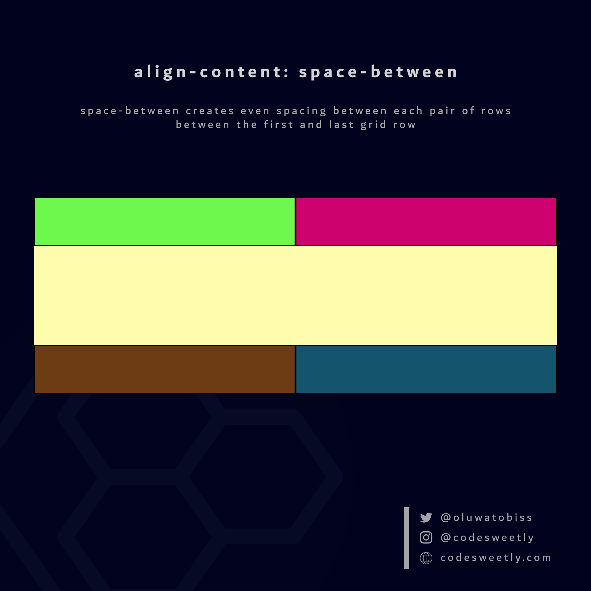
align-content's space-between value creates even spacing between each pair of rows between the first and last grid row
Here's an example:
section {
  display: grid;
  align-content: space-between;
  grid-template-columns: 1fr 1fr;
  background-color: orange;
  margin: 10px;
  height: 300px;
}The snippet above used the space-between value to create even spacing between each pair of rows between the first and last grid row.
What is align-content: space-around in CSS Grid?
space-around assigns equal spacing to each side of a grid container's rows.
Therefore, the space before the first row and after the last one is half the width of the space between each pair of rows.
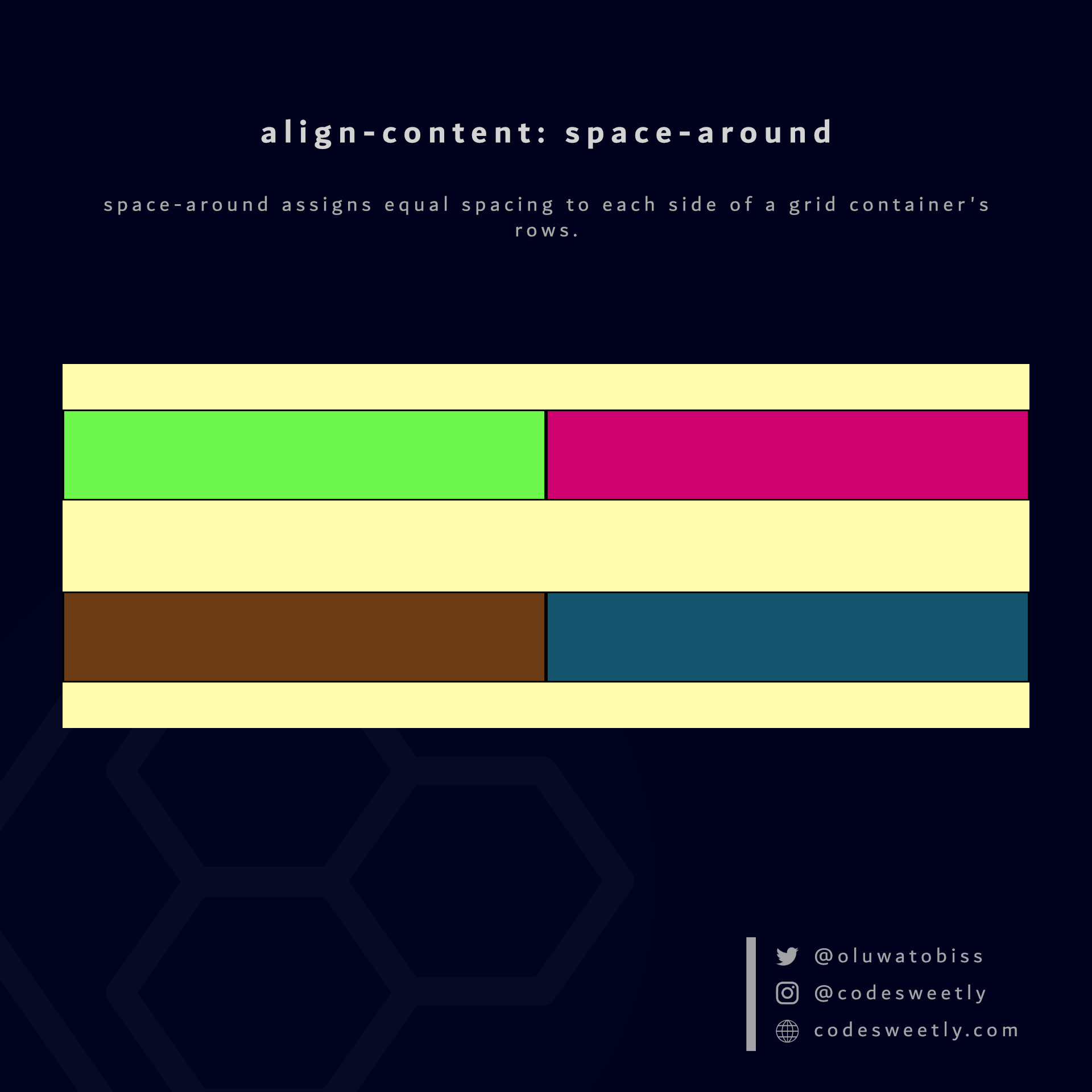
align-content's space-around value assigns equal spacing to each side of the grid container's rows
Here's an example:
section {
  display: grid;
  align-content: space-around;
  grid-template-columns: 1fr 1fr;
  background-color: orange;
  margin: 10px;
  height: 300px;
}The snippet above used the space-around value to assign equal spacing to each side of the grid container's rows.
What is align-content: space-evenly in CSS Grid?
space-evenly assigns even spacing to both ends of a grid container and between its rows.
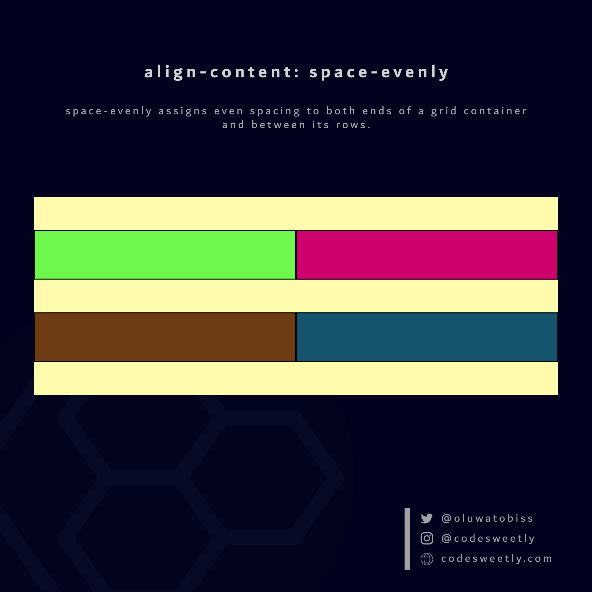
align-content's space-evenly value assigns even spacing to both ends of the grid container and between its rows
Here's an example:
section {
  display: grid;
  align-content: space-evenly;
  grid-template-columns: 1fr 1fr;
  background-color: orange;
  margin: 10px;
  height: 300px;
}We used the space-evenly value to assign even spacing to both ends of the grid container and between its rows.
What Is CSS Grid's align-items Property?
align-items specifies the default align-self value for all the grid items.
The align-items property accepts the following values:
stretchstartcenterend
Let's discuss the four values below.
What is align-items: stretch in CSS Grid?
stretch is the default value for align-items. It stretches the grid container's items to fill their individual cells' column (block) axis.
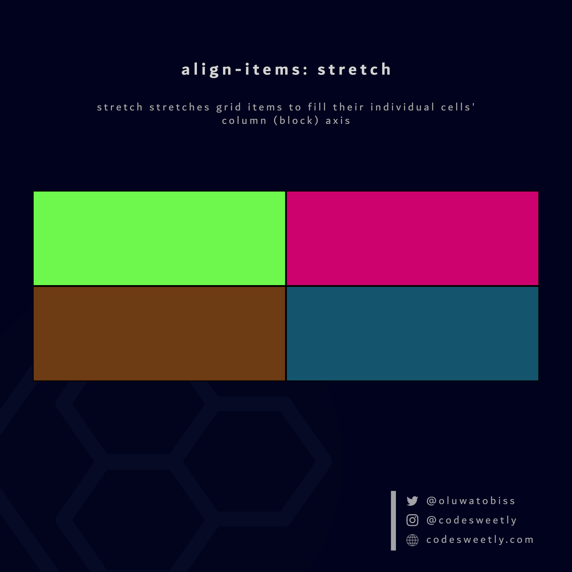
align-items' stretch value stretches grid items to fill their individual cells' column axis
Here's an example:
section {
  display: grid;
  align-items: stretch;
  grid-template-columns: 1fr 1fr;
  background-color: orange;
  margin: 10px;
  height: 400px;
}The snippet above used the stretch value to stretch the grid items to fill their individual cells' column axis.
What is align-items: start in CSS Grid?
start aligns a grid container's items with the column-start edge of their individual cells' column axis.
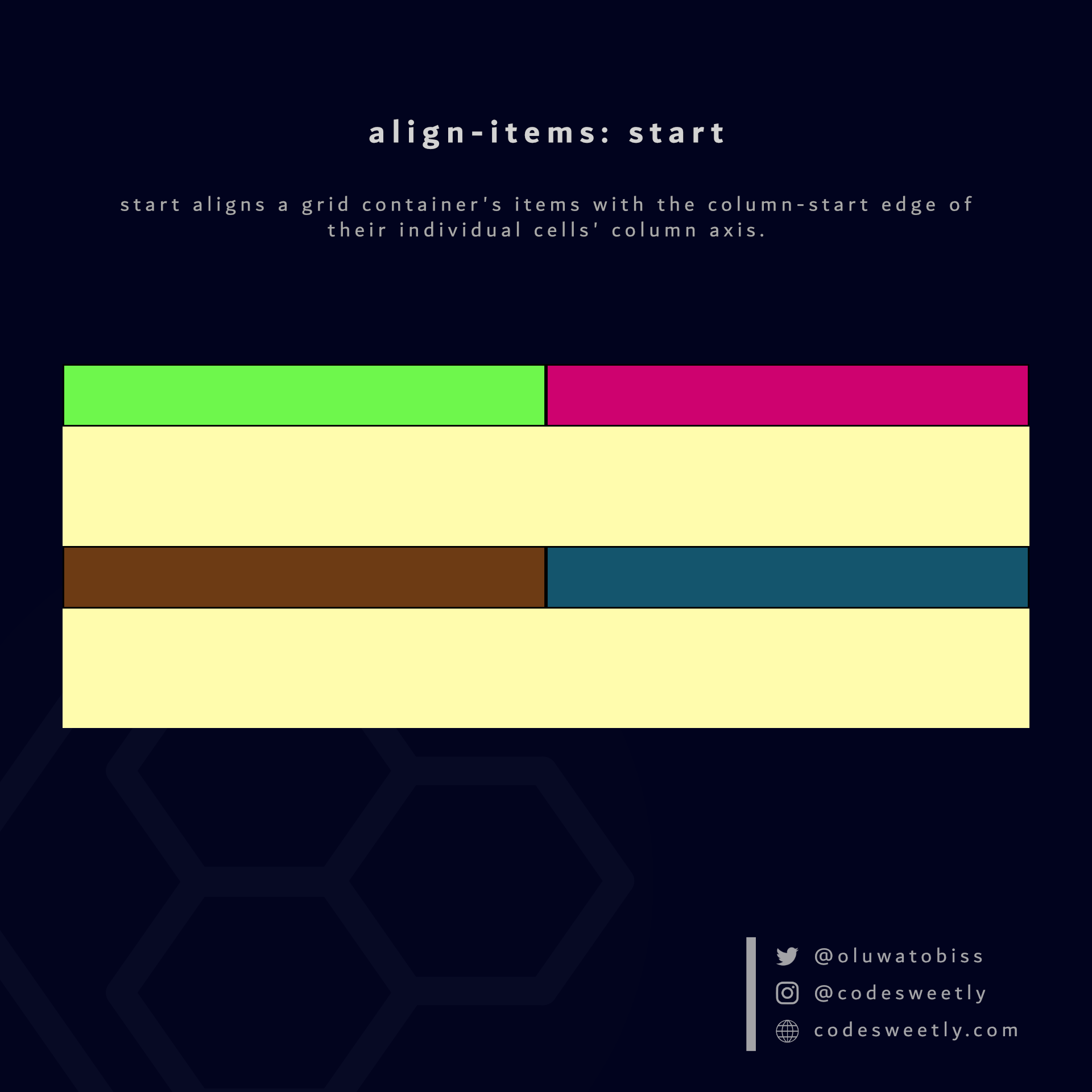
align-items' start value aligns grid items to their individual cells' column-start edge
Here's an example:
section {
  display: grid;
  align-items: start;
  grid-template-columns: 1fr 1fr;
  background-color: orange;
  margin: 10px;
  height: 400px;
}The snippet above used the start value to align the grid items to their individual cells' column-start edge.
What is align-items: center in CSS Grid?
center aligns a grid container's items to the center of their individual cells' column axis.
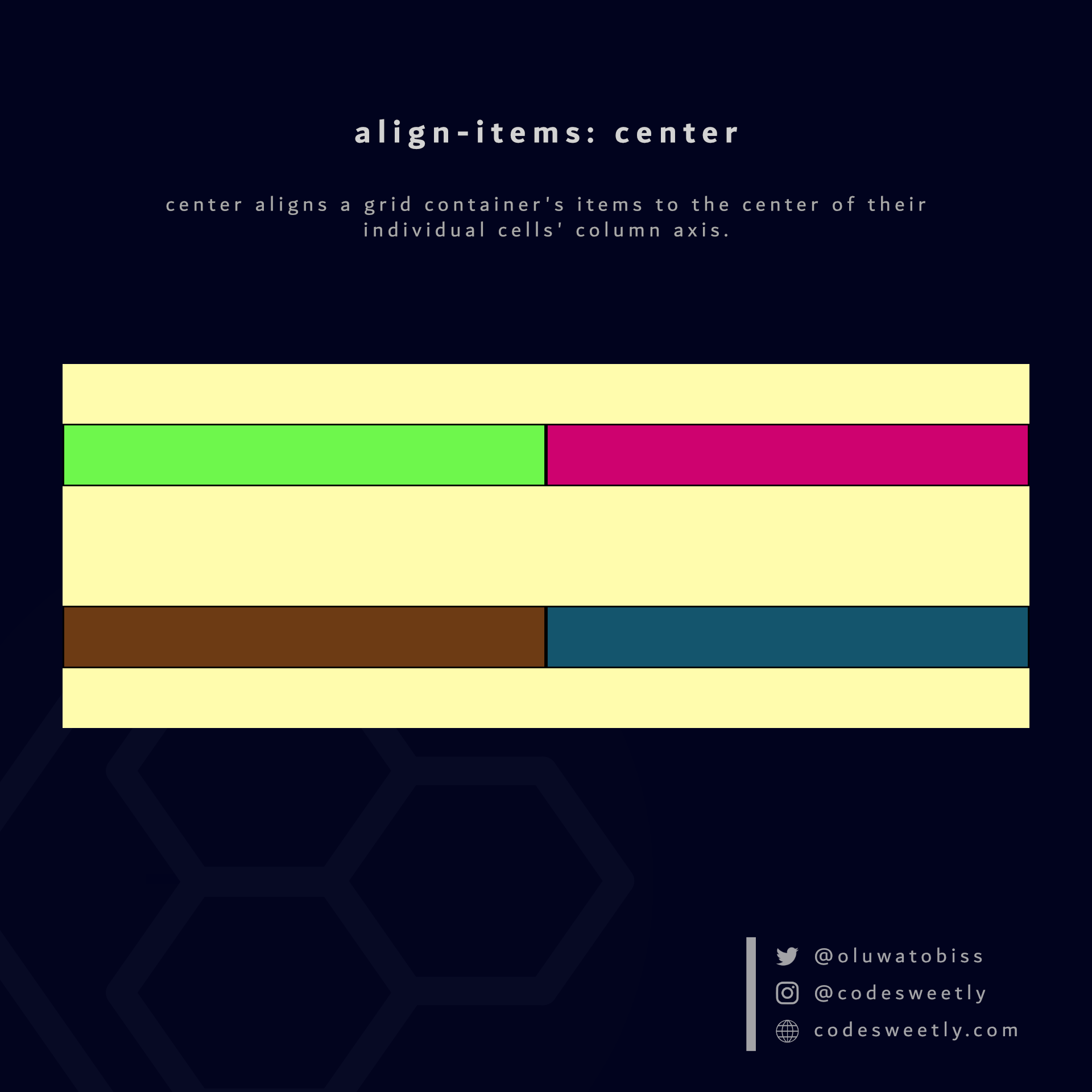
align-items' center value aligns grid items to their individual cells' center
Here's an example:
section {
  display: grid;
  align-items: center;
  grid-template-columns: 1fr 1fr;
  background-color: orange;
  margin: 10px;
  height: 400px;
}The snippet above used the center value to align the grid items to the center of their individual cells' column axis.
What is align-items: end in CSS Grid?
end aligns a grid container's items with the column-end edge of their individual cells' column axis.
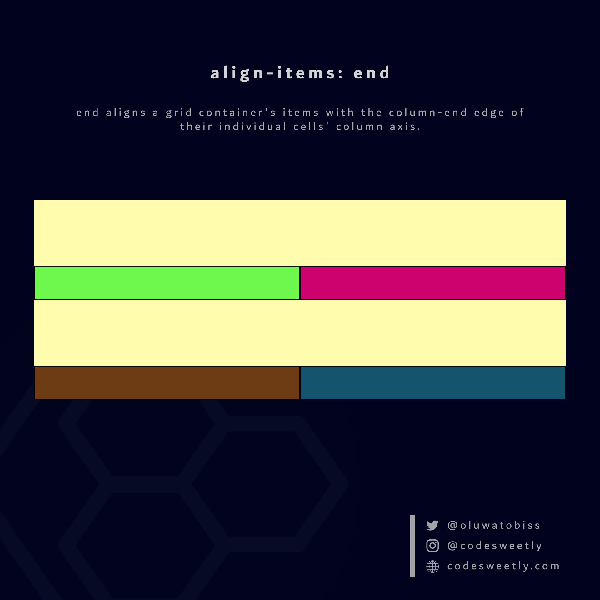
align-items' end value aligns grid items to their individual cells' column-end edge
Here's an example:
section {
  display: grid;
  align-items: end;
  grid-template-columns: 1fr 1fr;
  background-color: orange;
  margin: 10px;
  height: 400px;
}The snippet above used the end value to align the grid items to their individual cells' column-end edge.
So, now that we know the types of CSS grid container properties, we can discuss the grid item properties.
What Are the Grid Item's Properties?
A grid item's properties specify how browsers should layout a specified item within the grid box model.
Note: We define a grid item's property on the item, not its container.
The ten (10) types of grid item properties are:
justify-selfalign-selfgrid-column-startgrid-column-endgrid-columngrid-row-startgrid-row-endgrid-rowgrid-areagrid-template-areas
Let's discuss the ten types now.
What Is CSS Grid's justify-self Property?
justify-self specifies how browsers should position the selected grid item along its cell's row (inline) axis.
The justify-self property accepts the following values:
stretchstartcenterend
Let's discuss the four values.
What is justify-self: stretch in CSS Grid?
stretch is justify-self's default value. It stretches the selected grid item to fill its cell's row (inline) axis.
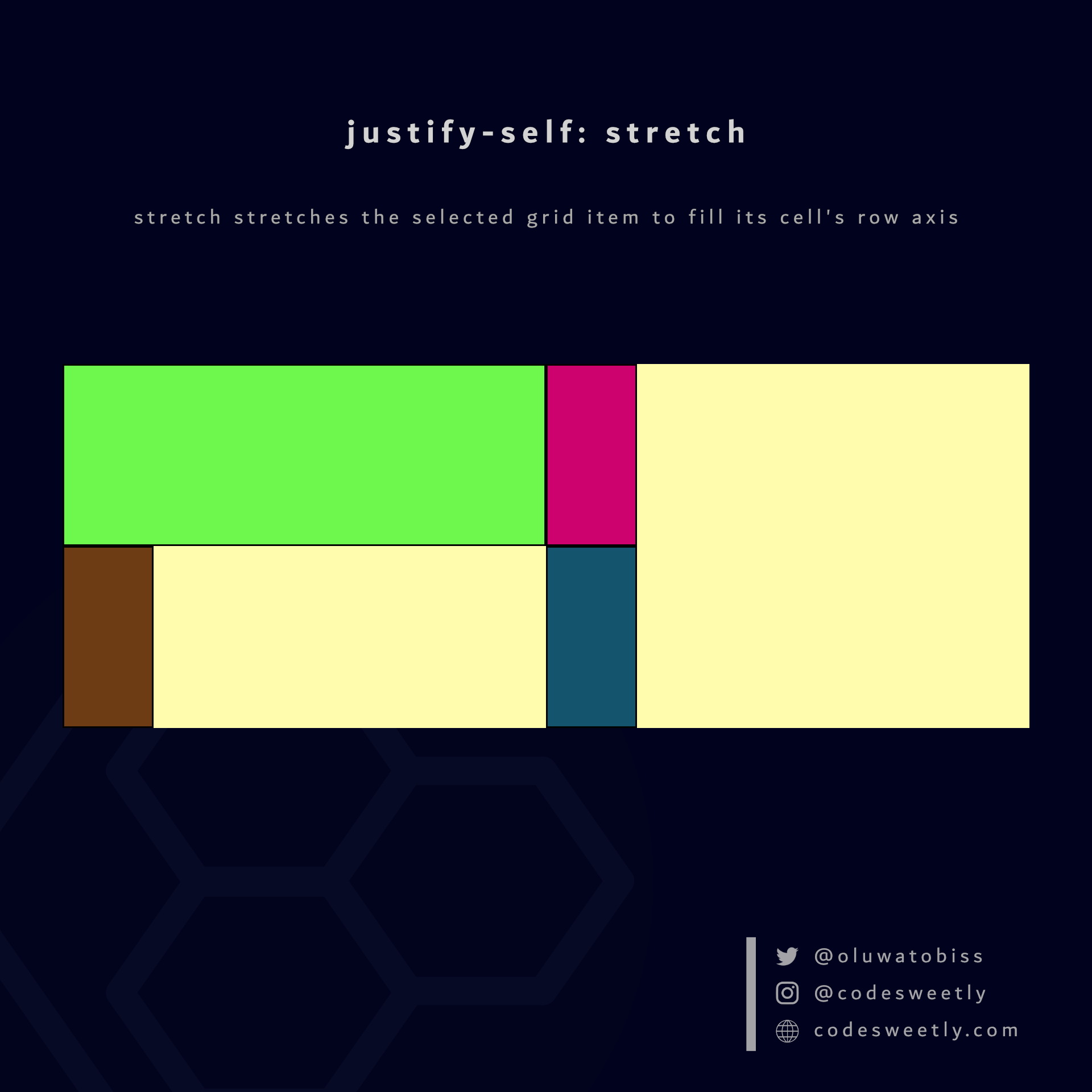
justify-self's stretch value stretches the selected grid item to fill its cell's row axis
Here's an example:
.grid-item1 {
  justify-self: stretch;
}The snippet above used the stretch value to stretch grid-item1 to fill its cell's row axis.
What is justify-self: start in CSS Grid?
start positions the selected grid item with the row-start edge of its cell's row axis.
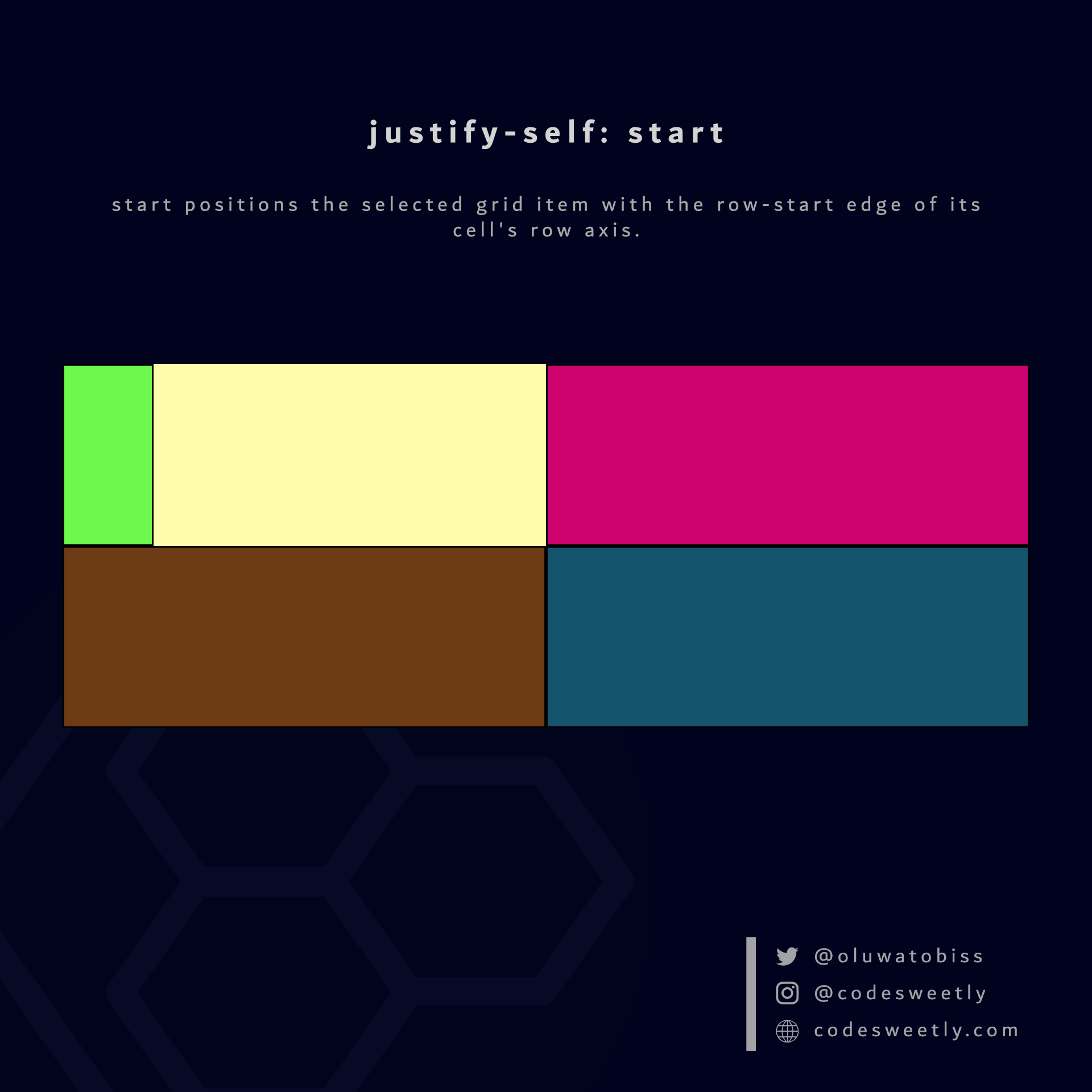
justify-self's start value positions the selected grid item to its cell's row-start edge
Here's an example:
.grid-item1 {
  justify-self: start;
}The snippet above used the start value to position grid-item1 to its cell's row-start edge.
What is justify-self: center in CSS Grid?
center positions the selected grid item to the center of its cell's row axis.
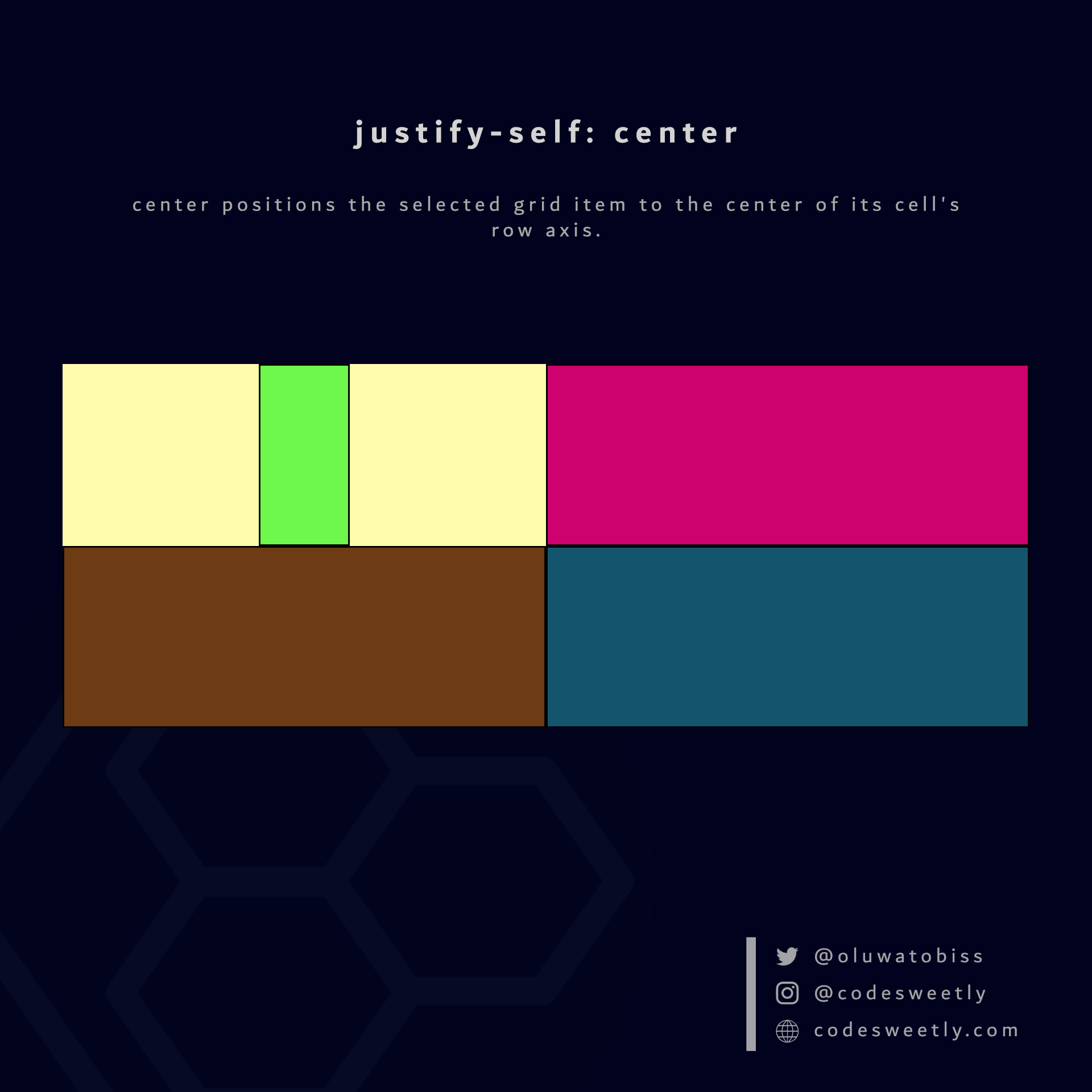
justify-self's center value positions the selected grid item to its cell's center
Here's an example:
.grid-item1 {
  justify-self: center;
}The snippet above used the center value to position grid-item1 to its cell's center.
What is justify-self: end in CSS Grid?
end positions the selected grid item with the row-end edge of its cell's row axis.
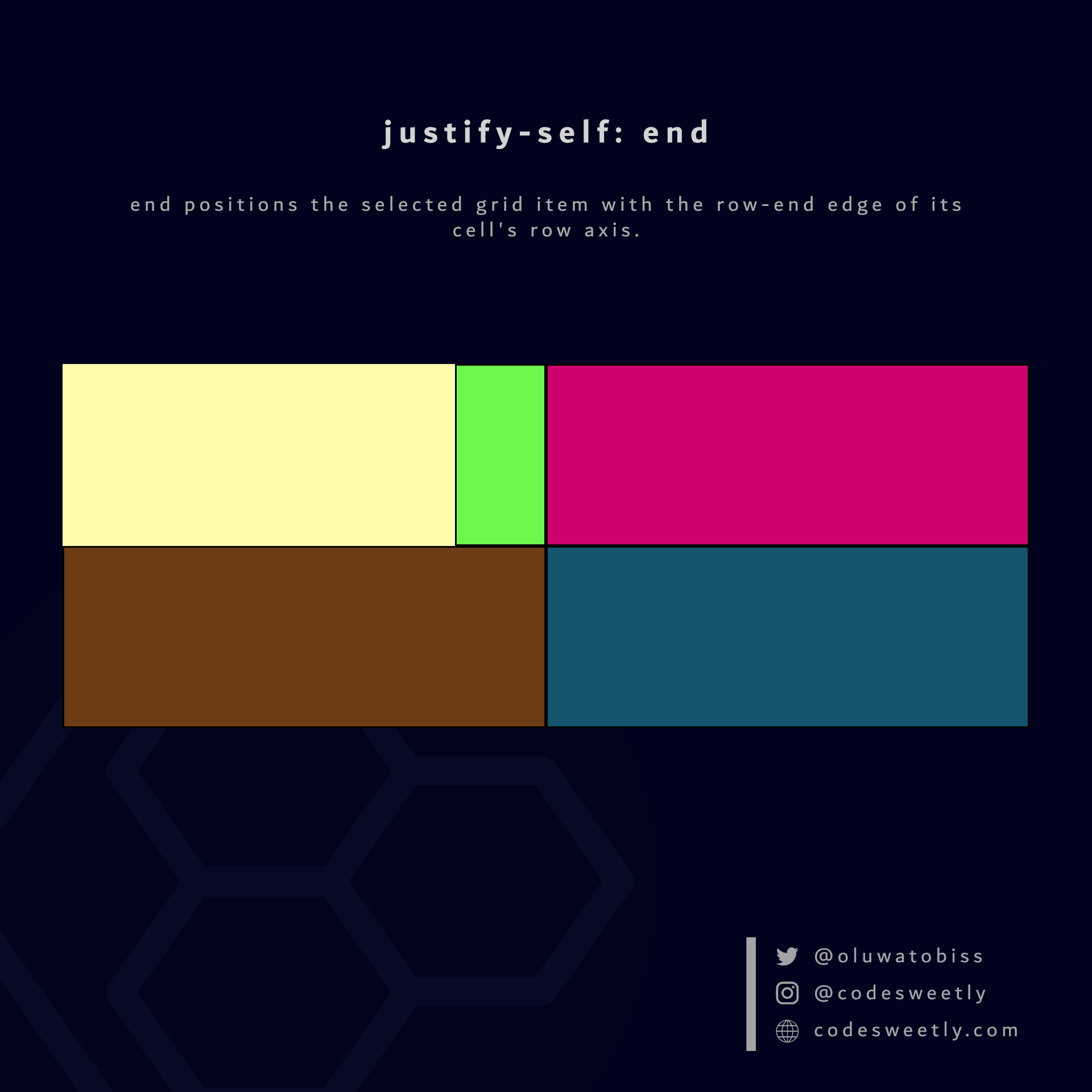
justify-self's end value positions the selected grid item to its cell's row-end edge
Here's an example:
.grid-item1 {
  justify-self: end;
}The snippet above used the end value to position grid-item1 to its cell's row-end edge.
What Is CSS Grid's align-self Property?
align-self specifies how browsers should align the selected grid item along its cell's column (block) axis.
The align-self property accepts the following values:
stretchstartcenterend
Let's discuss the four values below.
What is align-self: stretch in CSS Grid?
stretch is align-self's default value. It stretches the selected grid item to fill its cell's column (block) axis.
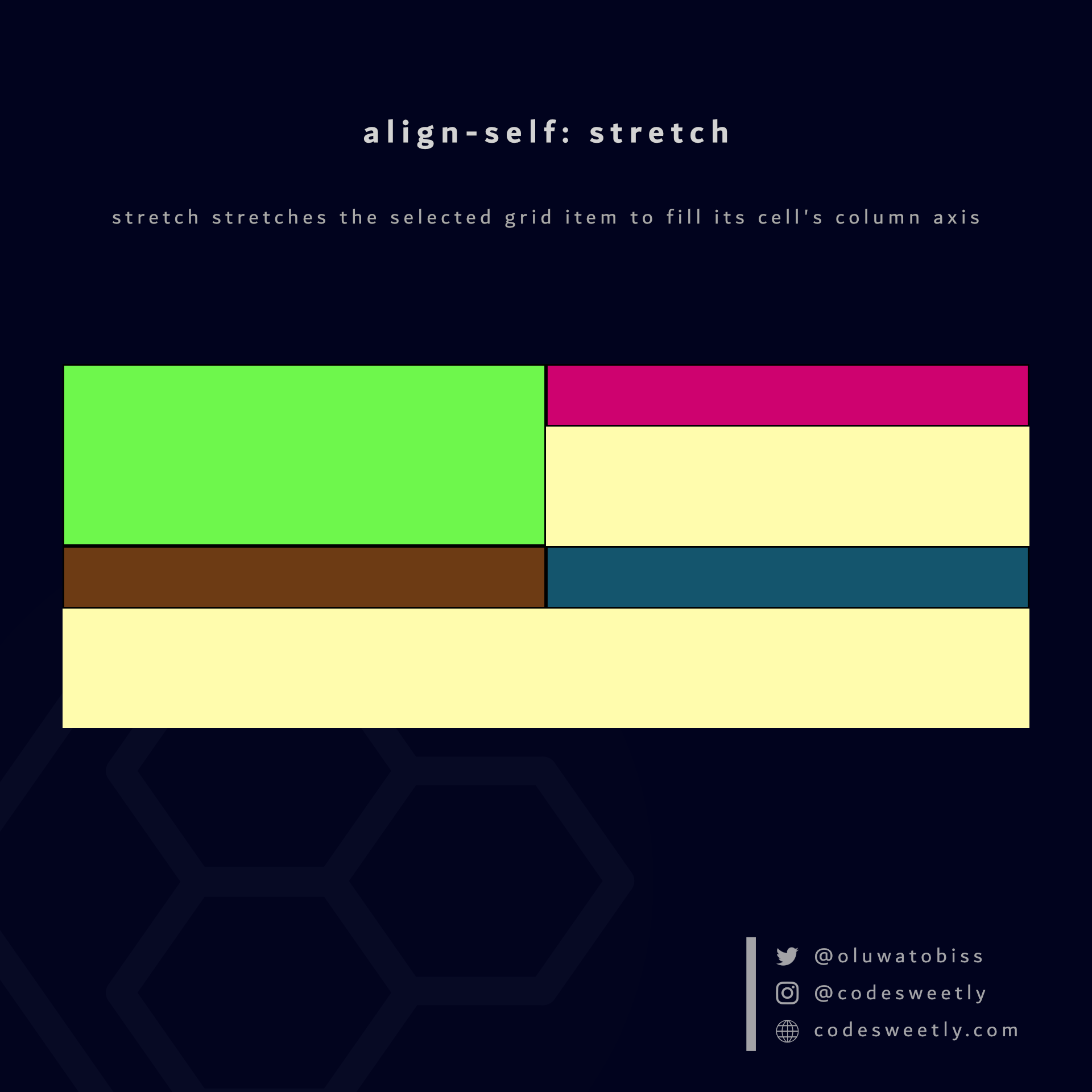
align-self's stretch value stretches the selected grid item to fill its cell's column axis
Here's an example:
.grid-item1 {
  align-self: stretch;
}The snippet above used the stretch value to stretch grid-item1 to fill its cell's column axis.
What is align-self: start in CSS Grid?
start aligns the selected grid item with the column-start edge of its cell's column axis.
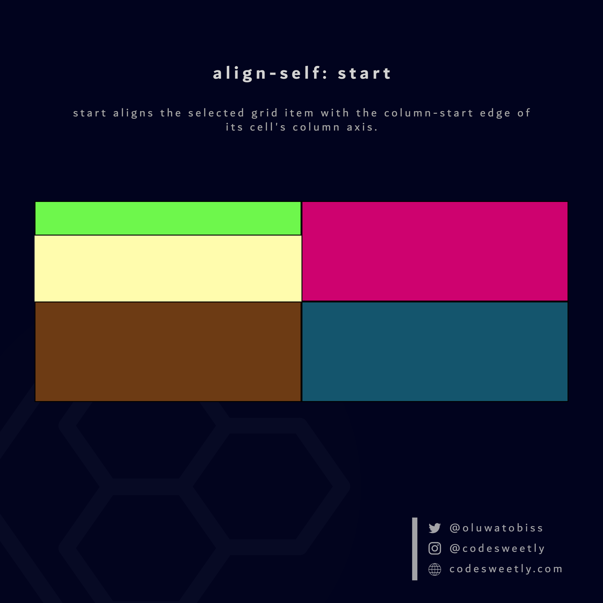
align-self's start value aligns the selected grid item to its cell's column-start edge
Here's an example:
.grid-item1 {
  align-self: start;
}The snippet above used the start value to align grid-item1 to its cell's column-start edge.
What is align-self: center in CSS Grid?
center aligns the selected grid item to the center of its cell's column axis.
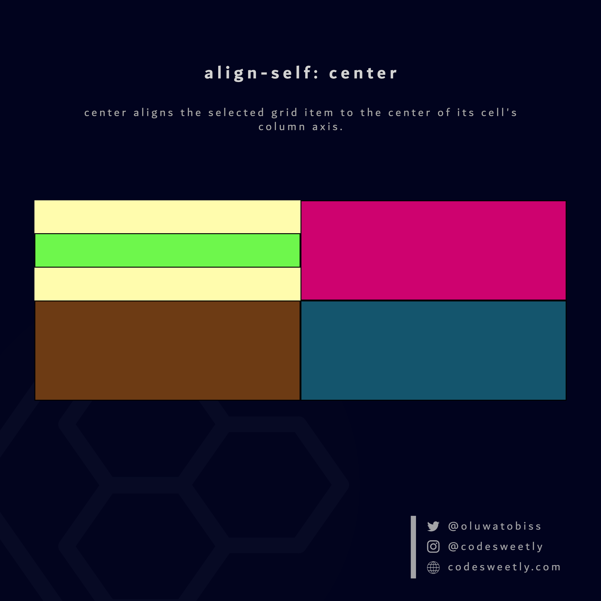
align-self's center value aligns the selected grid item to its cell's center
Here's an example:
.grid-item1 {
  align-self: center;
}The snippet above used the center value to align grid-item1 to its cell's center.
What is align-self: end in CSS Grid?
end aligns the selected grid item with the column-end edge of its cell's column axis.
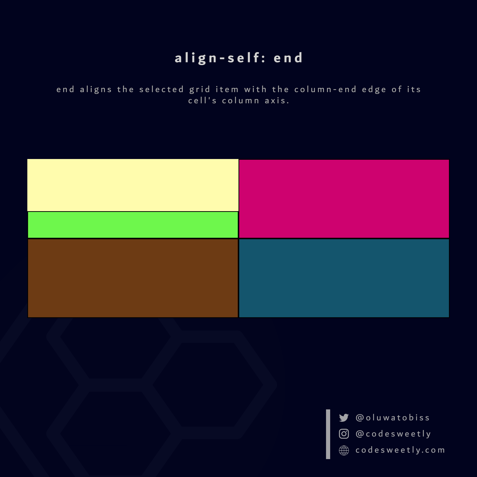
align-self's end value aligns the selected grid item to its cell's column-end edge
Here's an example:
.grid-item1 {
  align-self: end;
}The snippet above used the end value to align grid-item1 to its cell's column-end edge.
What Is CSS Grid's grid-column-start Property?
grid-column-start specifies where the selected grid item should start (or span) along the grid container's row (inline) axis.
The grid-column-start property accepts the following values:
auto<column-line-number>span <number-of-columns>
Example 1: How to auto-start the selected grid item following the normal column flow
.grid-item1 {
  grid-column-start: auto;
}The snippet above used the auto value to auto-start grid-item1 according to the normal column layout flow.
Example 2: How to start the selected grid item at column line 3
.grid-item1 {
  grid-column-start: 3;
}The snippet above used the grid-column-start property to start grid-item1 at column line 3.
Example 3: How to span the selected grid item across two columns
.grid-item1 {
  grid-column-start: span 2;
}The snippet above used the span 2 value to span grid-item1 across two columns.
What Is CSS Grid's grid-column-end Property?
grid-column-end specifies where the selected grid item should end (or span) along the grid container's row (inline) axis.
The grid-column-end property accepts the following values:
auto<column-line-number>span <number-of-columns>
Example 1: How to auto-end the selected grid item following the normal column flow
.grid-item1 {
  grid-column-end: auto;
}The snippet above used the auto value to auto-end grid-item1 according to the normal layout flow.
Example 2: How to end the selected grid item at column line 3
.grid-item1 {
  grid-column-start: 1;
  grid-column-end: 3;
}The snippet above used the grid-column-end property to end grid-item1 at column line 3.
Example 3: How to span the selected grid item across two columns
.grid-item1 {
  grid-column-start: 2;
  grid-column-end: span 2;
}The snippet above used the span 2 value to span grid-item1 across two columns.
What Is CSS Grid's grid-column Property?
grid-column is a shorthand for the grid-column-start and grid-column-end properties.
In other words, instead of writing:
.grid-item1 {
  grid-column-start: 1;
  grid-column-end: 3;
}
You can alternatively use the grid-column property to shorten your code like so:
.grid-item1 {
  grid-column: 1 / 3;
}
Here is grid-column's syntax:
grid-column: grid-column-start / grid-column-end;What Is CSS Grid's grid-row-start Property?
grid-row-start specifies where the selected grid item should start (or span) along the grid container's column (block) axis.
The grid-row-start property accepts the following values:
auto<row-line-number>span <number-of-rows>
Example 1: How to auto-start the selected grid item following the normal row flow
.grid-item1 {
  grid-row-start: auto;
}The snippet above used the auto value to auto-start grid-item1 according to the normal row layout flow.
Example 2: How to start the selected grid item at row line 3
.grid-item1 {
  grid-row-start: 3;
}The snippet above used the grid-row-start property to start grid-item1 at row line 3.
Example 3: How to span the selected grid item across two rows
.grid-item1 {
  grid-row-start: span 2;
}The snippet above used the span 2 value to span grid-item1 across two rows.
What Is CSS Grid's grid-row-end Property?
grid-row-end specifies where the selected grid item should end (or span) along the grid container's column (block) axis.
The grid-row-end property accepts the following values:
auto<column-line-number>span <number-of-columns>
Example 1: How to auto-end the selected grid item following the normal row flow
.grid-item1 {
  grid-row-end: auto;
}The snippet above used the auto value to auto-end grid-item1 according to the normal row layout flow.
Example 2: How to end the selected grid item at row line 5
.grid-item1 {
  grid-row-start: 1;
  grid-row-end: 5;
}The snippet above used the grid-row-end property to end grid-item1 at row line 5.
Example 3: How to span the selected grid item across three rows
.grid-item1 {
  grid-row-end: span 3;
}The snippet above used the span 3 value to span grid-item1 across three rows.
What Is CSS Grid's grid-row Property?
grid-row is a shorthand for the grid-row-start and grid-row-end properties.
In other words, instead of writing:
.grid-item1 {
  grid-row-start: 1;
  grid-row-end: 5;
}
You can alternatively use the grid-row property to shorten your code like so:
.grid-item1 {
  grid-row: 1 / 5;
}
Here is grid-row's syntax:
grid-row: grid-row-start / grid-row-end;What Is CSS Grid's grid-area Property?
You can use the grid-area property for the following purposes:
- As a shorthand for the
grid-column-start,grid-column-end,grid-row-start, andgrid-row-endproperties. - To specify a grid item's name.
Let's discuss the two purposes below.
How to use grid-area as a shorthand
Here is the syntax for using the grid-area property as a shorthand for the grid-column-start, grid-column-end, grid-row-start, and grid-row-end properties:
.your-grid-item {
  grid-area: grid-row-start / grid-column-start / grid-row-end / grid-column-end;
}
Therefore, instead of writing:
.grid-item1 {
  grid-row-start: 3;
  grid-row-end: 5;
  grid-column-start: 1;
  grid-column-end: span 2;
}You can alternatively use the grid-area property to shorten your code like so:
.grid-item1 {
  grid-area: 3 / 1 / 5 / span 2;
}How to use grid-area to specify a grid item's name
Here is the syntax for using the grid-area property to specify a grid item's name:
.your-grid-item {
  grid-area: item-name;
}
Here's an example:
.grid-item1 {
  grid-area: firstDiv;
}

.grid-item2 {
  grid-area: middleDiv;
}

.grid-item2 {
  grid-area: lastDiv;
}
<section>
<div class="grid-item1">1</div>
<div class="grid-item2">2</div>
<div class="grid-item3">3</div>
</section>Using grid-area to define a named grid item allows your grid container's grid-template-areas property to use the name to set the item's size and location.
What Is CSS Grid's grid-template-areas Property?
grid-template-areas specifies the area where you want to place named grid items within a grid container.
Remember: We use the CSS grid-area property to name grid items.
Example 1: How to place a named grid item across three columns
.grid-item1 {
  grid-area: firstDiv;
}

section {
  display: grid;
  grid-template-areas: "firstDiv firstDiv firstDiv . .";
  background-color: orange;
  margin: 50px;
}The snippet above used the grid-template-areas property to place grid-item1 across the first three column areas.
Note the following:
- Quotation marks (
"") define each grid row. - A period symbol (
.) defines an unnamed grid item. - We used the whitespace character to separate grid columns.
Example 2: How to specify multiple named grid items' placements
.grid-item1 {
  grid-area: header;
}

.grid-item2 {
  grid-area: article;
}

.grid-item3 {
  grid-area: footer;
}

.grid-item4 {
  grid-area: sidebar;
}

.grid-item5 {
  grid-area: ads1;
}

.grid-item6 {
  grid-area: ads2;
}

.grid-item7 {
  grid-area: ads3;
}

section {
  display: grid;
  grid-template-columns: repeat(5, 1fr);
  grid-template-rows: repeat(7, 1fr);
  grid-template-areas:
    "header header header header header"
    "sidebar article article article ads1"
    "sidebar article article article ads1"
    "sidebar article article article ads1"
    "sidebar article article article ads2"
    "sidebar article article article ads3"
    "sidebar footer footer footer footer";
  background-color: orange;
  margin: 30px;
}The snippet above used the grid-template-areas property to specify where browsers should place the grid items across the rows and columns of the grid container.
Important Stuff to Know about the grid-template-areas Property
Here are four essential facts to remember when using the grid-template-areas property:
1. grid-template-areas do not permit empty cells
The grid-template-areas property requires you to provide an item for all grid cells.
For instance, consider this snippet:
grid-template-areas:
  "header header"
  "sidebar article article article ads1"
  "sidebar article article article ads1"
  "sidebar article article article ads1"
  "sidebar article article article ads2"
  "sidebar article article article ads3"
  "sidebar footer footer footer footer";
Above is an invalid grid-template-areas value because the first row is incomplete.
In other words, the first row is the only one with two columns. However, grid-template-areas expect all the rows in a grid container to have the same number of columns.
2. You can use dots to specify empty cells
Suppose you wish to leave some cells empty. In that case, use a dot (.) or multiple unspaced dots (....).
Here's an example:
grid-template-areas:
  "header header . . ."
  "sidebar article article article ads1"
  "sidebar article article article ads1"
  "sidebar article article article ads1"
  "sidebar article article article ads2"
  "sidebar article article article ads3"
"sidebar footer footer footer footer";The snippet above used the three spaced dot (.) symbols to indicate three empty cells.
3. grid-template-areas do not permit placing an item in multiple locations
The grid-template-areas property cannot place items twice within a grid container.
For instance, consider this snippet:
grid-template-areas:
  "header header header header header"
  "sidebar article article article ads1"
  "sidebar article article article ads1"
  "sidebar article article article ads1"
  "sidebar article article article ads2"
  "sidebar article article article ads3"
  "sidebar footer header header header";
Above is an invalid grid-template-areas value because the header item occupies two grid areas.
4. grid-template-areas allows rectangular areas only
The grid-template-areas property cannot create non-rectangular areas (such as T-shaped or L-shaped).
For instance, consider this snippet:
grid-template-areas:
  "header header header header header"
  "sidebar ads1 ads1 ads1 ads1"
  "sidebar article article article ads1"
  "sidebar article article article ads1"
  "sidebar article article article ads2"
  "sidebar article article article ads3"
  "sidebar footer footer footer footer";
Above is an invalid grid-template-areas value because the ads1 item creates a non-rectangular grid area.
So, now that we know the types of CSS grid item properties, we can discuss how to define minimum and maximum grid sizes.
How to Use the CSS minmax() function to Define Minimum and Maximum Grid Sizes
minmax() is a CSS Grid function for defining minimum and maximum grid sizes.
Syntax of the CSS minmax() function
minmax() accepts two arguments. Here is the syntax:
minmax(minimum-size, maximum-size)Note the following:
- The
minimum-sizeargument specifies the smallest size for a specific length. - The
maximum-sizeargument specifies the largest size for a specific length. minmax()'s arguments can be any of the non-negative CSS lengths, or any one of the keywordsauto,min-content, ormax-content.- Suppose the
maximum-sizeargument is less than theminimum-size. In that case, browsers will ignore themaximum-sizeand treat theminmax()function asmin(). - An
frunit is an invalid unit for theminimum-sizeargument.
How to use the CSS minmax() function
You can use the minmax() function as a value for the following CSS properties:
grid-template-columnsgrid-template-rowsgrid-auto-columnsgrid-auto-rows
Examples of the CSS minmax() function
Below are examples of how the CSS minmax() function works.
How to define a 70px minimum and a 250px maximum row grid size
section {
  display: grid;
  grid-template-rows: 50px 100px minmax(70px, 250px);
  grid-template-columns: auto auto auto;
  background-color: orange;
  margin: 10px;
  padding: 7px;
}We used the CSS minmax() function to set the <section>'s third row's height to a minimum of 70px and a maximum of 250px.
How to define a 30% minimum and a 70% maximum column grid size
section {
  display: grid;
  grid-template-rows: auto auto auto;
  grid-template-columns: 1fr minmax(30%, 70%) 1fr;
  background-color: orange;
  margin: 10px;
  padding: 7px;
}We used the CSS minmax() function to set the <section>'s second column's width to a minimum of 30% and a maximum of 70%.
Note: You can use the CSS repeat() function to specify grid-template-rows or grid-template-columns values with repeated patterns. Let's discuss the repeat() function now.
How to Use the CSS repeat() Function to Define Grid Tracks with Repeated Patterns
The repeat() CSS function allows you to write more concise and readable values when specifying multiple grid tracks with repeated patterns.
Note:
- A track refers to a grid container's column (or row).
- You can use
repeat()as a value for the CSSgrid-template-columnsorgrid-template-rowsproperties.
Syntax of the CSS repeat() function
repeat() accepts two arguments. Here is the syntax:
repeat(number-of-repetition, track-list-to-repeat)Argument 1: number-of-repetition
The number-of-repetition argument specifies the number of times browsers should repeat the specified track list (the second argument).
The number-of-repetition argument can be any of the following values:
- Number
1or its multiple auto-fillauto-fit
auto-fill vs. auto-fit: What's the difference?
The auto-fill and auto-fit values automatically create as many tracks as needed to fill a grid container without causing an overflow.
The difference between the two values is that auto-fit collapses empty tracks to zero-pixel (0px). But auto-fill displays both empty and filled tracks.
Note: Empty tracks are columns or rows with no grid item.
Argument 2: track-list-to-repeat
The track-list-to-repeat argument specifies the track pattern you wish to repeat across a grid container's horizontal or vertical axis.
In other words, track-list-to-repeat consists of one or more values specifying the sizes of tracks browsers should repeat within a grid container.
Note: Suppose your number-of-repetition is auto-fill or auto-fit. In that case, you can use only fixed sizes as the track-list-to-repeat argument.
Examples of the CSS repeat() function
Below are examples of how the CSS repeat() function works.
How to create a three-column grid container with 70px column-widths
section {
  display: grid;
  grid-template-columns: repeat(3, 70px);
  background-color: orange;
  margin: 10px;
  padding: 7px;
}The snippet above used the CSS repeat() function to create three 70px-wide columns.
Below is the non-repeat() equivalent of the above grid-template-columns property:
grid-template-columns: 70px 70px 70px;How to create a four-column grid container with one 50px and three 90px column-widths
section {
  display: grid;
  grid-template-columns: 50px repeat(3, 90px);
  background-color: orange;
  margin: 10px;
  padding: 7px;
}The snippet above used the CSS repeat() function to create three 90px-wide columns.
Below is the non-repeat() equivalent of the above grid-template-columns property:
grid-template-columns: 50px 90px 90px 90px;How to create a five-column grid container with one 40px and two 60px 1fr column-widths
section {
  display: grid;
  grid-template-columns: 40px repeat(2, 60px 1fr);
  background-color: orange;
  margin: 10px;
  padding: 7px;
}The snippet above used the CSS repeat() function to create two 60px 1fr-wide columns.
Below is the non-repeat() equivalent of the above grid-template-columns property:
grid-template-columns: 40px 60px 1fr 60px 1fr;Note: We used the fr (fraction) unit to scale the third and fifth columns relative to the fraction of available space in the grid container.
How to auto-fill the grid container with 70px-wide columns
section {
  display: grid;
  grid-template-columns: repeat(auto-fill, 70px);
  background-color: orange;
  margin: 10px;
  padding: 7px;
}The snippet above used the CSS repeat() function to automatically fill the grid container with 70px-wide columns.
How to auto-fill the grid container with a minimum of 50px and a maximum of 1fr wide columns
section {
  display: grid;
  grid-template-columns: repeat(auto-fill, minmax(50px, 1fr));
  background-color: orange;
  margin: 10px;
  padding: 7px;
}The snippet above used the CSS repeat() and minmax() functions to automatically fill the grid container with a minimum of 50px-wide columns and a maximum of 1fr.
Note: 1fr means one fraction unit.
How to auto-fit the grid container with a minimum of 50px and a maximum of 1fr wide columns
section {
  display: grid;
  grid-template-columns: repeat(auto-fit, minmax(50px, 1fr));
  background-color: orange;
  margin: 10px;
  padding: 7px;
}The snippet above used the CSS repeat() and minmax() functions to automatically fit the grid container with a minimum of 50px-wide columns and a maximum of 1fr.
Overview
In this article, we discussed all the CSS Grid tools you need to create basic and advanced website layouts in responsive ways that look great on all devices.
I hope you've found this article helpful.
Source: https://www.freecodecamp.org
#css