An Introduction to Web Components
In this article, I’ll discuss why Web Components are a great tool to deliver high-quality user experiences without complicated frameworks or build steps and that don’t run the risk of becoming obsolete.
Front-end development moves at a break-neck pace. This is made evident by the myriad articles, tutorials, and Twitter threads bemoaning the state of what once was a fairly simple tech stack.
This series assumes a basic understanding of HTML, CSS, and JavaScript. If you feel weak in one of those areas, don’t worry, building a custom element actually simplifies many complexities in front-end development.
Article Series:
- An Introduction to Web Components
- Crafting Reusable HTML Templates
- Creating a Custom Element from Scratch
- Encapsulating Style and Structure with Shadow DOM
- Advanced Tooling for Web Components
Part 1: An Introduction to Web Components
What are Web Components, anyway?
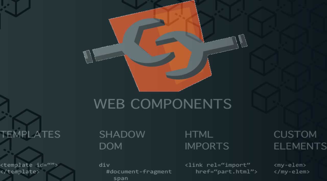
Web Components consist of three separate technologies that are used together:
- An Introduction to Web Components
- Crafting Reusable HTML Templates
- Creating a Custom Element from Scratch
- Encapsulating Style and Structure with Shadow DOM
- Advanced Tooling for Web Components
These are what make up the Web Components specification.
HTML Modules is likely to be the fourth technology in the stack, but it has yet to be implemented in any of the big four browsers. The Chrome team has announced it an intent to implement them in a future release.
Web Components are generally available in all of the major browsers with the exception of Microsoft Edge and Internet Explorer 11, but polyfills exist to fill in those gaps.
Referring to any of these as Web Components is technically accurate because the term itself is a bit overloaded. As a result, each of the technologies can be used independently or combined with any of the others. In other words, they are not mutually exclusive.
Let’s take a quick look at each of those first three. We’ll dive deeper into them in other articles in this series.
Custom elements
As the name implies, custom elements are HTML elements, like <div>, <section> or <article>, but something we can name ourselves that are defined via a browser API. Custom elements are just like those standard HTML elements — names in angle brackets — except they always have a dash in them, like <news-slider> or <bacon-cheeseburger>. Going forward, browser vendors have committed not to create new built-in elements containing a dash in their names to prevent conflicts.
Custom elements contain their own semantics, behaviors, markup and can be shared across frameworks and browsers.
class MyComponent extends HTMLElement {
  connectedCallback() {
    this.innerHTML = `<h1>Hello world</h1>`;
  }
}

customElements.define('my-component', MyComponent);
See the Pen Custom elements demo by Caleb Williams (@calebdwilliams)
on CodePen.
In this example, we define <my-component>, our very own HTML element. Admittedly, it doesn’t do much, however this is the basic building block of a custom element. All custom elements must in some way extend an HTMLElement in order to be registered with the browser.
Custom elements exist without third-party frameworks and the browser vendors are dedicated to the continued backward compatibility of the spec, all but guaranteeing that components written according to the specifications will not suffer from breaking API changes. What’s more, these components can generally be used out-of-the-box with today’s most popular frameworks, including Angular, React, Vue, and others with minimal effort.
Shadow DOM
The shadow DOM is an encapsulated version of the DOM. This allows authors to effectively isolate DOM fragments from one another, including anything that could be used as a CSS selector and the styles associated with them. Generally, any content inside of the document’s scope is referred to as the light DOM, and anything inside a shadow root is referred to as the shadow DOM.
When using the light DOM, an element can be selected by using document.querySelector('selector') or by targeting any element’s children by using element.querySelector('selector'); in the same way, a shadow root’s children can be targeted by calling shadowRoot.querySelector where shadowRoot is a reference to the document fragment — the difference being that the shadow root’s children will not be select-able from the light DOM. For example, If we have a shadow root with a <button> inside of it, calling shadowRoot.querySelector('button') would return our button, but no invocation of the document’s query selector will return that element because it belongs to a different DocumentOrShadowRoot instance. Style selectors work in the same way.
In this respect, the shadow DOM works sort of like an <iframe> where the content is cut off from the rest of the document; however, when we create a shadow root, we still have total control over that part of our page, but scoped to a context. This is what we call encapsulation.
If you’ve ever written a component that reuses the same id or relies on either CSS-in-JS tools or CSS naming strategies (like BEM), shadow DOM has the potential to improve your developer experience.
Imagine the following scenario:
<div>
  <div id="example">
    <!-- Pseudo-code used to designate a shadow root -->
    <#shadow-root>
      <style>
      button {
        background: tomato;
        color: white;
      }
      </style>
      <button id="button">This will use the CSS background tomato</button>
    </#shadow-root>
  </div>
  <button id="button">Not tomato</button>
</div>
Aside from the pseudo-code of <#shadow-root> (which is used here to demarcate the shadow boundary which has no HTML element), the HTML is fully valid. To attach a shadow root to the node above, we would run something like:
const shadowRoot = document.getElementById('example').attachShadow({ mode: 'open' });
shadowRoot.innerHTML = `<style>
button {
  color: tomato;
}
</style>
<button id="button">This will use the CSS color tomato <slot></slot></button>`;
A shadow root can also include content from its containing document by using the <slot> element. Using a slot will drop user content from the outer document at a designated spot in your shadow root.
See the Pen Shadow DOM style encapsulation demo by Caleb Williams (@calebdwilliams)
on CodePen.
HTML templates
The aptly-named HTML <template> element allows us to stamp out re-usable templates of code inside a normal HTML flow that won’t be immediately rendered, but can be used at a later time.
<template id="book-template">
<li><span class="title"></span> — <span class="author"></span></li>
</template>
<ul id="books"></ul>
The example above wouldn’t render any content until a script has consumed the template, instantiated the code and told the browser what to do with it.
const fragment = document.getElementById('book-template');
const books = [
  { title: 'The Great Gatsby', author: 'F. Scott Fitzgerald' },
  { title: 'A Farewell to Arms', author: 'Ernest Hemingway' },
  { title: 'Catch 22', author: 'Joseph Heller' }
];

books.forEach(book => {
  // Create an instance of the template content
  const instance = document.importNode(fragment.content, true);
  // Add relevant content to the template
  instance.querySelector('.title').innerHTML = book.title;
  instance.querySelector('.author').innerHTML = book.author;
  // Append the instance ot the DOM
  document.getElementById('books').appendChild(instance);
});
Notice that this example creates a template (<template id="book-template">) without any other Web Components technology, illustrating again that the three technologies in the stack can be used independently or collectively.
Ostensibly, the consumer of a service that utilizes the template API could write a template of any shape or structure that could be created at a later time. Another page on a site might use the same service, but structure the template this way:
<template id="book-template">
  <li><span class="author"></span>'s classic novel <span class="title"></span></li>
</template>

<ul id="books"></ul>
See the Pen Template example by Caleb Williams (@calebdwilliams)
on CodePen.
That wraps up our introduction to Web Components
As web development continues to become more and more complicated, it will begin to make sense for developers like us to begin deferring more and more development to the web platform itself which has continued to mature. The Web Components specifications are a set of low-level APIs that will continue to grow and evolve as our needs as developers evolve.
In the next article, we will take a deeper look at the HTML templates part of this. Then, we’ll follow that up with a discussion of custom elements and shadow DOM. Finally, we’ll wrap it all up by looking at higher-level tooling and incorporation with today’s popular libraries and frameworks.
Part 2: Crafting Reusable HTML Templates
HTML templates
One of the least recognized, but most powerful features of the Web Components specification is the <template> element. In the first article of this series, we defined the template element as, “user-defined templates in HTML that aren’t rendered until called upon.” In other words, a template is HTML that the browser ignores until told to do otherwise.
These templates then can be passed around and reused in a lot of interesting ways. For the purposes of this article, we will look at creating a template for a dialog that will eventually be used in a custom element.
Defining our template
As simple as it might sound, a <template> is an HTML element, so the most basic form of a template with content would be:
<template>
  <h1>Hello world</h1>
</template>
Running this in a browser would result in an empty screen as the browser doesn’t render the template element’s contents. This becomes incredibly powerful because it allows us to define content (or a content structure) and save it for later — instead of writing HTML in JavaScript.
In order to use the template, we will need JavaScript
const template = document.querySelector('template');
const node = document.importNode(template.content, true);
document.body.appendChild(node);
The real magic happens in the document.importNode method. This function will create a copy of the template’s content and prepare it to be inserted into another document (or document fragment). The first argument to the function grabs the template’s content and the second argument tells the browser to do a deep copy of the element’s DOM subtree (i.e. all of its children).
We could have used the template.content directly, but in so doing we would have removed the content from the element and appended to the document’s body later. Any DOM node can only be connected in one location, so subsequent uses of the template’s content would result in an empty document fragment (essentially a null value) because the content had previously been moved. Using document.importNode allows us to reuse instances of the same template content in multiple locations.
That node is then appended into the document.body and rendered for the user. This ultimately allows us to do interesting things, like providing our users (or consumers of our programs) templates for creating content, similar to the following demo, which we covered in the first article:
See the Pen Template example by Caleb Williams (@calebdwilliams)
on CodePen.
In this example, we have provided two templates to render the same content — authors and books they’ve written. As the form changes, we choose to render the template associated with that value. Using that same technique will allow us eventually create a custom element that will consume a template to be defined at a later time.
The versatility of template
One of the interesting things about templates is that they can contain any HTML. That includes script and style elements. A very simple example would be a template that appends a button that alerts us when it is clicked.
<button id="click-me">Log click event</button>
Let’s style it up:
button {
  all: unset;
  background: tomato;
  border: 0;
  border-radius: 4px;
  color: white;
  font-family: Helvetica;
  font-size: 1.5rem;
  padding: .5rem 1rem;
}
…and call it with a really simple script:
const button = document.getElementById('click-me');
button.addEventListener('click', event => alert(event));
Of course, we can put all of this together using HTML’s <style> and <script> tags directly in the template rather than in separate files:
<template id="template">
  <script>
    const button = document.getElementById('click-me');
    button.addEventListener('click', event => alert(event));
  </script>
  <style>
    #click-me {
      all: unset;
      background: tomato;
      border: 0;
      border-radius: 4px;
      color: white;
      font-family: Helvetica;
      font-size: 1.5rem;
      padding: .5rem 1rem;
    }
  </style>
  <button id="click-me">Log click event</button>
</template>
Once this element is appended to the DOM, we will have a new button with ID #click-me, a global CSS selector targeted to the button’s ID, and a simple event listener that will alert the element’s click event.
For our script, we simply append the content using document.importNode and we have a mostly-contained template of HTML that can be moved around from page to page.
See the Pen Template with script and styles demo by Caleb Williams (@calebdwilliams)
on CodePen.
Creating the template for our dialog
Getting back to our task of making a dialog element, we want to define our template’s content and styles.
<template id="one-dialog">
<script>
document.getElementById('launch-dialog').addEventListener('click', () => {
const wrapper = document.querySelector('.wrapper');
const closeButton = document.querySelector('button.close');
const wasFocused = document.activeElement;
wrapper.classList.add('open');
closeButton.focus();
closeButton.addEventListener('click', () => {
wrapper.classList.remove('open');
wasFocused.focus();
});
});
</script>
<style>
.wrapper {
opacity: 0;
transition: visibility 0s, opacity 0.25s ease-in;
}
.wrapper:not(.open) {
visibility: hidden;
}
.wrapper.open {
align-items: center;
display: flex;
justify-content: center;
height: 100vh;
position: fixed;
top: 0;
left: 0;
right: 0;
bottom: 0;
opacity: 1;
visibility: visible;
}
.overlay {
background: rgba(0, 0, 0, 0.8);
height: 100%;
position: fixed;
top: 0;
right: 0;
bottom: 0;
left: 0;
width: 100%;
}
.dialog {
background: #ffffff;
max-width: 600px;
padding: 1rem;
position: fixed;
}
button {
all: unset;
cursor: pointer;
font-size: 1.25rem;
position: absolute;
top: 1rem;
right: 1rem;
}
button:focus {
border: 2px solid blue;
}
</style>
<div class="wrapper">
<div class="overlay"></div>
<div class="dialog" role="dialog" aria-labelledby="title" aria-describedby="content">
<button class="close" aria-label="Close">✖️</button>
<h1 id="title">Hello world</h1>
<div id="content" class="content">
<p>This is content in the body of our modal</p>
</div>
</div>
</div>
</template>
This code will serve as the foundation for our dialog. Breaking it down briefly, we have a global close button, a heading and some content. We have also added in a bit of behavior to visually toggle our dialog (although it isn’t yet accessible). Unfortunately the styles and script content aren’t scoped to our template and are applied to the entire document, resulting in less-than-ideal behaviors when more than one instance of our template is added to the DOM. In our next article, we will put custom elements to use and create one of our own that consumes this template in real-time and encapsulates the element’s behavior.
See the Pen Dialog with template with script by Caleb Williams (@calebdwilliams)
on CodePen.
Part 3: Creating a Custom Element from Scratch
Creating a custom element
The bread and butter of Web Components are custom elements. The customElements API gives us a path to define custom HTML tags that can be used in any document that contains the defining class.
Think of it like a React or Angular component (e.g. <MyCard />), but without the React or Angular dependency. Native custom elements look like this: <my-card></my-card>. More importantly, think of it as a standard element that can be used in your React, Angular, Vue, [insert-framework-you’re-interested-in-this-week] applications without much fuss.
Essentially, a custom element consists of two pieces: a tag name and a class that extends the built-in HTMLElement class. The most basic version of our custom element would look like this:
class OneDialog extends HTMLElement {
  connectedCallback() {
    this.innerHTML = `<h1>Hello, World!</h1>`;
  }
}

customElements.define('one-dialog', OneDialog);
Note: throughout a custom element, the this value is a reference to the custom element instance.
In the example above, we defined a new standards-compliant HTML element, <one-dialog></one-dialog>. It doesn’t do much… yet. For now, using the <one-dialog> tag in any HTML document will create a new element with an <h1> tag reading “Hello, World!”
We are definitely going to want something more robust, and we’re in luck. In the last article, we looked at creating a template for our dialog and, since we will have access to that template, let’s utilize it in our custom element. We added a script tag in that example to do some dialog magic. let’s remove that for now since we’ll be moving our logic from the HTML template to inside the custom element class.
class OneDialog extends HTMLElement {
  connectedCallback() {
    const template = document.getElementById('one-dialog');
    const node = document.importNode(template.content, true);
    this.appendChild(node);
  }
}
Now, our custom element (<one-dialog>) is defined and the browser is instructed to render the content contained in the HTML template where the custom element is called.
Our next step is to move our logic into our component class.
Custom element lifecycle methods
Like React or Angular, custom elements have lifecycle methods. You’ve already been passively introduced to connectedCallback, which is called when our element gets added to the DOM.
The connectedCallback is separate from the element’s constructor. Whereas the constructor is used to set up the bare bones of the element, the connectedCallback is typically used for adding content to the element, setting up event listeners or otherwise initializing the component.
In fact, the constructor can’t be used to modify or manipulate the element’s attributes by design. If we were to create a new instance of our dialog using document.createElement, the constructor would be called. A consumer of the element would expect a simple node with no attributes or content inserted.
The createElement function has no options for configuring the element that will be returned. It stands to reason, then, that the constructor shouldn’t have the ability to modify the element that it creates. That leaves us with the connectedCallback as the place to modify our element.
With standard built-in elements, the element’s state is typically reflected by what attributes are present on the element and the values of those attributes. For our example, we’re going to look at exactly one attribute: [open]. In order to do this, we’ll need to watch for changes to that attribute and we’ll need attributeChangedCallback to do that. This second lifecycle method is called whenever one of the element constructor’s observedAttributes are updated.
That might sound intimidating, but the syntax is pretty simple:
class OneDialog extends HTMLElement {
  static get observedAttributes() {
    return ['open'];
  }

  attributeChangedCallback(attrName, oldValue, newValue) {
    if (newValue !== oldValue) {
      this[attrName] = this.hasAttribute(attrName);
    }
  }

  connectedCallback() {
    const template = document.getElementById('one-dialog');
    const node = document.importNode(template.content, true);
    this.appendChild(node);
  }
}
In our case above, we only care if the attribute is set or not, we don’t care about a value (this is similar to the HTML5 required attribute on inputs). When this attribute is updated, we update the element’s open property. A property exists on a JavaScript object whereas an attribute exists on an HTMLElement, this lifecycle method helps us keep the two in sync.
We wrap the updater inside the attributeChangedCallback inside a conditional checking to see if the new value and old value are equal. We do this to prevent an infinite loop inside our program because later we are going to create a property getter and setter that will keep the property and attributes in sync by setting the element’s attribute when the element’s property gets updated. The attributeChangedCallback does the inverse: updates the property when the attribute changes.
Now, an author can consume our component and the presence of the open attribute will dictate whether or not the dialog will be open by default. To make that a bit more dynamic, we can add custom getters and setters to our element’s open property:
class OneDialog extends HTMLElement {
  static get boundAttributes() {
    return ['open'];
  }

  attributeChangedCallback(attrName, oldValue, newValue) {
    this[attrName] = this.hasAttribute(attrName);
  }

  connectedCallback() {
    const template = document.getElementById('one-dialog');
    const node = document.importNode(template.content, true);
    this.appendChild(node);
  }

  get open() {
    return this.hasAttribute('open');
  }

  set open(isOpen) {
    if (isOpen) {
      this.setAttribute('open', true);
    } else {
      this.removeAttribute('open');
    }
  }
}
Our getter and setter will keep the open attribute (on the HTML element) and property (on the DOM object) values in sync. Adding the open attribute will set element.open to true and setting element.open to true will add the open attribute. We do this to make sure that our element’s state is reflected by its properties. This isn’t technically required, but is considered a best practice for authoring custom elements.
This does inevitably lead to a bit of boilerplate, but creating an abstract class that keeps these in sync is a fairly trivial task by looping over the observed attribute list and using Object.defineProperty.
class AbstractClass extends HTMLElement {
  constructor() {
    super();
    // Check to see if observedAttributes are defined and has length
    if (this.constructor.observedAttributes && this.constructor.observedAttributes.length) {
      // Loop through the observed attributes
      this.constructor.observedAttributes.forEach(attribute => {
        // Dynamically define the property getter/setter
        Object.defineProperty(this, attribute, {
          get() { return this.getAttribute(attribute); },
          set(attrValue) {
            if (attrValue) {
              this.setAttribute(attribute, attrValue);
            } else {
              this.removeAttribute(attribute);
            }
          }
        }
      });
    }
  }
}

// Instead of extending HTMLElement directly, we can now extend our AbstractClass
class SomeElement extends AbstractClass { /** Omitted */ }

customElements.define('some-element', SomeElement);
The above example isn’t perfect, it doesn’t take into account the possibility of attributes like open which don’t have a value assigned to them but rely only on the presence of the attribute. Making a perfect version of this would be beyond the scope of this article.
Now that we know whether or not our dialog is open, let’s add some logic to actually do the showing and hiding:
class OneDialog extends HTMLElement {
  /** Omitted */
  constructor() {
    super();
    this.close = this.close.bind(this);
  }

  set open(isOpen) {
    this.querySelector('.wrapper').classList.toggle('open', isOpen);
    this.querySelector('.wrapper').setAttribute('aria-hidden', !isOpen);
    if (isOpen) {
      this._wasFocused = document.activeElement;
      this.setAttribute('open', '');
      document.addEventListener('keydown', this._watchEscape);
      this.focus();
      this.querySelector('button').focus();
    } else {
      this._wasFocused && this._wasFocused.focus && this._wasFocused.focus();
      this.removeAttribute('open');
      document.removeEventListener('keydown', this._watchEscape);
      this.close();
    }
  }

  close() {
    if (this.open !== false) {
      this.open = false;
    }
    const closeEvent = new CustomEvent('dialog-closed');
    this.dispatchEvent(closeEvent);
  }

  _watchEscape(event) {
    if (event.key === 'Escape') {
        this.close();
    }
  }
}
There’s a lot going on here, but let’s walk through it. The first thing we do is grab our wrapper and toggle the .open class based on isOpen. To keep our element accessible, we need to toggle the aria-hidden attribute as well.
If the dialog is open, then we want to save a reference to the previously-focused element. This is to account for accessibility standards. We also add a keydown listener to the document called watchEscape that we have bound to the element’s this in the constructor in a pattern similar to how React handles method calls in class components.
We do this not only to ensure the proper binding for this.close, but also because Function.prototype.bind returns an instance of the function with the bound call site. By saving a reference to the newly-bound method in the constructor, we’re able to then remove the event when the dialog is disconnected (more on that in a moment). We finish up by focusing on our element and setting the focus on the proper element in our shadow root.
We also create a nice little utility method for closing our dialog that dispatches a custom event alerting some listener that the dialog has been closed.
If the element is closed (i.e. !open), we check to make sure the this._wasFocused property is defined and has a focus method and call that to return the user’s focus back to the regular DOM. Then we remove our event listener to avoid any memory leaks.
Speaking of cleaning up after ourselves, that takes us to yet another lifecycle method: disconnectedCallback. The disconnectedCallback is the inverse of the connectedCallback in that the method is called once the element is removed from the DOM and allows us to clean up any event listeners or MutationObservers attached to our element.
It just so happens we have a few more event listeners to wire up:
class OneDialog extends HTMLElement {
  /** Omitted */

  connectedCallback() {
    this.querySelector('button').addEventListener('click', this.close);
    this.querySelector('.overlay').addEventListener('click', this.close);
  }

  disconnectedCallback() {
    this.querySelector('button').removeEventListener('click', this.close);
    this.querySelector('.overlay').removeEventListener('click', this.close);
  }
}
Now we have a well-functioning, mostly accessible dialog element. There are a few bits of polish we can do, like capturing focus on the element, but that’s outside the scope of what we’re trying to learn here.
There is one more lifecycle method that doesn’t apply to our element, the adoptedCallback, which fires when the element is adopted into another part of the DOM.
In the following example, you will now see that our template element is being consumed by a standard <one-dialog> element.
See the Pen Dialog example using template by Caleb Williams (@calebdwilliams)
on CodePen.
Another thing: non-presentational components
The <one-template> we have created so far is a typical custom element in that it includes markup and behavior that gets inserted into the document when the element is included. However, not all elements need to render visually. In the React ecosystem, components are often used to manage application state or some other major functionality, like <Provider /> in react-redux.
Let’s imagine for a moment that our component is part of a series of dialogs in a workflow. As one dialog is closed, the next one should open. We could make a wrapper component that listens for our dialog-closed event and progresses through the workflow.
class DialogWorkflow extends HTMLElement {
  connectedCallback() {
    this._onDialogClosed = this._onDialogClosed.bind(this);
    this.addEventListener('dialog-closed', this._onDialogClosed);
  }

  get dialogs() {
    return Array.from(this.querySelectorAll('one-dialog'));
  }

  _onDialogClosed(event) {
    const dialogClosed = event.target;
    const nextIndex = this.dialogs.indexOf(dialogClosed);
    if (nextIndex !== -1) {
      this.dialogs[nextIndex].open = true;
    }
  }
}
This element doesn’t have any presentational logic, but serves as a controller for application state. With a little effort, we could recreate a Redux-like state management system using nothing but a custom element that could manage an entire application’s state in the same one that React’s Redux wrapper does.
That’s a deeper look at custom elements
Now we have a pretty good understanding of custom elements and our dialog is starting to come together. But it still has some problems.
Notice that we’ve had to add some CSS to restyle the dialog button because our element’s styles are interfering with the rest of the page. While we could utilize naming strategies (like BEM) to ensure our styles won’t create conflicts with other components, there is a more friendly way of isolating styles. Spoiler! It’s shadow DOM and that’s what we’re going to look at in the next part of this series on Web Components.
Another thing we need to do is define a new template for every component or find some way to switch templates for our dialog. As it stands, there can only be one dialog type per page because the template that it uses must always be present. So either we need some way to inject dynamic content or a way to swap templates.
In the next article, we will look at ways to increase the usability of the <one-dialog> element we just created by incorporating style and content encapsulation using the shadow DOM.
Part 4: Encapsulating Style and Structure with Shadow DOM
If you haven’t read those articles, you would be advised to do so now before proceeding in this article as this will continue to build upon the work we’ve done there.
When we last looked at our dialog component, it had a specific shape, structure and behaviors, however it relied heavily on the outside DOM and required that the consumers of our element would need to understand it’s general shape and structure, not to mention authoring all of their own styles (which would eventually modify the document’s global styles). And because our dialog relied on the contents of a template element with an id of “one-dialog”, each document could only have one instance of our modal.
The current limitations of our dialog component aren’t necessarily bad. Consumers who have an intimate knowledge of the dialog’s inner workings can easily consume and use the dialog by creating their own <template> element and defining the content and styles they wish to use (even relying on global styles defined elsewhere). However, we might want to provide more specific design and structural constraints on our element to accommodate best practices, so in this article, we will be incorporating the shadow DOM to our element.
What is the shadow DOM?
In our introduction article, we said that the shadow DOM was “capable of isolating CSS and JavaScript, almost like an <iframe>.” Like an <iframe>, selectors and styles inside of a shadow DOM node don’t leak outside of the shadow root and styles from outside the shadow root don’t leak in. There are a few exceptions that inherit from the parent document, like font family and document font sizes (e.g. rem) that can be overridden internally.
Unlike an <iframe>, however, all shadow roots still exist in the same document so that all code can be written inside a given context but not worry about conflicts with other styles or selectors.
Adding the shadow DOM to our dialog
To add a shadow root (the base node/document fragment of the shadow tree), we need to call our element’s attachShadow method:
class OneDialog extends HTMLElement {
  constructor() {
    super();
    this.attachShadow({ mode: 'open' });
    this.close = this.close.bind(this);
  }
}
By calling attachShadow with mode: 'open', we are telling our element to save a reference to the shadow root on the element.shadowRoot property. attachShadow always returns a reference to the shadow root, but here we don’t need to do anything with that.
If we had called the method with mode: 'closed', no reference would have been stored on the element and we would have to create our own means of storage and retrieval using a WeakMap or Object, setting the node itself as the key and the shadow root as the value.
const shadowRoots = new WeakMap();

class ClosedRoot extends HTMLElement {
  constructor() {
    super();
    const shadowRoot = this.attachShadow({ mode: 'closed' });
    shadowRoots.set(this, shadowRoot);
  }

  connectedCallback() {
    const shadowRoot = shadowRoots.get(this);
    shadowRoot.innerHTML = `<h1>Hello from a closed shadow root!</h1>`;
  }
}
We could also save a reference to the shadow root on our element itself, using a Symbol or other key to try to make the shadow root private.
In general, the closed mode for shadow roots exists for native elements that use the shadow DOM in their implementation (like <audio> or <video>). Further, for unit testing our elements, we might not have access to the shadowRoots object, making it unable for us to target changes inside our element depending on how our library is architected.
There might be some legitimate use cases for user-land closed shadow roots, but they are few and far between, so we’ll stick with the open shadow root for our dialog.
After implementing the new open shadow root, you might notice now that our element is completely broken when we try to run it:
See the Pen Dialog example using template with shadow root by Caleb Williams (@calebdwilliams)
on CodePen.
This is because all of the content we had before was added to and manipulated in the traditional DOM (what we’ll call the light DOM). Now that our element has a shadow DOM attached, there is no outlet for the light DOM to render. Let’s start fixing these issues by moving our content to the shadow DOM:
class OneDialog extends HTMLElement {
  constructor() {
    super();
    this.attachShadow({ mode: 'open' });
    this.close = this.close.bind(this);
  }

  connectedCallback() {
    const { shadowRoot } = this;
    const template = document.getElementById('one-dialog');
    const node = document.importNode(template.content, true);
    shadowRoot.appendChild(node);

    shadowRoot.querySelector('button').addEventListener('click', this.close);
    shadowRoot.querySelector('.overlay').addEventListener('click', this.close);
    this.open = this.open;
  }

  disconnectedCallback() {
    this.shadowRoot.querySelector('button').removeEventListener('click', this.close);
    this.shadowRoot.querySelector('.overlay').removeEventListener('click', this.close);
  }

  set open(isOpen) {
    const { shadowRoot } = this;
    shadowRoot.querySelector('.wrapper').classList.toggle('open', isOpen);
    shadowRoot.querySelector('.wrapper').setAttribute('aria-hidden', !isOpen);
    if (isOpen) {
      this._wasFocused = document.activeElement;
      this.setAttribute('open', '');
      document.addEventListener('keydown', this._watchEscape);
      this.focus();
      shadowRoot.querySelector('button').focus();
    } else {
      this._wasFocused && this._wasFocused.focus && this._wasFocused.focus();
      this.removeAttribute('open');
      document.removeEventListener('keydown', this._watchEscape);
    }
  }

  close() {
    this.open = false;
  }

  _watchEscape(event) {
    if (event.key === 'Escape') {
        this.close();
    }
  }
}

customElements.define('one-dialog', OneDialog);
The major changes to our dialog so far are actually relatively minimal, but they carry a lot of impact. For starters, all our selectors (including our style definitions) are internally scoped. For example, our dialog template only has one button internally, so our CSS only targets button { ... }, and those styles don’t bleed out to the light DOM.
We are, however, still reliant on the template that is external to our element. Let’s change that by removing the markup from our template and dropping it into our shadow root’s innerHTML.
See the Pen Dialog example using only shadow root by Caleb Williams (@calebdwilliams)
on CodePen.
Including content from the light DOM
The shadow DOM specification includes a means for allowing content from outside the shadow root to be rendered inside of our custom element. For those of you who remember AngularJS, this is a similar concept to ng-transclude or using props.children in React. With Web Components, this is done using the <slot> element.
A simple example would look like this:
<div>
  <span>world <!-- this would be inserted into the slot element below --></span>
  <#shadow-root><!-- pseudo code -->
    <p>Hello <slot></slot></p>
  </#shadow-root>
</div>
A given shadow root can have any number of slot elements, which can be distinguished with a name attribute. The first slot inside of the shadow root without a name, will be the default slot and all content not otherwise assigned will flow inside that node. Our dialog really needs two slots: a heading and some content (which we’ll make default).
See the Pen Dialog example using shadow root and slots by Caleb Williams (@calebdwilliams)
on CodePen.
Go ahead and change the HTML portion of our dialog and see the result. Any content inside of the light DOM is inserted into the slot to which it is assigned. Slotted content remains inside the light DOM although it is rendered as if it were inside the shadow DOM. This means that these elements are still fully style-able by a consumer who might want to control the look and feel of their content.
A shadow root’s author can style content inside the light DOM to a limited extent using the CSS ::slotted() pseudo-selector; however, the DOM tree inside slotted is collapsed, so only simple selectors will work. In other words, we wouldn’t be able to style a <strong> element inside a <p> element within the flattened DOM tree in our previous example.
The best of both worlds
Our dialog is in a good state now: it has encapsulated, semantic markup, styles and behavior; however, some consumers of our dialog might still want to define their own template. Fortunately, by combining two techniques we’ve already learned, we can allow authors to optionally define an external template.
To do this, we will allow each instance of our component to reference an optional template ID. To start, we need to define a getter and setter for our component’s template.
get template() {
  return this.getAttribute('template');
}

set template(template) {
  if (template) {
    this.setAttribute('template', template);
  } else {
    this.removeAttribute('template');
  }
  this.render();
}
Here we’re doing much the same thing that we did with our open property by tying it directly to its corresponding attribute. But at the bottom, we’re introducing a new method to our component: render. We are going to use our render method to insert our shadow DOM’s content and remove that behavior from the connectedCallback; instead, we will call render when our element is connected:
connectedCallback() {
  this.render();
}

render() {
  const { shadowRoot, template } = this;
  const templateNode = document.getElementById(template);
  shadowRoot.innerHTML = '';
  if (templateNode) {
    const content = document.importNode(templateNode.content, true);
    shadowRoot.appendChild(content);
  } else {
    shadowRoot.innerHTML = `<!-- template text -->`;
  }
  shadowRoot.querySelector('button').addEventListener('click', this.close);
  shadowRoot.querySelector('.overlay').addEventListener('click', this.close);
  this.open = this.open;
}
Our dialog now has some really basic default stylings, but also gives consumers the ability to define a new template for each instance. If we wanted, we could even use attributeChangedCallback to make this component update based on the template it’s currently pointing to:
static get observedAttributes() { return ['open', 'template']; }

attributeChangedCallback(attrName, oldValue, newValue) {
  if (newValue !== oldValue) {
    switch (attrName) {
      /** Boolean attributes */
      case 'open':
        this[attrName] = this.hasAttribute(attrName);
        break;
      /** Value attributes */
      case 'template':
        this[attrName] = newValue;
        break;
    }
  }
}
See the Pen Dialog example using shadow root, slots and template by Caleb Williams (@calebdwilliams)
on CodePen.
In the demo above, changing the template attribute on our <one-dialog> element will alter which design is being used when the element is rendered.
Strategies for styling the shadow DOM
Currently, the only reliable way to style a shadow DOM node is by adding a <style> element to the shadow root’s inner HTML. This works fine in almost every case as browsers will de-duplicate stylesheets across these components, where possible. This does tend to add a bit of memory overhead, but generally not enough to notice.
Inside of these style tags, we can use CSS custom properties to provide an API for styling our components. Custom properties can pierce the shadow boundary and effect content inside a shadow node.
“Can we use a <link> element inside of a shadow root?” you might ask. And, in fact, we can. The trouble comes when trying to reuse this component across multiple applications as the CSS file might not be saved in a consistent location throughout all apps. However, if we are certain as to the element’s stylesheet location, then using <link> is an option. The same holds true for including an @import rule in a style tag.
It is also worth mentioning that not all components need the kind of styling we’re using here. Using the CSS :host and :host-context selectors, we can simply define more primitive components as block-level elements and allow consumers to provide classes to style things like background colors, font settings, and more.
Our dialog, on the other hand, is fairly complex. Something like a listbox (comprised of a label and an checkbox input) is not and can be just merely as a surface for native element composition. That is equally as valid a styling strategy as is being more explicit about styles (say for design systems purposes where all checkboxes might look a certain way). It largely depends on your use case.
CSS custom properties
One of the benefits of using CSS custom properties — also called CSS variables — is that they bleed through the shadow DOM. This is by design, giving component authors a surface for allowing theming and styling of their components from the outside. It is important to note, however, that since CSS cascades, changes to custom properties made inside a shadow root do not bleed back up.
See the Pen CSS custom properties and shadow DOM by Caleb Williams (@calebdwilliams)
on CodePen.
Go ahead and comment out or remove the variables set in the CSS panel of the demo above and see how this impacts the rendered content. Afterward, you can take a look at the styles in the shadow DOM’s innerHTML, you’ll see how the shadow DOM can define its own property that won’t affect the light DOM.
Constructible stylesheets
At the time of this writing, there is a proposed web feature that will allow for more modular styling of shadow DOM and light DOM elements using constructible stylesheets that has already landed in Chrome 73 and received positive signaling from Mozilla.
This feature would allow authors to define stylesheets in their JavaScript files similar to how they would write normal CSS and share those styles across multiple nodes. So, a single stylesheet could be appended to multiple shadow roots and potentially the document as well.
const everythingTomato = new CSSStyleSheet();
everythingTomato.replace('* { color: tomato; }');

document.adoptedStyleSheets = [everythingTomato];

class SomeCompoent extends HTMLElement {
  constructor() {
    super();
    this.adoptedStyleSheets = [everythingTomato];
  }

  connectedCallback() {
    this.shadowRoot.innerHTML = `<h1>CSS colors are fun</h1>`;
  }
}
In the above example, the everythingTomato stylesheet would be simultaneously applied to the shadow root and to the document’s body. This feature would be very useful for teams creating design systems and components that are intended to be shared across multiple applications and frameworks.
In the next demo, we can see a really basic example of how this can be utilized and the power that constructble stylesheets offer.
See the Pen Construct style sheets demo by Caleb Williams (@calebdwilliams)
on CodePen.
In this demo, we construct two stylesheets and append them to the document and to the custom element. After three seconds, we remove one stylesheet from our shadow root. For those three seconds, however, the document and the shadow DOM share the same stylesheet. Using the polyfill included in that demo, there are actually two style elements present, but Chrome runs this natively.
That demo also includes a form for showing how a sheet’s rules can easily and effectively changed asynchronously as needed. This addition to the web platform can be a powerful ally for those creating design systems that span multiple frameworks or site authors who want to provide themes for their websites.
There is also a proposal for CSS Modules that could eventually be used with the adoptedStyleSheets feature. If implemented in its current form, this proposal would allow importing CSS as a module much like ECMAScript modules:
import styles './styles.css';

class SomeCompoent extends HTMLElement {
  constructor() {
    super();
    this.adoptedStyleSheets = [styles];
  }
}
Part and theme
Another feature that is in the works for styling Web Components are the ::part() and ::theme() pseudo-selectors. The ::part() specification will allow authors to define parts of their custom elements that have a surface for styling:
class SomeOtherComponent extends HTMLElement {
  connectedCallback() {
    this.attachShadow({ mode: 'open' });
    this.shadowRoot.innerHTML = `
      <style>h1 { color: rebeccapurple; }</style>
      <h1>Web components are <span part="description">AWESOME</span></h1>
    `;
  }
}

customElements.define('other-component', SomeOtherComponent);
In our global CSS, we could target any element that has a part called description by invoking the CSS ::part() selector.
other-component::part(description) {
  color: tomato;
}
In the above example, the primary message of the <h1> tag would be in a different color than the description part, giving custom element authors the ability to expose styling APIs for their components and maintain control over the pieces they want to maintain control over.
The difference between ::part() and ::theme() is that ::part() must be specifically selected whereas ::theme() can be nested at any level. The following would have the same effect as the above CSS, but would also work for any other element that included a part="description" in the entire document tree.
:root::theme(description) {
  color: tomato;
}
Like constructible stylesheets, ::part() has landed in Chrome 73.
Wrapping up
Our dialog component is now complete, more-or-less. It includes its own markup, styles (without any outside dependencies) and behaviors. This component can now be included in projects that use any current or future frameworks because they are built against the browser specifications instead of third-party APIs.
Some of the core controls are a little verbose and do rely on at least a moderate knowledge of how the DOM works. In our final article, we will discuss higher-level tooling and how to incorporate with popular frameworks.
Part 5: Advanced Tooling for Web Components
Framework agnostic
Our dialog component works great in almost any framework or even without one. (Granted, if JavaScript is disabled, the whole thing is for naught.) Angular and Vue treat Web Components as first-class citizens: the frameworks have been designed with web standards in mind. React is slightly more opinionated, but not impossible to integrate.
Angular
First, let’s take a look at how Angular handles custom elements. By default, Angular will throw a template error whenever it encounters an element it doesn’t recognize (i.e. the default browser elements or any of the components defined by Angular). This behavior can be changed by including the CUSTOM_ELEMENTS_SCHEMA.
…allows an NgModule to contain the following:* Non-Angular elements named with dash case (
-).
- Element properties named with dash case (
-). Dash case is the naming convention for custom elements.
…allows an NgModule to contain the following:
Consuming this schema is as simple as adding it to a module:
import { NgModule, CUSTOM_ELEMENTS_SCHEMA } from '@angular/core';

@NgModule({
  /** Omitted */
  schemas: [ CUSTOM_ELEMENTS_SCHEMA ]
})
export class MyModuleAllowsCustomElements {}
That’s it. After this, Angular will allow us to use our custom element wherever we want with the standard property and event bindings:
<one-dialog [open]="isDialogOpen" (dialog-closed)="dialogClosed($event)">
  <span slot="heading">Heading text</span>
  <div>
    <p>Body copy</p>
  </div>
</one-dialog>
Vue
Vue’s compatibility with Web Components is even better than Angular’s as it doesn’t require any special configuration. Once an element is registered, it can be used with Vue’s default templating syntax:
<one-dialog v-bind:open="isDialogOpen" v-on:dialog-closed="dialogClosed">
  <span slot="heading">Heading text</span>
  <div>
    <p>Body copy</p>
  </div>
</one-dialog>
One caveat with Angular and Vue, however, is their default form controls. If we wish to use something like reactive forms or [(ng-model)] in Angular or v-model in Vue on a custom element with a form control, we will need to set up that plumbing for which is beyond the scope of this article.
React
React is slightly more complicated than Angular. React’s virtual DOM effectively takes a JSX tree and renders it as a large object. So, instead of directly modifying attributes on HTML elements like Angular or Vue, React uses an object syntax to track changes that need to be made to the DOM and updates them in bulk. This works just fine in most cases. Our dialog’s open attribute is bound to its property and will respond perfectly well to changing props.
The catch comes when we start to look at the CustomEvent dispatched when our dialog closes. React implements a series of native event listeners for us with their synthetic event system. Unfortunately, that means that controls like onDialogClosed won’t actually attach event listeners to our component, so we have to find some other way.
The most obvious means of adding custom event listeners in React is by using DOM refs. In this model, we can reference our HTML node directly. The syntax is a bit verbose, but works great:
import React, { Component, createRef } from 'react';

export default class MyComponent extends Component {
  constructor(props) {
    super(props);
    // Create the ref
    this.dialog = createRef();
    // Bind our method to the instance
    this.onDialogClosed = this.onDialogClosed.bind(this);

    this.state = {
      open: false
    };
  }

  componentDidMount() {
    // Once the component mounds, add the event listener
    this.dialog.current.addEventListener('dialog-closed', this.onDialogClosed);
  }

  componentWillUnmount() {
    // When the component unmounts, remove the listener
    this.dialog.current.removeEventListener('dialog-closed', this.onDialogClosed);
  }

  onDialogClosed(event) { /** Omitted **/ }

  render() {
    return <div>
      <one-dialog open={this.state.open} ref={this.dialog}>
        <span slot="heading">Heading text</span>
        <div>
          <p>Body copy</p>
        </div>
      </one-dialog>
    </div>
  }
}
Or, we can use stateless functional components and hooks:
import React, { useState, useEffect, useRef } from 'react';

export default function MyComponent(props) {
  const [ dialogOpen, setDialogOpen ] = useState(false);
  const oneDialog = useRef(null);
  const onDialogClosed = event => console.log(event);

  useEffect(() => {
    oneDialog.current.addEventListener('dialog-closed', onDialogClosed);
    return () => oneDialog.current.removeEventListener('dialog-closed', onDialogClosed)
  });

  return <div>
      <button onClick={() => setDialogOpen(true)}>Open dialog</button>
      <one-dialog ref={oneDialog} open={dialogOpen}>
        <span slot="heading">Heading text</span>
        <div>
          <p>Body copy</p>
        </div>
      </one-dialog>
    </div>
}
That’s not bad, but you can see how reusing this component could quickly become cumbersome. Luckily, we can export a default React component that wraps our custom element using the same tools.
import React, { Component, createRef } from 'react';
import PropTypes from 'prop-types';

export default class OneDialog extends Component {
  constructor(props) {
    super(props);
    // Create the ref
    this.dialog = createRef();
    // Bind our method to the instance
    this.onDialogClosed = this.onDialogClosed.bind(this);
  }

  componentDidMount() {
    // Once the component mounds, add the event listener
    this.dialog.current.addEventListener('dialog-closed', this.onDialogClosed);
  }

  componentWillUnmount() {
    // When the component unmounts, remove the listener
    this.dialog.current.removeEventListener('dialog-closed', this.onDialogClosed);
  }

  onDialogClosed(event) {
    // Check to make sure the prop is present before calling it
    if (this.props.onDialogClosed) {
      this.props.onDialogClosed(event);
    }
  }

  render() {
    const { children, onDialogClosed, ...props } = this.props;
    return <one-dialog {...props} ref={this.dialog}>
      {children}
    </one-dialog>
  }
}

OneDialog.propTypes = {
  children: children: PropTypes.oneOfType([
      PropTypes.arrayOf(PropTypes.node),
      PropTypes.node
  ]).isRequired,
  onDialogClosed: PropTypes.func
};
…or again as a stateless, functional component:
import React, { useRef, useEffect } from 'react';
import PropTypes from 'prop-types';

export default function OneDialog(props) {
  const { children, onDialogClosed, ...restProps } = props;
  const oneDialog = useRef(null);

  useEffect(() => {
    onDialogClosed ? oneDialog.current.addEventListener('dialog-closed', onDialogClosed) : null;
    return () => {
      onDialogClosed ? oneDialog.current.removeEventListener('dialog-closed', onDialogClosed) : null;
    };
  });

  return <one-dialog ref={oneDialog} {...restProps}>{children}</one-dialog>
}
Now we can use our dialog natively in React, but still keep the same API across all our applications (and still drop classes, if that’s your thing).
import React, { useState } from 'react';
import OneDialog from './OneDialog';

export default function MyComponent(props) {
  const [open, setOpen] = useState(false);
  return <div>
    <button onClick={() => setOpen(true)}>Open dialog</button>
    <OneDialog open={open} onDialogClosed={() => setOpen(false)}>
      <span slot="heading">Heading text</span>
      <div>
        <p>Body copy</p>
      </div>
    </OneDialog>
  </div>
}
Advanced tooling
There are a number of great tools for authoring your own custom elements. Searching through npm reveals a multitude of tools for creating highly-reactive custom elements (including my own pet project), but the most popular today by far is lit-html from the Polymer team and, more specifically for Web Components, LitElement.
LitElement is a custom elements base class that provides a series of APIs for doing all of the things we’ve walked through so far. It can be run in a browser without a build step, but if you enjoy using future-facing tools like decorators, there are utilities for that as well.
Before diving into how to use lit or LitElement, take a minute to familiarize yourself with tagged template literals, which are a special kind of function called on template literal strings in JavaScript. These functions take in an array of strings and a collection of interpolated values and can return anything you might want.
function tag(strings, ...values) {
  console.log({ strings, values });
  return true;
}
const who = 'world';

tag`hello ${who}`;
/** would log out { strings: ['hello ', ''], values: ['world'] } and return true **/
What LitElement gives us is live, dynamic updating of anything passed to that values array, so as a property updates, the element’s render function would be called and the resulting DOM would be re-rendered
import { LitElement, html } from 'lit-element';

class SomeComponent {
  static get properties() {
    return {
      now: { type: String }
    };
  }

  connectedCallback() {
    // Be sure to call the super
    super.connectedCallback();
    this.interval = window.setInterval(() => {
      this.now = Date.now();
    });
  }

  disconnectedCallback() {
    super.disconnectedCallback();
    window.clearInterval(this.interval);
  }

  render() {
    return html`<h1>It is ${this.now}</h1>`;
  }
}

customElements.define('some-component', SomeComponent);
See the Pen LitElement now example by Caleb Williams (@calebdwilliams)
on CodePen.
What you will notice is that we have to define any property we want LitElement to watch using the static properties getter. Using that API tells the base class to call render whenever a change is made to the component’s properties. render, in turn, will update only the nodes that need to change.
So, for our dialog example, it would look like this using LitElement:
See the Pen Dialog example using LitElement by Caleb Williams (@calebdwilliams)
on CodePen.
There are several variants of lit-html available, including Haunted, a React hooks-style library for Web Components that can also make use of virtual components using lit-html as a base.
At the end of the day, most of the modern Web Components tools are various flavors of what LitElement is: a base class that abstracts common logic away from our components. Among the other flavors are Stencil, SkateJS, Angular Elements and Polymer.
#web-development #html #css #javascript #html5 #css3