How to Build React Native Forms with UI Components
In this tutorial, you will learn how to build better React Native forms using native UI components and React form libraries.
Forms are interactive parts of websites and product UI. Feedback, surveys, data collection, etc., are critical aspects of your product that require the extensive use of forms. If you don’t get your forms right, you may unknowingly create a bad UX, drastically reducing your product’s use. In this article, we will explore how to build different performant React Native forms with React Native UI components.
Before getting started, you will need to have Xcode or Android Studio installed, as well as Node.js v14+. Although it is not mandatory, some knowledge of React Native will be helpful. It is worth noting that we will not be covering the styling for the app examples we’ll build in this project. This will allow us to focus on functionality. However, all the styles will be available in the project repository.
Contents:
- What are forms in React Native?
- Creating forms in React Native
- Using the
Pickercomponent - Working with the
Slidercomponent - Using the
Modalcomponent
- Using the
- Building forms with a React form library
- Creating a form with React Hook Form
What are forms in React Native?
React Native forms offer intuitive ways of gathering user input and submitting it to a backend server or storing it locally. Generally, forms can constitute input fields, such as text inputs, checkboxes, radio buttons, dropdown menus, and submit buttons. You can check out our guides to radio buttons and dropdown menus in React Native to learn more.
React Native comes with inbuilt components to create forms, such as TextInput, Switch, Picker, and Slider. Likewise, you can create custom components to suit your exact needs. React Native handles user input and form submission with the state object. The state object can be defined in a component to hold input values and update them with values as the user interacts.
Some third-party libraries are also available to facilitate form handling in React Native. Libraries like Formik and Redux Form provide extra components like form validation and refined form submission options.
Creating forms in React Native
We will start with a few installations for those using React Native for the first time. If this is your first time with React Native, install the required packages and follow the steps accordingly. First, install the React Native CLI tool with the following command:
npm install -g react-native-cliAfterward, create a new React Native project named pickerSample and start the server by running this command:
react-native init pickerSample
Then, change the directory into the newly created project and start the server with this command:
cd pickerSample && npx react-native run-ios // Start the iOS simulator
// OR
cd pickerSample && npx react-native run-android // Android the android emulator
If you have Xcode or Android Studio installed, the commands above will run the project, and you should have the simulator show up on the screen like this:
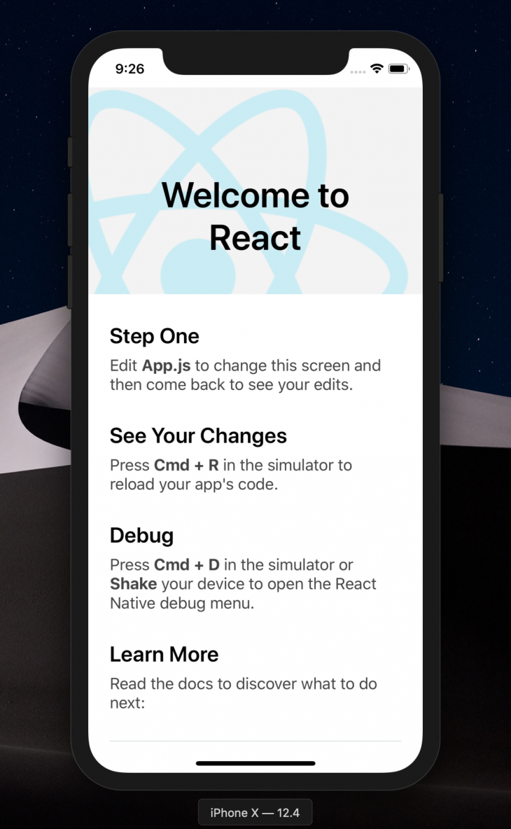
In my case, I’m using Xcode.
Using the Picker component
The React Native Picker component is the equivalent of a dropdown in regular JavaScript. It is used to render a list of multiple choices for users to select only one option. The functionality is useful when asking a question with varying options but only one correct answer.
For instance, in payment, you ask users to select their currency. It makes sense to render as many currencies as possible depending on the scope of your customer base. That way, you can offer various options and allow only one answer. Let’s see how we can achieve that using the React Native Picker component! First, install the React Native Picker by running the following:
npm install @react-native-picker/picker --save
#OR
yarn add @react-native-picker/picker.
In the root directory of the sample project, create a new src/components/Picker.js file and define some form fields for demonstration purposes, as shown below:
import React, {useState} from 'react';
import {Text, StyleSheet, View, TextInput, Button} from 'react-native';
import { Picker } from '@react-native-picker/picker';

const App = () => {
  const [currency, setCurrency] = useState('US Dollar');
  return (
    <View >
      <Text > Demo Form </Text>
      <View>
        <TextInput
          placeholder="Email" />
        <TextInput
          secureTextEntry={true}
          placeholder="Password"
        />
        <Picker
          selectedValue={currency}
          onValueChange={currentCurrency => setCurrency(currentCurrency)}>
          <Picker.Item label="USD" value="US Dollars" />
          <Picker.Item label="EUR" value="Euro" />
          <Picker.Item label="NGN" value="Naira" />
        </Picker>
        <Text>
          Selected: {currency}
        </Text>
      </View>
    </View>
  );
};
const styles = StyleSheet.create({
  //Check project repo for styles
});

export default App;
To output this component, we need to update our App.js file like so:
import React from 'react';
import Picker from './src/components/Picker'
const App = () => {
  return (
    <Picker />
  );
};
export default App;
We’ve just rendered the Picker component we created in the src/components/Picker.js file here. As a result, when the app loads, the picker file will be rendered. If we run the app at this point, we should get the following output on the simulator:
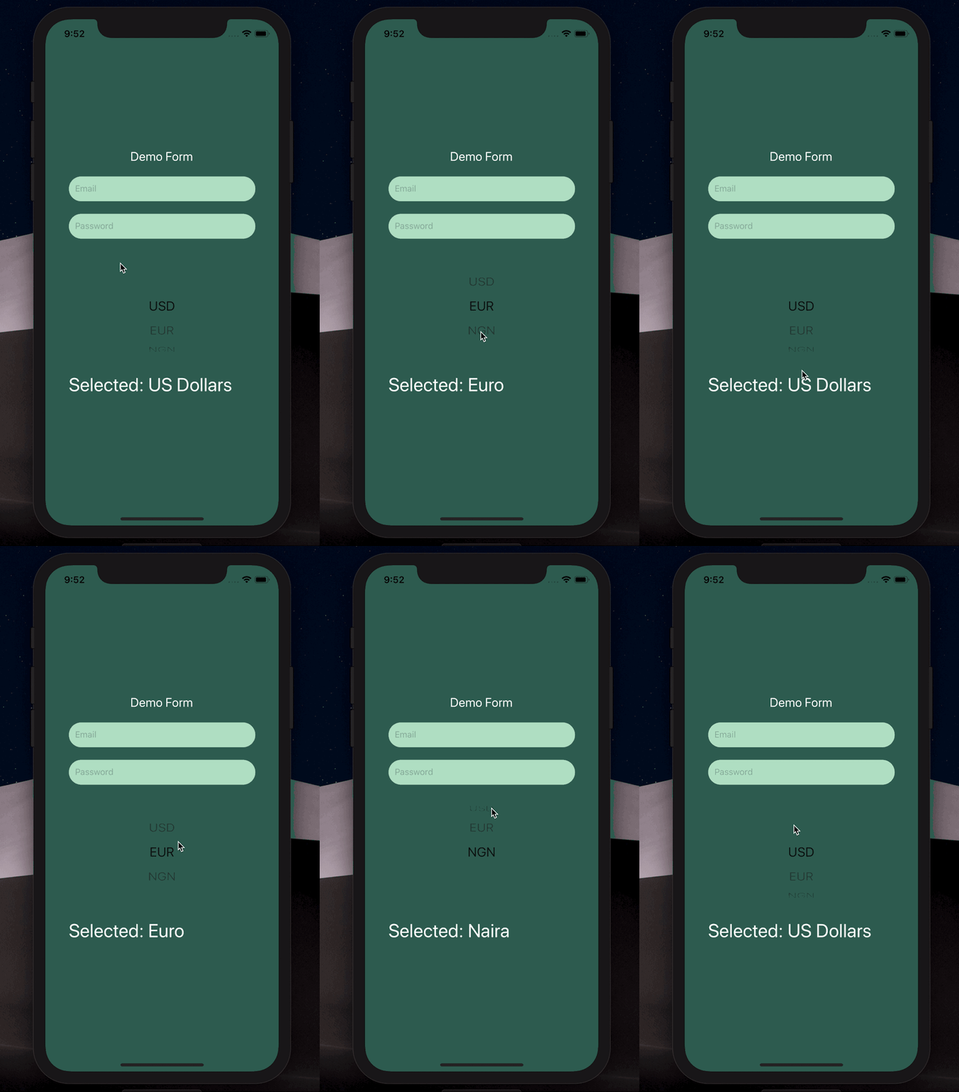
Working with the Slider component
The React Native Slider component is mostly used to select a single value from a range of values. This feature is especially useful in forms where you need to present users with a range of values from a defined minimumValue to a maximumValue scale.
Practical examples of this component include product and performance rating scales. To demonstrate this, we’ll create a new component, build out our form, and implement the slider. Install the component by running the following:
yarn add @react-native-community/slider
#OR
npm install @react-native-community/slider --save.
In the src/components we created earlier, create a new Slider.js file and update it with the code below:
import React, {useState} from 'react';
import {Text, StyleSheet, View, TextInput} from 'react-native';
import Slider from '@react-native-community/slider';

const App = () => {
  const [value, setValue] = useState(0);
  return (
    <View>
      <Text> Demo Form </Text>
      <View>
        <TextInput placeholder="Email" />
        <TextInput
          secureTextEntry={true}
          placeholder="Password"
        />
        <Text>
          Rate your teams performance this quarter
        </Text>
        <Slider
          step={1}
          minimumValue={0}
          maximumValue={100}
          value={value}
          onValueChange={slideValue => setValue(slideValue)}
          minimumTrackTintColor="#1fb28a"
          maximumTrackTintColor="#d3d3d3"
          thumbTintColor="#b9e4c9"
        />
        <Text>
          Slide value: {value}%
        </Text>
      </View>
    </View>
  );
};
export default App;
To render this component when the app runs and see what it looks like, we’ll update the App.js file again like so:
import React from 'react';
import Picker from './src/components/Picker'
import Slider from './src/components/Slider'
const App = () => {
  return (
    <Slider />
  );
};
export default App;
Run the app again, and we should get the following output:

Using the Modal component
The Modal UI component lets you present content directly on top of a parent (enclosing) view. This functionality is usually useful when performing several activities while avoiding navigation into different pages. Just like the Slider component, the React Native Modal component has also been extracted from React Native core into the community package that is now available via npm.
The major difference is the added features that came with the react-native-modal package. This includes animations, inline style props, more customization options, etc. As a result, the earlier Modal component from React Native core will be deprecated in future releases.
To further exemplify it, we’ll build a demo app to show how you can implement the Modal component independently. In my case, I want to show a login form in a modal when a user clicks it. But first, let’s install the package from npm:
npm i react-native-modal
#OR
yarn add react-native-modal
Then, create a Login.js file in the /components directory. In this file, we’ll define the form we want to render on the modal with the following code:
import React, {useState} from 'react';
import { Text, View, TextInput} from 'react-native';

const LoginForm = () => {
  const [value, setValue] = useState(0);
  return (
    <View>
      <Text> Login Form </Text>
      <View>
        <TextInput placeholder="Enter Email" />
        <TextInput
          secureTextEntry={true}
          placeholder="Enter Password"
        />
      </View>
    </View>
  );
};

export default LoginForm;
This is a login form that doesn’t do much. I’m only defining the email and password fields to give you a visual understanding of the supposed use case. Next, we’ll create the Modal component src/components/Modal.js and update it like so:
import React, { useState} from 'react';
import {Button, View, StyleSheet} from 'react-native';
import Modal from 'react-native-modal';
import LoginForm from './Login';

const ModalDemo = () => {
  const [isModalVisible, setIsModalVisible] = useState(false);
  const toggleModal = () => {
    setIsModalVisible(!isModalVisible);
  };
  return (
    <View style={styles.container}>
      <Button title="Click here to login" onPress={toggleModal} />
      <Modal
        isVisible={isModalVisible}>
        <View>
          <LoginForm />
          <View>
            <Button title="Hide modal" onPress={toggleModal} />
          </View>
        </View>
      </Modal>
    </View>
  );
};
const styles = StyleSheet.create({
  container: {
    flex: 1,
    backgroundColor: '#E6E6FA',
    alignItems: 'center',
    justifyContent: 'center',
  },
});
export default ModalDemo;
Here, we import the React Native Modal component we installed earlier. We also did the same for the login form we created to render on the modal. Next, we render the modal with buttons to show and hide the modal. Initially, the modal will be hidden. We’ll do this by setting the isVisible prop of the Modal component to false.
When the login button is clicked, we call the toggleModal() function that changes the value of the isVisible prop from false to true. When that happens, the modal will be visible. In the Modal component, we rendered the login form and a button to hide the modal by toggling the value of the isVisible prop, as shown below:
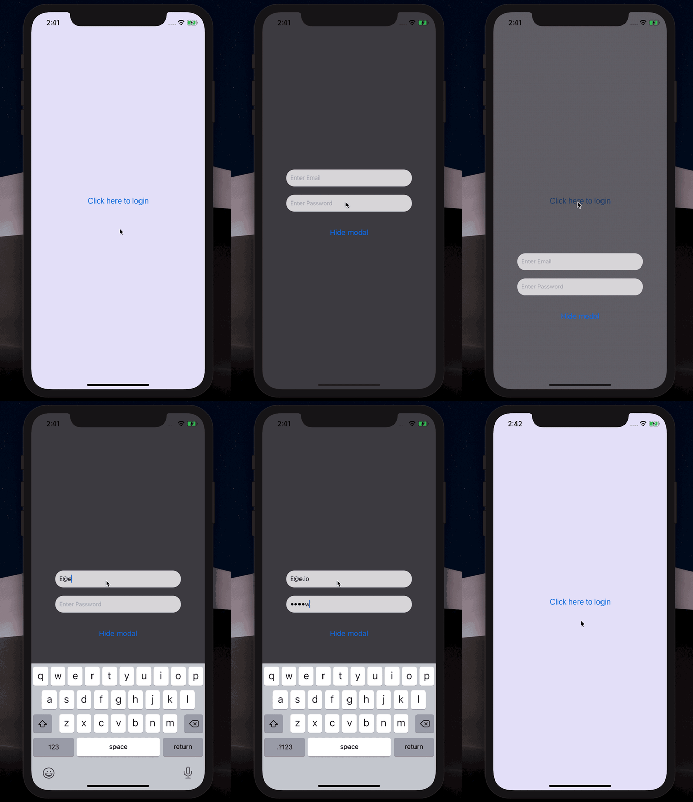
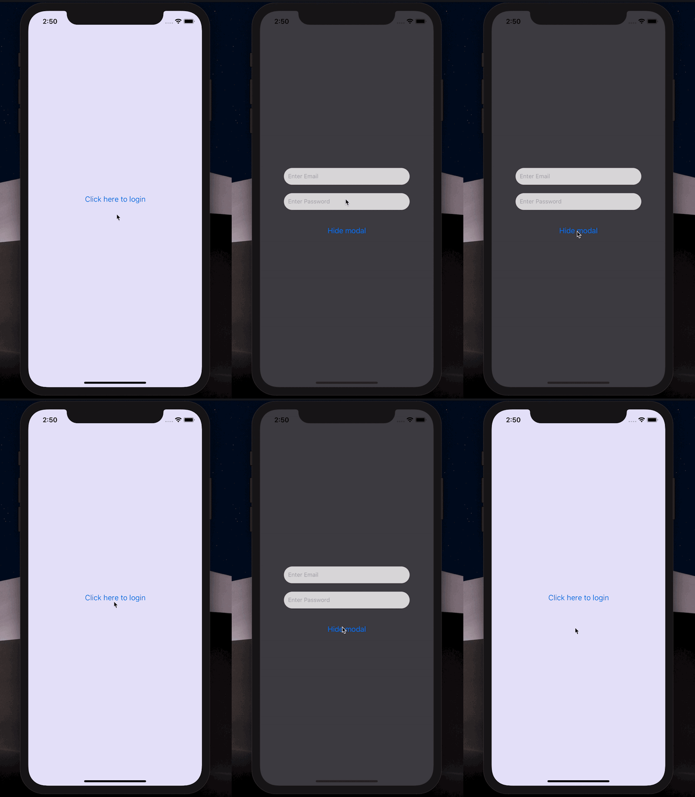
Some other props are available to the modal component for other customizations, like styling and animations. For instance, we can decide to alter the default behavior of the modal by modifying the animation styles. So, let’s slow down the modal exit speed when we click the hide modal button.
We can do this with the animationOutTiming prop by setting a higher value. The same applies to animating the modal from the top of the screen rather than below, as seen in the GIF above. We can also work with more animation props in React Native. For example, enter the following code:
return (
  <View style={styles.container}>
    <Button title="Click here to login" onPress={toggleModal} />
    <Modal
      animationOutTiming={1000}
      animationOut={'slideOutUp'}
      isVisible={isModalVisible}>
      <View>
        <LoginForm />
        <View style={{marginTop: 150}}>
          <Button title="Hide modal" onPress={toggleModal} />
        </View>
      </View>
    </Modal>
  </View>
);
This update will yield a different modal behavior than you’d expect. Check it out below:
You can find more available props for the Modal component here.
Building forms with a React form library
React form libraries simplifies building forms by providing pre-built components and functionalities for handling form inputs, validation, and submission. Next, let’s build a simple sign-up form using the Formik Library. Install the library with the below command:
npm install yup formik --save
OR
yarn add formik yup
Next, let’s create a Formik.js file in the /components directory with the following snippets:
// components/Formik.js
import { Formik, Form, Field, ErrorMessage } from 'formik';
import * as Yup from 'yup';

// Handling form validation
const userSchema = Yup.object({
  name: Yup.string().required('Name is required'),
  email: Yup.string().email('Email is not valid').required('Email is required'),
  password: Yup.string().min(7, 'Password is too short').required('Password is required'),
});

const userSignup = () => {
  const initialValues = { name: '', email: '', password: '' };
  const handleSubmit = (values, { setSubmitting }) => {
    // Handle form submission here
  };
return (
    <Formik initialValues={initialValues} validationSchema={userSchema} onSubmit={handleSubmit}>
      {({ isSubmitting }) => (
        <Form>
          <label htmlFor="name">Name</label>
          <Field type="text" name="name" />
          <ErrorMessage name="name" />

          <label htmlFor="email">Email</label>
          <Field type="email" name="email" />
          <ErrorMessage name="email" />

          <label htmlFor="password">Password</label>
          <Field type="password" name="password" />
          <ErrorMessage name="password" />

          <button type="submit" disabled={isSubmitting}>Submit</button>
        </Form>
      )}
    </Formik>
  );
}
export default userSignup;
In the snippets above, we define a SignupForm component that uses the Formik library to handle form inputs, validations, and submission. We define a validation schema using the Yup library, set up an initial formState object, and define a function to submit the form details.
We render the form using the Formik components, including the Field component for each input, the ErrorMessage component for validation errors, and the Form component to wrap the form fields and submission button.
Creating a form with React Hook Form
React Hook Form is a form library that uses React Hooks to handle form inputs, validation, and submission. To learn more about React Hook Form, check out our complete guide here. Now, let’s build a sign-up form with the React Hook Form. Start by installing the library with the below command:
npm install react-hook-form
OR
yarn add react-hook-form
Next, create a ReactHook.js file in the /components directory with the following snippets:
import { useForm } from 'react-hook-form';

const SignupForm = () => {
  const { register, handleSubmit, formState: { errors } } = useForm();

  const Submit = (data) => {
    // Handle submit codes here
  };

  return (
    <form onSubmit={handleSubmit(Submit)}>
    /* "handleSubmit" will validate your inputs before invoking "Submit" function */
      <label htmlFor="name">Name</label>
 {/* register your input into the hook by invoking the "register" function */}
      <input type="text" {...register('name')} />

      <label htmlFor="email">Email</label>
 {/* include validation with required or other standard HTML validation rules */}
      <input type="email" {...register('email', { required: true, pattern: /^\S+@\S+$/i })} />
   {/* errors will return when field validation fails  */}
      {errors.email && <span>Please enter a valid email address</span>}

      <label htmlFor="password">Password</label>
      <input type="password" {...register('password', { required: true, minLength: 6 })} />
      {errors.password && <span>Password must be at least 6 characters</span>}

      <button type="submit">Submit</button>
    </form>
  );
}
In the above snippets, we define a SignupForm component that uses the useForm Hook provided by React Hook Form to handle form inputs, validation, and submission. We also define a Submit function to handle the form submission using the handleSubmit() React Hook Form inbuilt function to submit the form data.
We registered each input field using the register function provided by React Hook Form and specified validation rules using the options object. Finally, we render the form using standard HTML input and label elements and conditionally render error messages using the errors object returned by React Hook Form.
Conclusion
In this article, we’ve demonstrated how to build better React Native forms using native UI components and React form libraries. We covered the Picker, Slider, and Modal components. We built sign-up form examples using Formik and React Hook Form to give you a hands-on experience of how they work and how to build your form in React Native. You can find the source code for this project here.
Source: https://blog.logrocket.com
#reactnative
