This article shows how I improved the accessibility of a simple GitHub Timeline app I built.
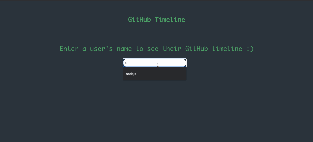
A few weeks ago, I worked on a little GitHub Timeline project. When you enter a user’s username you can view a timeline of their public repositories in a chronological order — the most recent repo on top.
I chose a design, a colour palette, settled on React, and off I was to build my timeline app. Here’s a gif of how it eventually looked like:
GIF of how the app works
Everything worked perfectly, right? I ensured it was responsive, the font and colours looked okay, and I ensured there was feedback when a user wasn’t found or when a user existed but without public repositories. I was ready for deployment, right?
Wrong.
What I described above is the default path of most developers. As long as we feel like the product/app works using ourselves as the standard, we make mistakes. The above application works and looks ready for deploy but let’s do another test. An accessibility test, and let’s see what we find. I will be using WAVE, a web accessibility evaluation tool, and we shall start with the homepage. Here are the errors and alerts found:

#frontend-development #front-end-development #accessibility #accessibility-testing
