Data visualization is the process of representing data using visual elements like charts, graphs, etc. that helps in deriving meaningful insights from the data. It is aimed at revealing the information behind the data and further aids the viewer in seeing the structure in the data.
Data visualization will make the scientific findings accessible to anyone with minimal exposure in data science and helps one to communicate the information easily. It is to be understood that the visualization technique one employs for a particular data set depends on the individual’s taste and preference.
Need for visualizing data :
- Understand the trends and patterns of data
- Analyze the frequency and other such characteristics of data
- Know the distribution of the variables in the data.
- Visualize the relationship that may exist between different variables
The number of variables of interest featured by the data classifies it as univariate, bivariate, or multivariate. For eg., If the data features only one variable of interest then it is a uni-variate data. Further, based on the characteristics of data, it can be classified as categorical/discrete and continuous data.
In this article, the main focus is on** univariate data** visualization(data is visualized in one-dimension). For the purpose of illustration, the** ‘iris’** data set is considered. The iris data set contains 3 classes of 50 instances each, where each class refers to a type of iris plant. The different variables involved in the data set are Sepal Length, Sepal Width, Petal Length, Petal width which is continuous and Variety which is a categorical variable. Though the data set is multivariate in nature, for univariate analysis, we consider one variable of interest at a time.
We proceed by first importing the required libraries and the data set. You can download the python notebook and dataset here.
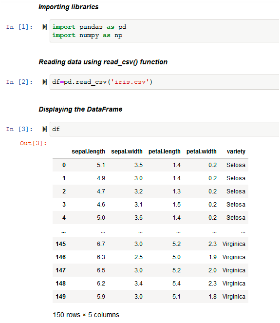
The data set originally in .csv format is loaded into the DataFrame df using the pd.read_csv( ) function of pandas . Then, it displays the DataFrame df.
Before analyzing any data set, inspect the data types of the data variables. Then, one can decide on the right methods for univariate data visualization.
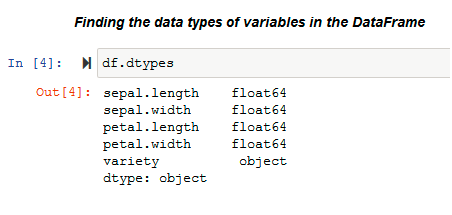
dtypes
The .dtypes property is used to know the data types of the variables in the data set. Pandas stores these variables in different formats according to their type. Pandas stores categorical variables as ‘object’ and, on the other hand, continuous variables are stored as int or float. The methods used for visualization of univariate data also depends on the types of data variables.
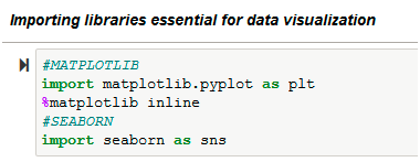
In this article, we visualize the iris data using the libraries: matplotlib and seaborn. We use Matplotlib library to draw basic plots. Seaborn library is based on the matplotlib library and it provides a wide variety of visualization techniques for univariate data.
VISUALIZING UNIVARIATE CONTINUOUS DATA :
Univariate data visualization plots help us comprehend the enumerative properties as well as a descriptive summary of the particular data variable. These plots help in understanding the location/position of observations in the data variable, its distribution, and dispersion. Uni-variate plots are of two types: 1)Enumerative plots and 2)Summary plots
Univariate enumerative Plots :
These plots enumerate/show every observation in data and provide information about the distribution of the observations on a single data variable. We now look at different enumerative plots.
1. UNIVARIATE SCATTER PLOT :
This plots different observations/values of the same variable corresponding to the index/observation number. Consider plotting of the variable ‘sepal length(cm)’ :
Input (Univariate scatter plot using Matplotlib)
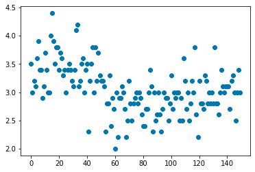
Output (Univariate scatter plot using Matplotlib)
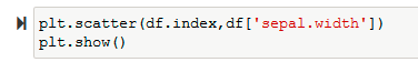
Use the_ plt.scatter()_ function of matplotlib to plot a univariate scatter diagram. The scatter() function requires two parameters to plot. So, in this example, we plot the variable ‘sepal.width’ against the corresponding observation number that is stored as the index of the data frame (df.index).
Then visualize the same plot by considering its variety using the _sns.scatterplot() _function of the seaborn library.
#univariate #data-visualization #python #visual studio code #visual studio