A light Weight Content Loader for React Native
Provide a placeholder at the place which need waiting for loading, Easy to implement and fun to use, this package is highly customizable, Please go through docs to find info :).
I tried to move this package to @sarmad1995/react-native-content-loader, but seems like people are using this version a lot, so I will be maintaining this version from now, @sarmad1995/react-native-content-loader also has all the features.
Features
- Customizable: Feel free to change the colors, speed, sizes, paragraphs, title and much more.
- Lightweight: Lightweight with only neccessory code.
- Typescript: Fully typed
Getting Started
npm install react-native-easy-content-loader --save
yarn add react-native-easy-content-loader
Examples
Simple Example
<ContentLoader active />
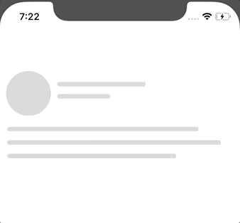
With Avatar
<ContentLoader active avatar />
With Loading State
<ContentLoader active avatar loading={this.state.loading}>
  <Text>This would be rendered with loading is false</Text>
</ContentLoader>
Number of paragraphs
<ContentLoader active avatar pRows={4} />
Different Widths for differnt paragrahs lines
<ContentLoader active avatar pRows={4} pWidth={["100%", 200, "25%", 45]} />
Facebook and Instagram Style
These are also flexible and customizable
| Facebook loader | Instagram loader |
|---|---|
|
 |
import { FacebookLoader, InstagramLoader } from 'react-native-easy-content-loader';

<FacebookLoader active />

<InstagramLoader active />
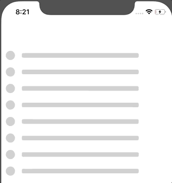
Bullets Style
<Bullets active listSize={10} />
Default Style
It is highly customizable, please refer the options sections.
import ContentLoader from "react-native-easy-content-loader";
<ContentLoader
  avatar
  pRows={5}
  pHeight={[100, 30, 20]}
  pWidth={[100, 70, 100]}
/>;
| Added custom heights and widths | Same with other loaders |
|---|---|
 |
 |
Some more examples,
<FacebookLoader pHeight={[20, 10]} />
<ContentLoader reverse avatar pRows={5} pHeight={[40, 30, 20]} />
<ContentLoader active listSize={10} />
| Default Loader | Colored |
|---|---|
 |
 |
Usage
import ContentLoader, {
  FacebookLoader,
  InstagramLoader,
  Bullets
} from "react-native-easy-content-loader";
<ContentLoader active />
Options
These Options are common with every component,
primaryColor?: string, rgba/hex
Defaults to rgba(220, 220, 220, 1).
secondaryColor? string, rgba/hex
Defaults to rgba(200, 200, 200, 1).
animationDuration? number
Defaults to 500. The animation transition time from primaryColor to secondaryColor
loading?: bool | null
Defaults to null, If given a bool value, when false, it will return children (Works as a wrapper component)
active? bool
Defaults to false, true if you want to animate the compoennt.
title? bool
Defaults to true. If you want to show the title, Works only with ContentLoader.
titleStyles? object
Add styles to title.
listSize? number
Defaults to 1. If you want to render a list of loaders, Works with all the loaders.
avatar? bool
Defaults to false. If you want to render the avatar.
aShape? string 'circle' | 'square'
Defaults to circle. shape of the avatar, can be circle or square.
aSize? string 'default' 'small' 'large' | number
Defaults to default. can be a specific number.
reverse? bool
Defaults to false. if you want to reverse the view.
containerStyles? object
If you want to add style to container.
Title specific options.
tHeight? string | number
Used to change the title height.
tWidth? stirng | number
Used to change the title width.
sTHeight? string | number
Used to change the secondary title height Works with only Facebook and Instagram.
sTWidth? string | number
Used to change the secondary title width Works with only Facebook and Instagram.
titleStyles? object
Add styles to title.
secondaryTitleStyles? object
Add styles to secondaryTitle. Works with only Facebook and Instagram.
Paragraph specific options.
pHeight? string | number | array
Paragraph line height, Can specify same height with single value, Or could use array for different heights, eg [‘100%’, 200, 300], you can use pHeight and pWidth to achieve different shapes as well,
pWidth? string | number | array
Paragraph line width, Can specify same width with single value, Or could use array for different widths, eg [‘100%’, 200, 300]
paragraphStyles? objecct
Add paragraph styles
Instagram specific options.
imageHeight? number
Change the height of the image
imageStyles? number
Add styles to image
Release History
See CHANGE_LOG.md.
Contributing
Feel free to contribute, this is still in beta and I have plans to include more features in future :)
Download Details:
Author: sarmad1995
GitHub: https://github.com/sarmad1995/react-native-easy-content-loader
#react-native #react #mobile-app #programming
