Stroked Text in CSS
This tutorial will show you several approaches for creating stroked text (or outline text) in CSS and with SVGs, and explore how a stroke is applied to text.
Stroked text, also referred to as outlined text, can be used to improve readability, helping letters stand out from a background. It can be employed in a variety of ways to give your webpage some additional punch.
Here’s an example of the type of text that’s usually seen on the web:

Here’s an example of stroked text, sometimes referred to as outlined text:

A stroke is a border drawn along the outline of a letter. Stroked text can bring a different aesthetic to a webpage and can be utilized in some cool ways. The example above makes me think of American football jerseys! What do you think?
In this article, we’ll clarify some terminology pertaining to web fonts and explore how a stroke is applied to text. Then, we’ll move on to some examples, and dive into the CSS.
Let’s get started!
Contents:
- Basic primer on stroke
- Where would you use stroked text?
- Stroked text in CSS
- The non-standard
-webkit-text-strokeproperty - The shadow hack
- The pseudo-element hack
- The non-standard
- Stroked text in SVGs
- Stroked text with variable fonts
- Creating stroked text with CSS vs. SVGs
Basic primer on stroke
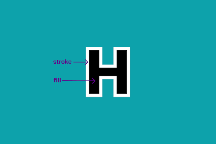
In graphic design or web design, the outside bit of outlined text is referred to as the stroke, and the inside bit as the fill:
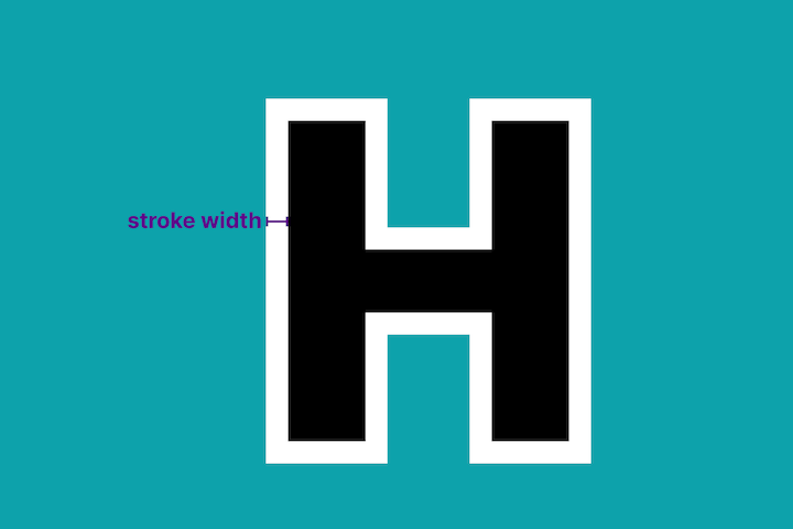
The stroke can have a color that is different from that of the fill, usually referred to as a stroke color. Also, it can vary in width (i.e., thickness). It is similar to a border in this regard. This is usually referred to as stroke width:
Stroke text may have no fill, or may have a transparent fill, so that the background is visible through the text. In this scenario, the text looks like an outline:

A less obvious facet of a stroke is its alignment. Stroke is like a border — it lies outside of the fill area, but its placement can vary.
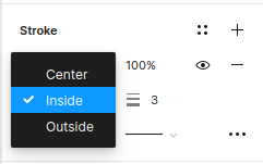
Most UI design tools, such as Figma, usually have three values for alignment:
- Center: The stroke lies half inside the fill area, and half outside
- Inside: The stroke is inset
- Outside: The stroke is like a border, lying on the edge of the fill area
Each of the below three text examples has identical property values, but a different stroke alignment value:
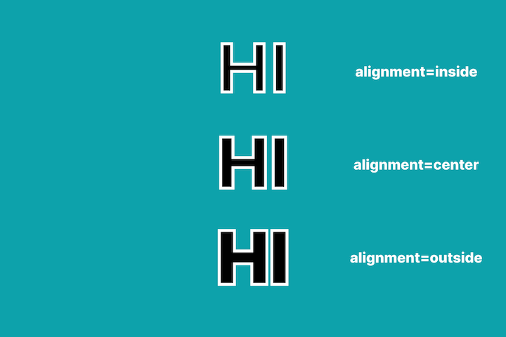
You can see that the inside value “eats up” the space inside each letter. The outside value is the only option that does not shrink the size of the fill area.
It is worthwhile to keep in mind that there are some differences in capabilities between design tools and CSS. Some things are simple to accomplish with a design tool but can be hard to do with CSS! This can create tension between designers and developers! Let’s keep this in mind when we revisit stroke alignment later in this article!
Where would you use stroked text?
Stroked text is not that prevalent on the web, but you probably see it more often than you realize! It is used in a variety of ways.
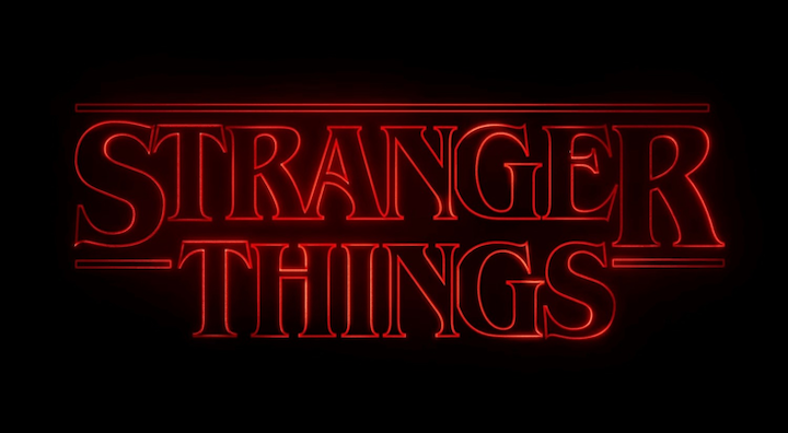
Stroked text was a more popular aesthetic in the 1980s. You can see that reflected in the design of the text logo for the television series Stranger Things:
If you want to create neon-esque text, you can achieve the effect using stroked text and a shadow with some blur.
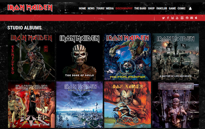
For me, stroked text is synonymous with comics and heavy metal album cover art. You can check out Iron Maiden’s album covers for a range of examples. Stroked text can provide needed contrast for text to stand out against a busy or very graphic background:
I see stroked text used often in fashion too. A classy font with a transparent fill overlaid on a beautiful background can convey elegance:

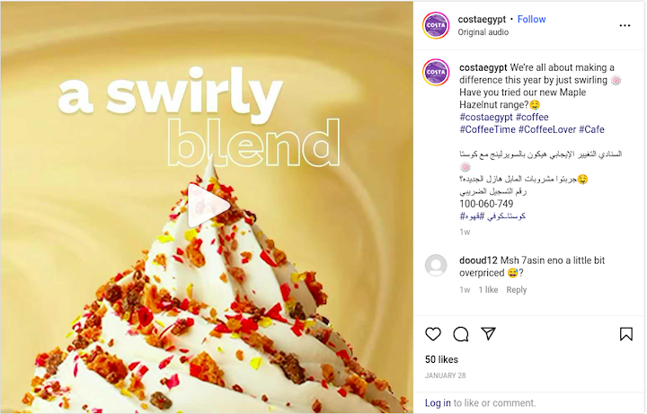
Costa Coffee drops in stroked text frequently in its promotional campaigns. Combining stroked text with filled text offers an intriguing contrast of style:
There is an interesting example of mixed typographic style in the hero section of IMDb’s “Top Series of 2022” article. As you can see below, the text for each block of text varies in style by color, font family, or stroke. For example, the text “2022” is stroked and has no fill. It is eye-catching:
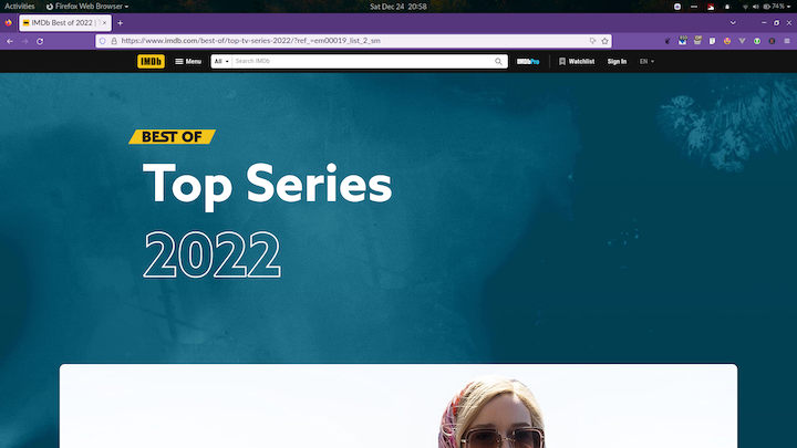
In this case, IMDb used an SVG for the stroked text. We’ll discuss using CSS vs. SVGs later in this article.
Stroked text in CSS
Stroked text can be created in CSS through the following three methods:
- The non-standard
webkit-text-strokeproperty - A shadow hack
- A pseudo-element hack
Here’s a spoiler alert — all of the above methods have a significant drawback from a performance standpoint.
Let’s take a look at these methods to understand how we could use each to replicate the IMDb title. The proof is in the pudding!
The non-standard -webkit-text-stroke property
The CSS -webkit-text-stroke property specifies the width and color of a stroke for text content.
For example, here we’re creating a top-level heading with a white stroke that is 3px wide and has no fill:
h1 {
  -webkit-text-stroke: 3px white;

   color:transparent;
}
The -webkit-text-stroke property is a shorthand CSS property for two longhand properties: webkit-text-stroke-width and webkit-text-stroke-color.
Here is the equivalent CSS rule with the longhand properties:
h1 {
  -webkit-text-stroke-width: 3px;
  -webkit-text-stroke-color: white;

   color:transparent;
}
Here is an example of mixing stroked text with regular text:

It can be difficult to get an attractive result with CSS for stroked text that has a fill (i.e., that has a value other than “transparent” for color). This is because the stroke sits above the fill and lies inside the text. It is similar to the center stroke alignment that we mentioned earlier. So, wider strokes “swallow up”, or cover, more of the letter’s fill area. This can lead to the text appearing misshapen and blurry.
Here are some examples where we increase the -webkit-text-stroke-width on large text (font-size: 40px):
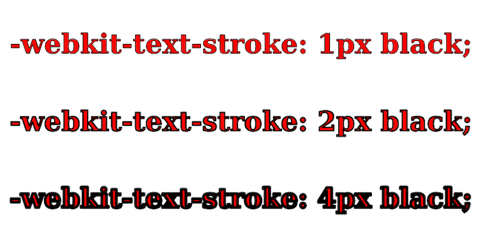
When -webkit-text-stroke-width has a value of 4px, the text appears blurry. It’s like it’s had four whiskeys! Here is a CodePen of the example.
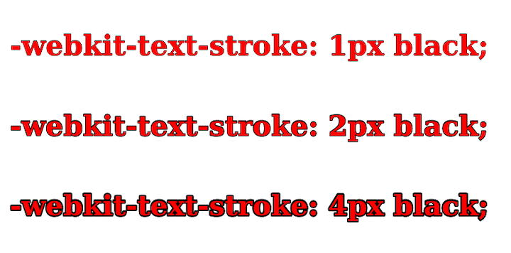
We can mitigate the blurry appearance with the paint-order property, which lets us control the order in which the fill and stroke of text content are drawn. This means that we can place the stroke underneath the fill, so that it does not consume space in the fill area.
This property is borrowed from SVG-land, so references to fill are equivalent to color in HTML-land. The default paint order is: fill, stroke, markers. We can reverse the paint order to put the stroke below the fill using the following CSS:
h2 {
  paint-order: stroke fill;
}
The result looks much better in Firefox (Linux):
In Chrome (Linux), it appears that the paint-order property is ignored:
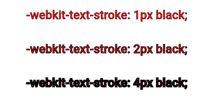
In Chrome, when -webkit-text-stroke-width has a value of 4px, the text looks almost completely covered by the stroke. Here’s a CodePen of the example if you want to review it yourself.
The -webkit-text-stroke property is currently supported by approximately 98% of modern browsers. However, since it is a non-standard property, there’s always a chance that it could be removed from a browser in the future. If you want to create a fallback to hedge against the possibility of the property being unsupported, you can use @supports to have the text filled instead:
@supports (-webkit-text-fill-color: white) {
  h1{ {
       color: white;
  }
}
Pros
- Simple to use
- May be used as a single property
- Very well supported in modern browsers
Cons
- It’s difficult to get a pleasing outcome when you have a fill and a stroke together. This method requires consistent implementation of the
paint-orderproperty to be a more viable option - It is a non-standard property, so it could potentially be yanked and replaced in the future. Also, there may be some inconsistencies between browsers
The shadow hack
We can use the text-shadow property to simulate a stroke. Unfortunately, text-shadow does not have a value like box-shadow, which can create an expanded shadow to greatly simplify execution.
Instead, we can create multiple shadows offset on different sides of the text that overlap to form an outline. With this approach, we can’t use a transparent fill because shadows sit underneath and the shadow will cover the fill area too!
To demonstrate this technique, let’s give our text a blue fill and create a white “stroke” using the text-shadow property. We’ll use four shadows, each with 1px offset to place them at the top, left, bottom, and right of the text:
h1{
  color:blue;
  text-shadow:
    1px 0 0 white, /*right */
    0 1px 0 white, /*top */
    -1px 0 0 white, /*left */
    0 -1px 0 white; /*bottom */
}
As you can see, the result looks fine:
See the CodePen example.
However, if we increase the offset values to 3px, there are noticeable gaps, or spaces, in the corner areas:

See the CodePen example.
We can fix this by adding more shadows to smooth it out, but doing this by hand is cumbersome and prone to errors. It’s probably best to create a SASS mixin to do the required math to provide a manageable implementation. But should we go that far?
Using filter: drop-shadow instead does not offer anything extra. In fact, it’s probably a more expensive action as filters are computationally more taxing.
In summary, this method is messy. I would avoid it.
Pros
- Works quite well with sans-serif fonts
Cons
- Does not work well with text that has more edges or curves; more shadows would need to be added to provide a smoother appearance
- Cannot be used with a transparent fill
- Corners may take on a slightly different shape since this approach involves using multiple offset versions of the text
Pseudo-element hack
We can simulate a stroke with outside alignment using a CSS pseudo-element. Basically, we create a surrogate element to serve as the stroke. Then, we position it below the text and apply the -webkit-text-stroke property.
The “gotcha” with this approach is that we need to duplicate the text content using a data-* custom attribute to make it available to the pseudo-element. For example, here we use the custom data-text attribute:
<h1 data-text="HI">HI</h1>In the CSS code, we position the ::after pseudo-element absolutely, and give it a lower z-index so that it will sit underneath the h1 text:
h1:after {
  content: attr(data-text);

  position: absolute;
  left: 0;
  z-index: -1;

  /* visible stroke is 10px because of alignment */
  -webkit-text-stroke: 20px white;

  /* is sized relative to h1 */
  font-size: 1em;
}
If we use -webkit-text-stroke: 20px white; on the pseudo-element to create the stroke, the stroke will actually appear to have a width of 10px. The stroke is aligned centrally, so 10px is the portion that overflows and is visible. If we change the value to 1px, no stroke is visible, as shown below:

Alternatively, we could do some math to position and size the pseudo-element to overflow equally and simulate a stroke, but this is more involved. Personally, I prefer to steer clear of adding calculations of this type in CSS!
Pros
- Does a decent job of creating a stroke
- The stroke scales when the element’s
font-size(theh1in our example) changes
Cons
- Text content must be duplicated in a custom attribute
- Actual stroke width is actually half the value of the
-webkit-text-stroke-width; this is not intuitive - Has the same drawbacks as
-webkit-text-stroke-widthif you use it to create the stroke. To avoid this property, we’d need to get busy with some math!
Stroked text in SVGs
SVGs have three specific attributes for stroke and fill that can be applied to the text element:
stroke: stroke colorstroke-width: stroke widthfill: fill color
IMDb uses an SVG for the “2022” text in the “Top Series of 2022” title. We can see this in DevTools below:
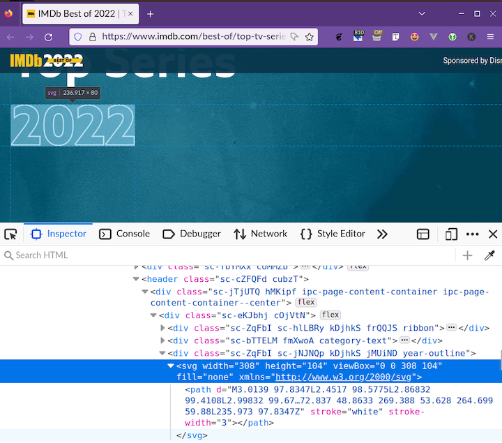
I was expecting IMDb to use a text element like this:
<svg width="308" height="104" viewBox="0 0 308 104" xmlns="http://www.w3.org/2000/svg">
  <text x="0" y="90" fill="none" stroke="white" stroke-width="3" font-family="Noto Sans" font-size="100px" font-weight="800">2022</text>
</svg>
But, instead, the “2022” test was converted to a path. Maybe, this was done to save loading an extra font in the page.
There is an issue with IMDb’s implementation — it’s not accessible. The text “2022” does not exist for screen readers and assistive technologies. At a minimum, IMDb should have added an aria-label attribute on the SVG to give it an accessible label:
<svg width="308" height="104" viewBox="0 0 308 104" fill="none" aria-label="2022" xmlns="http://www.w3.org/2000/svg">
    <!-- long-winded path goes here -->
</svg>
In fact, the HTML here is not well written — there’s no heading for the hero section, or the document as a whole (i.e., there’s no h1).
SVGs have more attributes available to style the stroke. For example, if we look at the “Stroke style” panel from the Inkscape vector graphics editor below, we can get an idea of what else we may want to do with the styling of a stroke.
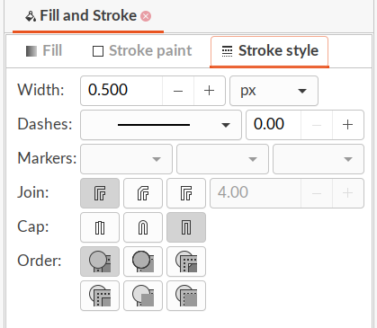
These fields correlate to SVG attributes such as:
stroke-dasharray: Dashstroke-linejoin: Joinstroke-linecap: Cap
I don’t know if it’s really necessary to use stroke-linejoin and stroke-linecap for text, but we can create dashed stroked text with stroke-dasharray!
There’s a working draft, W3C specification CSS Fill and Stroke Module Level 3, for adding stroke properties to CSS such as stroke-color, stroke-width, and stroke-align. It looks like it is more oriented to SVGs, but I guess the properties could also be applied to text in HTML. The spec doesn’t appear to have moved forward too much since 2017. Tobi Reif made a specification request to the W3C for an “outside stroke” property, and that hasn’t advanced either!
Stroked text with variable fonts
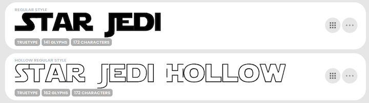
You may be wondering – what about the font itself? Can variable fonts create stroked text? Well, some fonts do offer a stroked variant. For example, the Star Jedi Font has a hollow variant that is stroked text with a transparent fill:
However, stroked variants of fonts aren’t very common.
With a variable font, we can create many different styles of a font through a single font file. The heart of the variable font format is the concept of an axis of variation, describing the allowable range of that particular aspect of the typeface design.
The axes we’d expect are a “weight axis” (describing how light or how bold the letterforms can be) and an “italic axis” (describing if italic letterforms are present and can be turned on or off accordingly). Font designers can create an endless variety of custom axes if they’d like. So, in theory, they could create axes or features related to stroke.
The only variable font that I found that has something related to stroke is the dT Jakob Variable Concept by dooType. The website’s download link is broken, but fortunately, I could access it on the Axis-Praxis font playground.
The font’s features can create inline, shape (ss02), and shadow versions (ss03) of the text:
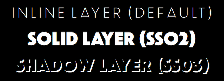
If we turn off the contextual alternatives (calt) and ligatures (liga) features in CSS, we’ll get text similar to the following:

font-size: 180px;
font-family: "dT Jakob Variable Concept Regular";
font-variation-settings: "wght" 40;
font-feature-settings: "calt" 0, "liga" 0;
color: purple;
The inner part is transparent and cannot be given a color. You can see in this short video, how varying the font’s weight affects the text:

dooType calls this a “layer font”. We can overlay an inline version on top of a shape version to create stroked text. This allows us to change the color of the stroke and fill.
This is easier to accomplish with a vector graphics tool such as Adobe Illustrator. I guess when this is done in CSS, the text will line up well, but we’d probably need to tweak the font weight and size of each layer to get our desired result! Having two copies of text content is always a bit clunky.
So, in theory, variable fonts can achieve stroked text too. And, in fact, the example font I selected has this capability! However, this is a niche functionality, and may not offer the amount of control we’d like over different aspects of styling, such as alignment.
Creating stroked text with CSS vs. SVGs
To create stroked text, I would favor SVGs over the CSS -webkit-text-stroke property. The SVG approach is a standard that is consistently implemented across browsers. Hacks are simply harder to understand and maintain; you may understand them well, but your colleague may not!
You could probably get away with the -webkit-text-stroke approach for some use cases, such as letters with a transparent fill. I just wouldn’t have confidence that the resulting text would have a consistent appearance in all browsers across all operating systems. Do you want to test it across browsers to verify it? Or just go for it?
If you want a wider stroke, it will look bad quickly with inside or center stroke alignment. As mentioned earlier, the paint-order property doesn’t work as expected on Chrome (Linux), so I would not rely on it to create a stroke with an outside alignment. In that case, you could implement the pseudo-element hack, with some caveats such as using the -webkit-text-stroke property.
Also, you may want to have more control over the stroke to get your desired result. SVGs offer more control through stroke-related attributes compared to CSS.
Additionally, you can create dashed stroked text with stroke-dasharray! This is not possible through any CSS property.
I don’t want to portray SVGs as an ideal alternative though — this approach is a compromise. You may find the SVG approach a bit finicky to get the text the way you want it to appear. To get the outcome you want, you’ll need to create a document with dimensions and values for text attributes. But, there’s a high probability that your end result will look the same across browsers.
Here’s an example implemented using the SVG approach, by applying attributes for stroke and fill to the text element:

Closing thoughts
It’s possible to create beautiful outlined (or stroked) text in CSS, but you may find the methods a bit unreliable and unwieldy for achieving your desired results sometimes. Using a non-standard property, or a hack, is not a great way to go.
Fortunately, transparent stroked text does appear to render reliably across browsers. Applying the CSS methods in other ways requires some care to look consistent across browsers!
I hope we can get a W3C-approved CSS stroke property soon. There is a dormant W3C specification CSS Fill and Stroke Module Level 3 to add stroke properties to CSS that could be dusted down!
Variable fonts offer the possibility of providing some stroke-like behavior. However, as a font designer is required to create this as an additional feature, I don’t see this becoming a typical offering.
For now, I would generally recommend using SVGs to create stroked text. When you use this approach, favor using the text element to ensure that the stroked text is accessible and can be copied and pasted in the same manner as the rest of your text.
Thanks for reading!
Source: https://blog.logrocket.com
#css