Corona Virus Live Updates in India using Python
As we know the whole world is being affected by COVID-19 pandemic and almost everyone is working from home. We all should utilize this duration at best, to improve our technical skills or writing some good Pythonic scripts.
Let’s see a simple Python script to demonstrate the state-wise corona virus cases in India. This Python script fetches the live data from Ministry of Health Affairs Official Website. Then data is represented in the horizontal bar graph.
To run this script follow the below installation:
$ pip install bs4
$ pip install tabulate
$ pip install matplotlib
$ pip install numpy
Let’s try to execute the script step-by-step.
Step #1:
# importing libraries

import requests
from bs4 import BeautifulSoup
from tabulate import tabulate
import os
import numpy as np
import matplotlib.pyplot as plt
Step #2:
extract_contents = lambda row: [x.text.replace('\n', '') for x in row]
URL = 'https://www.mohfw.gov.in/'

SHORT_HEADERS = ['SNo', 'State','Indian-Confirmed',
				'Foreign-Confirmed','Cured','Death']

response = requests.get(URL).content
soup = BeautifulSoup(response, 'html.parser')
header = extract_contents(soup.tr.find_all('th'))

stats = []
all_rows = soup.find_all('tr')

for row in all_rows:
	stat = extract_contents(row.find_all('td'))
	if stat:
		if len(stat) == 5:
			# last row
			stat = ['', *stat]
			stats.append(stat)
		elif len(stat) == 6:
			stats.append(stat)

stats[-1][1] = "Total Cases"

stats.remove(stats[-1])
Step #3:
objects = []
for row in stats :
objects.append(row[1])
y_pos = np.arange(len(objects))
performance = []
for row in stats :
performance.append(int(row[2]) + int(row[3]))
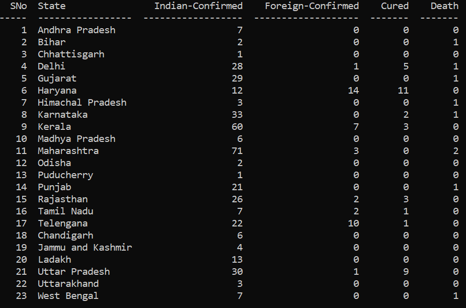
table = tabulate(stats, headers=SHORT_HEADERS)
print(table)
Output:
Step #4:
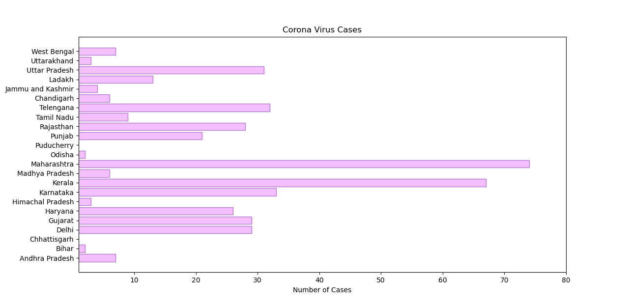
plt.barh(y_pos, performance, align='center', alpha=0.5,
				color=(234/256.0, 128/256.0, 252/256.0),
				edgecolor=(106/256.0, 27/256.0, 154/256.0))

plt.yticks(y_pos, objects)
plt.xlim(1,80)
plt.xlabel('Number of Cases')
plt.title('Corona Virus Cases')
plt.show()
Output:
#python #web-development

6.75 GEEK