In this tutorial, see how you can easily generate a variety of Charts based on the data in your Kendo UI for Angular Grid.
A frequent question that pops up from people using Kendo UI for Angular is how they can work with the Grid and the Chart component together. This makes sense after all, the Grid can display the raw data and the chart is a nice way to visually consume said data. One particular scenario we are asked about often:
“How do I generate charts with the current selection in a Grid?”
Well, I’m here to say that it’s as easy as pie 🥧 and all you need is a Grid, a Chart, a Menu component and maybe a pie tin!
In this post I am going to be walking you through THIS KILLER DEMO and how you too can achieve such ✨ MAJESTY ✨ in your Kendo UI for Angular Grid! To easily follow along, grab the source code and see what we have done. I’m going to cover the important pieces for setting up this type of interaction between our components!
This gif was taken from one of our sample applications that you can find here: https://prgress.co/ChartsSampleApp. For those that want to follow along in the source code, here’s a link to the GitHub repo: https://prgress.co/ChartsGitHub.
When you select a row on this Grid and right click it, you are offered a context menu. In this menu you’ll see all of the chart types you can generate with that data.
Once you choose a chart type, a dialog pops up with the chosen data displayed in chart form!
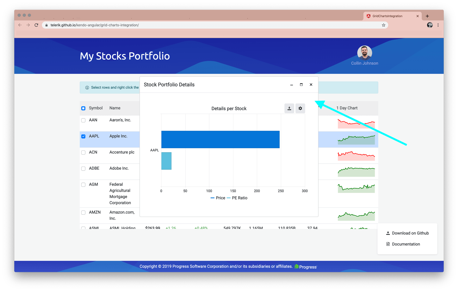
This article is going to walk through some of the steps it will take to create this workflow. We will start by adding in a menu for the chart types on right click. Then we will show you how to build out the different charts when they are selected. Let’s dive in and step through the sample app to see the kind of interaction the demo focuses on!
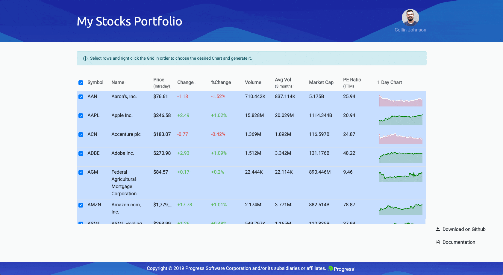
Building the Loveliest of Grids
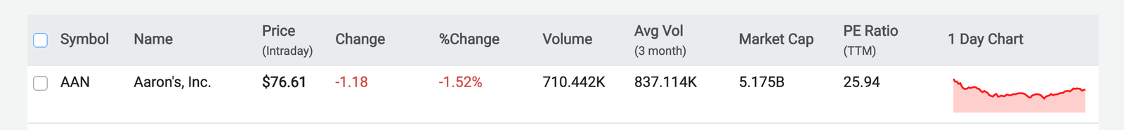
The first step in this incredible Grid-to-Chart journey is, of course. the Grid. We have added a lot of items to this Grid: checkboxes for selectability, names and descriptions of course, lots of other data pieces, and a mini-Grid in the last column! You can further customize cells and columns of your Kendo UI Grid by specifying what template is used. Check out our Grid Template docs for more details.
Let’s go over the “bones” of our Grid to see how we have achieved this layout:
The Grid Itself
Firstly, we needed to create the Grid itself, the pie tin if you will, that will hold this gorgeous confection. Our data is public gridData:Stock[] = stocksInPortfolio; is coming from the data.ts file if you’d like to check out how it is formatted.
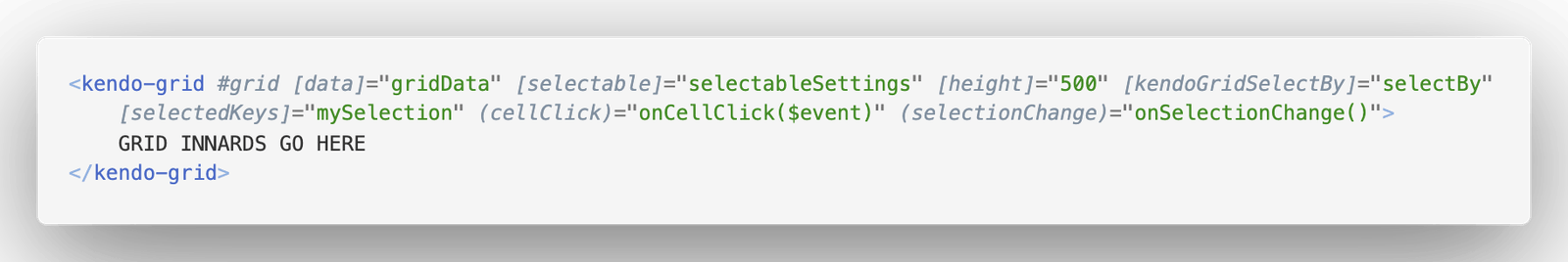
Selectable Settings
We are passing in [SelectableSettings](https://www.telerik.com/kendo-angular-ui-develop/components/grid/selection/) to allow users to select the Grid with or without arrow selection (so they can click on the row) and we are allowing multiple rows to be selected at once.
Persistent Selection
If you notice the kendoGridSelectBy binding, this is where we are linking in the stored items that we have selected. The selectedKeys is where we define the collection that is storing our selected items. I love this feature! Read more on our Persisting the Selection docs.
Note: An important piece to note here—when a user changes their selected items, the Grid emits a selectionChange event that we are using to call onSelectionChange(), which stores the new selected items for persistence! 🙌
#ui #generate #chart