And we’re back! Let’s pick up where we left off in the first article of this series and use the visual we built there as a starting point.
Before we dive in, let’s set the stage for what we’ll accomplish here:
- Build upon what we know about creating calculated fields in Tableau and show how that translates to Python
- Demonstrate how we can use color to add depth to the insights our visuals provide
In Tableau, you can often get your brain all twisted around a tricky situation that requires you to produce calculations various levels of aggregation. Some of you might have Googled your way through this to the point that if you type ‘level’ into the search bar, it autocompletes to ‘level of detail tableau’ (I feel you).
While it will take time to learn all the nuances of Python, one of the powerful aspects of using any programming language is the freedom you have to creatively solve problems. You’ll find that in Tableau there may have been a handful of different ways to get to the correct results, while in Python (or any programming language) the options are nearly limitless.
Something I think Tableau did a great job with is the marks card. That’s the area where you can drag fields to modify aspects of your visual such as size, color, labels, and details provided in your tooltip. Let’s explore how we can take something that was a click away with the marks card in Tableau, and recreate its output in Python.
In today’s exercise, we will use our ‘Profit’ and ‘Sales’ values to create a new column (similar to a calculated field) and name it ‘Profit Ratio’. We will then apply that new column to enhance the visual we created in the first article, such that the profit ratio dictates the color in the visual.
First things first, let’s build a baseline in Tableau to compare with.
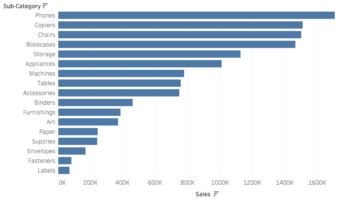
Step 1: setting a goal by building it first in Tableau
Let’s revisit where we left off last week:
As someone who used to teach Tableau trainings, this brings back memories.
Okay, so aside from removing gridlines (AKA non-data ink), what could make it better?
#data-visualization #programming #data-science #python #tableau #data analysis