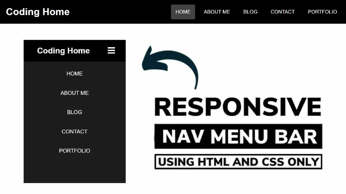
Responsive Navigation Menu Bar using only HTML & CSS
Hello readers, Today in this blog you’ll learn how to create a Responsive Navigation Menu using only HTML & CSS. Earlier I’ve shared a blog on how to create a Responsive Chatbox Widget. In this blog, I’m going to create a Responsive Navbar that is based on pure CSS.
You may have seen the Navigation Bar on many websites. Generally, A navigation bar is a user interface (UI) element within a webpage that includes links to other sections of the website. The navigation bar is the essential UI element of a website’s design.
In this program (Responsive Navigation Menu Bar Design), there is a navbar on the top of the webpage and in this navbar, there is a logo on the left side and some navigation links on the right side of the navbar. On the PC, these navigation links are aligned in a horizontal line but on mobile devices, these links are aligned vertically. This is a pure CSS program and I didn’t use JavaScript or any JavaScript library to create this Navigation Bar.