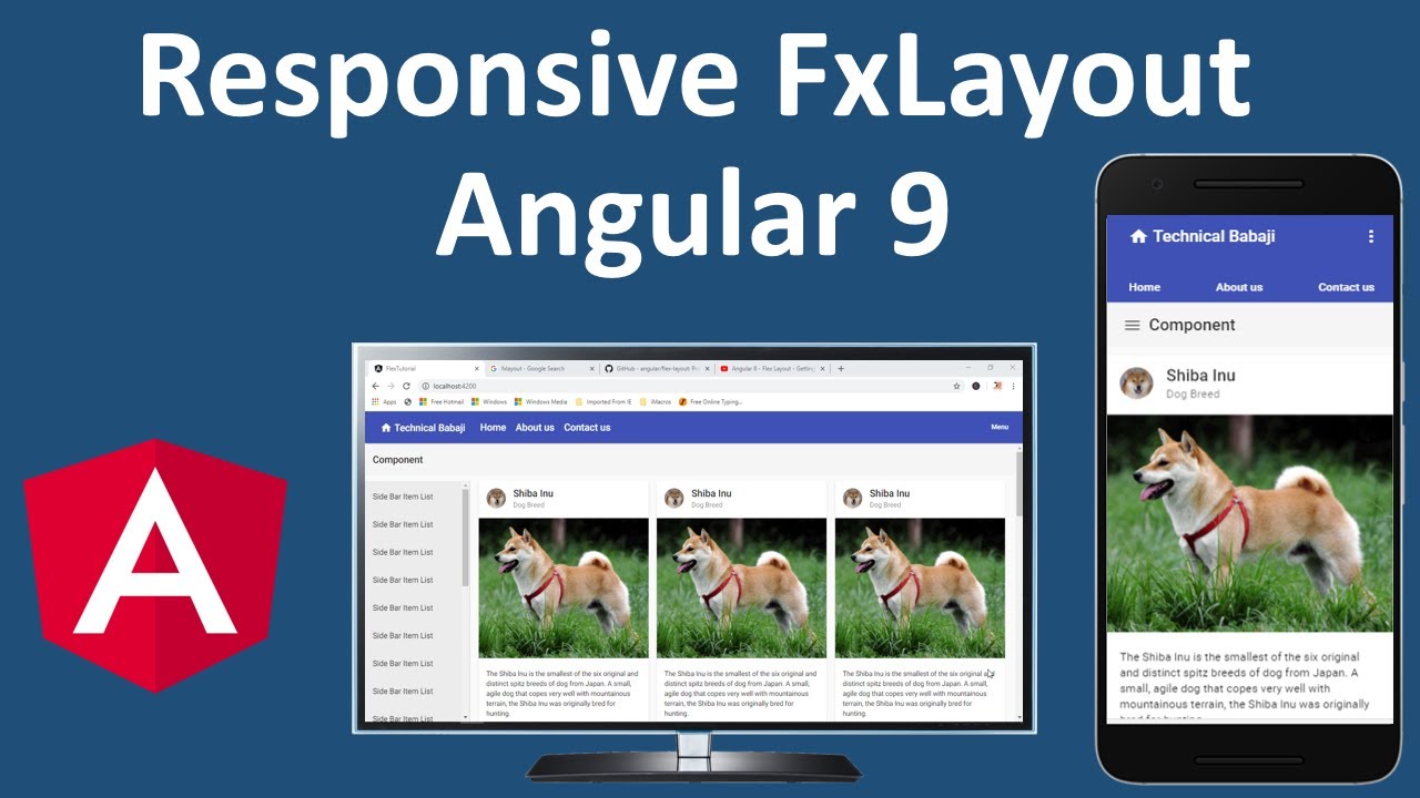
Using flexbox CSS layout we can change the width and height of HTML DOM elements based upon the available space.
We can define different kinds of layouts for different kinds of display devices and different screen sizes.
In this video I am going to show you how you can design the responsive layout using angular flex-layout along with angular material.
Source Code ( GitHub Link ): https://github.com/Tariqu/flex-tutorial
Flex-Layout Documentation Link : https://github.com/angular/flex-layout
Angular Material UI Documentation : http://material.angular.io/
Angular Flex Layout provides a sophisticated layout API using Flexbox CSS + mediaQuery. This module provides Angular developers with component layout features using a custom Layout API, mediaQuery observables, and injected DOM flexbox-2016 CSS stylings.
The Flex Layout engine intelligently automates the process of applying appropriate Flexbox CSS to browser view hierarchies. This automation also addresses many of the complexities and workarounds encountered with the traditional, manual, CSS-only application of box CSS.
The real power of Flex Layout, however, is its responsive engine. The Responsive API enables developers to easily specify different layouts, sizing, visibilities for different viewport sizes and display devices.
Getting Started
Start by installing the Angular Layout library from npm
npm i -s @angular/flex-layout @angular/cdk
Next, you’ll need to import the Layout module in your app’s module.
app.module.ts
import { FlexLayoutModule } from ‘@angular/flex-layout’;
…
@NgModule({
…
imports: [ FlexLayoutModule ],
…
});
After that is configured, you can use the Angular Layout attributes in your HTML tags for flex layout:
#angular #angular 9 #html
