Visualization is an interactive representation of (abstract, complex) data that can help human to perform the task more effectively. It helps us see patterns in broader contexts that specific statistical questions do not reveal. Also, it helps us drive insights and questions that even predefined analytical queries do not elicit.
In this blog post, I will critique one good and one bad visualization.
Good Visualization:
In the below visualization, the three maps accurately show the life expectancy in the years 1800, 1950 and 2015. We can easily interpret how life expectancy has changed over the last three centuries. In the year 1800, people could expect a life span of only 25–40 years, irrespective of the location of their birth. As the new century (1950) began, newborns had the chance of longer life (over 60 years) but it is highly dependent on the location of their birth. People in continents like North America have a higher life expectancy as compared to people born in Asia. In recent decades every country has made very substantial progress in health and many other aspects.
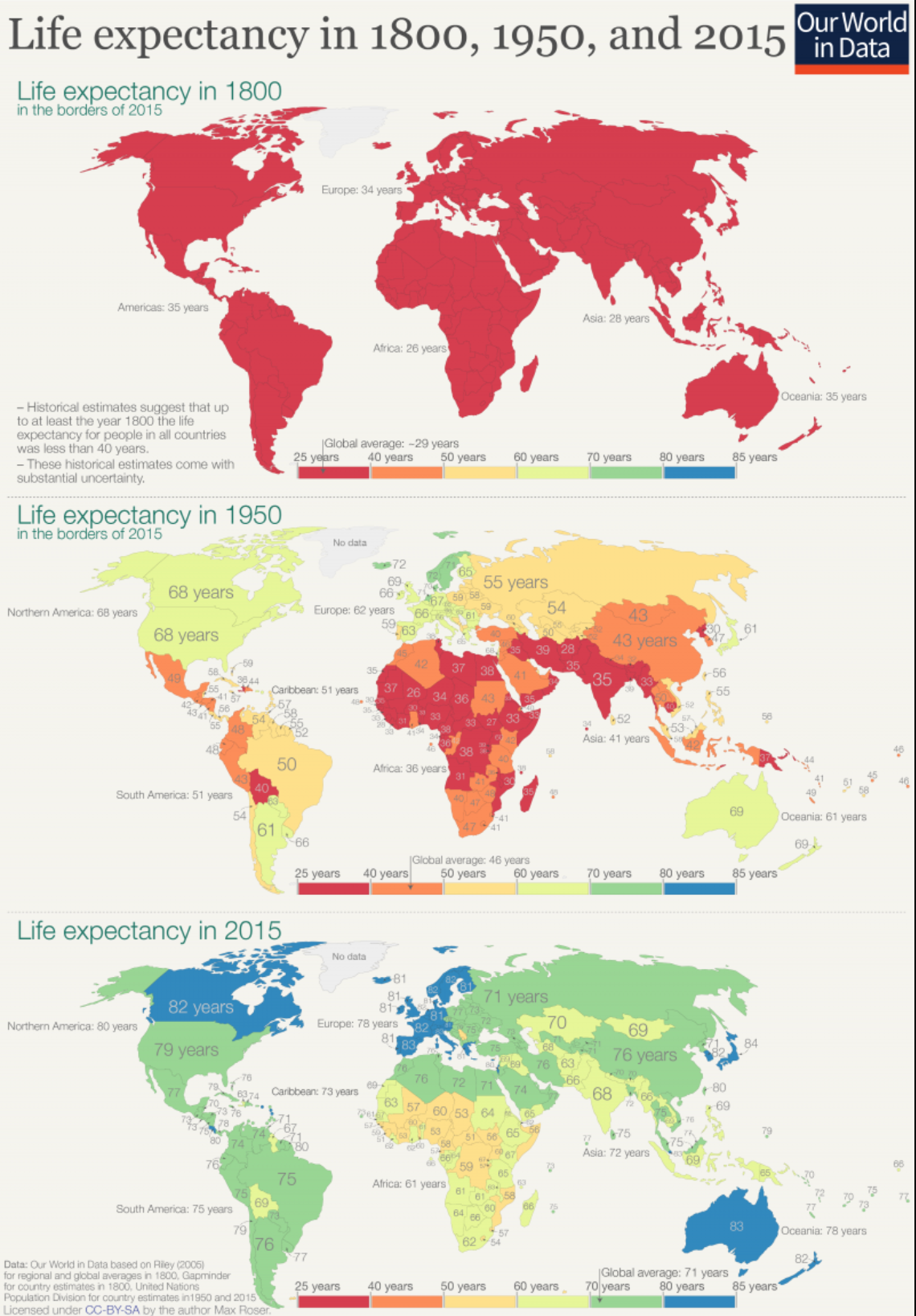
Life Expectancy in 1800, 1950 and 2015 [source]
Globally the life expectancy increased from less than 30 years to over 72 years; after two centuries of the progress, we can expect to live even twice as long as our ancestors.
#visualization #data-visualization #visual studio code #visual studio
