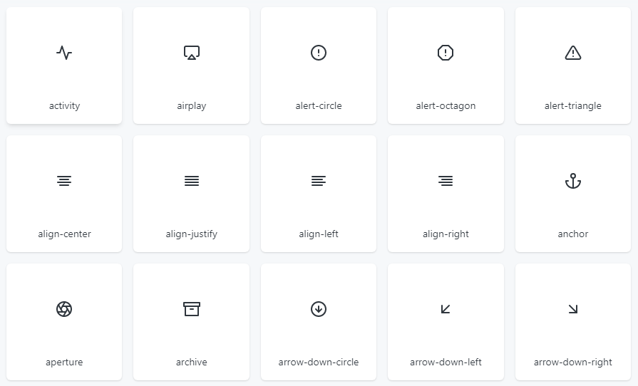
Optimized Feather icon set for Vue using SVG references
vue-feather-icon-set
Optimized Feather icon set for Vue using SVG references.
Install
npm i vue-feather-icon-set
👩🏫 Usage
- Put the IconLayer at the top of your app.
- The IconLayer needs to be top-level, above any icon usage. It’s okay to put it in the app too as long as it’s before any icons are used.
<template>
  <icon-layer>
    <app />
  </icon-layer>
</template>

<script>
import IconLayer from 'vue-feather-icon-set';
import App from './app';

export default {
  components: {
    IconLayer,
    App,
  }
};
</script>
- Import the icon and use it!
<template>
  <div>
    <alert-triangle-icon />
  </div>
</template>

<script>
// direct import
import AlertTriangleIcon from 'vue-feather-icon-set/icons/alert-triangle';

// or, if you have tree-shaking
import { AlertTriangleIcon } from 'vue-feather-icon-set';

export default {
  components: {
    AlertTriangleIcon
  }
};
</script>
FAQ
How is this optimized?
It’s optimized using vue-svg-icon-set by leveraging how SVGs can be referenced and reused like variables with the <use> element. This icon-set leverages this feature to define referencable SVGs so that repeated usage of an icon isn’t duplicated in the DOM.
Demo on JSFiddle
<!-- Defined SVGs -->
<svg style="display: none">
  <defs>
    <svg id="plus">
      <path d="M8 2V14M2 8H14" stroke="black" stroke-width="2" />
    </svg>

    <svg id="circle">
      <circle cx="8" cy="8" r="8" fill="black" />
    </svg>
  </defs>
</svg>

<!-- Use "plus" icon -->
<svg class="icon" width="16" height="16">
  <use href="#plus" />
</svg>

<!-- Use "circle" icon -->
<svg class="icon" width="16" height="16">
  <use href="#circle" />
</svg>
Download Details:
Live Demo: https://feathericons.com/
GitHub: https://github.com/privatenumber/vue-feather-icon-set
#icon #vue
12.40 GEEK